How to Install Responsive Social Buttons on Your Blog
Published by Drew Hendricks • Social Media • Posted June 2, 2016 ContentPowered.com
One of the most basic things you can do to integrate your social media accounts and your website is install social sharing buttons. However, there are probably well over a hundred different plugins and methods for using social sharing buttons out there, and many of them are out of date. They look perfectly fine, they work, but they have a few drawbacks.
One such drawback stems from the fact that the web is becoming an increasingly mobile place. More and more people are using mobile devices – smartphones, tablets, smartwatches, and more – to do their internet browsing. It’s all well and good to have social sharing buttons on your site, but if you don’t have responsive buttons, they’ll break or not display when mobile users browse. When as much as 60% of your traffic comes from mobile, you can’t afford to ignore them and their benefits.
How can you go about implementing social sharing buttons that respond to the device the user is browsing with? It’s actually not as complex as it may seem.
Step 1: Have a Blog
The first step is, obviously, that you need to have a blog. I’m going to talk a little about using a blog to cater to mobile users. There’s more to it than just having a responsive design, after all.
As a mobile browser myself, one of the worst things you can do is use a bunch of advertisements to try to make money off your blog. It’s one thing to have a banner ad or a mid-content box ad. It’s quite another to have pop-ups and finicky little ads that show up all over. I’ve browsed a few pages that had so many ads they layered over each other, and it was a minefield trying to tap the tiny X that closed one so I could even see the X for the next one. I can tell you one thing; I blacklisted that site immediately. Even if they clean up their act, I’m never going back.
Usability is huge when it comes to the web experience, and it’s even more important for mobile users. Remember that Google has some best practices as well, including the ease of ability for closing ads. When your user experience is crap, you’re going to lose users and you’re going to lose search ranking.
There’s also another consideration that many bloggers don’t think about when they’re running their so-called mobile friendly blogs. That consideration is mobile friendly content. Simple blog posts are fine, of course, but the topics may need to be tweaked to be relevant to mobile audiences. If you’re writing about how to use a web app, you might consider that a lot of your users may want to use the mobile version of that app. If the app works differently, or is laid out in a different way, why not cater to mobile users by including mobile tutorials as well?
Another thing to keep in mind is locality. A lot of mobile users have desktops or laptops as well. They use their phones or tablets to browse when they’re out and about, not at home. They don’t necessarily have the luxury of being able to reference your content later, or they may forget about it. They may also not want to read about content that’s only really helpful when they’re on their home PCs.
I’m not saying you should dedicate your entire site to mobile users. What I’m saying is that you should include some more mobile-focused content in your content plan. If you can include mobile steps in an evergreen tutorial, do so. If you haven’t written something relevant to mobile users in a while, write something now. It’s all about keeping them in mind.
Step 2: Have Social Media Accounts
The second thing is to make sure you have the relevant social media accounts set up and in active use. If you’re not using an account, for the love of god, don’t put a button on your site to promote it. People will follow you and find no value. They’ll click through and see the most recent post from months or years ago. It does you no good and it makes them less confident in your other social profiles.
If you’re only using one or two social networks, make sure you’re choosing to only include the relevant buttons. If you have a social plugin that has Facebook, Pinterest, Twitter, Buffer, and Google+ on it, but you only use Facebook and Twitter, those other buttons are red herrings. They’re going to waste, and every click on one of them is a loss.
If you’re only really using one or two social networks, you might not even need a social sharing plugin. Every network has buttons of their own, which are often tiny and compatible with both desktop and mobile users. By including those buttons, and other forms of social integration, you can hook people without a plugin with unnecessary data.
What do I mean when I say other forms of social integration? Here are some examples.
- The Facebook like box often sits in a sidebar and shows users a semi-random selection of people, including their friends, who follow you. It’s encouragement to follow you, but it doesn’t work the same way as a social sharing button.
- The Twitter click to tweet – or tap to tweet in this case – plugin will run and allow users to one-tap share a particular sentence you set aside for tweeting. They’ll be brought to their Twitter app if they have one, but that’s fine; it’s not directing them away from your site so much as it is temporarily distracting them. This is one reason I prefer the click to tweet plugins over the highlight-and-tweet options that exist.
- Pinterest’s “pin this” overlay for images works for users who happen to use Pinterest as well. If a user sees an image of yours they like and would like to pin, they can tap your image and will be given the option to pin it.
These are ways you can integrate social networks into your site without using social buttons. If you don’t have enough profiles to fill out a tray of buttons, consider using these instead and simply having smaller individual buttons in a prominent place.
Step 3: Find the Right Social Media Plugins
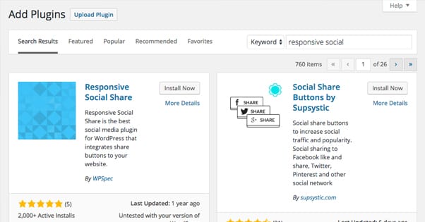
I don’t have a particular social media button plugin on hand for you. You’re going to have to do some searching to find one that suits your particular needs and theme. If you’re using WordPress, that’s easy; their plugin database is very robust and there are a bunch of other options not published in their free directory as well.
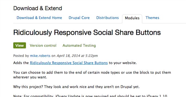
If you’re not using WordPress, you’ll have to find a plugin that works with your setup. For example, this jQuery plugin will give them to a Drupal installation.
Regardless of what plugin you choose, you’re going to want to make sure of a few things.
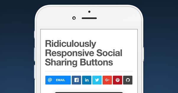
- They need to be responsive. Obviously, since the entire point of this post is to hook you up with responsive social sharing buttons, the ones you choose need to be responsive. This does actually narrow the field a bit, so do some reading into the documentation of your choice before you start installing code.
- They need to be customizable in terms of color and size. Your goal is to make the buttons look like they’re a part of your design. If you have a pale blue background, you don’t want them surrounded by a white field, and you don’t want their icons to be a pale blue that blends in. You need to be able to adjust the colors to match your design.
- You need to be able to pick which networks are displayed. Most of these social sharing plugins will have a list of social networks it can display. Some of them boast that they have as many as 100 different networks to pick through. Obviously, you don’t need them all. You want a plugin that will display just the ones you use, and won’t shoehorn you into displaying or using networks you don’t want to use.
- You need to be able to display them in different places on your site. Sometimes you want your social buttons on the sidebar, sometimes you want them in the footer, sometimes you want them below the title of each post; it depends on what you want and what device you’re displaying them on. Make sure the bar you’re using has a way to configure these different layouts, so you can test them and find the one that works best for both your desktop and your mobile audience.
Really, to be honest, most plugins you find will meet most of these criteria. You shouldn’t have a problem finding one that will work for you.
Step 4: Follow the Steps to Implement the Code
Installing social sharing buttons will be a varied process depending on the options you’re using.
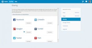
Some plugins will be easy to install. Just drop some files in your host in the way the readme specifies. Then when you go into your dashboard – this is typically for WordPress – you will be able to navigate to a new option for configuring those buttons. That’s where you’ll link the profiles you want to use and display the buttons in the way you want them.
Some particularly bare-bones plugins will work in a similar way, but will require that you make tweaks to some files specifically in order to change configuration options. Color specifically is often a tweak you have to make manually. This shouldn’t be hard, but if you’re not sure of what you’re doing, double-check the documentation. Or send it to a developer to help, if you have one on hand.
Plugins on non-WordPress systems will be a bit trickier, but as long as it’s not custom code running on a custom system, you should be fine. If it’s all custom, I have to ask why you’re not just having your developer do all of this for you. It’s not my place to tell you how to run your business, of course, but ideally the one in charge of maintaining your site will be the one making changes to the code.
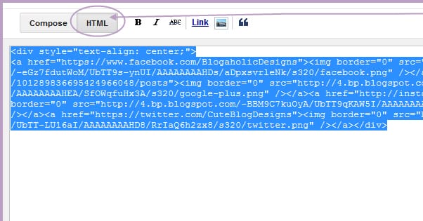
If you’re using more standard plugins like the Facebook like box, you can get the code from the social network itself. Facebook actually has a range of different plugin and button options, and you can get the code right from their developer center. From there it’s easy to find the place on your site you want the buttons and paste the code in. Unless you change something other than adding the code, it should work just fine.
Step 5: Test Your Buttons on Various Platforms
This is the final step, but it’s perhaps the most important. You need to test your buttons on various devices. I recommend at least four; a desktop device, a tablet, an Android phone and an iPhone. If you happen to have people browsing your site from a smartwatch or a smart TV, or any other exotic device, you should try to test from those environments as well. You can’t cover all the bases, but you need to make sure that they actually function.
There are three things you should look for when you’re testing. The first is basic appearance. Do the buttons look the way they should on each device you’re using to test? Are they the right colors and sizes? Are they positioned where you want them?
The second is responsiveness. You can usually test this on a desktop system simply by grabbing and resizing the window, though that only works if the responsive code you’re using determines layout by screen size. If it takes device profile, you’ll need to test in other ways. Make sure when you change resolution, the site and the plugin change appropriately, and that there’s no weirdness for certain layouts.
Finally, and most importantly, you need to test function. Make sure the buttons do what you want them to do, take you to the right sites and the right profiles, share the right posts, and generally function the way they’re supposed to. If they don’t, you’ll need to figure out why. If you’re not keen to dig into code, it might be a sign you need to find a different plugin.
