


Key Takeaways
- Only 0.39% of mobile and 0.60% of desktop users click share buttons; users are 11.5x more likely to tap ads.
- Displaying zero share counts can actively discourage sharing; visible high counts increase click rates by 60%.
- Below-content placement catches readers at peak intent, while floating sidebars work well but must hide on mobile.
- Pop-ins and overlays should be reserved for email signups, not social sharing, as email relationships are more valuable.
- Social lockers that gate content until users share are harmful to trust, bounce rates, and search engine rankings.
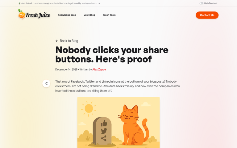
If you’ve been around the internet for a while, you’ve probably seen social media sharing buttons all over the place. I’m looking at a site with two of them up in the top bar navigation. Sites have them in the footer, down with the pseudo-sitemap so many sites put down there. I’ve seen them at the top of articles, below the title. I’ve seen them on the left and right sidebars, either stationary or floating to hover along with the user as they scroll. I’ve seen them beneath the post. I’ve seen them in pop-ins and lightbox pop-overs. I’ve seen them off the shoulder of Orion. I’ve seen them in the dark near Tannhauser Gate. They’re everywhere, but the question is; should they be?
Which location is best for your site? And in 2026, with engagement metrics painting a pretty sobering picture, is it even worth thinking that hard about this?
First, a Reality Check on Share Button Engagement
Before talking about placement strategy, it’s worth being honest about what the data actually shows. According to data cited on Marketing Insider, only 0.39% of mobile users and 0.60% of desktop users actually tap share buttons. Across more than 61 million mobile sessions studied, only 0.2% of mobile users did any social sharing at all - meaning users are 11.5 times more likely to tap an advertisement than a social sharing button on mobile.
It doesn’t get better in email either. A study by GetResponse found that for every 10,000 emails opened, only 34 clicked social sharing buttons. And a case study by Visual Website Optimizer of Finnish retailer Taloon.com found that removing social sharing buttons from product pages resulted in an 11.9% higher conversion rate - suggesting that in some contexts, these buttons are actively hurting you.

That said, context matters enormously. There is one bright finding in the data: a share button displaying a share count showed a 60% higher click rate than one showing zero. Social proof still works - it’s just that most sites are showing zero counts, which may actually discourage sharing instead of encourage it.
All of this to say: think about whether share buttons belong on your site at all before obsessing over where to put them. If you’re a content-heavy blog, news site, or media publisher, they likely still make sense. If you’re an ecommerce site or a service business trying to drive conversions, they may be costing you more than they’re worth.
A Note on Code Placement
In case you arrived on this post thinking “location to install share buttons” is talking about where in your code you should place the scripts, there’s an easy answer. Put the code in the footer of your site.
Code placed in the header has to load before anything else on the site loads. Social sharing scripts have to query external servers for share counts and other data, which can add latency. By placing them in the footer and loading them asynchronously, they won’t slow down your page load time, which matters for user experience and SEO. Core Web Vitals are a ranking factor in 2026, and any unnecessary render-blocking script in your header is working against you.
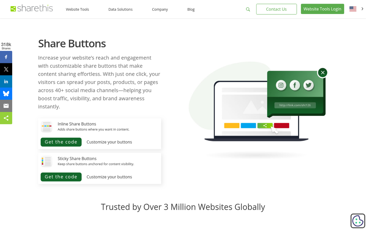
Types of Social Share Buttons
There are basically three types of share buttons that can appear on a blog. Two of them like to be lumped together. But those two and the other one have different purposes and so can be placed in different locations. What are these three forms?
- Share buttons. These are the buttons that count how many times a specific post has been shared on a given social network, and when clicked, allow the user to share that specific post. They are often auto-filled with the link to the post and can sometimes be configured to include a hashtag or a pregenerated message. Note that share count availability has diminished significantly over the years - Facebook removed public share counts from its API years ago, and most networks have followed suit to varying degrees, making it harder to display meaningful social proof numbers.
- Profile links. These are buttons that link to your profile rather than a specific post. They’re used to encourage people to follow your page, your Instagram account, your LinkedIn profile, and so on. They often have more custom designs and aren’t made to stand out quite as much as share buttons.
- Non-social buttons. Print and email buttons fall into this category. These have largely fallen out of fashion and can safely be omitted from most modern sites. The exception might be recipe blogs or resource-heavy content where users genuinely want a clean printed version, but even then, a dedicated print stylesheet is usually a better solution.
Additional Notes on Design
One thing you should remember is that the position of social buttons is usually going to affect your site design as a whole. Unless your buttons are always floating in a sidebar tray, you’ll need to account for them in your layout - it means making a choice between integration and visibility.
Some sites make their social buttons blend well with their design - matching color schemes, monochrome silhouettes, and so on - this looks clean but tends to cut back on clicks. Buttons in their native brand colors (the blue of Facebook and LinkedIn, the black of X/Twitter, the red of Pinterest, the gradient of Instagram) make them stand out more. They’ll draw more attention but will also introduce visual noise into your design. Styling your WordPress theme to match your site can help strike that balance.
Speaking of colors: the social media landscape has shifted considerably. Twitter is now X, and its branding is black. Threads has emerged as a major text-based platform. TikTok remains dominant for video content. Pinterest remains strong for visual and DIY content. Make sure the platforms you’re featuring actually match where your audience lives - there’s little point in a prominent Pinterest button if your readers aren’t there. If you do use Pinterest heavily, it’s worth learning the many ways to share and promote content on Pinterest.
Another choice you have to make is whether or not to show share counts. The data shows that high share counts increase clicks by as much as 60%. But the flip side is equally clear - displaying a count of zero can actively discourage sharing by implying that no one found the content worth sharing. If you can’t guarantee actual counts on most of your posts, consider hiding counts entirely and using icon-only buttons instead. It’s also worth noting that some platforms have removed share counts altogether, which can affect your display options.
As always, the answer is to test and find what works for your audience. Checking your social media traffic in Google Analytics will give you the data you need. This article has the framework; the numbers from your own analytics will give you the answer.
Typical Placements and Analysis
Rather than tell you which position is definitively best, here’s an overview of standard placements and what job each one realistically serves in 2026.
In the top bar navigation: Generally positioned in the top right corner, this is a reliable location for profile link buttons - the kind that say “follow us on X” instead of “share this article.” Jakob Nielsen’s eyetracking research established that users read web pages in an F-shaped pattern, which means the top-left area gets the most attention. But the top-right is still well within the first visual scan. These buttons don’t need to scream for attention here - not a great location for post share counts or anything page-dependent.
In the content, above the post: A strong location for post share buttons, and that’s especially true if you can display actual share counts. The logic is social proof - a reader sees that thousands of people have shared a post before they’ve read a single word, and that signals credibility and quality - this was the philosophy behind Mashable’s velocity graph and similar engagement indicators. The caveat: if your counts are low or zero, this placement can backfire. Consider only showing counts above a threshold.
In the content itself: Generally stay away from this, with two exceptions. First, the click-to-tweet (or equivalent quote-sharing) style plugin, which shows a strong pull quote and invites the reader to share it. Used sparingly - once or twice per post - these can be legitimately effective, especially for long-form content. Second, select-to-share functionality, which surfaces a share prompt when a user selects text - a great idea in theory. But it tends to annoy readers who select text as a reading habit rather than an intent to share. Use your judgment based on your audience.
Below the content, above the footer: The most traditional placement for post share buttons. The logic is straightforward: the reader finished the article, they liked it, and the buttons are right there - this remains one of the most defensible placements because it catches users at the highest point of intent - immediately after consuming the content. Keep these clean and uncluttered - not the place for widgets, feeds, or anything that competes with the sharing action.
Below the content, in the footer: A better choice for profile link buttons and sitewide follow prompts. You have more visual space here, which makes it a reasonable place for an expanded widget - an embedded LinkedIn follow button, for example - but don’t try to squeeze in more than one of these. Pick the platform most relevant to your audience and feature it instead of cramming in everything.
In the sidebar, on either side: Floating sidebar trays - the kind that scroll alongside the user as they read - remain a common and reasonably effective placement for post share buttons. They stay visible throughout the reading experience without interrupting the content itself. The important caveat here is mobile: a floating sidebar tray that works beautifully on desktop can cover content on smaller screens. Any plugin or implementation you use must have a responsive hide option for mobile, or you’ll damage the user experience for the majority of your visitors.
In a pop-in of some sort: Exit-intent overlays, scroll-triggered corner pops, and hello-bar style sliders can all technically house social buttons. But this is usually an incorrect use of high-value real estate. These interruption-based formats are best reserved for your single most important conversion action - usually email list signups, lead magnets, or a key offer. Using them for social sharing in 2026, when email subscribers and direct relationships are more valuable than social follows, is trading gold for pennies.
All of the above: Don’t do this. There is a point at which the volume of sharing prompts on a page can become actively counterproductive - it signals desperation, it clutters the design, and it can hurt your conversion rate on things that actually matter. At most, choose one or two placements that serve different purposes: a floating sidebar tray for post sharing while reading, and a clean set of buttons below the content for sharing after finishing. Keep it simple.
Finally, a word on social lockers - plugins that hide your content until a user shares or follows your page. These were questionable practice years ago and are indefensible in 2026. They inflate vanity metrics while damaging user trust, increasing bounce rates, and hiding your content from search engines. Google has become increasingly sophisticated at recognizing and discounting or penalizing content gating schemes that manipulate engagement signals. Do not use them.
The bottom line in 2026 is this: social sharing buttons are still worthwhile on content-driven sites. But they deserve a more critical eye than they’ve historically received. Place them thoughtfully, don’t plaster them everywhere, hide low share counts, and never let them compete with higher-value conversion actions on your page.