Are Infographics Still Valuable for Backlink Building?
Published by Kenny Novak • Search Engine Optimization • Posted August 13, 2015 ContentPowered.com
Infographics smashed into the world of marketing a few years ago, and within a few months everyone and their mother was making one. They were everywhere; on Facebook, on Pinterest, on LinkedIn, on every blog under the sun. Heck, I’m surprised I’ve never seen one on a billboard. I’m sure if it was possible to turn one into a radio advertisement, someone would have.
Very quickly, the market for infographics became utterly saturated. Everyone made them, and a lot of people made them really poorly. It almost killed the concept as a whole, but some excellent designers and talented marketing firms have kept the idea alive.
All of this happened over the course of 2010 through 2013. It’s now 2015, and people are asking; are Infographics still worthwhile for backlinks, or have they passed into the realm of trite, worthless and outdated techniques?
A Simple Answer
The simplest answer is: yes, infographics are still great for links. There’s just one caveat; you need to do them properly. It’s very, very easy to make a really bad infographic that just doesn’t catch on. Ask yourself; could you see this infographic cut up into a PowerPoint presentation in a business meeting? If so, it’s a bad infographic and you should feel bad for making it.
Thankfully, you have me, and I’m here to give you a rundown of what it takes to make a good infographic, what you should do to avoid making a bad infographic, and how to market an infographic successfully.
The Benefits of Infographic Marketing
There’s more to running an infographic than just getting backlinks. In fact, I would venture to say that backlinks are one of the more tertiary benefits to come from creating and circulating infographics. Here are some other things you can get out of them.
- Brand recognition. When you create a good infographic, people start to take notice, though they may not immediately connect your brand to the graphic. When you create more than one over time, people start to associate you with high quality graphics and information, and that leads to a better brand reputation. This tends to be a little more valuable in a B2B sense than a B2C, but it works equally well for both if you use the right information and presentation.
- Social media shares and viral traffic. Infographics are good for Facebook, where graphical content is always in demand, though you have to use a snippet of the graphic and link to the whole thing off-site because there’s no way to post a very long image on Facebook and have it still readable. That said, infographics are much more effective when posted to more graphics-oriented sites like Instagram and Pinterest, which open you up to millions of additional users you won’t find elsewhere.
- Evergreen traffic for certain topics. Much like blog posts, if you choose the right topic, you can have a graphic that circulates again and again, drawing in traffic for literal years to come. Alternatively, you can make newsjacking infographics to get an immediate and timely viral surge that will die down after a while. By using both frequently, you can leverage graphics into a lot of incoming traffic, branding, and other benefits.
- A reputation for quality graphic design. If you’re making infographics the right way – and you should be once you’re done with this post – you’ll be making very nice, well-designed and visually compelling graphics. They will have more in common with comic books than with PowerPoint graphs, and that will show. Graphic design is difficult to do well, and if you’re pulling it off, it will benefit your reputation.
- Education benefits for both readers and others. One of the best subjects for infographics in general is education. Find a complex or semi-complex topic within your industry that you are qualified to explain and explain it in simple detail, with graphic representation. People digest information more easily via a visual medium, particularly when large numbers and comparisons are involved. By using graphics to explain information to your users, you are able to further convince them of the value and trust they should place in your brand.
- Valuable research and design for use in other projects. When you do research for an infographic, you can use that research in other ways. You have the statistics on hand to write a detailed blog post or even an e-book. You can split the graphic up into discrete chunks and post it to Slideshare. You can animate it and post it as a video to YouTube and Facebook. The same information, presented different ways, gives you more opportunities for links and traffic.
- And, of course, the links.
Reasons Infographics can Fail
There are a lot of ways an infographic can fall flat or fail. The worst part about a failed infographic is that it will still earn you some links and traffic, and you might never realize it’s not a success. If you’ve never made a great infographic, you don’t have the standard for comparison, and you might just think the industry interest is low or that infographics in general don’t work as well as some people say. Here’s how an infographic might fail.
1: The data sucks. There are a lot of ways the data for an infographic can suck, but they all kill a graphic. If the data is dishonest or misleading, it’s not going to make a good graphic. At best it will die an ignoble death. At worst, it will get a lot of circulation because someone points out how misleading it is and your brand is mocked around the Internet. If the data is just plain incorrect, the same thing can happen, and some people might even attribute malicious intent to the incorrect data rather than just ignorance or poor fact checking.
Another possibility is when the data comes from an unreliable source. You know how college professors always tell students never to cite Wikipedia in their papers? The same holds true in real life. At least have the decency to find what Wiki uses as a source and use that.
If the data is old, it’s another reason the graphic might fail. Who, today, is going to want to see an infographic about Hurricane Katrina, or about the 2008 presidential election, or about the economic status of Lichtenstein in 1996? Old data is old news, and old news doesn’t bring in traffic.
On a related note, it’s possible that no one cares. It’s difficult to stomach sometimes, particularly if you’ve gone through the trouble of harvesting the data yourself, but it’s a possibility you need to consider. What is your fallback if no one cares about the subject?
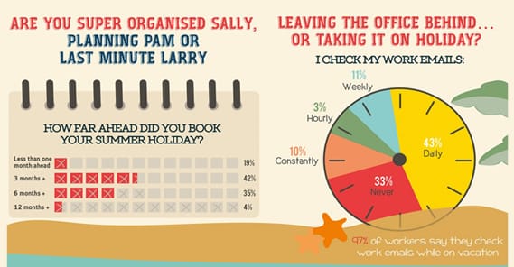
2: Your graphic design is awful. It takes more than a bit of knowledge of Photoshop to make a good infographic. You need to have an internal narrative, a flow to the information. You need a logical trip from point A to point B, from intro to conclusion. You need more than a few pie charts and some clip art. Fancy typography and scatter plots do not make a good infographic. Just take a look at the top infographics and count how many of them include charts you can generate in an office program. Or just look at this.
3: You have no plan for promotion. You can’t just put an infographic out into the wild and expect it to thrive. It’s like releasing your child’s cage-raised pet rabbit in the back yard; an eagle is going to swoop down and eat it before you know what’s up. That’s not a metaphor for your graphic flying high; it’s a metaphor for a sad and disheartening death.
“Promote it on social media” isn’t a strategy. Neither is sending the graphic out in messages to every top blog you know. There’s a lot more to promotion than a list of the tools you want to use. You need to write copy to go with it, share it to targeted sites and with targeted people, and focus on getting traffic over links. Once it has popularity, then people will be reposting and linking to it. That’s where your links come in.
Designing an Infographic
The first word of warning I have for designing an infographic is avoid companies that sell the service. Remember how I said infographics took off as a means for building links? Just like other forms of link building, black hat spammers took over the industry very quickly, and there are hundreds if not thousands of companies out there looking to prey upon you with a slick sales pitch. They’ll make you a graphic, sure. You just have a few possible outcomes. Maybe the graphic is good, but you paid about ten times what it was worth. Maybe the graphic was cheap, but it’s basic and looks terrible. Maybe it’s decent and cheap, but not white-label, and does as much to advertise the infographic company as it does to advertise yours.
In general, it’s better to come up with a concept and hire a freelance graphic designer than it is to hire a company that specifically creates infographics.
So, what’s the process for creating an infographic? It typically goes a little something like this:
- The first step is to get the team together – or just your idea people, whatever works for you – and brainstorm a topic. You want to come up with something that has generalized appeal but is something you have the authority to cover. No one is going to care about a business blog making a graphic about a political topic, any more than they would care about a political blog making an infographic about recipes. You have to decide at this point whether you want to shoot for something evergreen, and thus likely to generate a lot of traffic slowly over time, or something trending and newsworthy, which requires quick and agile creation and publication but can net you huge rewards when done properly. This is also where you’ll determine whether or not you’ll have a gimmick, like animated infographics. I don’t recommend these for novice infographic creators.
- Once you have come up with the topic, do the research. This will likely involve a lot of hunting down statistics in most cases, though you might also be able to get away with direct interviews or even personally harvested data. Make sure the data is generally accessible, so anyone who wants to fact-check you can do so with links you provide. Feel free to harvest more data than you think you will need; this can be useful for expanding your graphic into other forms of content, or just so you can prune it out and have a more streamlined graphic later.
- Filter your data. This is where you want to make sure the data is as correct and accurate as possible. Don’t start making a graphic using statistics from 2011; find updated statistics. At this point, you also want to run your content by a layman or two, to gauge interest and effectiveness of the presentation. If it falls flat with a test audience, it’s not going to fare much better around the Internet as a whole.
- Come up with an emotional perspective. Are you trying to present things in a negative or positive light? What emotional response are you aiming to achieve? This will guide your graphic design later in the process.
- Establish a narrative. What is your starting premise? What is the hook to draw in users? Where do you take them on their emotional journey through the information you have to present? What conclusions do you want them to draw, or do you want to draw for them?
- Establish the details. How can your data be visually represented? Do you want to stick with comparisons with iconography or symbols? Are you looking to use interesting diagrams? Are you going to have it illustrated with cartoons or graphics in some way? Are you including pictures, and do you need to take those pictures or get the rights to use them? Are you adding humor, and if so, have you made sure your jokes are actually funny?
- Write a script. The graphic design will fit around the words. The exact script should look more like a transcript of a short phone call than it should a blog post. You want short, sharable bites of information. Ideally, every line on your graphic should be easily converted into a sharable tweet you can use to spread the graphic.
- Find a designer. Maybe you have one on staff; great! You know how to work with them and you know what they do. If not, you’re going to have to do some legwork. Visit freelancer hubs like Upwork or Freelancer.com. Look at the portfolios of various artists and figure out where their proclivities lie. It’s a million times easier to find a designer that works in a way you want than it is to get a cheap designer to go out of their comfort zone to come up with something that works for you.
- Work with your chosen designer for an outline or wireframe of the design. Before the design is finalized, this is where you’ll be tweaking layouts, details, and flow of the piece as a whole. It’s also where you’ll be making sure everything will look good as a finished product, where your logo will be, where your links will be, and other relevant details.
- Finalize the graphic, pay your designer, and begin the promotion process. Under no circumstances should you try to stiff your designer; ideally, they will become an important part of your infographic team moving forward. Plus, it’s just good business.
I’ve glossed over a lot of the details of hiring and working with a designer, which you can find covered in a bit more detail here. It’s an older article, but most of the information still holds true.
If you’ve been paying attention, you might notice that there’s a lot of details to infographic creation. It’s a lot more intensive than just throwing some charts in Photoshop, slapping in some text and tossing it up on social media. That’s where most businesses go wrong; they fail to realize that the process involves a lot of work if you want a good product.
The promotion process is worthy of a whole other post. Suffice it to say that you’ll have a lot of work ahead of you, posting about the graphic, sharing it on social media in various ways, performing blogger outreach and keeping the graphic alive as long as possible. Meanwhile, you’ll be starting the whole loop over with brainstorming your next graphic. For novice graphic creators, I’d suggest a 2-4 week cycle of development, as long as you can find the topics. Once you have it streamlined, you can tighten it down and release graphics more often.

Kenny is a blogger and networking professional. He uses blogging and content marketing as a launchpad for small businesses looking to grow their online presence.