15 Types of Effective Calls to Action to Use on Your Blog
Published by Kenny Novak • Content Marketing • Posted January 4, 2016 ContentPowered.com

Your call to action is the driving force behind your conversions. It’s like a medieval war horn blown to rally the troops and drive them into the fight. It is, literally, a call for your audience to perform an action.
A great orator can deliver a speech and have people rallying for their cause. Martin Luther King’s I Have a Dream, Lyndon Johnson’s We Shall Overcome, and many more are all good examples.
A poor speaker can bore an entire audience, and the only call to action they’ll take away is “can I leave yet?” It’s obvious which of the two you want to be.
The trouble is, you don’t have the length of a speech. You don’t have a captive audience. You don’t have a one-time-only opportunity like the gathering for a speech. You have a passive website that sits on the web, viewed whenever a user comes along from one of your various traffic streams. You have a very limited amount of space, typically little more than the span of a button or a sentence. If you tried to write a speech and post it on a landing page, you’d probably see a solid 0% conversion rate.
On this blog we have covered calls to action before, focused largely on the types of language you can use. This post is meant to expand upon the concept and give you a series of examples you can use and adapt for your own CTAs.
1. “Have you put any of these methods into action? Tell us about your success in the comments!”
This CTA is focused on getting users to comment on a blog post or social media post. The idea is simple; you want comments, you ask for them. You’re not going out and saying “hey can you comment on my post? Thanks in advance.” Instead, you’re being a little more active about it. It’s not a question, it’s a command. It relates to the content at hand, something like this post itself. I could write “what are your favorite CTAs? Let me know in the comments!” for the same effect.
One interesting thing about the language in this particular CTA example is that it implies that you’ve had success with the methods mentioned. That expresses confidence in the quality of the content. I’m asking you to tell me about how successful they made you, not whether or not they worked.
2. “What do you think? Is Google’s web search dying?”
This is another CTA aimed at producing engagement through comments, but it does it with a different angle. Rather than asking you to share your experiences with a particular method, product, or what have you, it tries to spark a debate.
This CTA is generally best used when following an opinion piece that has data supporting it. Ideally, that post will profess some kind of unconventional opinion. I couldn’t write a post about how Microsoft is a giant tech company and ask you whether or not you agree; of course you do. It’s not something that’s up for debate. Start a debate with an unconventional opinion supported by data, and keep the discussion going in the comments by discussing it further there.
This is a potentially dangerous CTA, though. Sparking a debate is one thing, but if you touch upon a polarizing issue, you can incite harsh feelings and language, and you can drive away users. This happens if you touch on a very contentious issue like political positions, or if you take the wrong side of an issue, like saying “you know, maybe Hitler was right.” Don’t do that.
3. “Subscribe now to receive our free ebook with 10x more tips!”
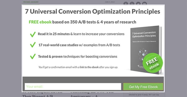
This CTA isn’t focused on getting engagement. Rather, it’s all about trying to get more of an audience to sign up to your mailing list. It’s best used at the end of a lengthy post with a lot of good information. People who liked that information and want more will be liable to subscribe to get more.
The key with this example specifically is that you have an ebook with an expansion on the same topic. If I give you 15 examples of good CTAs, I might then try to offer you an ebook with 100 more examples contained within. The sheer value of the ebook, coupled with giving it away for “free,” means that more people are likely to register just to get it.
Of course, they aren’t getting it truly for free. They’re just paying with personal information, i.e. whatever it is in the form you’re having them fill out. I recommend keeping your form short, though; the more fields a user has to fill out, the less they’ll want to finish the process and actually subscribe, and thus the less effective your CTA is.
4. “This is an awesome little quote from our post. Click to tweet!”
Twitter is a great social network and one of the top sites to use if you want to drive traffic and engagement. Of course, you have to use it properly if you want it to work at its best. One of the best ways to do that is to use some kind of Twitter engagement tool. One of my favorite happens to be in the CTA itself up there: ClickToTweet.
You’ve probably seen this one in action before. Essentially, the webmaster or blogger will provide a few stand-out quotes throughout the post, with a link that says click to tweet them. When a reader clicks the link, they’re asked to confirm the message on Twitter, and that’s it. The perfect CTA, the perfect link, it’s all formatted just right. The message you want goes out, rather than something produced by someone who doesn’t have your marketing in mind.
There’s another similar plugin that simply allows a user to highlight any section of text and will pull up a little box allowing them to click to tweet that exact selection, with a link and hashtag of your choice added on. I consider this a little less effective because you don’t get your own customized message, but it still works fairly well, and certainly better than basic social buttons.
5. “Interested to see how our services can boost your business? Contact us at 1-800-555-5555.”
This is the first much more obviously sales-oriented CTA on this list, though it will not be the last. In this case, the example provides a phone number as the means of contact. In general, a landing page should provide a couple of different means of contact, but it should also avoid overloading the user with options. Instead, do some research to find which 2-3 options are the best, be they live chat, phone, email, a messaging service, social media direct messages, or something else. For physical stores, you can even have your address with a “stop in today” message attached.
Some businesses do a lot better with lead generation than with direct sales in this manner. You can, for example, tweak the initial phrasing such that you’re soliciting users to get an informational packet or a brochure rather than a sales call. This helps contact people who aren’t up and ready for the purchase just yet.
6. “Featured Product: This Awesome Red Widget! Click Here to Buy”
This example doesn’t make a lot of sense on its own. It’s formatted like a headline, rather than something you might include in a landing page or blog post, but it wouldn’t work as a headline at all. The key to it is positioning.
In this case, the positioning is a slide-in or pop-up corner box. These slide-in CTAs are boxes that appear on the screen via an animation triggered when the user has scrolled some distance down a page. You typically set the distance so that they are nearly done reading the blog post, but have not yet finished, so their attention is still on the page. Hubspot and many other marketing blogs use this to great effect. In fact, you can read a tutorial about them on Hubspot’s blog here.
7. “In fact, you can read a tutorial about them on Hubspot’s blog here.”
Did you catch that one? It’s called an in-line call to action, though most of you probably just think of it as a link.
An in-line call to action is really nothing more than a basic link with a purpose. In this case, my link above was a CTA to get you to check out a particular Hubspot tutorial. I don’t have an affiliate with Hubspot, and I don’t get anything out of you checking out that link, but other links on other posts might have more of a motive.
This is the same kind of in-content CTA you might want to use if you’re running affiliate links, for example. The link you post would have your affiliate tag on it, so users who click it are making you some money when they fill out forms or purchase products.
8. “Do we have you convinced? If so, click here to make your first purchase today!”
This is possibly one of the most straightforward CTAs in the world. It’s a simple question; are you ready to convert? If you are, click the link, and you’re taken right to a product page, a login or signup page, or whatever other portal is necessary to get you to make the first step on your purchasing journey.
This is a very up-front version of the CTA, but you can have the same goal with more subtle language. Feel free to experiment to see what variations work best with your audience. You might consider a more passive encouragement to “just take a look, no obligations.” In these cases, be sure to promote your money-back guarantee.
9. “Remember Everything”
This phrase alone means nothing and isn’t a good CTA. It’s very much like any of another million phrases, and yet it’s the top headline for a great Evernote landing page. Dropbox did something similar with their page, “Your stuff, anywhere.” These short, basic CTAs are quick, punchy ways of conveying what it is you do and how you do it. You can see them, and a bunch more, by checking out another Hubspot post over here.
The key to this kind of CTA is not in the language you use; it’s in the graphics you surround the CTA with. It’s generally the kind of page that will only be seen by people who already know about your service and who want to convert. That basic, empty Dropbox page wouldn’t convince anyone on its own; their blog, their reputation, and their utility do that. The page itself doesn’t need much.
10. “Did you love this post? Want to see more of them more often? Follow us on Facebook!”
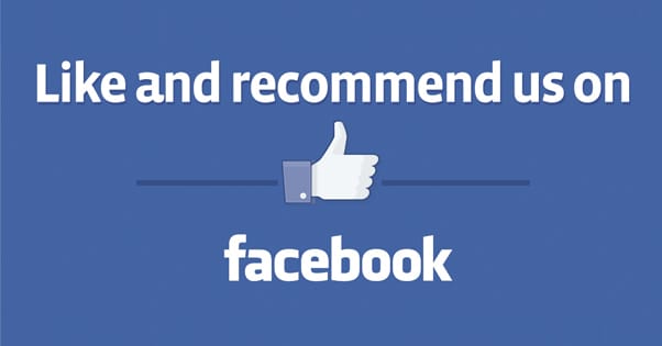
This is the typical social media follow CTA, where you want people to follow your accounts on any given social media profile. It’s basic, and chances are a lot of your audience is already following you so this CTA is lost on them. You can implement a retargeting-based dynamic float-over CTA for different audience segments, but that’s a lot of work. Honestly, I just let the CTA reach people who won’t matter to it, because other people it reaches will.
One caveat here is that I recommend you focus on one specific social media account at a time. I used Facebook in the example, but you can swap it out for whatever account you want to use.
11. “Do you think X or Y is more valuable? Vote in our poll so we can help you in the future!”
This is a poll-focused CTA, though it’s up to you how you want to run the poll. I’ve seen people use this as another variation on the comment-soliciting debate structure, but it also works if you use it in conjunction with a survey of some sort. Using a Google form, a SurveyMonkey result, or something else of the sort will give you a more formal poll for your audience to vote in. If you’re crafty, you can even tie in an optional mailing list opt-in to the end of the poll and hit two birds with one stone.
12. “Check out our live tour for a deeper look!”
This is a CTA that only works if you have the kind of limited live web app necessary to give users a taste of how your product works, without actually requiring them to gain complete free access. Some web apps are able to put up example versions, for instance.
One great place I’ve seen this used is on WordPress theme sites. Almost every theme site is going to have some way to click a link and see a live preview, a version of a static blog with example pages, each skinned with the theme in question. The user can click the preview button to see the theme in action, and decide from there if they want to make the conversion decision.
13. “Available for businesses of all sizes. Click here if you’re a small business, or here for enterprise-level organizations”
This is a lengthy CTA, but it has a lot going for it, because it’s actually two CTAs at once. This is an ideal format to use if you have one business or service that caters to multiple levels of user. It’s also best used on content that appeals to both sides of the coin. You can’t target one or the other because you alienate the one you don’t target, so target them both. It’s a sort of user-driven “choose your own adventure” style of call to action.
14. “Want access to our product before the official release date? Click here to find out how.”
This is the incentivized, exclusive CTA. I like to see this used on exit-intent pop-up lightboxes, the kind that only show up when the user is about to leave. It’s an interest-capturing device that gives people something tangible, like early access, exclusive information, or a limited product or offer. Boost it with a coupon, a free upgrade, or something else you can afford to give away.
15. “Do you love having low sales and negative reviews? If not, click here to find out how to get rid of them.”
This CTA is what I call the reverse psychology CTA. Rather than promote yourself, you demote your readers. You would think “negging” your customers would be a bad idea, but you’re not actually putting them down. You’re just pointing out flaws they may have with their business, and offering them a solution. This is best use sparingly, because being too insulting or negative can have bad consequences. It’s also best used on content that helps solve that issue, so you know the people who are coming in are already suffering that issue, and you’re offering a quick solution. All they have to do is buy.

Kenny is a blogger and networking professional. He uses blogging and content marketing as a launchpad for small businesses looking to grow their online presence.