15 Ways to Include Calls to Action on Your Shopify Blog
Published by Kenny Novak • Monetization • Posted September 11, 2019 ContentPowered.com

A Shopify blog is basically just like any other blog on the web. You have your core theme, you have your navigation, you have your blog post content, and you have an array of different widgets you can use to improve and expand functionality.
All you need to do is get it to work for you. The trick, here, is the call to action. A good call to action mobilizes the user, convincing them that now is the time to take action, not later. Different calls to action have different properties, and how you formulate it all comes down to your goals.
Before we get into specific ways to include calls to action, let’s first talk about what makes a good call to action in the first place.
- It inspires urgency. A good call to action either states or implies that there’s some reason why the user should take action now, rather than later.
- It stands out. A good call to action draws user attention, either by positioning, animation, or color.
- It’s simple. Many people will only glance at a call to action, so it needs to convey its message at a glance.
- It’s above the fold. A lot of people will fail to scroll your page at all, so a call to action placed too low on the page won’t attract attention. There are some exceptions to this, as I’ll mention below.
You can read more about each of these, as well as see some examples of good calls to action, in this post from Shopify themselves.
Now let’s talk about positions and methods for including a call to action on your blog. I’m going to list 15 different options here, but I recommend you choose maybe 3-5 of them at most. If you put too many on your page at once, you end up looking like a spam page trying harder to sell something than convey information. That’s bad for your users, and it’s bad for Google, so it’s bad for you. Find the most effective options you have and stick with them.
1. Link to Products in Blog Posts
The simplest and most common form of call to action is just a link in your blog posts. You’re probably so used to this you might not even think of it as a call to action. All you need to do is mention your services – like blog promotion – with a link to your service page, or product page, or what have you.
See what I did there?
The tricky part with this is that blog post links don’t stand out. This is just one link of many in any given post, and not even the only internal link. You can’t necessarily make it stand out without making your blog posts distracting. I always say you should include this kind of call to action, but make sure you’re not relying too heavily on it.
2. Create a Shopify-Based Clickable Button
Shopify provides instructions on a step-by-step basis for creating a clickable call to action button for your Shopify store. You can read their instructions on this page. It walks you through the entire process at a mechanical level.
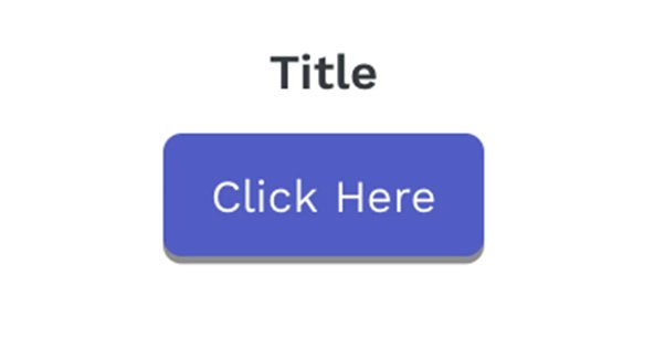
Typically, this kind of button is placed on or next to a header that showcases a product. You show a product with an image, and include some reason why the user should click; maybe it’s a limited edition product, for example. You then provide the button with text like “get yours now” or “shop today” or whatever text happens to work best for your audience.
3. Use a Scroll-Triggered Slider Call to Action
You’ve probably been on a website before where, as you’re scrolling down through the content, you see a box that slides in to the side and hovers in the corner. This is really just a script that triggers when the user gets far enough down the page, and all it does is makes a small box of content appear. You can do this with plugins like OptInMonster or with some custom code.
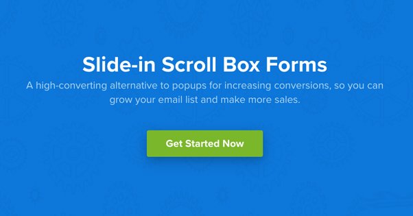
This is one example of a call to action that can be below the fold. Because it doesn’t appear until further down the page, it’s guaranteed to only capture the attention of your most engaged users. As such, it will probably have a lower view rate, but a higher click rate than other CTAs.
4. Use a Hello Bar
Hello Bar is one of several similar plugins that creates a colored banner across the top of your page, usually with a slight scroll-in effect, and always with a call to action button on it.
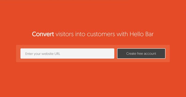
You can customize the color and the text, as well as the destination of the button. Hello Bar is the brand that pioneered this plugin, so they have some of the more robust options, albeit not for free.
5. Use a Top Banner CTA
Unlike a Hello Bar, a top banner call to action is more like a banner ad. You can make these small and position them above or below your navigation. You can make them larger and have them take up a larger portion of the top of your site. Different styles require different kinds of attention, but the main benefit is that they’re big, they’re up front, and they’re obvious. It’s impossible to ignore these kinds of top banners, though whether or not they get any real attention is another matter entirely.
6. Deliver an Offer on Exit Intent
One of my favorite semi-annoying methods for capturing user attention is the exit intent pop-over. These pop-ups are easy to code, or they can be found in plugins as well.
Basically, when the user’s cursor moves outside of the active window – such as towards the X that closes the tab or window – the pop-over appears in a lightbox. This disrupts the user’s action and makes them glance a second time at the site. You can then capture them with a compelling offer, a time-limited deal, or just a guilt trip asking them not to go over a picture of a sad kitten. You know, whatever works best.
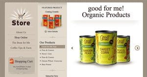
7. Turn Product Images into Links to Pages
Since you’re likely writing about your niche for your Shopify blog, you can probably find a way to include a picture of one of your products. Any time you include such a picture, you can make it into a call to action. The picture itself can be a link to the product page for that product, and you can use the caption to be a text-based call to action as well. There’s a reason those Amazon boxes work as well as they do, right?
8. Use a Sidebar Ad for Your Own Products
Sidebar ads are familiar to just about everyone, and sidebars tend to be relatively wasted space. In addition to a hovering box of social media buttons – more on those later – you can also include a larger tower-style ad for your own products. I see this most often with ebook offers and newsletter opt-ins, but you can really make one for whatever you want.
The major downside to this is that they aren’t necessarily going to be visible on mobile. Mobile is a vertical format, and one of the first things to go with a responsive design is the sidebars. This means your call to action in the sidebar is necessarily going to be focused primarily on desktop users, so keep that in mind.
9. Use a Recent Sales Widget
A lot of small-scale stores use apps like this one. What does it do? Well, while your users are browsing your site, this continually pops up a message in the corner every few seconds – you can set the timing – with a sales notification. It’s usually something simple, like “MWebb42 just purchased Product Name. 3 Minutes ago.” It might also include a thumbnail of the product. You can customize it, of course.
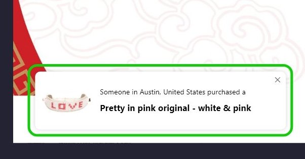
This works best if there’s a limited quantity of products available, to encourage the fear of missing out. If only three are available, and the user sees a notification saying “ONE JUST SOLD JUST NOW HURRY IF YOU WANT ONE OR IT WILL SELL OUT YOU DON’T KNOW WHEN IT’LL BE BACK”, well, maybe they’ll make a purchase.
10. Embed Social Media Posts that Link to Landing Pages
Posting on a site like Facebook, Twitter, Instagram, or Pinterest with images of your products and a call to action can help you get traffic and buyers to your site. Beyond that, though, you can then take those social media posts and embed them on your site, in your blog posts. You get all of the benefit of a social media post, in your blog post, with accompanying call to action.
11. Create Whole Site Wraps
Fewer sites do this than they used to, but some sites still create whole site wraps full of advertising. Usually this is on behest of another company willing to pay for a lot of web real estate, but you can use the same technique to advertise something you’re selling. A whole site wrap will add sidebars, gutters, backgrounds, headers, images, everything. It basically replaces your existing theme with its own huge pile of advertising.
12. Use Social Media Buttons with Arrows
One thing to keep in mind is that not all calls to action have to be about products and landing pages. I’ve mentioned a couple of other kinds, like the newsletter mailing list before, but social media is generally one of the easier sells.
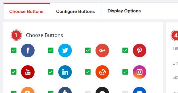
You can include social media buttons in a variety of different ways, such as across the top of posts, in a sidebar that hovers with the user as they scroll, at the bottom of the post, in a header or footer, or even in more than one of those locations. Embellish them with some arrows to draw attention, and you can get a good inflow of followers with each new post.
13. Include a Related Posts Widget
Every blog, in my opinion, should have a related posts widget. A related posts widget like this one will add boxes that showcase a thumbnail and title for a couple of other blog posts, typically posts that have some relation to the post the user is currently reading, though they may just be recent posts as well. It’s like internal linking but with additional graphical visibility. The call to action here is just to keep users on your site reading more of your articles, where they can be exposed to other calls to action as well.
14. Create a Box for Newsletter Opt-Ins
I’ve seen a variety of different boxes that focus on newsletter opt-ins, but one of the most prominent tends to be a large box that interrupts the blog post text, either mid-way through or down near the bottom. Some even sit after the conclusion, but before the comments section.
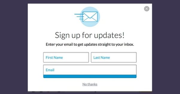
They have a call to action like “don’t miss our posts in the future” with an email opt-in attached, and they do a good job of getting the people who read your post in full to sign up to read more in the future.
15. Call for Comments
Another good call to action you can use is simply a call for comments. At the end of your blog posts, just post a sentence or two at the end asking your users to leave a comment. As long as your comments sections are generally moderated and easy to use – none of that proprietary account stuff – you can get a lot of people commenting just by asking for it.
Blog comments are great because they boost the amount of content on your page, they give you engagement from your users, and they give you feedback. You can use them to build a community and guide the future development of your blog topics.
It’s even simple to do. See, watch:
What do you guys think? What calls to action have proven to be the most effective on your sites? I’d like to hear how well various techniques perform. Leave a comment with your top techniques below!

Kenny is a blogger and networking professional. He uses blogging and content marketing as a launchpad for small businesses looking to grow their online presence.