Your landing page is an important part of your marketing efforts. When you think of sales as a funnel, it's one of the large openings at the top - it's a gateway to the rest of your marketing, and it's the main fixture of your paid campaigns.
A landing page is a source of traffic independent of organic search. Most won't find it because of SEO - they find it because they clicked an ad, a social post, or a link in an email sequence. It already has targeted traffic coming in, so you don't need to worry about educating users from scratch or building brand awareness. All you have to do is convince them to take action.
Making a landing page is hard work. As you'll see as you read, there's quite a bit you have to keep in mind.
Why a template? When it takes so much effort to make a landing page, it's not an investment every business can make from scratch. In 2026, the landscape has shifted - tools like Unbounce, Instapage, Leadpages, Framer, and even AI-assisted builders have made templates smarter and more flexible than ever. It's better to start from a solid template than to build something half-baked, or skip a landing page entirely.
Key Takeaways
- Landing pages receive targeted traffic from ads, emails, or social posts, so the primary job is convincing visitors to convert.
- Effective landing pages must be professional, visually consistent with ads, minimal on fluff, and focused on a single goal.
- Templates save time and money but must be fully customized-copy, visuals, and message match-to perform well.
- Platform-native libraries from Unbounce, Leadpages, Webflow, and Framer are the most reliable template sources in 2026.
- Track conversion rates, scroll depth, click maps, and lead quality, then continuously A/B test to improve performance.
What Makes a Good Landing Page
A landing page should look professional. There's nothing that kills the desire to convert faster than seeing an unprofessional landing page. This includes a page that has broken elements, doesn't render properly on mobile, loads slowly, or looks like it was built in 2012. Make sure your copy aligns with your ads and is free of typos. Avoid thin affiliate templates, aggressive popups, and autoplay videos with sound - all of which signal spam and erode trust immediately.
A landing page should be consistent in visual design, matching both your advertising and your broader branding. If a user clicks your ad expecting one thing and lands on something visually or tonally different, that disconnect will drive them away. Message match - the alignment between what your ad promises and what your landing page delivers - is one of the most important and most commonly neglected principles in paid traffic.
A landing page should be minimal on the fluff. It needs to get straight to the point and stay there. You have a narrow window to convince the user to take the next step, so be efficient. That said, "minimal fluff" doesn't mean short - studies have consistently shown that longer landing pages can outperform shorter ones for complex or high-ticket offers. The rule is simple: it can be as long as it needs to be, but not a word longer.
A landing page needs to understand the target audience and speak their language. If you're selling enterprise software to large organizations, don't write like you're chatting casually with a solo freelancer. Conversely, don't overwhelm small business owners with jargon about multi-team workflows and enterprise-grade compliance frameworks. Know who you're talking to and write for them specifically.
A landing page cannot be overly broad so as to appeal to everyone. One landing page does not fit all. Many specialized landing pages consistently outperform a single catch-all page. If your product serves both small businesses and enterprise clients, great - make separate landing pages for each. Target different audience segments with different ads pointing to different pages. With modern builders, spinning up variations is easier than ever.
A landing page should not demand more information than is necessary. Your opt-in or lead form should only ask for what you genuinely need. Every additional field is another opportunity for the user to bail. In 2026, with growing privacy awareness and increasing friction around data sharing, this matters more than ever. Users are warier about handing over personal information, so earn that trust by asking for as little as possible upfront.
A landing page should be tracked, tested, tweaked, and optimized over time. Collecting data, analyzing it, and making changes based on what you find is the engine of improvement. Run A/B tests - most modern landing page builders have this built in. Use heatmaps and session recording tools like Hotjar or Microsoft Clarity to see how people actually interact with your page. Change one variable at a time so you know what's actually moving the needle.
A landing page should not be alone. You can - and should - have as many landing pages as it takes to speak to every meaningful segment of your audience. The beauty of starting from a solid template or system is that you can customize it in countless ways while maintaining a consistent foundation. Think of it as a family tree: one base design, many tailored branches.
A landing page should be unique, rather than directly copied from a competitor or left as an out-of-the-box template. The purpose of using a template is to give you a strong starting point - not a finished product. Copying another brand's landing page won't work because you're not them. Their offer, their audience trust, and their brand context are all different from yours.
A landing page does not need to keep everything above the fold. You should have your headline, core value proposition, and at minimum one CTA visible without scrolling - but the page can extend well below that. Just make sure a CTA is within reach at any point as the user scrolls. Sticky headers with CTA buttons are a simple and effective way to handle this.
A landing page should include elements of trust and verification, calibrated to the ask. If you're requesting sensitive personal or financial information, security badges and clear privacy policies matter. If you're just collecting an email address, you don't need to make users paranoid - instead, lead with social proof: testimonials, recognizable client logos, star ratings, media mentions, or user counts. In 2026, video testimonials and verified review widgets from platforms like Trustpilot or G2 carry significant weight.
A landing page does not need to obsess over specific colors. The reason "use a red button" advice spread so widely is because it worked on pages that were otherwise white, blue, or gray - contrast is what matters, not the specific hue. Your CTA button needs to stand out clearly from everything around it. Choose your color palette for brand coherence and visual clarity, then make your CTA the most visually distinct element on the page.
A landing page should have one and only one goal. You cannot ask for an email address and then pitch a product further down the page - that splits your message and dilutes your conversion rate. If you have two goals, build two pages.
Why a Template is a Good Idea
When you read all the above, it's easy to see why starting from a template makes sense. A lot of what makes a landing page work comes down to subtle design decisions that are genuinely difficult to get right from scratch. A template gives you a proven foundation.
In 2026, templates have evolved well beyond static HTML files. Platforms like Framer, Webflow, Unbounce, and Leadpages offer dynamic, responsive templates with built-in A/B testing, analytics integrations, and AI-assisted copy tools baked right in. The barrier to launching a high-quality landing page has never been lower - but the caveat remains the same as it always has: you need to actually customize it. A template used straight out of the box, with placeholder logic and generic copy, will underperform every time. If you want to go further, there are proven hacks to increase landing page conversions worth exploring once your foundation is in place.
Templates save you time and money. They eliminate the cost of hiring a developer to build a single page from scratch. They give you something functional and testable within hours rather than weeks. Use them as the starting point they're meant to be.
How to Properly Use a Template
First, find a template that works for your specific goal. A mailing list opt-in page and a SaaS free trial page have very different structural needs. If your audience is primarily on mobile - and in most industries in 2026, it is - make sure the template is genuinely mobile-first, not just technically responsive.
Second, check the licensing and customization flexibility. Some free templates restrict editing or require designer attribution. Both limit your ability to make the page truly yours. Read the license terms before committing.
Third, customize the visual design. Match the color palette to your brand, and ensure your CTA button stands out clearly from the surrounding elements. Swap out any stock photography for images that feel authentic to your brand - generic stock photos are immediately recognizable and undermine trust.
Fourth, customize the copy. This is where most people underinvest, and it's the single highest-leverage change you can make. Your headline, subheadline, and CTA text need to directly reflect the language of the ads driving traffic to the page. Message match is everything. If you're running multiple ad campaigns with different angles, consider building separate landing page variants for each.
Once the page is live, track everything. Conversion rate is the headline metric, but dig deeper. Track scroll depth, click maps, time on page, and - critically - the downstream quality of the leads or customers the page generates. A page that drives high opt-in volume but low-quality leads is not actually a win.
Where to Find Landing Page Templates in 2026
The landscape for landing page templates has changed considerably. Many of the older PSD-based template lists that circulated for years now contain dead links, abandoned resources, or files that require outdated software to use. Rather than pointing you toward lists that may be partially or fully broken, here's where to actually look in 2026:
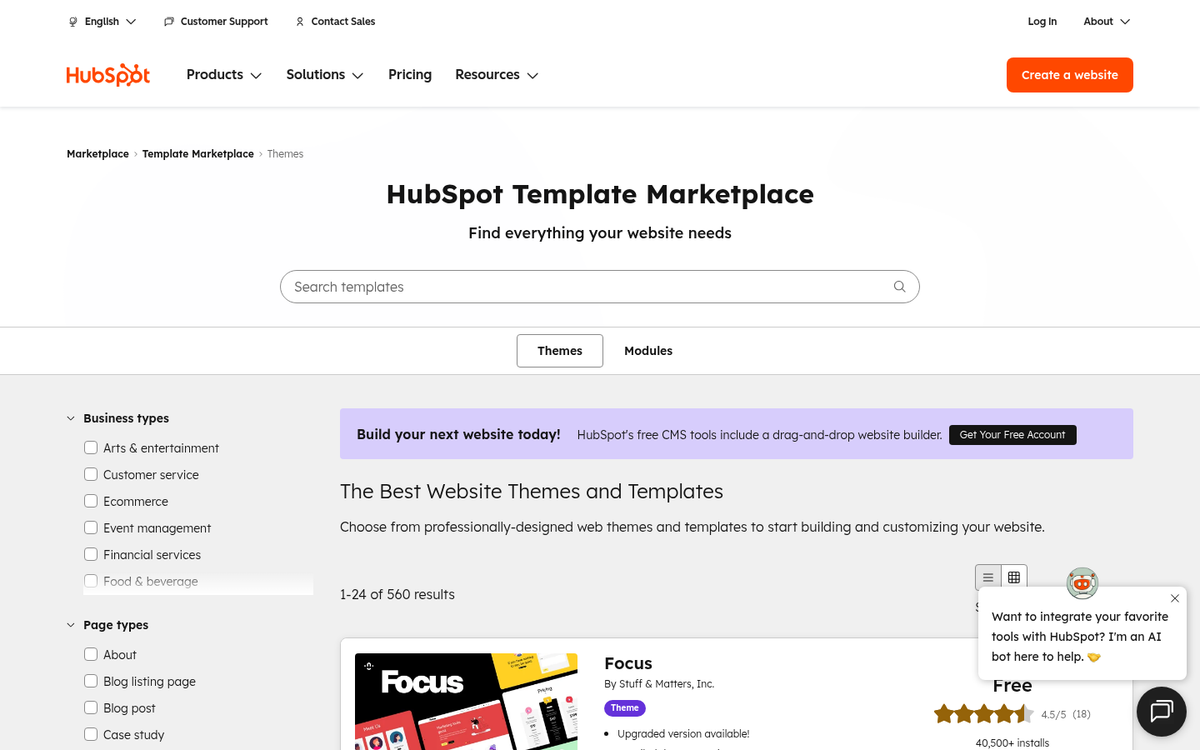
Platform-native template libraries are the most reliable starting point. If you're already using a tool like Leadpages, Unbounce, or Instapage, their built-in template libraries are purpose-built, regularly updated, and designed to integrate directly with their A/B testing and analytics features. These are far more practical than raw HTML or PSD files for most businesses.
Webflow's template marketplace has matured into one of the strongest sources for visually polished, fully responsive landing page templates - both free and premium. Because Webflow generates clean code and handles hosting, the gap between template and live page is minimal.
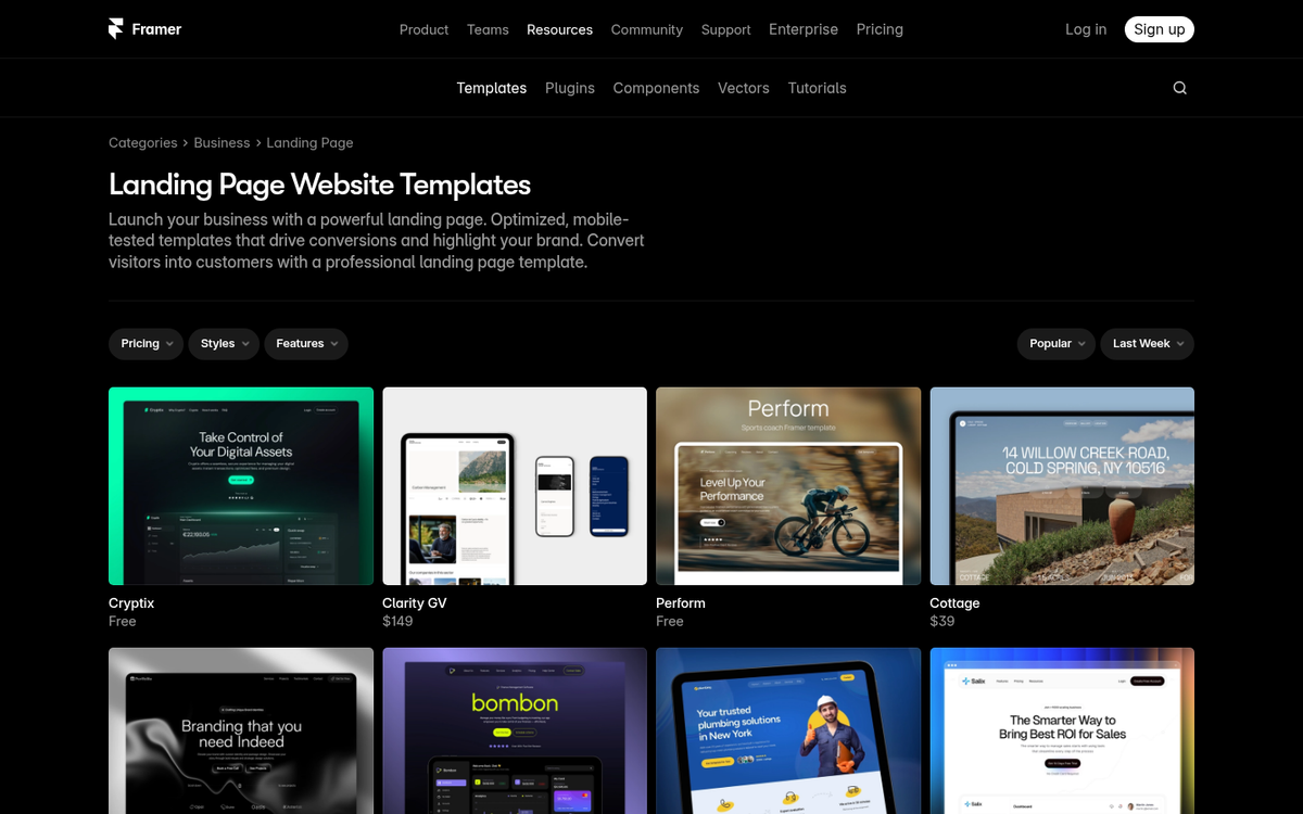
Framer's template library has grown rapidly and is particularly strong for SaaS, app, and startup-focused landing pages. Framer templates are live, interactive, and editable directly in the browser without needing to write code.
ThemeForest and Envato Elements remain solid sources for premium HTML landing page templates, with a wide range of styles and use cases. The quality floor has risen considerably, and most templates here are mobile-optimized and well-documented.
Free HTML templates can still be found through resources like HTML5 UP and Templated.co, which offer clean, modern, and genuinely free designs under Creative Commons licenses. If you want to go further, you can also create free landing pages and squeeze pages without relying on templates at all.
The right template for your business depends on your goals, your audience, and the platform you're building on. Start with the tool you're already using, explore its native template options first, and branch out from there. The template is just the beginning - what you do with it is what determines whether it converts. Once your page is live, make sure you know which of your pages are actually landing the most sales so you can focus your efforts where they matter most.