We marketers, when talking about ads, often have to reference something called the ad quality score. Google maintains a quality score, and Facebook (now Meta) has an ad relevance score, both of which are important for the successful function of your ads.
The thing is, they aren't the only metrics that matter. In this case, we're talking about another metric that Google maintains, something called the Landing Page Experience. The LPE is a way Google uses to measure the landing pages you use for your ads.
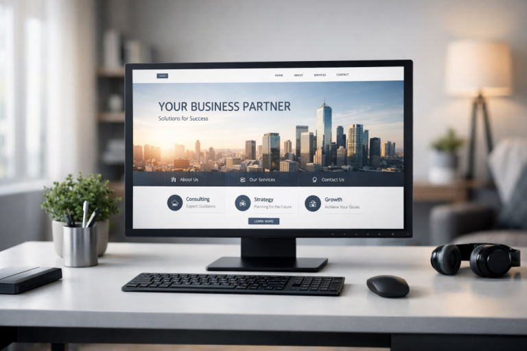
Your landing page is the page users land at after they click your ad. Your landing page experience is, in the words of Google, "Google Ads' measure of how well your website gives people what they're looking for when they click your ad."
Your landing page experience is a metric for each ad - since different ads can have different landing pages, and different ads to the same landing page can have a different level of congruence between ad and landing page - and it's part of the ad rank that goes into calculating your CPC and ad auction position.
In other words, a poor landing page experience means your users aren't getting the messages they think they'll be getting. It can be anything from an ad promising 15% off and the landing page only showing 10% off, to a landing page advertising shoes when the ad promoted shirts. A poor landing page experience means your ads are going to cost more and you'll have a harder time getting premium positioning, as well, so it's always in your best interests to improve your experience.
Keep in mind that your landing page experience is evaluated in comparison to other advertisers whose ads showed for the exact same search over the last 90 days. There are algorithms and an automatic system that parses your ads and your landing pages, but Google also uses individual human raters to help rate and rank your landing page experience as well. This leads to a little bit of variability in landing page ratings, but it'll average out in general so it's not really a big deal.
Key Takeaways
- Landing Page Experience affects ad rank, CPC, and auction position; above-average ratings drive 87% better CTR and 750% better conversions.
- Ad-to-landing-page congruence is critical; messaging, offers, and content must align closely to avoid poor experience ratings.
- Landing pages should match user intent, provide useful content, and keep forms short-reducing fields from 11 to 4 boosts conversions 120%.
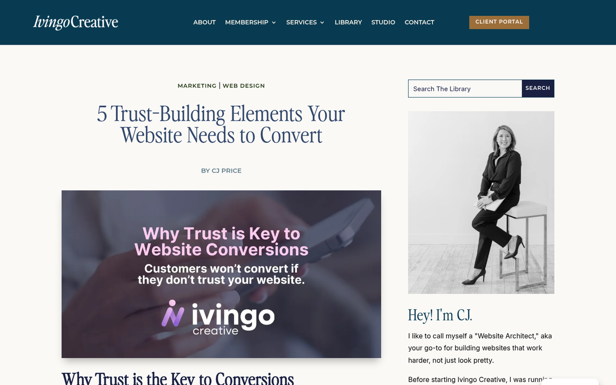
- Trust signals like SSL, contact pages, privacy policies, and social proof improve both user confidence and Google's transparency evaluation.
- Mobile optimization and page speed are essential; a 1-to-3-second load delay increases bounce likelihood by 32%.
Checking Your Landing Page Experience
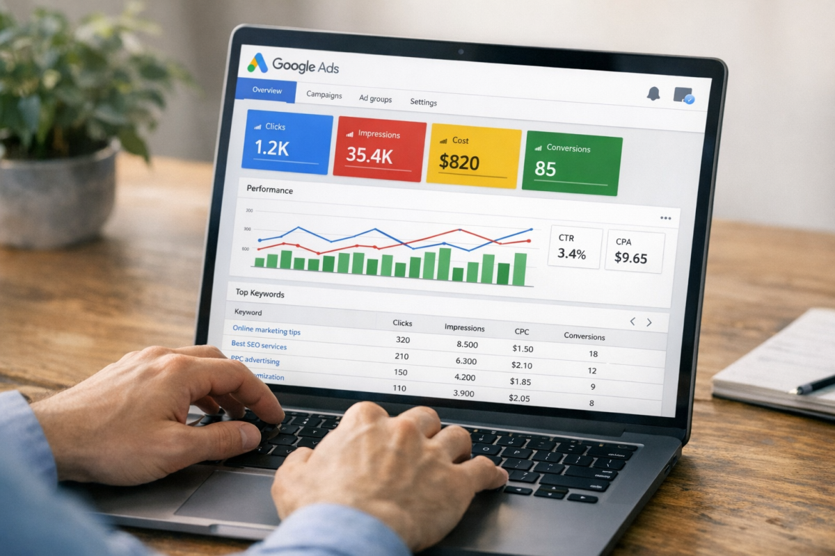
Unfortunately, there's no easy way to check your specific landing page experience. The best you can do is check your overall ad quality score, which includes landing page experience as part of the calculation.
To do this, log into your Google Ads account and find the Keywords section on the page menu. One of the columns is Status. Look for individual keywords and either hover over them or click/tap them to see a rating. This rating will typically be generic, like "above average" or "average" as calculated based on the various quality score metrics.
It's worth knowing just how much this rating matters in practice. According to Search Engine Land, ads with "Above average" ratings for landing page experience and ad relevance showed click-through rates 87% better and conversion rates 750% better compared to "Below average" rated ads. That's an enormous gap, and it makes optimizing your landing page experience one of the highest-ROI activities you can focus on in your Google Ads account.
Here are my top tips for improving your landing page experience. Keep in mind when you're checking that it can take a bit for your quality score to update once you've made some changes. For landing page experience specifically, Google says "You might not see an immediate impact, but you may see results within days or weeks."
Make Your Landing Page Content Original
This is a generally good tip for landing pages across the board, though it doesn't necessarily apply to every landing page. What do I mean?
When you're split-testing different landing page variations, you might end up with several iterations of a landing page that are virtually identical, except for the positioning of an image or the color of a button. This is fine. Google understands that businesses run tests like this.
You do run the slight risk of a duplicate content penalty if you do this too much, but you should be fine if you canonize your main landing page using the meta tags on all of the variations. Don't worry too much about it though; Google is smart enough to overlook minor mistakes.
You should also make sure your landing page isn't broadly copied from other landing pages in your industry. This is a common issue with affiliate marketers who buy template-based sites with landing pages that all look basically the same. You might find 100 sites shilling the same affiliate product, all with the same landing page template and largely identical copy. All of these sites are going to perform worse than average because there's nothing original about their landing pages.
Make Your Landing Page Content Useful
Remember that your landing page should be useful to the user as they arrive on the page. They are searching for something, and they typically have a purchase intent, or at least the intent to research a future purchase. They're looking for something specific, whether it's a specific product buy button or information about a product. Your landing page needs to provide that useful information to that user.
A large part of this is about understanding user intent when they're searching. If a user is searching for information about, say, home security cameras, your landing page is going to do best when you're providing information about multiple camera systems you sell and the pros and cons between them. A comparison page does best in this sort of scenario. Conversely, if a user is searching for a specific model of a home security camera, landing them on a comparison page isn't going to give them much value. If that specific model is one of several, it CAN be useful, but you're generally going to get better results if the landing page is specifically focused on that one camera model.
On the conversion side, keep your forms lean. Data shows that reducing form fields from 11 down to just 4 can lead to a 120% increase in conversions. Every extra field you ask a user to fill out is friction standing between you and a lead.
Make Your Landing Page Content Relevant to Your Ads
Congruence is the most important word for this tip. Congruence means "agreement or harmony; compatibility." In advertising, congruence is the flow of relevance from ad to landing page. This is a case where details matter, and it's also relevant to user intent. Congruence and page utility are both important.
For example, if you're promoting a sale on your product and your ads say it's 10% off, the landing page should also say that the price is 10% off. If you're promoting a specific model of home security camera in your ads, your landing page should be 100% focused on that model. The point is to make sure that there's as minimal disconnect between ad and landing page as possible.
Keep in mind that you can use advanced ad targeting to enhance congruence. For example, if you run ads that bring users to your website for the first time, your landing page can be focused on basic explanations and first-time impressions and FAQs. If you then make a remarketing audience out of those visitors and run ads targeting those people, your landing page for that ad can answer more advanced questions and assume a basic level of familiarity with your offering.
Make Your Website's Contact Information Clearly Accessible
One of the elements that goes into landing page experience as far as Google is concerned is the transparency and trustworthiness of your website in general and your landing pages specifically.
One of the factors that goes into that is how accessible your business information is to users. I know that one of the typical pieces of advice for landing page optimization is to give users as few links as possible to send them places other than the purchase/conversion process, but these links are exceptions.
You want to provide a way for users to read more about your business, and ways for them to reach out and contact you if they so desire. Typically, I find this boils down to two pages: an About Us page and a Contact Us page.
The About Us page should tell details about your brand, your story, and your history. This helps users feel good about making their purchase when, for example, they know you aren't some shell company running drop-shipping for a product they can buy cheaper elsewhere. Even if that's what you're actually doing, you can dress it up nicely in an About section.
The Contact page makes your business seem more legitimate as well. By presenting various generally accepted means of communication - ranging from email to web chat to a phone number and even a physical address - you assure users that you're a real business. It's best if you have offices relatively local to the user - a USA headquarters for a business selling in the USA rather than an office in India, for example - but you shouldn't lie about it either.
A third page you can consider linking, either directly or from within one of those two pages, is a Privacy Policy page. This is especially important for landing pages focused on getting email opt-ins, and should speak in plain language about how you're gathering emails for marketing only and you aren't selling them to other businesses or anything like that. You can find an example of this kind of page in our own Privacy Policy.
Make Your Business Trustworthy
Many of the elements of trust in a website are the same as elements of transparency above, like having a privacy policy page and having an About Us that showcases how real and legitimate you are.
However, your landing page can also include some elements of trust outside of just those factors.
- Use SSL site-wide for maximum trustworthiness across the board. At this point, any page without HTTPS is a red flag to both users and Google.
- Use a trust seal users will recognize as something that lends legitimacy to your page.
- Clearly and obviously disclose any sponsored or affiliate links, as per FTC disclosure rules.
- Use elements of social proof, such as customer numbers or specific testimonials, to improve user trust.
Making your business trustworthy is a huge part of gaining not just immediate sales, but long-term repeat customers and brand advocates.
Make Your Landing Page Mobile Friendly
It should come as no surprise that one of the elements of landing page experience as far as Google is concerned is the ability for mobile devices to navigate the page. This matters more than ever in 2026 - mobile now accounts for approximately 65% of landing page traffic. However, mobile visitors still convert at roughly 58% of the desktop rate, which means there's a significant opportunity to close that gap with better mobile optimization.
First, it means setting a viewport that mobile devices can use to adequately view a page. A viewport can be dynamically adjusted, as per responsive design, and is a huge part of modern compatible websites.
Next, it means making sure all of your text is large enough to read on a mobile device. Bump up that font size, and make sure line spacing and contrast are sufficient for smaller screens.
You also want to make sure your clickable elements are distinct and far enough apart from one another that there's no way to "fat finger" tapping the wrong one on a mobile device. Learn more about picking the perfect CTA size, color, and placement to improve tap accuracy and conversions.
It's pretty unlikely for a landing page, but for your website as a whole, you should make sure you aren't layering it with scripts and ads such that it becomes difficult or impossible to view the actual content of the site. Issues like these are among the top reasons website visitors bounce and leave without converting.
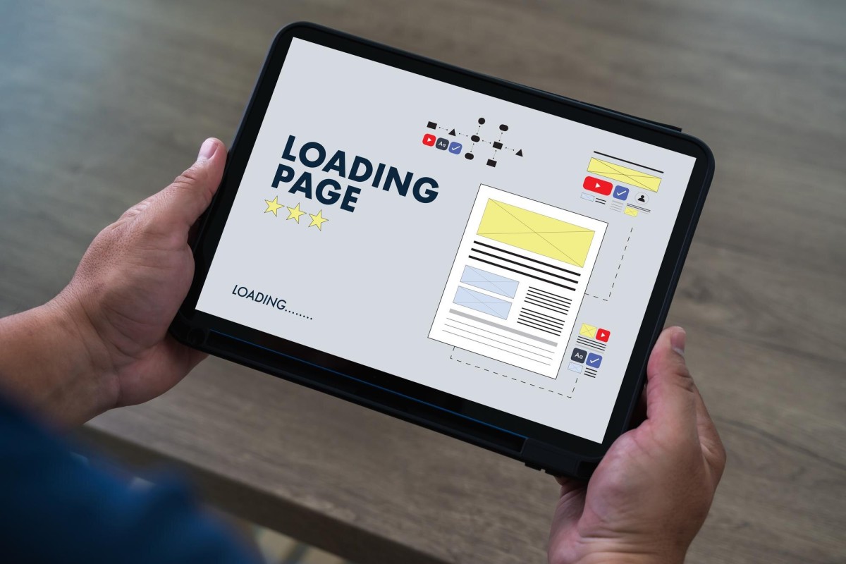
Make Your Site Load Faster

Site speed is another critically important aspect of landing page quality, and the data behind it is striking. A visitor is 32% more likely to bounce when page load time extends from just 1 to 3 seconds. Sites loading in 1 second have conversion rates 5 times higher than those loading in 10 seconds. Even a single second of delay can decrease conversions by as much as 20%.
Speed also has a direct impact on what you pay. A landing page with poor Core Web Vitals can cost you more per click than a faster competitor bidding on the same keyword. That means slow pages aren't just hurting your conversions - they're actively inflating your ad spend at the same time.
Core Web Vitals - Google's framework measuring loading performance (LCP), interactivity (INP, which replaced FID in 2024), and visual stability (CLS) - are now firmly embedded in how Google evaluates page quality. Make sure you're regularly auditing these scores using Google's PageSpeed Insights or Search Console.
There are a ton of different ways you can speed up a site - enough that it's worth an entire article - so I highly recommend reading a detailed guide and putting as many of those tips into practice as you can. Site speed is critical in 2026, and it can boost your landing page experience significantly.
Once you've implemented as many of these tips - for both site speed and for general landing page experience - as possible, you should start to see improvements to your ads and quality score across the board.