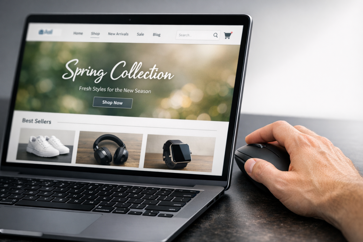
Landing pages are the heart of any good marketing strategy. Sooner or later, every path through your marketing scheme should lead to a landing page. Your social posts, your blog posts, your ads - they all hint at the value to come, but the landing page is where it's laid on thick. It's where you turn the sales pressure up to 11 and close the deal. Even if that deal is just "sign up for my mailing list," it's something you need to take seriously.
Optimizing your landing page for a higher level of conversions is, of course, the day-to-day work for many of us. According to Unbounce, the median landing page conversion rate across industries sits at just 6.6% - which means the vast majority of your visitors are leaving without converting. There are dozens of tweaks you can make to change that. I've listed some of my favorites here.
Key Takeaways
- Median landing page conversion rates sit at just 6.6%, meaning most visitors leave without converting.
- Strong copy, specific CTAs, benefit-led messaging, and minimal decisions significantly boost conversion performance.
- Social proof works best with specific testimonials, verified reviews, real numbers, and recognizable client logos.
- Fake urgency damages trust; only real deadlines, genuine scarcity, and actual expiring offers drive action.
- Split testing every element methodically, starting with headlines, is the foundation of real landing page optimization.
1. A Change of Color
Color is a strange subject when it comes to landing pages. I've seen some people swear by the stereotypical green CTA button, and I've seen others test a whole range of different colors and find almost no tangible difference. I think focusing on color is a bit of a red herring.
There are two things you need to understand to realize why picking the exact shade of orange is a waste of time. The first is color theory, and the second is contrast.
Color theory covers the idea that different colors carry different cultural and emotional weight - you should pick colors that complement the tone you're trying to achieve. A high-energy, urgent offer might suit red or orange, while a calming, trust-focused page might lean into blues and greens.
Contrast applies to your CTA button. It doesn't matter so much what the color of the button is, as long as it stands out from the rest of your design. If your whole landing page is blue and gray, you don't want a blue or gray CTA button - it'll get lost in the details. You need something that pops, like red or orange.
2. The Animated CTA Button
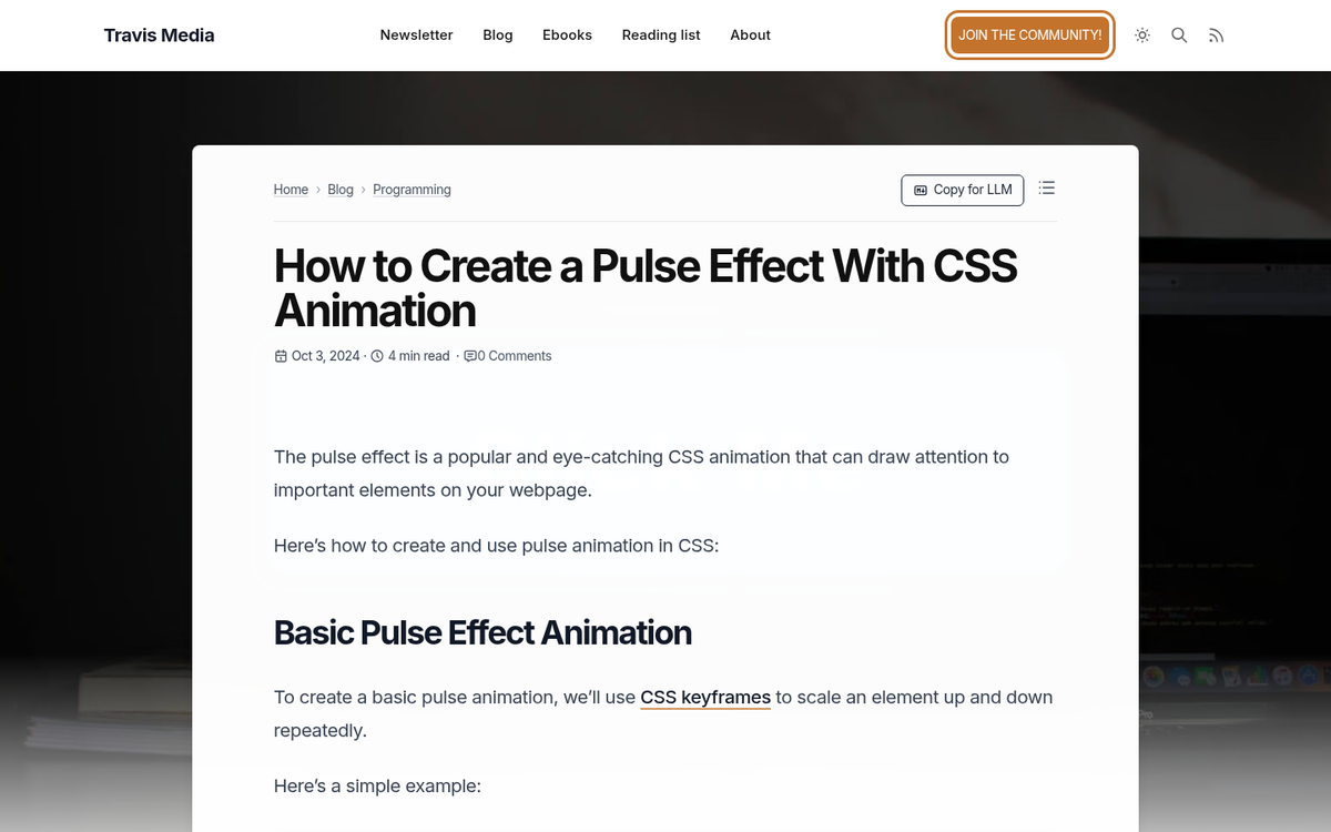
Drawing attention to your CTA without being obnoxious about it is a fine art. One approach that's held up well over the years is a subtle animation on your call-to-action button - a gentle shake, pulse, or glow effect that fires periodically. Users who are deep in reading mode will stay focused, but those who are on the fence will catch it in their peripheral vision and give it a second look. It's no net loss.
In 2026, you don't need jQuery to pull this off - a simple CSS animation works perfectly and is far more lightweight. A quick @keyframes pulse or shake effect does the job without adding any script overhead to your page load time, which matters more than ever given that Google data shows bounce probability increases 32% as load time goes from one to three seconds.
3. Sticky Elements
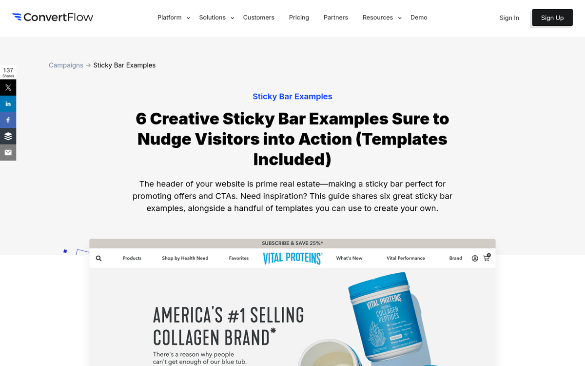
When you're scrolling through a page, a static element - something that doesn't move while the rest of the page scrolls - catches your eye. It's also why a sticky sidebar, sticky header CTA, or sticky bottom bar is so effective. The user scrolls down and everything moves accordingly, except the one element you want to stay in focus: your CTA or opt-in form.
In 2026, sticky elements are trivially easy to implement with plain CSS using position: sticky. No plugins, no JavaScript libraries needed. On mobile especially, a sticky bottom CTA bar has become a highly effective pattern - it stays within thumb reach and keeps the conversion action visible at all times. If you want to boost results further, consider increasing opt-in rates on your squeeze pages alongside these sticky elements.
4. Lead Magnets
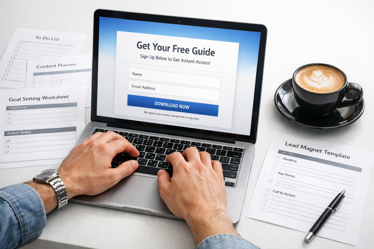
People love free stuff. The term "free eBook" has lost a bit of its shine over the years - frankly, there are so many of them that people have grown skeptical. But the underlying principle is as strong as ever: offer something genuinely useful in exchange for an opt-in, and conversions go up.
In 2026, the most effective lead magnets tend to be highly specific and immediately actionable. Think templates, checklists, calculators, mini-courses, or swipe files rather than a generic 40-page PDF. The more tailored to your audience's exact problem, the better. And yes, including a discount code or exclusive offer inside the lead magnet still works well as a follow-up conversion trigger - especially if you focus on increasing opt-in rates on your squeeze pages.
5. Opt-In Incentives
A simple concept used everywhere: when you sign up, you get something. What do you get? That depends on your audience. Offer a template. Offer a coupon. Offer a free trial. Offer early access. It doesn't even matter all that much what it is - the presence of an incentive alone increases sign-ups because it adds perceived value to the exchange. Just make sure the incentive is actually relevant to what you're selling, or you'll attract an audience that has no interest in converting later.
6. Exit Intent Popups
By now you've definitely seen these, even if you didn't know what they were called. An exit intent popup is triggered when the user performs an action that signals they're about to leave - their cursor moving toward the browser bar, for example. It fires one last offer before they go.
Exit intent popups remain highly effective when done right. The key in 2026 is relevance and restraint. A well-timed popup with a specific, compelling offer - a discount code, a free resource, a limited-time deal - can recover a meaningful percentage of abandoning visitors. A generic "wait, don't go!" popup with no real value just annoys people. Tools like OptinMonster, Privy, and Klaviyo all offer solid exit intent functionality with good targeting options. If you want to get started, here's how to install an exit popup on your site, and it's also worth understanding whether popups and modal windows are bad for SEO before you deploy them.
7. Buff Up Your Copy
There is a LOT you can do to improve the copy on your landing page, and it remains one of the highest-leverage changes you can make. Here are some principles that hold up:
- Evoke emotion. Positive aspirations work, but so does identifying a pain point and presenting your product as the relief.
- Match your reader's language. Don't be stuffy and formal if they aren't, and don't be too casual if you're targeting executives or enterprise buyers.
- Be specific and unconventional with CTAs. "Get My Free Template" outperforms "Click Here" every single time.
- Minimize decisions. Every choice you ask the user to make is a potential exit point. Simplify the path.
- Lead with benefits, not features. Nobody cares what your product does until they know what it does for them. This is especially important if you want to increase sales from your landing page.
8. Include a Video
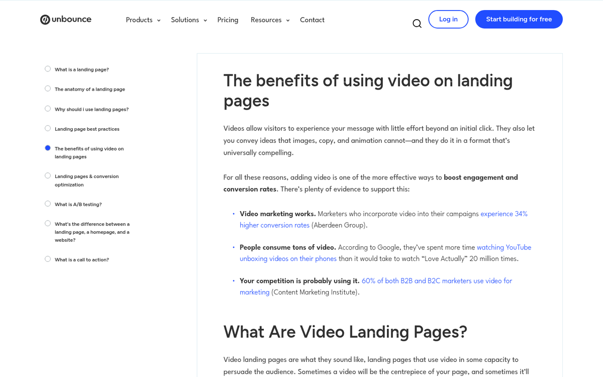
A well-produced video on a landing page can dramatically boost conversions. Vidyard found that adding a video to a landing page doubled the conversion rate in their own testing - and that kind of lift is hard to ignore. Video lets you deliver a rich, informative pitch while keeping the written content on the page itself clean and minimal.
The video doesn't need to be Hollywood-level, but it does need to look intentional. In 2026, a well-lit talking-head video shot on a modern smartphone with a decent microphone is entirely acceptable. What you can't get away with is something that looks neglected or amateurish - that actively hurts trust.
One rule that has never changed: do not autoplay your video with sound on. Ever.
9. Track and Remarket
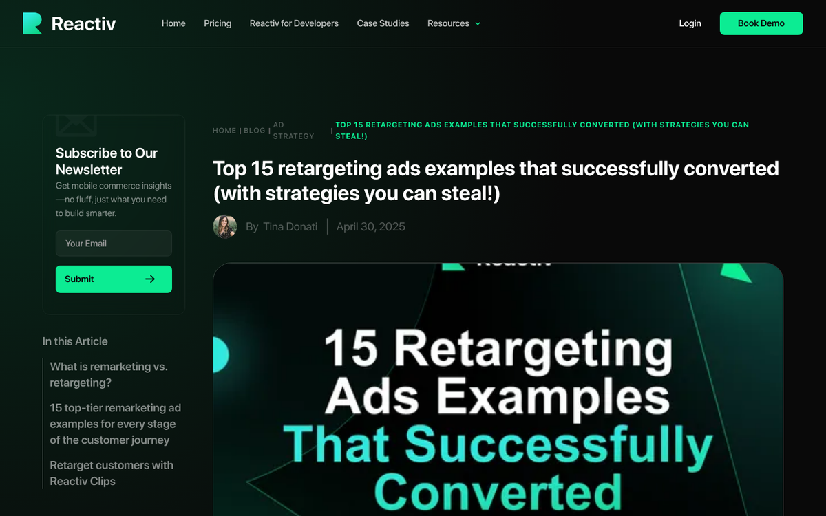
Visitors who land on your page and leave without converting are not necessarily lost. With retargeting, you can serve ads specifically to people who showed enough interest to click through but didn't complete the conversion. This works across Google, Meta, and increasingly through platforms like TikTok and connected TV.
The mechanics have evolved since the cookie-based tracking days. With privacy changes - third-party cookie deprecation, iOS tracking restrictions, and tighter platform policies - you'll want to make sure you're using server-side tracking and first-party data strategies alongside pixel-based retargeting. The concept is the same; the implementation has matured. Retargeting remains one of the most cost-efficient ad strategies available.
10. Include Social Proof
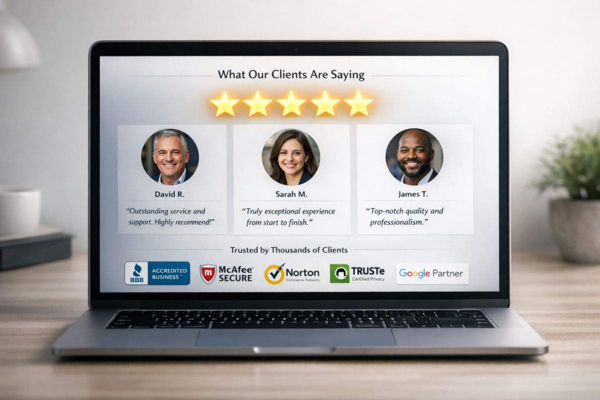
Social proof continues to be one of the most reliable conversion tools available. Research consistently shows that around 37% of top-performing landing pages include at least one testimonial - and it's not hard to see why. Humans look to others to validate their decisions, especially before spending money.
- Testimonials work best when they're specific, include a real name and photo, and tell a story rather than just saying "great product!"
- Review counts and ratings from verified platforms (Google, Trustpilot, G2, etc.) carry more weight than self-hosted testimonials.
- Client logos are effective if the brands are recognizable. Unknown logos add visual noise without adding trust.
- Case studies and results - actual numbers from actual customers - are the gold standard of social proof in 2026. See case studies of highly converting calls to action for real-world examples.
- Follower counts and social media boxes have largely lost their punch unless the numbers are genuinely impressive. Learn more about which of your pages land the most sales to prioritize where social proof matters most.
11. Minimize Roadblocks to Conversion
Anything that stands between the user and clicking "buy now" is a conversion roadblock. Long forms, required account creation, confusing navigation, too many clicks - they all bleed conversions. HubSpot found that simply removing navigation links from middle-of-funnel landing pages boosted conversions by 16% for free trials and 28% for demo requests.
Map out every step a user has to take from their entry point to conversion. Every link, every form field, every decision. Then ask yourself what you can cut. You'll almost always find something.
12. Include Signs of Urgency
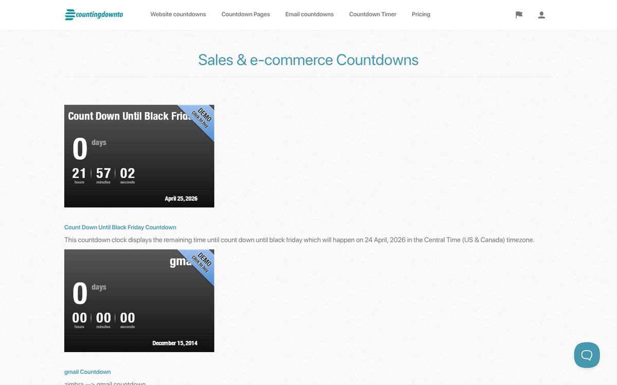
Urgency still works - but only when it's real. Countdown timers that reset every time someone visits the page, "only 3 left!" claims on a digital product, or perpetual "limited time offers" have trained savvy shoppers to ignore them entirely. Fake urgency in 2026 doesn't just fail to convert; it actively damages trust.
Real urgency, on the other hand, is powerful. A genuine sale with a real end date, actual limited availability on a cohort or physical product, or an early-bird price that truly expires - these create legitimate motivation to act now rather than later. Hold to whatever you promise, or don't make the promise at all.
13. Ditch the Slider
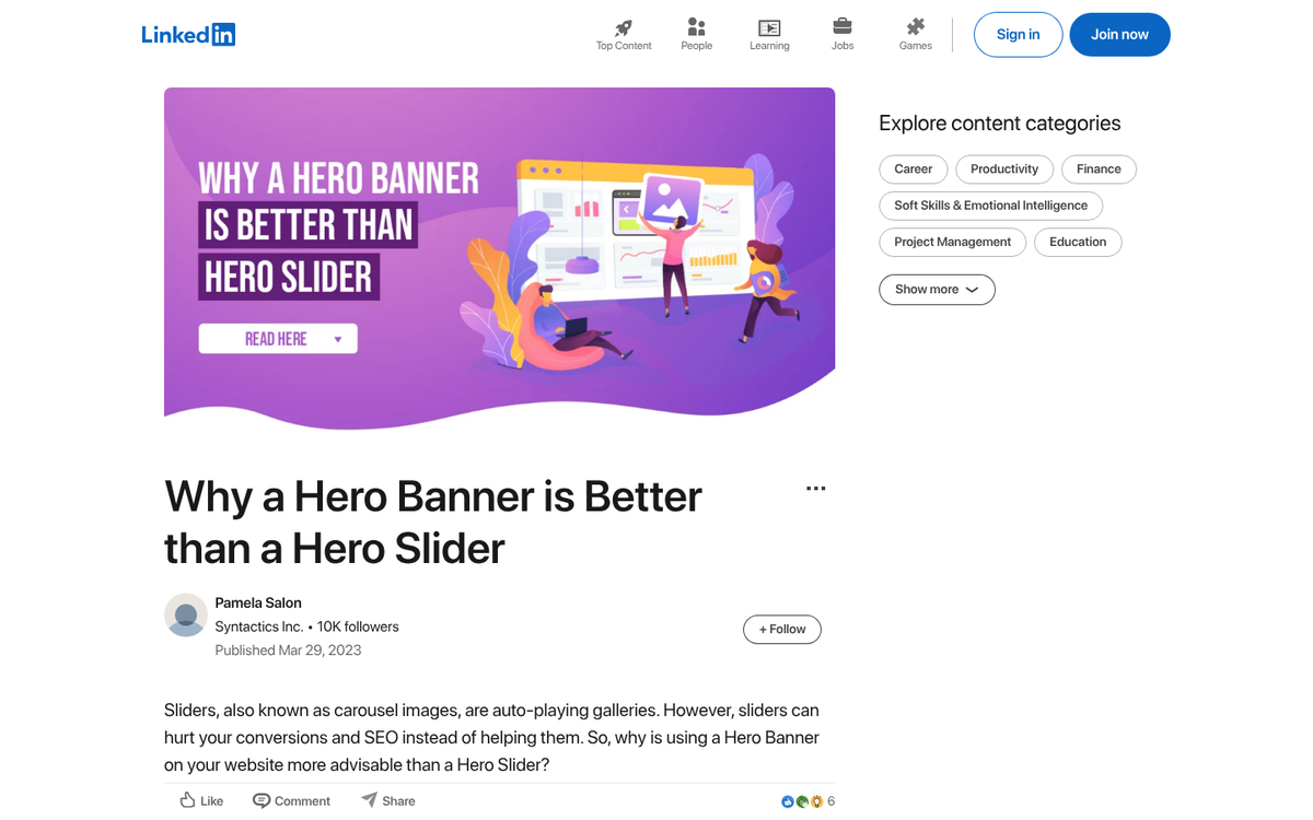
Image sliders, carousels, and auto-rotating banners are bad for conversions and always have been. They cause banner blindness, dilute your primary message, and typically hurt page load speed. If someone opens your page in a background tab and tabs over during slide three, they've already missed your two main offers. There's no scenario where a carousel outperforms a single, focused hero section. Just don't use them.
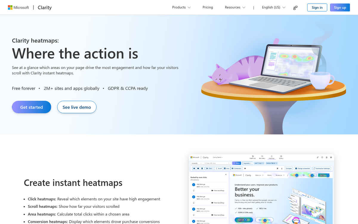
14. Adjust the Layout to Improve Flow
This is less of a quick hack and more of an ongoing process, but it's one of the highest-value things you can do. Good landing page flow means your visitor's eye naturally moves from the headline to the subhead to the key benefit to the CTA - without friction or confusion.
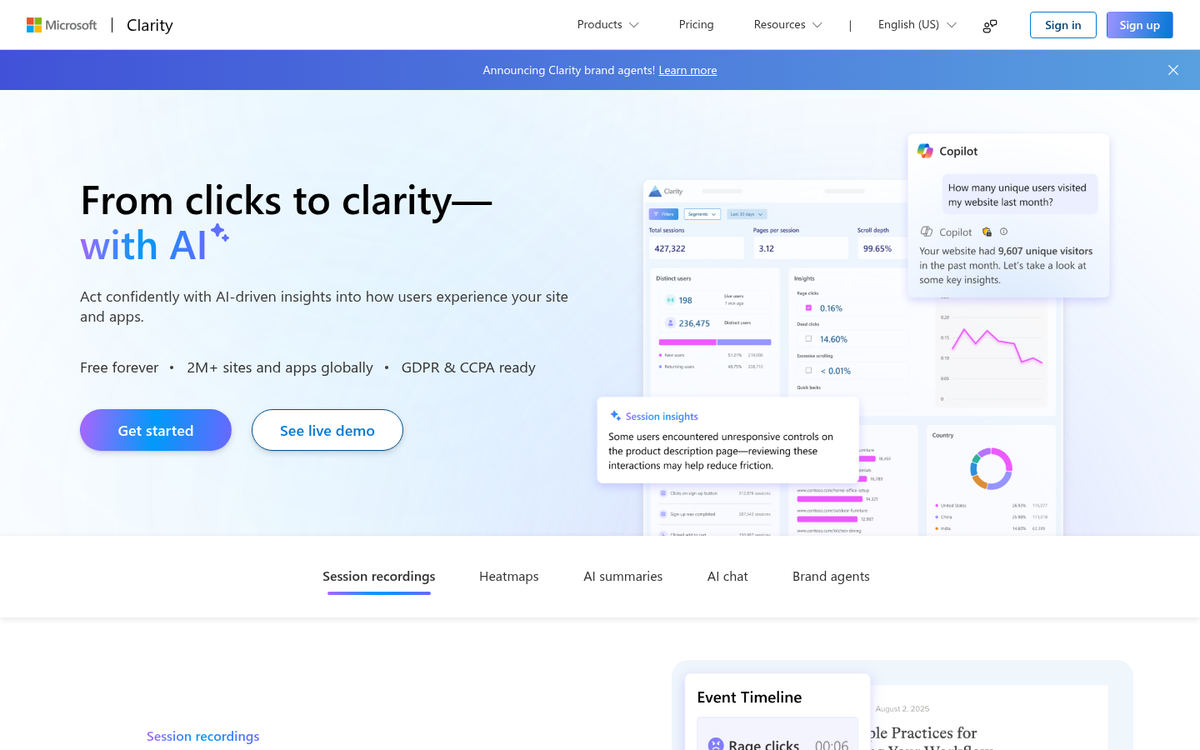
Heat mapping tools like Microsoft Clarity (free) or Hotjar will show you where people are clicking, where they're dropping off, and what they're ignoring. Session recordings take it further, letting you watch real users navigate your page. These tools make the invisible visible and give you a direct roadmap for layout improvements.
15. Avoid Rounded Numbers
If you've helped 2,847 customers, don't say "nearly 3,000" or "over 2,500." Precise numbers read as real. Round numbers read as estimates - or worse, as made up. This applies to client counts, results, case study figures, and anywhere else you're citing a statistic. The more specific, the more believable.
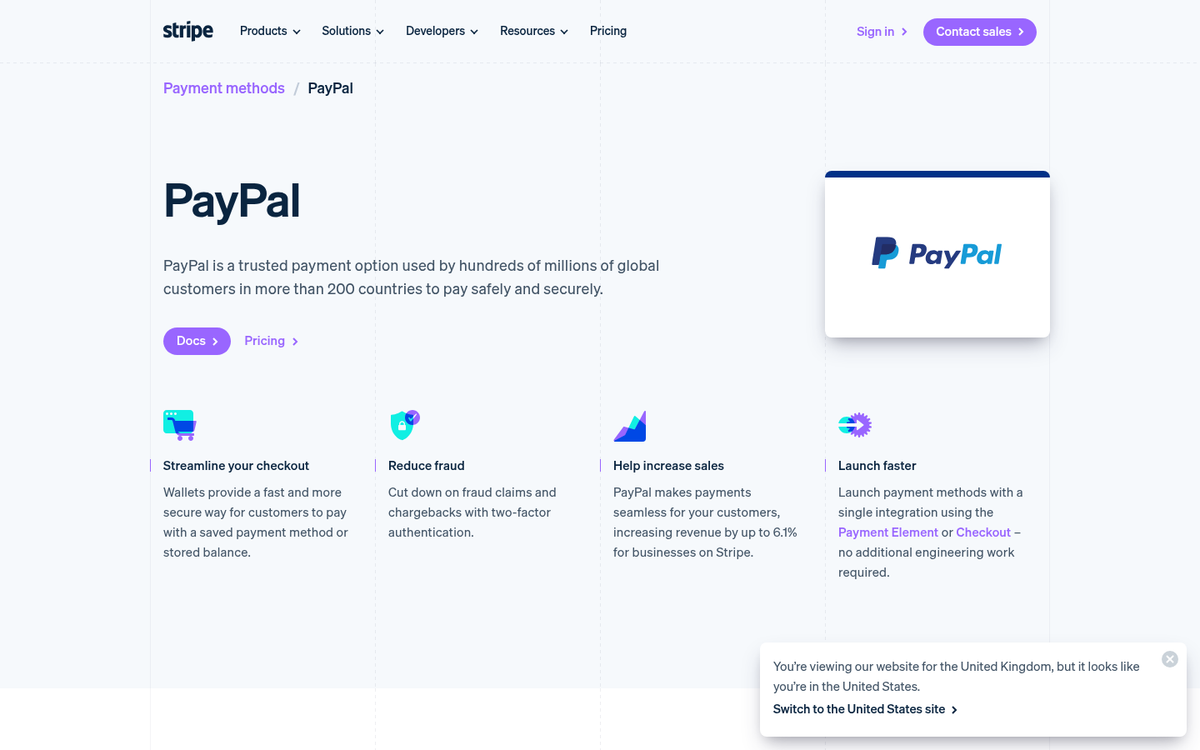
16. Ditch the Meaningless Trust Badges
Generic trust seals from obscure third-party companies don't move the needle - most visitors don't recognize them and they've become visual wallpaper. What actually builds trust in 2026 is visible HTTPS, clear and specific money-back or satisfaction guarantees written in plain language, and recognizable payment processor logos (Stripe, PayPal, major credit cards) at checkout. Setting up conversion tracking with Stripe can also help you measure the impact of these trust signals. Real guarantees that remove purchase risk will do far more for your conversion rate than a badge nobody's ever heard of.
17. Test Varied Copy Lengths
There's no universal answer on long-form versus short-form landing pages - the right answer depends on your product, your price point, and your audience. High-ticket or complex products often benefit from long, detailed pages that address every objection. Simple, low-cost, or already-understood offers can convert well with minimal copy. The only way to know what works for your specific situation is to test. Run the experiment, measure the results, and let your actual audience tell you what they respond to.
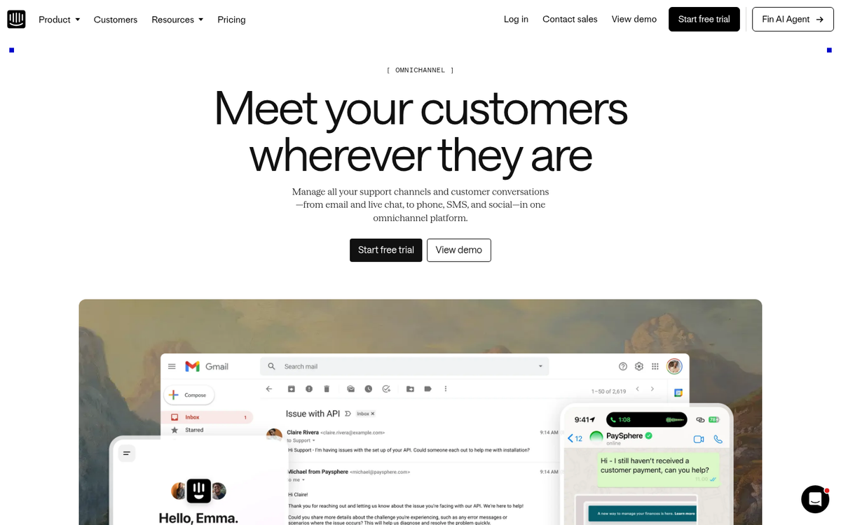
18. Offer Easy Support

An accessible support option - even if most visitors never use it - reduces the perceived risk of converting. Live chat remains one of the best tools for this. Modern options like Intercom, Tidio, and Crisp offer smart inbox features, AI-assisted responses, and visitor targeting, so you can provide real-time help without staffing a full support team around the clock. Just seeing a chat widget available gives visitors confidence that someone is there if something goes wrong.
19. Offer a Guarantee Instead of a Price Match
Price matching has become increasingly difficult to sustain and execute, particularly against large platforms that can absorb losses you can't. A more effective and lower-risk trust-builder in 2026 is a strong, clearly worded satisfaction guarantee. A 30-day money-back guarantee, a "love it or your money back" promise, or a free cancellation policy removes the purchase risk that often stops fence-sitters from converting. It shifts the question from "is this worth it?" to "what do I have to lose?" - and the answer becomes "nothing." If you're also exploring ways to avoid budget decisions that lower conversions, pairing smart guarantees with the right ad strategy can make a measurable difference.
20. Match Your Marketing to Your Landing Page

Message match is critical. If your ad promises one thing and your landing page delivers something different - different headline, different offer, different tone, different imagery - visitors feel misled and bounce immediately. This also tanks your quality score with Google and Meta, which drives up your ad costs.
Every ad you run should land on a page that directly reflects that ad's specific promise. If you're running ten different ad variations targeting different audiences, ideally you have ten landing page variants to match. It sounds like more work than it is, and the conversion improvement is almost always worth it.
21. Chase Opt-Ins with Immediate Follow-Up
The moment someone opts in is when their interest is at its peak. Don't waste it. Your automation should trigger an immediate welcome email, deliver whatever you promised, and kick off a structured email sequence that nurtures the relationship over the following days and weeks. A well-built post-opt-in sequence is a major revenue multiplier - it's far easier to convert someone who already raised their hand than to find someone new. There are many ways to increase your blog's revenue earnings once you have a solid opt-in flow in place, and choosing the right email marketing service for your list type can make all the difference.
22. Implement and Study a Heat Map
A heat map gives you a clear picture of what users are actually doing on your landing page - where they click, how far they scroll, what they ignore. Microsoft Clarity is a strong free option in 2026. Hotjar remains popular for teams that want more advanced features. Look for elements that users are clicking that aren't actually buttons - those are signals that visitors expect interactivity there, and either adding functionality or repositioning your CTA to that area can produce quick wins.
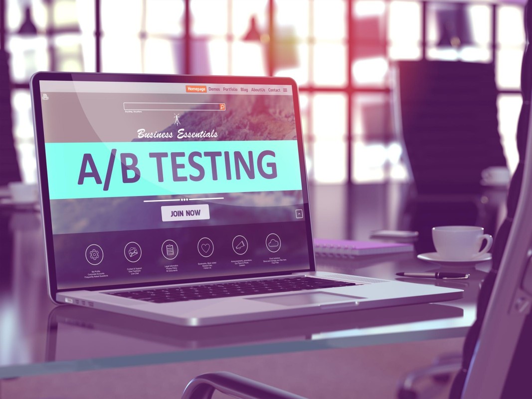
23. Split Test Everything
Testing is the foundation of all real optimization. Everything else on this list is a hypothesis until you test it against your actual audience. Do it methodically: one variable at a time, with a large enough sample size to produce statistically meaningful results. Tools like Google Optimize alternatives (VWO, Convert, AB Tasty), or built-in testing features in platforms like Unbounce and Webflow, make this accessible even for smaller teams. Test the headline first - it has the highest impact - then the CTA, then the offer, then the layout. Keep going. There's always another improvement to find.