


Serving Mobile Users: Your Options in 2026
You have three main options when it comes to serving mobile users on your website. Option 1 is to use a responsive design and let the dynamic code handle everything automatically. Option 2 is to use a subdomain or subfolder specifically designed for mobile, redirecting mobile users to that URL. Option 3 is to use a dedicated app for mobile users, redirecting mobile traffic to the download page.
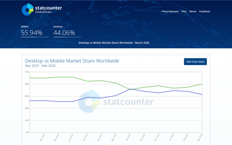
With mobile devices now accounting for 64.35% of all global web traffic (SOAX Research, 2025), this is no longer an edge case to plan around. Mobile-first is simply the reality of the web. It's worth noting that mobile traffic first surpassed desktop back in Q4 2016, and the gap has only widened since. If your site still isn't optimized for mobile visitors, you're actively turning away the majority of your audience.
Option 1 - responsive design - is the standard for virtually every website built or rebuilt in the last several years. It's no longer the "wave of the future"; it's the baseline expectation. Google has operated on a mobile-first indexing model for years, meaning it primarily uses the mobile version of your content for indexing and ranking. If you haven't made the switch yet, the cost of not doing so in lost rankings and lost users far outweighs the cost of a redesign.
Option 3 can work if a significant portion of your mobile traffic has one very specific purpose, such as managing reservations or checking account information. Very few businesses fall into this category, and forcing mobile users to download an app before they can access your content is a reliable way to drive them away.
Option 2 - a separate mobile subdomain or subfolder - was once considered a reasonable middle ground but is increasingly seen as a legacy approach. That said, it remains in use on large, complex sites where a full responsive rebuild isn't feasible. You'll recognize this setup by the m.example.com URL format. Given that 61% of mobile users abandon sites that aren't mobile-friendly (Google/Ipsos), whichever option you choose, the execution needs to be solid.
Mobile Site Duplication Issues

If you're running a separate mobile subdomain, the first SEO concern that should come to mind is duplicate content. You're serving essentially the same content - product descriptions, blog posts, navigation, calls to action - across two different URLs. Without proper handling, this can create problems when Google indexes your site.
Fortunately, there are two layers of protection.
The first is contextual. Google can often recognize that www.example.com and m.example.com are two versions of the same site. That alone isn't sufficient protection, but it works in your favor.
The second, and more reliable, protection is proper canonicalization. This is non-negotiable if you're running a separate mobile version.
On your desktop pages, add a rel="alternate" tag pointing to the corresponding mobile URL. This signals to Google that the mobile version is an alternate format of the desktop page, not a duplicate. It also helps Google discover and index your mobile pages.
On your mobile pages, add a rel="canonical" tag pointing back to the desktop URL. This tells Google the desktop version is the authoritative source, protecting you from duplicate content issues and ensuring link equity flows to the right place.
Together, these two tags form a reciprocal relationship that keeps your mobile setup clean from an SEO standpoint.
Redirecting Traffic

There are two primary methods for redirecting users to the appropriate version of your site: HTTP redirects and JavaScript redirects.
HTTP redirects work at the server level. When a device requests a page, it sends along a header that includes device information - essentially answering the question "who's asking?" Your server reads that information and routes the user accordingly. It's fast, reliable, and happens before any page content loads.
Google recommends using a 302 redirect for mobile redirects rather than a 301. The reason is straightforward: a 301 is permanent. If you ever need to change or remove the redirect, a 301 creates significant SEO complications. A 302 signals a temporary redirect, giving you the flexibility to adjust your setup without penalty.
JavaScript redirects are more flexible but come with a real performance cost. The user must first download enough of the page to execute the script, which then detects the device and loads a new URL. This adds meaningful load time - and load time matters enormously on mobile. Pages that take 3 seconds to load see a 32% higher bounce rate compared to pages that load in 1 second. At 5 seconds, that bounce rate increase jumps to 90% (Google). JavaScript redirects introduce unnecessary latency that can push you into that danger zone.
If you do use JavaScript redirects, you can filter by user agent or by screen width. Screen-width-based redirects typically use a breakpoint of ≤800 pixels to identify mobile visitors. Either approach requires adding the script to every page on your site.
Given the performance implications, HTTP redirects are the stronger choice wherever they're feasible to implement.
Bidirectionality
What happens when a desktop user clicks a link that points to your mobile URL? Some sites simply load the mobile version; others use redirects to return desktop users to the appropriate desktop page. Either approach is technically acceptable - Google has no stated preference here.
One feature worth implementing is a "View desktop site" link on your mobile pages. This gives mobile users the ability to opt into the full desktop experience if they prefer it. It's a small addition that respects user choice and reduces frustration, particularly for users on larger phones or tablets who may find the desktop layout more useful for certain tasks.
Also keep in mind that 76% of mobile searchers visit a local business within 24 hours of their search (Google Consumer Insights). For local businesses especially, a seamless mobile experience isn't just good practice - it has a direct and measurable impact on foot traffic and conversions.

2 responses
Thoughtful replies only - we moderate for spam, AI slop, and off-topic rants.
Even though I am familiar with the topic, I must admit that this article is very, very well written. So easy to understand if you are not too technical person. Thumbs up, James!
Thank you so much for the kind words, Jsh! That means a lot to us. Our goal is always to make technical topics as accessible as possible, so it's great to hear that came through in this article. We'll pass your compliment along to James - he'll definitely appreciate it! Stay tuned for more easy-to-follow guides coming soon!