Click here to find out more!
Did that excite you? Did it make you want to click to read more of whatever it was I had to say? Probably not. And that's a problem for the thousands of websites that still use a bland, boring "click here" call to action as their one attempt to get readers to convert.
A good call to action has to have a lot going for it. It has to, in one sentence, tell users what they're getting, convince them of the value of what they're getting, and convince them it's an easy process to redeem. A vague, boring, or hidden call to action is a conversion killer - and the data backs this up. WordStream found that emails with a single, focused CTA can increase clicks by over 371% and sales by around 1,617%. Meanwhile, button-based CTAs outperform plain text links by around 30% in click-through rate. The details matter more than most people think.
Here are fifteen great call to action styles, and what you can learn from them.
Key Takeaways
- Effective CTAs must communicate value, simplicity, and relevance in a single sentence to drive conversions.
- Urgency, exclusivity, and social proof remain among the most powerful psychological triggers for getting users to act.
- Reducing friction - through free trials, short calls, or no-credit-card offers - significantly increases conversion rates.
- Personalized, contextual CTAs consistently outperform generic ones, whether for content recommendations, social sharing, or lead magnets.
- Clean, uncluttered CTA presentation matters; focused single CTAs and white space can dramatically boost click-through rates.
1. The Temporary Offer
Get early access to our new toolkit - available to subscribers only for the next 48 hours. Sign up now before it's gone!
The time-limited offer provides an exclusive bit of value to users who otherwise wouldn't get it. It makes them feel special, as if they're part of an elite inner circle - when in reality, anyone can join. Hype up something valuable and offer early or exclusive access in exchange for your conversion. Urgency and exclusivity are still two of the most powerful psychological triggers in 2026. If you're looking to maximize results, learning how to turn your subscribers into customers can make a real difference.
2. The Choice Without Choice
We help both solo creators and growing businesses. Are you a freelancer looking to land more clients, or a business owner looking to scale your team's output?
At first glance, this seems like a choice that splits your audience and complicates things. In reality, your users already know which camp they fall into - the choice is already made for them. The other option may as well be invisible. Just make sure you don't give them too many options. Decision fatigue is real, and too many paths lead to no path at all.
3. The Free Demonstration
Want to see exactly how this works before committing? Watch a real client walk through the entire process in under five minutes.
This is a great call to action for a particular kind of content you can promote to increase conversions for your product. It combines a testimonial, multimedia content, and a live tutorial all in one. Short-form video has never been more expected by audiences, and in 2026, a polished two-to-five minute walkthrough can do more heavy lifting than a thousand words of sales copy. Pairing your demonstration with the right color psychology and calls to action can make a significant difference in how viewers respond.
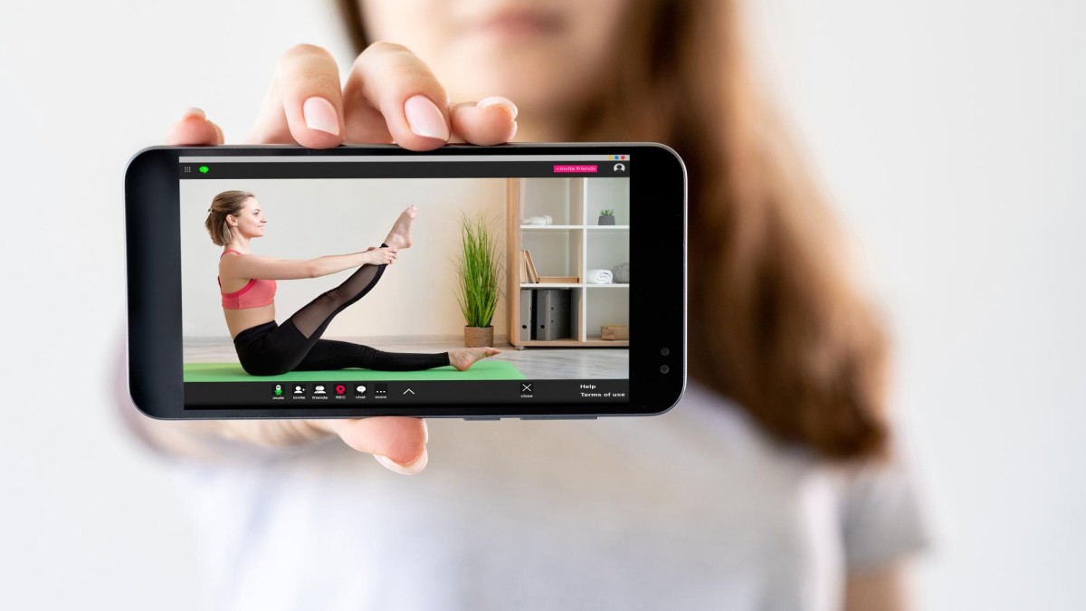
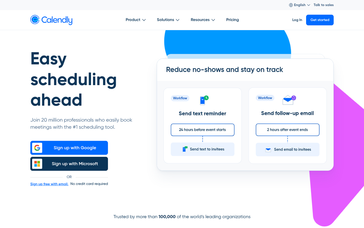
4. The Free Trial
Try it free for 14 days - no credit card required, no complicated setup, and no strings attached.
Any product that can be time-locked is perfect for this CTA. Users love the word "free," and when you reassure them that they won't be charged if they forget to cancel, the friction drops dramatically. One important note for 2026: be transparent. With increased scrutiny around dark patterns and auto-renewal billing, clearly stating your trial terms upfront builds far more trust than burying them in fine print.
5. The Ask The Audience

Which feature would you most love to see us build next? Cast your vote and help shape our roadmap.
Sometimes a user is completely satisfied with what you offer. Other times, they have a small desire that you could implement but you're not sure it's worth the investment. Running a poll helps you figure it out. As a bonus, it makes your audience feel heard and invested in your product - a powerful retention tool on top of being a great CTA. If you're looking for ways to grow that audience further, check out these tips on increasing user signups on your website.
6. The Social Encouragement

Want quick tips you won't find on the blog? Follow us on Instagram and LinkedIn for daily insights.
Social media remains a huge asset to any modern marketing effort, though the platforms worth prioritizing have shifted. Twitter (now X) has fragmented significantly since 2023, and many audiences have migrated to LinkedIn, Instagram, Threads, or niche communities. Know where your audience actually hangs out and tailor your CTA accordingly - don't just copy-paste the same message across every platform. If you're looking to expand your reach further, learn how you can buy traffic to a social media page to grow your following faster.
7. The Social Encouragement (Mk. II)
Found this useful? Your network probably will too. Share it with one person who needs to read this today.
There's a special brand of CTA centered around social sharing, and it's worth mastering. Every share puts your content in front of a new audience you weren't reaching before. The subtle shift here - asking someone to share it with "one person" rather than broadly blasting it - actually increases follow-through, because it feels personal rather than performative.
8. The Breaking News

Get our best content delivered straight to your inbox every week - no fluff, no spam, just the good stuff.
Your email list remains the best lead generation tool you have that doesn't depend on a third party like Google or Meta. Omnisend's analysis of over 229 million emails found that messages with fewer CTAs consistently outperform those crammed with three or more - so keep your newsletter focused. Specify your send frequency upfront so subscribers know exactly what they're signing up for.
9. The Lead Magnet

Download our free 2026 guide and get a practical, step-by-step framework you can start using today - no fluff, just results.
The free downloadable resource - whether it's a PDF guide, a checklist, a template pack, or an interactive workbook - remains one of the most reliable lead magnets around. The classic "eBook" has evolved; in 2026, a well-designed one-page template or a ready-to-use Notion dashboard can convert just as well, if not better. Promise genuine utility and deliver on it.
10. The Product Promotion
Ready to stop guessing and start growing? Head to our product page and see exactly what we can do for you.
At the end of the day, it all comes back to your product or service. Research from QuickSprout found that placing a CTA at the end of a page makes it 17% more effective than at the beginning - so let your content do the convincing first, then close with confidence. For higher-ticket offerings, check out the ultimate guide to promoting your new product and give users a clear next step that doesn't feel like a hard sell.
11. The Related Content

Enjoyed this? You'll want to read our deep dive into landing page optimization next - it picks up right where this leaves off.
A related articles widget is a quick way to surface other content, but a personalized, contextual CTA is far more effective. Guide readers intentionally to the next logical piece of content rather than leaving it to an algorithm. Think of it as building a reading journey, not just filling a sidebar.
12. The Sales Pitch
Not sure where to start? Book a free 20-minute call with our team and we'll map out exactly what you need.
Most people visiting your site want more information but don't want to hunt for it. A low-commitment entry point - like a short discovery call or a free audit - works far better than asking for a sale cold. In 2026, tools like Calendly and built-in booking widgets make this frictionless to set up, so there's no excuse not to have one. If you want to promote a sale on your website, pairing a clear pitch with an easy entry point is one of the most effective approaches.
13. The Community Invite
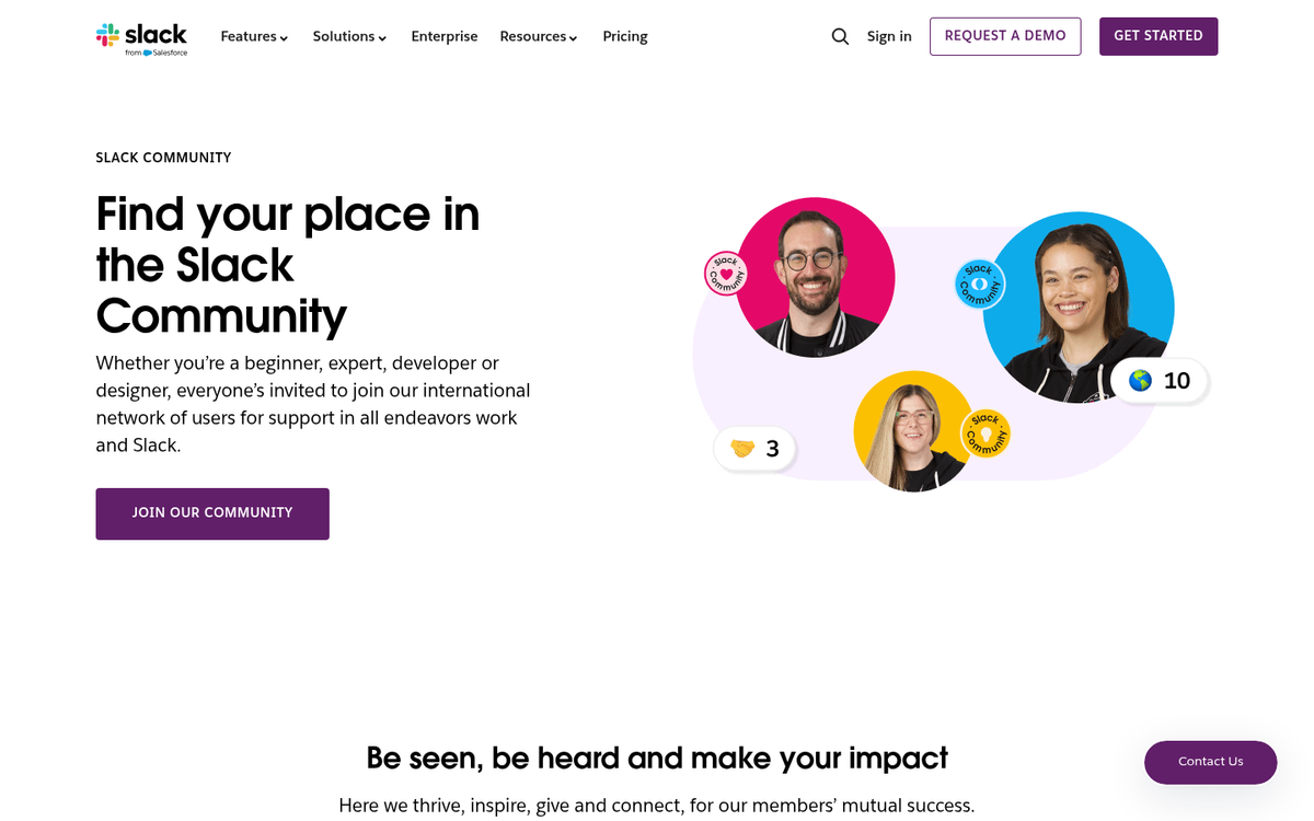
Join over 12,000 marketers in our free community - ask questions, share wins, and get feedback from people who've been where you are.
RSS feeds have largely faded from mainstream use, replaced by newsletters, private communities, and content hubs. If you have a Discord server, a Slack group, a Circle community, or even a well-maintained LinkedIn group, this is a CTA worth leaning into. Community builds loyalty in a way that passive content consumption simply can't.
14. The Debate Club
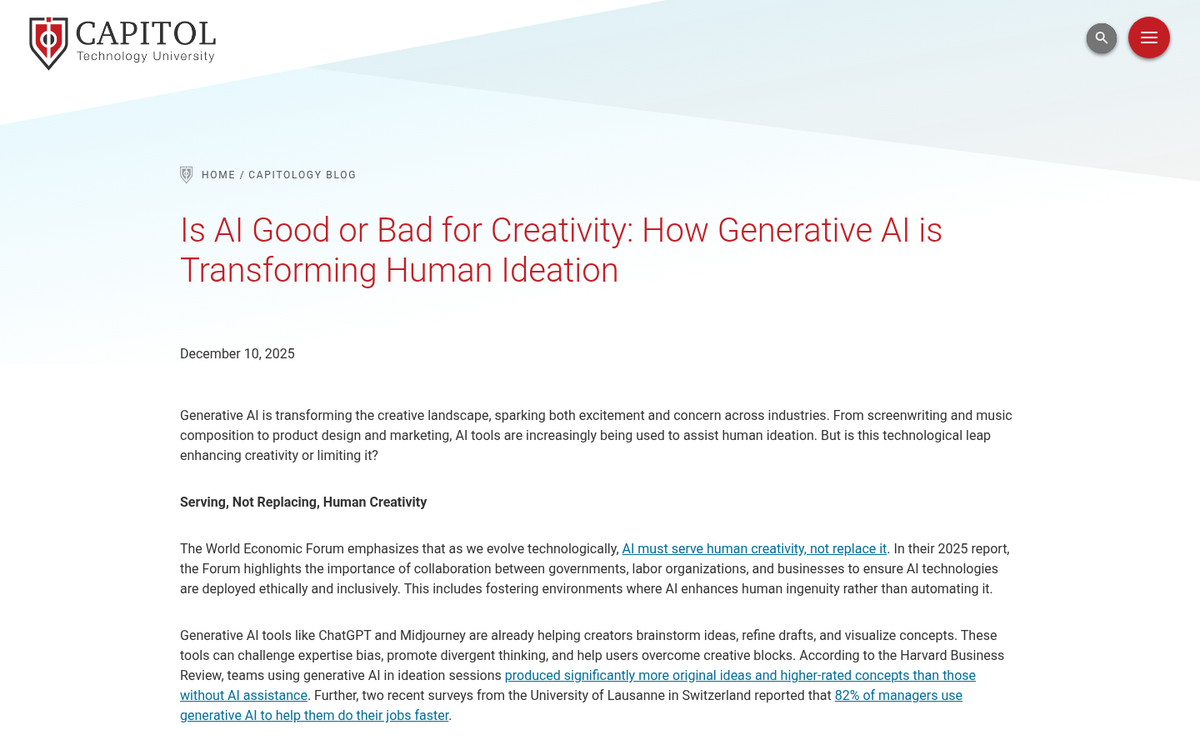
Is AI-generated content killing creativity online, or is it just another tool in the kit? We want to know where you stand - drop your take in the comments.
This CTA isn't one to use all the time - save it for your most polarizing, thought-provoking posts and tack it on at the end. Stir up a genuine discussion and let your readers do the talking. In an era of AI-generated content flooding the web, authentic human debate in the comments section is more valuable and more rare than ever.
15. The Response Seeker
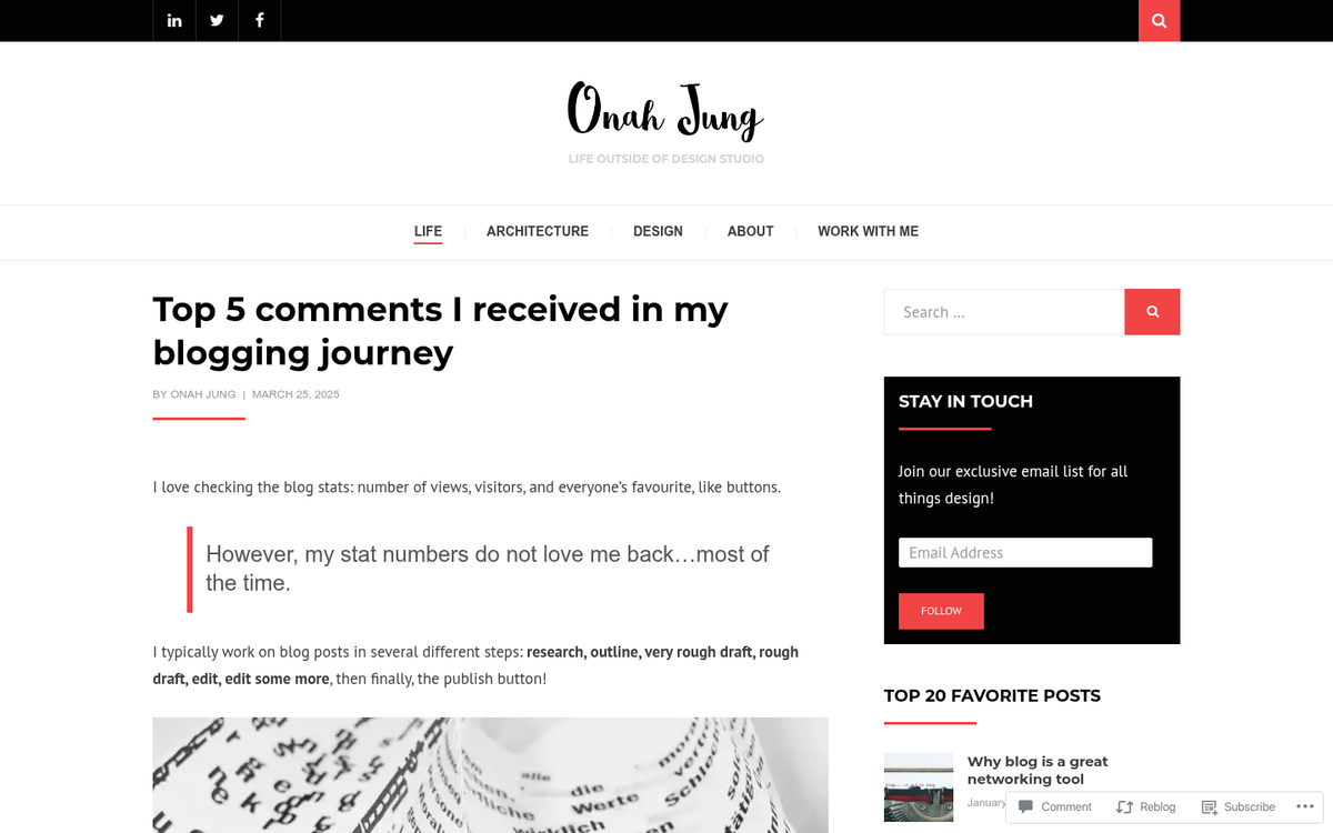
Have a CTA that's worked surprisingly well for you? Drop it in the comments - we'd love to see what's converting in 2026.
Comments are great. We get to know you, you get to know us, and everyone learns something in the process. And with CTAs surrounded by clean white space and less clutter converting up to 232% better than cluttered ones, make sure your comment prompt doesn't get buried under a wall of widgets. Keep it visible, keep it simple, and let the conversation flow.