The eyes are the windows to the soul. Your landing page, then, is like the eyes of your website. They're the window users take to go from disinterested to converted. In a sense, you want your landing page eyes to be like Jehovah's Witnesses, converting everyone they can.
Okay, so that was a mess. If you made it through that metaphor, you deserve a reward. That reward, my friends, is me telling you what causes a high bounce rate on your landing page, and what you can do about it.
Already, someone out there is probably thinking "but a high bounce rate isn't always bad!" It's true, it's not; for pages that want to provide one quick piece of information or assistance. A landing page isn't that kind of page. It's a specialized kind of page designed to hook the reader into getting more interested in the product you're selling, investigating it further, and dragging those users into conversion. You don't want them leaving before you've hooked them.
Worth noting: if you're using Google Analytics 4, you may have noticed that "bounce rate" has been replaced with "engagement rate." GA4 counts a session as engaged if it lasted more than 10 seconds, included a conversion event, or had two or more pageviews. Same concept, different label - a low engagement rate is your new red flag.
As a baseline, a bounce rate somewhere between 60% and 90% is considered standard for landing pages. Databox puts the median bounce rate for B2B companies at around 63%, while the broader median across all industries sits closer to 44%. So before you panic, know where you stand relative to your industry.
Anyway, here are a bunch of reasons users might bounce from your site.
Key Takeaways
- Slow load times significantly hurt conversions; a one-second delay can cause a 7% drop in conversions.
- Landing pages must stay hyper-focused - remove navigation links, ads, and distractions that give users reasons to leave.
- Mismatched messaging between your ad and landing page creates distrust, causing visitors to bounce immediately.
- Autoplay videos and dense, hard-to-read content frustrate visitors and signal you prioritize metrics over user experience.
- Missing social proof and overly long forms reduce trust and discourage users from completing conversions.
Your Page Loads Slowly
The average user gets frustrated and leaves a site if it takes anything longer than four and a half picoseconds to load.
Okay, so I'm probably exaggerating there a bit, but only a bit. The point is, if your site isn't loading in a second or two, you're losing users. Research backs this up hard - a one-second delay in load time can result in a 7% decrease in conversions, and the likelihood of a mobile visitor bouncing increases by 123% when load times are slow.
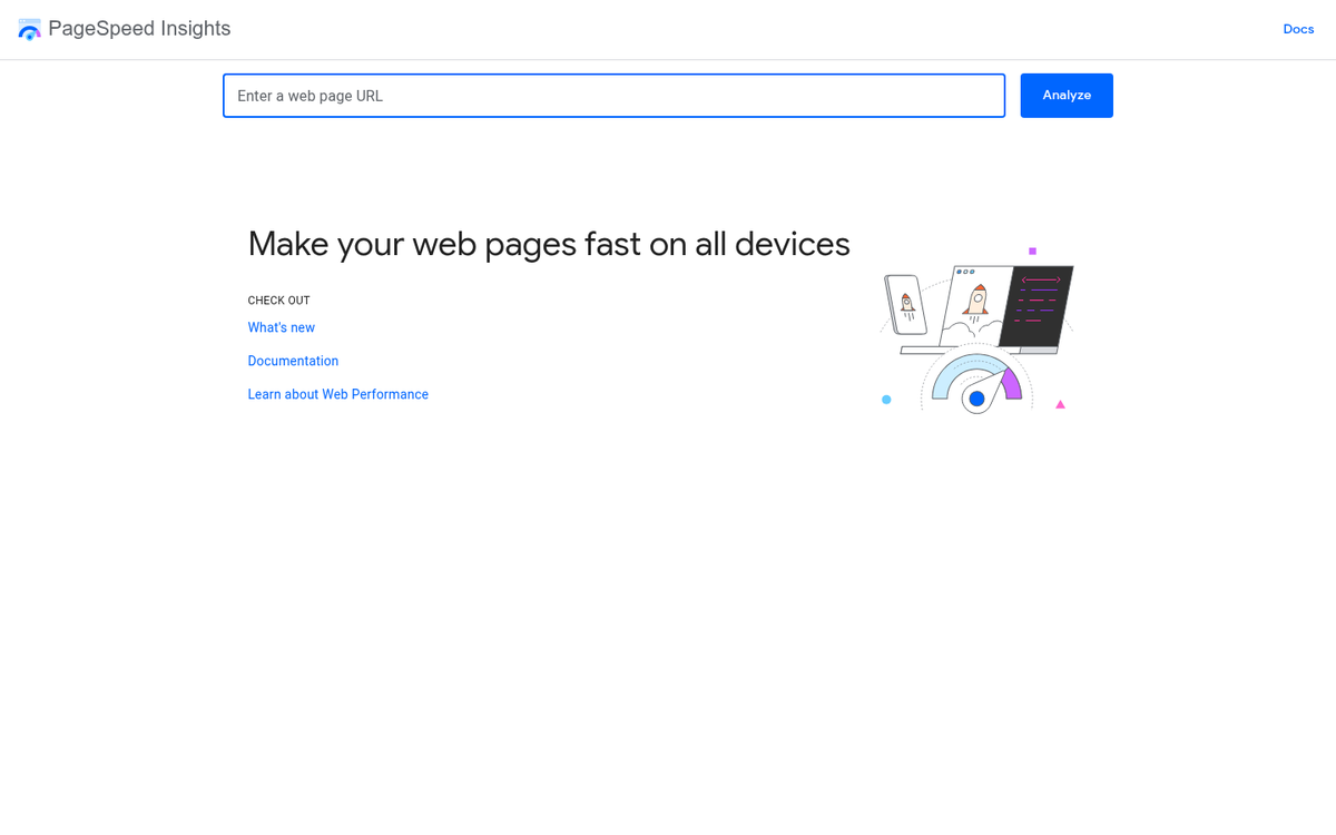
You can test your load times using tools like Google PageSpeed Insights or GTmetrix, and while you should get your entire site loading quickly if possible, your landing page is the important part for this discussion. It should be easier to get under control, because you don't have additional code and widgets like a related posts box dragging out your load times.
Your Mobile Experience is an Afterthought
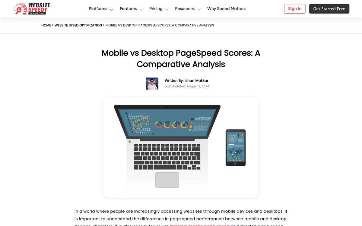
Mobile is not the future. Mobile is the present - and has been for years now. What's easy to overlook, though, is that mobile landing pages still load about 22% slower than their desktop counterparts on average (3.1 seconds versus 2.5 seconds). That gap alone is costing conversions.
If you're not using a responsive design, you're already behind. But responsive design alone isn't enough anymore. You need to actively test your landing page on mobile devices, check that your CTA buttons are thumb-friendly, and make sure your forms don't require pinching and zooming just to fill out a single field.
Your Message is Diluted

A landing page should be a hyper-focused piece of marketing. Any navigation link that leads away from the page is going to dilute your message. Any offer other than your primary offer is going to distract users. Any opportunity for the user to do something other than fill out your opt-in form is a chance for a bounce rather than a conversion. Minimize distractions, eliminate ads, remove navigation links, and keep everything on the one page as much as possible.
Your Video Autoplays
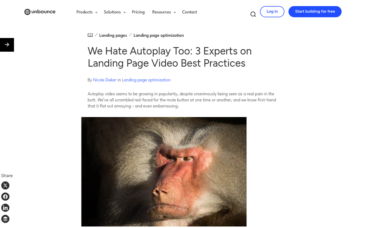
An explainer video is a great addition to your landing page. It takes time for the user to watch, that time keeps them on the page longer, and a well-made video can do a better job selling your product than three paragraphs of copy ever could.
The only thing is, if you're setting your video to play automatically upon page load, you're being a gigantic jerk. Autoplay videos are one of the most reliably annoying things you can do to a visitor. They're disruptive, they startle people in quiet environments, and they signal to the user that you care more about your metrics than their experience. Let them press play.
Your Page Doesn't Match Your Ad
When a user sees an ad and clicks it, they arrive with an expectation. If your landing page doesn't closely match the message, tone, and branding of that ad, they'll feel like they ended up somewhere they didn't intend to go. They'll wonder if something shady is happening, and they'll leave before giving you a fair shot. Make sure your marketing message is coherent across every platform and every touchpoint. message match is one of the most critical factors in converting paid traffic into leads or customers.
Your Content is Too Dense

A landing page is all about getting the most important, most critical information to the reader as quickly and easily as possible. This means short sentences, bullet points, graphics, and explainer videos. It means you do not want long dense paragraphs or deep statistics to parse. If the user can't explain your product back to you after spending a minute on your page, you're too dense.
What you need to do is examine the people you're selling to and figure out what questions they have. Figure out what they already know and remove that from your landing page. Figure out what they want to know and add that to the page. Use expandable sections for those who want to dig deeper. Don't link to other pages; it sends users elsewhere and rarely brings them back.
Your Ads Target the Wrong People

Ad targeting is just as important as the coherence between your ad and your landing page. You need to be targeting the people who are actually going to buy. Compelling ads will get clicks from people who were never going to convert - and that does nothing but inflate your bounce rate and drain your budget.
Your Text is Hard to Read
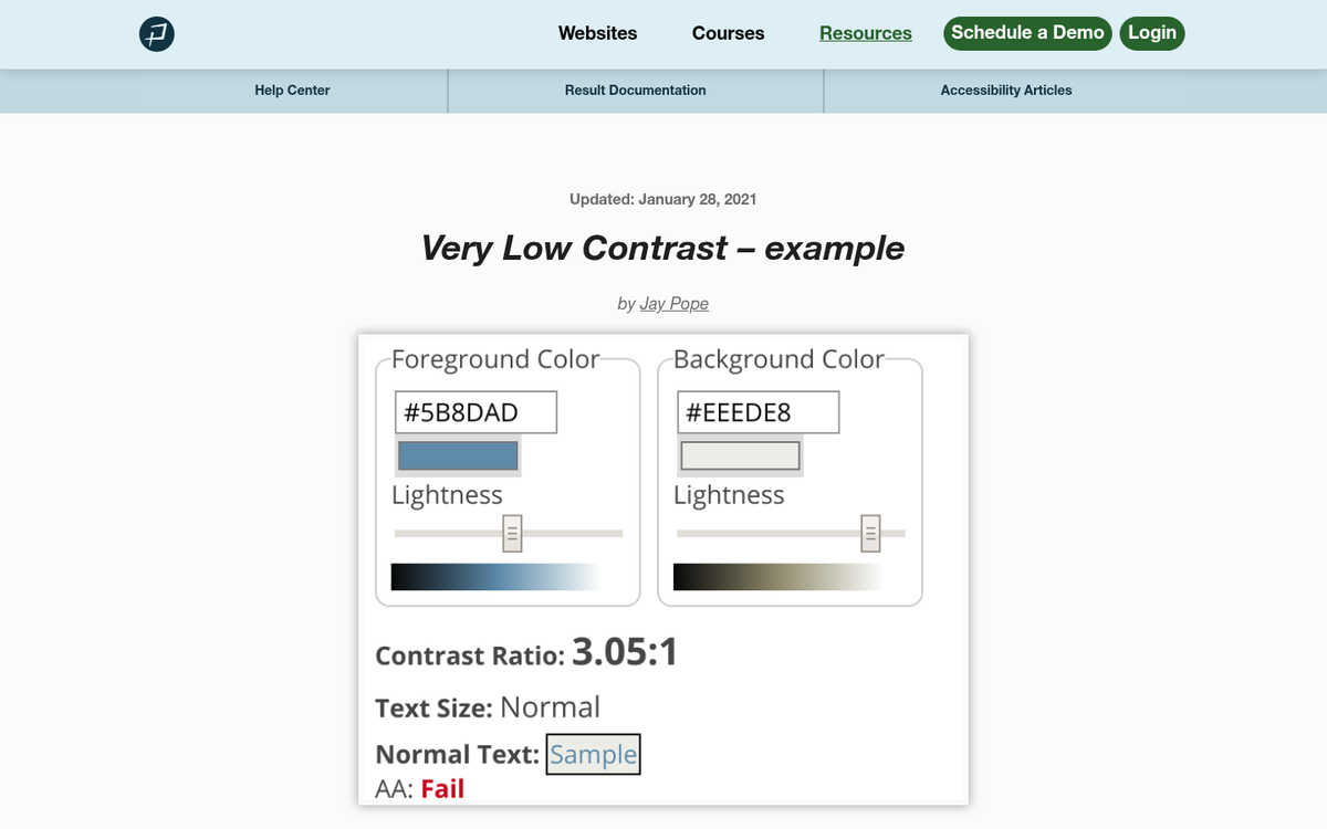
This one is just common sense. If you have a light gray background, don't make your text a slightly darker gray. You need contrast to keep user attention focused. If it's hard to read your content, whether because of color, font size, or formatting, users will leave without giving your message a real chance.
This goes double for your CTA. Your call to action needs to stand out no matter what. Ideally it should be the only element using its particular color on the page, so it's as obvious as possible what the user needs to do next.
You Don't Have Social Proof
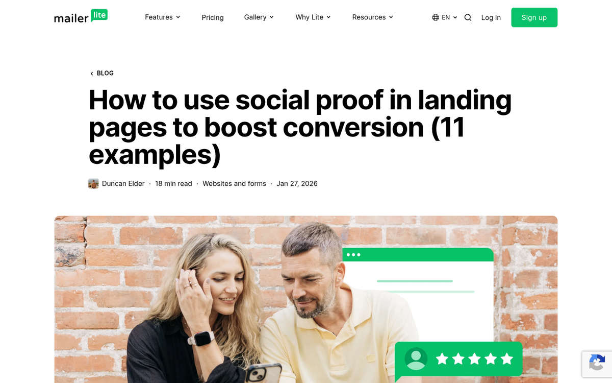
If a user doesn't know your brand, they're going to be skeptical. There are simply too many scams and too many shady operations online to blindly trust anyone. That's why you need social proof on your landing page. Show them that real people and recognizable companies trust you. Testimonials, logos, review scores, case study snippets - use whatever you have and make it visible above the fold if you can.
You're Demanding Too Much
How often have you considered grabbing a free resource, only to bail when the form asks for your name, company, job title, phone number, annual revenue, and the name of your childhood pet? Ask as little as possible to get as many results as possible. An email address is often enough to start the relationship.