Ads are tricky to get right. You can have a great ad, but if it's positioned in the wrong place, users will ignore it. Sometimes it's a fast process, sometimes it's slower. It's all ad blindness, and it's the bane of every marketer.
Banner blindness itself isn't new - it was first documented by the Nielsen Norman Group in 1997, and the term was formally coined in 1998 by Benway and Lane in their research paper "Banner Blindness: Web Searchers Often Miss 'Obvious' Links." It was revisited with eye tracking in 2007, and again in 2018, confirming the problem has only grown worse over time.
Fast ad blindness is a type of ad blindness that occurs throughout the web. For years, websites always put their ads in the same places; the top of the page beneath the navigation, and in the right hand sidebar. You still find users today who completely ignore the sidebar because they're so used to everything there being an ad.
Slow ad blindness occurs only on your own site, and can happen to all of your ads no matter where they're positioned. It typically happens when you use the same ad for too long; people stop paying attention to it and their brains ignore the fact that it's there at all.
Of course, I just made up these categories. They're both forms of ad blindness regardless, however, and the solutions to ad blindness are typically the same regardless of ad placement or how quickly blindness occurs. The scale of the problem is hard to overstate: a 2013 Infolinks study found that 86% of web users experience banner blindness, only 14% could recall the last display ad they saw, and a mere 2.8% said that ad was even relevant to them. Display ads today carry an average click-through rate of just 0.46%.
Key Takeaways
- 86% of web users experience banner blindness, with display ads averaging only a 0.46% click-through rate.
- Rotating ads frequently prevents slow ad blindness; dynamic rotation extends individual ad lifespan significantly.
- Heat map tools like Hotjar or Microsoft Clarity help identify high-traffic areas for better ad placement.
- Fewer ads improve user trust, increase visibility of remaining ads, and positively impact Google search rankings.
- Native ads are seen 47% faster and by 451% more people than banners, but require proper FTC disclosure.
1. Rotate Ads Often
This is the first and most obvious change to make, but it's a change that you need to keep making more or less the entire time you're running ads on your site. It's a habit you need to get into, not a change you can make once and forget.
Ideally you will have a selection of ads you can switch through dynamically, whenever a page loads. This means you have a selection to rotate through, which gives you a longer lifespan on any individual ad. You can also swap out one or add one to the rotation to freshen things up, particularly for long-time readers.
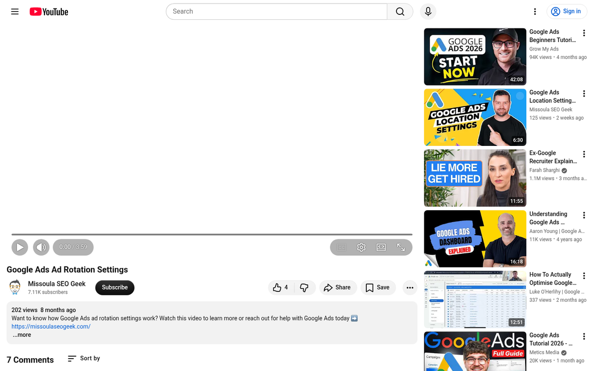
Thankfully, if you're using a third party ad program like Google, you have access to ad rotations already. All you need to do is set them up. If you're not using a program that allows you to rotate ads on your site, it might be time to find a new program.
2. Place Ads Near High Traffic Areas

Ad placement is perhaps almost as important as ad creative. Poor placement means your ads will receive basically no attention. The Infolinks eye tracking study found that some of the most common ad placements received something like 30% attention at most - meaning the majority of users never even registered the ad was there.
The trick to putting ads near high traffic areas is that you need to know where those high traffic areas are. Typically they'll be next to "related links" boxes, social sharing buttons, and top bar navigation. To find out the specific places on your site where you get the most attention, you'll need to turn to analytics. Specifically, you'll want to use a heat map tool, such as Hotjar or Microsoft Clarity (both of which offer free tiers), to track the places your users click and scroll most often.
There are two reasons to put ads in high traffic areas. The primary reason is just that those areas get more attention. Users need to look at your navigation in order to click it, and ads in the navigation thus see more attention. The second reason is a little tricky; when a user mis-clicks, they sometimes click your ad. It might not do you much good in terms of conversions, but if you're running PPC, a free few cents here and there adds up.
3. Use Fewer Ads

This technique is partly a good user experience, and partly good SEO. The fewer ads you have on your site, the more attention those ads receive.
The primary reason for this is simply because of the way spammers used to permeate the web. One ad earned money when it was viewed. To make more money, advertisers would plaster ads all over their sites. It reached a point where you would see sites with more ads than content. Of course, back then content didn't matter as much, and SEO was in its infancy.
Over the following years, a dichotomy emerged. Sites with a lot of ads looked spammier and thus received less attention than sites with fewer ads. Google cottoned on, and ad density is now a negative factor in search ranking. Google's "page experience" signals and its long-standing heavy ad page penalties make it clear: fewer, better-placed ads are rewarded. So, fewer ads means users are more likely to notice your ads and more likely to trust you - while Google is more likely to send traffic your way.
4. Try the Left Sidebar
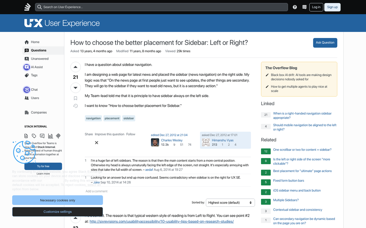
Going back to that eye tracking research, one of the more underused placements is the left sidebar. Most websites tend to center their content, and many use right-side bars, but few use a left sidebar. You can center your webpage and occupy the left gutter with ads, even scaling those ads to different size devices like a responsive site.
Additionally, ads above the fold or ads that scroll with the user tend to get more visibility than ads that don't. Ads below the fold, particularly footer ads or ads in the lower right corner, are virtually invisible. Avoid those locations.
5. Use Native Advertising
Native advertising has moved well beyond buzzword status - it's now one of the dominant formats in digital advertising, and the data backs up why. The same Infolinks research found that natively integrated ad units were seen 47% faster than banner ads, and the area containing native units was seen by 451% more people than the area containing the banner ad. Those are numbers that are hard to argue with.
Native advertising is essentially advertising that looks native; that is, it looks like part of your site. For example, if you have a sidebar that's full of links to other posts on your site, including a title in the rotation that leads out to another site as a paid placement is native advertising. Platforms like Taboola and Outbrain have built entire businesses around this concept, and sponsored content within editorial feeds - common on publishers large and small - operates on the same principle. You can also find more examples of native ads in action on popular websites to see how different publishers implement them.
One thing to note about native advertising is you have to be very careful with disclosure. The FTC requires that paid and affiliate content be clearly disclosed to readers, and Google's guidelines echo this. Failing to disclose properly can result in manual penalties or legal exposure. When in doubt, label it clearly - readers tend to respect transparency more than they resent it.