


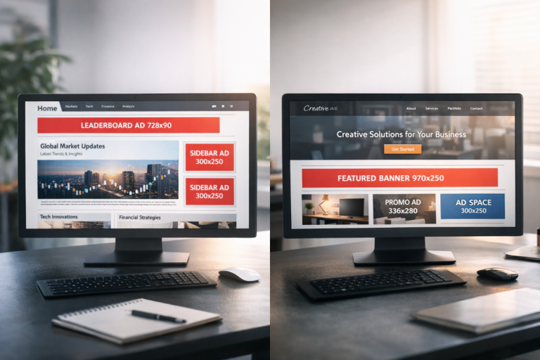
Where you put your ads on your page is almost as important as the content of those ads. Some positions will annoy users, particularly if they're interrupting site use or hindering some function of your site. Other positions will fall by the wayside as the user never sees them. How valuable would a banner below the footer be, do you think? How many users would complain if you had an ad show up in a lightbox over top of your content?
Google encourages you to consider your user experience when implementing ads. They offer you questions to ask yourself. What is the user trying to do on your site? What actions do they take while viewing certain portions of your page? Where is their attention?
These are factors you need to consider before placing your ads. You can't put your ads too far out of the way, or they'll never be clicked. You can't put them right up front, or your users will be distracted and ignore them out of disgust. You can't clutter your page with ads, or you hurt your user experience.
What sort of positions can you use to place your ads, to maximize their impressions and their clicks, without violating Google's guidelines?
Key Takeaways
- Ad placement location is critical - positions above the fold and on the left side get significantly more user attention.
- In-content ads placed a few paragraphs in are among the highest-performing placements, balancing visibility without disrupting user experience.
- Native ads beneath content perform well because they blend with site design, resembling related post recommendations rather than obvious advertisements.
- Gutter whitespace ads are effective for high-traffic sites but are increasingly impractical due to the global rise in mobile browsing.
- Heatmap tools like Hotjar and Microsoft Clarity help identify where users click, enabling smarter, data-driven ad placement decisions.
Before We Begin
One concept you'll want to remember when considering ad placement is the pattern people use when they read. English is a language that reads from left to right. It also displays from top to bottom. Some languages in other parts of the world buck this trend, but we're primarily talking about English websites, so English is the determining factor.
So people read left to right and top to bottom. In practice, this means an F-shaped pattern, focusing on subheadings, skimming, and more detailed reading in certain sections.
As you might expect, the upper left corner gets the most attention in this scenario. Therefore, placing content on the right side of the page is going to get less attention and fewer clicks than the same content on the left side. Content above the fold, likewise, gets more attention than content below the fold.
You also have to take into account the gutter of a page. Most standard web design these days has significant space on either side left open for widescreen monitors, while allowing smaller devices to scale down without issue. There's also almost always top bar navigation, which is generally ignored unless it's needed. Placing an ad above the navigation means it will be virtually invisible.
Now let's take a look at five good positions you can use for ads.
1. Ads Within the Content

This is increasingly common and has become one of the best-performing placements available. A paragraph or two into your content, you insert a horizontal banner or text ad. It gets attention because it breaks up the user's ability to read from one paragraph to the next. It's not intrusive, because it's not exceptionally tall, and it doesn't push much more than a few lines below the fold.
The important part of this position is that it's above the fold, but close to it. The idea is to make it an "artificial footer" if your page didn't stretch below the fold. The user, if they want to continue reading the post after the first few paragraphs, can scroll down and see it. If they don't, they still reach the end of the introduction and see the ad.
With Google's move toward auto ads and AI-driven ad placement, in-content ads are often placed automatically by AdSense itself. However, manually placing them gives you more control over the user experience. Always make sure this ad is slim, vertically. Banner ads and other wide-but-short ad formats are ideal here.
2. Under Navigation, Above Content

This is a more traditional banner ad position, resting below your navigation, where it won't be ignored as easily as an ad above navigation. Again, this type of ad should be wide but short. The primary reason for this is because Google can and will penalize your site if the ads push the content entirely below the fold. If you're displaying more advertising than content on a given page loaded on a normal monitor, you're at risk.
One benefit to this ad position is the accidental click. When a user moves to click your navigation, there's a chance they'll click your ads instead. Even if they don't, when they move to focus their attention on your navigation, the close proximity of your ad will attract their attention.
Be very careful about taking too much advantage of accidental clicks, however. Don't make a hover-over drop-down navigation menu flaky enough that a user can accidentally click an ad because the nav bar disappeared. I'll go over that a bit more in a minute, when we discuss Google's placement guidelines.
3. Left of the Title
As I mentioned before, many sites have fixed-width designs, in a way. That is, they will shrink down to fit smaller devices, but they won't expand beyond a certain level. There's a good design reason for this; it's easier to read a typical page width than it is to read an extra-wide page on a widescreen monitor. It also makes short paragraphs look bulkier.
This means there's generally a good amount of whitespace to the left of your content. Many sites use this gutter to place social sharing buttons or a scrolling call to action that follows the user as they scroll. You can use the same techniques to place a vertical banner that follows the user as they scroll.
This placement tends to be more ideal for your own products than for Google ads. That is, you'll get more attention and less scorn from advertising your consulting or your ebook than you will running Google ads. That said, it's still a viable ad position worth testing.
4. Native Ads Beneath the Content
How often do you scroll down a page and see a block of thumbnails with titles and short descriptions, trying to get you to click on other articles now that you've finished the one you were reading? This style of placement is everywhere.
Here's a secret: half the time, those related post links are actually sponsored ads. The immediate end of the content is a great place to put an ad, ideally one that relates to the content the user just read, so they're more willing to click to learn more. The more it looks like part of your site design, the better, within limits. See how native ads appear on popular websites for real-world examples of this done well.
Content recommendation networks that specialize in native ads dominate this space. Taboola remains one of the largest players here, particularly after its merger discussions and continued expansion through the early 2020s. Outbrain is another well-known option. Both specialize in native content ads and are worth considering for this placement if you're looking beyond Google AdSense.
5. Using the Gutter Whitespace
The idea here is that all the whitespace above and to the sides of your content can be "skinned" to advertise something. Both the left and right gutters will have mirrored ads that include logos and links, and their design will flow from one to the next. This is a great ad position for high-traffic sites, if you can pull it off.
Some sites go even deeper with skinning and choose a new color scheme for their site while they run a skinned promotion. This can be visually striking, but it's not something every site can pull off, and it requires a direct relationship with an advertiser rather than a programmatic ad network.
It's worth noting that with the continued rise in mobile traffic - now accounting for the majority of web browsing globally - gutter ads have become less practical as a primary strategy. They simply don't translate well to smaller screens. Think of this position as a supplement to your mobile-friendly placements, not a replacement.
Google's Placement Guidelines

Google has a lot of rules about where you can and cannot place your ads. In general, anything that makes your site look spammy, and anything that gets in the way of the user experience, is going to be a negative placement. These policies have grown stricter over time, particularly with Google's increased focus on page experience signals as ranking factors.
- You need to avoid accidental clicks as much as possible. Ads must look clearly like ads. You cannot encourage a user to click on a link that looks as if it goes to another page on your site when it's really an ad. This is considered fraudulent activity.
- You are not allowed to use elements of site design to draw extra attention to ads. For example, you can't have a message with an arrow pointing at the ad saying "click this to help us!" or anything of the sort.
- Your ads must be clearly labeled as advertisements. You cannot place ad links in a column labeled "resources" or "additional reading" without making their sponsored nature clear.
- You cannot solicit ad clicks. Any time you ask your users to click an ad in order to support you, it's a violation of the AdSense guidelines.
- You cannot run ads that are tall enough to push your content below the fold. An ad that pushes a couple of lines down is fine; one that takes up the majority of the above-the-fold space is not.
- You cannot offer any form of compensation in exchange for ad clicks. At all.
- Your ads are not allowed to refresh themselves and rotate without the user explicitly refreshing the page themselves.
- You cannot place ads on interstitial pages, welcome pages, exit pages, or login pages. You also cannot place ads on error pages or 404 pages.
- You cannot use AdSense ads within emails or in a web-based email client.
- You cannot use ads in a frame where the primary content comes from another site. Learn more about whether iFrames are allowed on Google AdWords PPC ads.
- You must comply with Google's Publisher Restrictions regarding content. Since 2023, Google has tightened enforcement around ad placement on pages featuring AI-generated content that lacks clear editorial value, so keep this in mind if your site uses AI-assisted writing.
As you can see, these guidelines are very strict about where you can run Google's ads, and as such, they eliminate many potentially lucrative forms of advertising. If you want to run native ads, welcome page ads, or email ads, you will need to use a different ad network.
Heatmaps, Hotspots and Experimentation
I have given you five different ad placements, as well as a few other ideas for ads with non-Google platforms, but I do not and cannot guarantee their value. Most websites have unique designs, and that means user behavior varies from website to website. A skin ad will work great for a major entertainment site, but it won't work as well for a smaller niche blog.
How can you determine which placements work best for you and your site? That's where data harvesting and testing come in.
The first thing you want to do is figure out where users are looking and clicking while they're on your site. The absolute best way to do this would be through a detailed eye-tracking study, but very few businesses are able to afford the costs of setting up and running such a study.
The next best thing is a heatmap application. Heatmaps generate activity reports based on user actions, primarily based on clicks, though some will actively track mouse position and scroll depth. You will get a graphic with colors ranging from blue to red-yellow-white depending on the density of activity in those areas. If you're looking for options, there are free tools available to see a heat map of your website visitors.
Most of the time, what you'll see is a variation on the F-shaped pattern mentioned above. What you'll want to do is look for abnormal hotspots or locations where you might be able to place an ad for more attention.
Hotjar has become one of the most widely used heatmap and session recording tools available, offering a free tier that works well for smaller sites. Microsoft Clarity is another strong option that launched as a completely free tool and has grown significantly in popularity since its release - it integrates neatly with Google Analytics 4 as well. Crazy Egg remains a solid paid option if you want more advanced testing features built in. You can also explore whether there are any good free heatmap tools worth using before committing to a paid plan.
So what about testing? The idea here is simple, and if you've ever done split testing for ads or headlines or landing page designs, you're already familiar with it. Basically, you'll be running the same ad in different positions, or in different sizes. Make sure they run for roughly equivalent amounts of time or for equivalent amounts of traffic so you can accurately compare performance. Learning how to accurately track users and visitors on your site will make this process much more reliable.
The goal is to try out ads in different places to see which gets more attention and more clicks. Google's Auto Ads feature can also help here - it uses machine learning to test and optimize ad placements automatically across your site, which can serve as a useful baseline to compare against your manual placements.
Once you've figured out a winning position for your ads, you'll be able to focus on other optimizations, such as the content of those ads, the content on your site, and passive ways to encourage ad clicks that don't violate Google's various rules.
Speaking of Google's rules: when you log in to your Google AdSense dashboard, you can navigate to the Policy Center at any time to see if your site is in violation of any of Google's policies. If you see any issues flagged there, address them as quickly as possible. You don't want to risk being penalized or removed from AdSense over something you could have fixed easily.


5 responses
Thoughtful replies only - we moderate for spam, AI slop, and off-topic rants.
A great article.
Awesome post, thanks, I actually finished the whole thing, you really gave me much to consider. Regards, Nick.
A proper ads placement is really important, its not that you should place too many ads to get the impressions. Place fewer ads but at the right area... that goes well.
Thanks for the well explained article and heatmap.
Hi James,
I clearly understood what you explained, but my problem is CPC related. I am getting only 0.02$ per click. Can proper ad placement increase my CPC? Please let me know. Thanks!
Hey Biplab! Yes absolutely, if your ad is super close to videos or other clickable elements, you might be getting accidental clicks. This sounds like a good thing, but when someone accidentally clicks an ad, what do they do? They close it right away. Google has something called "Smart Pricing" that will see most of your clicks are just closing the ad right away, and your payment per click will drop dramatically.
This is why some sites get paid $2 per click and others get paid $0.01 per click. You want your ads to be away from any content and media so they aren't clicked accidentally.
Your CPC will change from time to time, so definitely experiment with your placements to see what pays the best. Just give it a month or two between each tweak to see what works and what doesn't. Google doesn't change anything slowly, so if you're changing your ad placement every week, you won't know what is working because you didn't wait long enough.
Lastly, make sure you're keeping to 3 placements maximum on your site. This should be a total of all your ads. If your page is loaded with ads, you'll get paid less for your ads and it could even impact your organic search traffic and rankings. Three ad placements should be plenty.
I hope this helps!