5 of the Highest Earning AdSense Layouts for Blogs
Published by James Parsons • Monetization • Posted October 5, 2015 ContentPowered.com
AdSense is one of the best easy means of monetizing a blog for a reason. The pay is reasonable, the effort is minimal, and it scales well with a lot of traffic. It’s trivial to implement, it’s incredibly easy to register and get started, and you know you can trust Google to pay when you earn enough money to get a check.
That all said, it’s never as easy as a simple plug and play, is it? You know there has to be more, and of course there is. AdSense has a wide range of possible ad units, and you can place several on your blog at once. Finding the right layout, the right ad units in the right positions in the right density, will greatly affect the amount of money you’re making.
I’m going to give you five sample AdSense layouts, based on the typical blog layouts I see around the internet all the time. Bear in mind, however, that some layouts might not work for your blog design. You might not have the right page elements to apply the layout properly. You can adapt the layout, or you can experiment with your own layouts using these as a baseline. Regardless of your plan, always test different layouts and see which earn you the most money over the course of a week, two weeks, a month, or whatever testing period you want to use.
As I mentioned, most blogs look more or less the same. They are tall vertical columns, typically with each post on its own page with its own URL. Tumblr-like sequential posting on one URL isn’t effective for a monetized blog, because you want unique pageviews rather than keeping everyone on your homepage.
Typically you will have a logo in the upper left with some space to the right. Below that will be your navigation bar, with links to pages like your homepage, your storefront, your blog index, an FAQ, a free ebook offer, or whatever else you want to promote. Below that tends to be two columns, a wide one with your content and a narrow one to one side or the other containing additional information. This sidebar, as it is called, typically includes ad space, links to resources or other pages that don’t deserve a link in the navigation bar, and the like. I’ve also seen content calendars, Facebook like boxes, recent posts, related posts, and all sorts of other information in this sidebar.
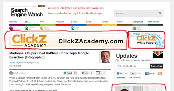
There are a bunch of different places in such a layout you can use for ads. You can put a link unit under the navigation bar. You can put a banner above the nav bar, to the side of the logo. You can put a vertical ad in the sidebar. You can put a box ad or a banner ad in the content itself. You can even do all of the above at once.
Before I get to the specific layouts, I’ll first talk about what ad units exist, and what limits are placed on using them.
AdSense Ad Units
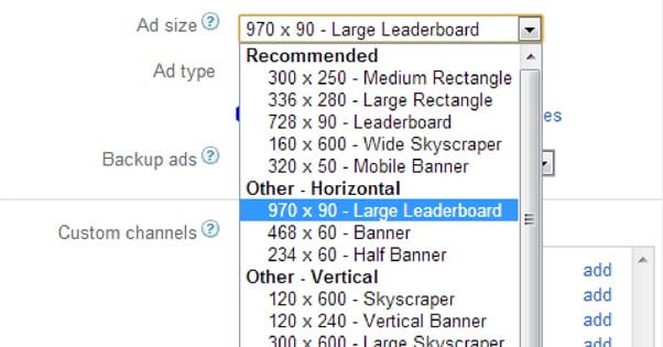
Google divides their ad units into a bunch of different categories. You have text ads, display ads, link ads, video ads, and mobile ads, with sub-categories within each. You can read about them here, and see examples, but I’m going to cover them in general here.
Many ad units are the same in essence, and just vary in terms of content. For example, under the “recommended” selection of ads in each section there is a 300×250 pixel rectangle. The text ad rectangle has a text ad in it, while the display ad version has a graphical image, and the video ad has a small video player. So, there will be some redundancy between each category.
First up we have the text ads. These may take up the same space as a display ad, but they focus on text and don’t include images. They typically have a title in blue, copy in black, an arrow, and a small AdSense icon in the corner to indicate it’s an ad. Here are the formats they come in:
- Medium Rectangle – 300×250 pixels.
- Large Rectangle – 336×280 pixels.
- Leaderboard – 728×90 pixels.
- Wide Skyscraper – 160×600 pixels.
- Half Banner – 234×60 pixels.
- Banner – 480×60 pixels.
- Large Leaderboard – 970×90 pixels.
- Skyscraper – 120×600 pixels.
- Vertical Banner – 120×240 pixels.
- Large Skyscraper – 300×600 pixels.
- Various Squares – 250 px, 200 px, 125 px.
- Small Rectangle – 180×150 pixels.
When I reference something like a “skyscraper” later on in the post, now you know what size I’m talking about. A skyscraper can be a text ad or a display ad, so make sure to test which works better for your website.
Display ads are much more traditional in terms of online advertising. They’re the large graphical ads you see, still or animated, banner ads and box ads and the like. Again, Google has examples on their ads page, if you’ve somehow never been exposed to a graphical advertisement online before.
Display ads are slightly more limited in size formats. You have your medium rectangle, large rectangle, leaderboard, and large skyscraper listed under “recommended. In the other categories you have the large leaderboard, banner, skyscraper, wide skyscraper, and both the 250 and 200 px squares.
This means in display ads, you don’t have half banners, vertical banners, 125 px squares, or small rectangles. This is fine, because those formats tend to be a little redundant and less effective than their established counterparts. If you desperately need to fill a small space with an ad and none of the display ad formats fit, a text ad probably will fill it just fine.
Link units are also great for filling in small spaces. They come in six different formats, two of which are horizontal while the rest are vertical. All of them include either three or four text links and a highlighted “ads by Google” flag, so users are aware that those links are ads.
- 4-link horizontal bar 728×15 pixels.
- 4-link horizontal bar 468×15 pixels.
- 3-link vertical box 200×90 pixels.
- 3-link vertical box 180×90 pixels.
- 3-link vertical box 160×90 pixels.
- 3-link vertical box 120×90 pixels.
The primary differences here are just whether the layout is horizontal or vertical, and how spaced out the text links happen to be. You’ll essentially just want to pick one based on the space you have available and the layout of your page.
Video ads only come in two formats, both with the same aspect ratio, looking like an old-school YouTube embedded video player. One is 300×250 pixels while the other is larger, at 336×280 pixels. They are very much like display ads, in that they are large and graphical, but they are less flexible. They are also limited to linking to videos, so if your users don’t have the time or attention to watch videos, it’s better to use display ads or text links.
Google ads, especially text ad units, can be customized with a selection of several predefined ad stylesheets. You can see examples of them here. These are useful for making the ads match your site more closely, by changing the color of the text or the background and images. This will also be a big factor in how well your ads convert, so try to match your site as closely as possible.
Restrictions on Ad Placement
Now, you can’t just go slapping ads into your site without a care in the world. Google has some limits on how many ads can be present on a given page, at least within AdSense. Nothing stops you from running the maximum number of AdSense ads and then ads from another provider, but that’s not very sensible.
There are three limitations to the number of ads you can run on the page, and I’m not counting “amount of available space” here, because filling every square inch of your site with ads just makes you look like a spam site or one of those old gimmick sites selling ad space for the sake of ad space.
- The first limitation is that regular internet users don’t like seeing too many ads. The more ads you have, the less likely a user is to click on any one of them. They’re just going to inherently distrust your site and will feel like it’s oppressive.
- The second limitation is one imposed by Google by way of organic search. Google doesn’t like sites that try to serve too many ads at once, and in their “Top Heavy Update” started penalizing sites with too many ads above the fold.
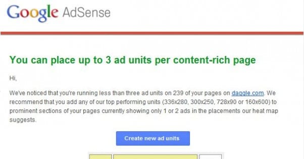
- The third limitation is Google’s AdSense ad units limitation. In their ad placement policies, Google tells you that for each page, you can have up to three AdSense content units, up to three link units, and up to two search boxes. Realistically, this is too many ads all at once, but there are also additional restrictions. You can only have one large-sized ad unit per page as well.
It is also well worth reading the various restrictions, limitations, guidelines and rules placed on AdSense usage. You might be surprised with what you can and can’t do. For example, you can’t place ads on a thank you page, a login page, an error page or exit pop-ups. You can’t place ads that auto-refresh to get more views. You can’t embed them in emails either. It’s all very tricky to navigate and worth learning.
Anyways, now that you know the restrictions and you know what I mean when I refer to a skyscraper or a link unit, you can parse what I tell you when I give you a layout. Here are five good layouts you can use as the basis for future testing.
Layout 1: The Standard
This layout is perhaps one of the most used and most typical layouts found on the web. It uses four ad units in total.
- A link unit under the navigation bar, above the content. A link unit is best here because it’s unobtrusive and it can encourage users to click thinking the links are part of your navigation.
- A square sidebar ad unit. This unit will sit in your sidebar or to one side of your content. Choose an ad unit that fits the width of your sidebar, so it doesn’t stretch. A rectangle or a skyscraper works best here, which limits you to a text or a display ad.
- A square ad unit embedded in the text of your post, near the top, justified to the right. If you justify it to the left it will cause people to miss your opening paragraph, which isn’t good. This can be a text unit, display ad, or video ad.
- A horizontal banner, half banner, or other wide unit placed some distance down in the text. Use it as a mid-page “page break” in long content to go right before a subheading. Typically display or text ads work best here, but you could experiment with link units as well.
I like to use this layout as the basic foundation for tweaking future layouts. Feel free to customize it as necessary.
Layout 2: The Wrap
As the name might imply, this layout is a bit more aggressive with placement, and relies on you having a relatively narrow layout with a strong and consistent bit of branding.
- Use a graphical banner, preferably the wide banner, to span above the top of your content, above the title and below the navigation. Make this a display ad.
- Use skyscraper ads on both sides of your content, in gutters outside of the sidebar if you have a sidebar. This works best if the sidebar is narrow and you have equal space on both sides. Make these display ads as well.
- A smaller horizontal banner would be ideal, but would be a fourth ad unit and against the AdSense rules. Instead, use an in-text link unit the way you use a banner unit in the previous layout.
This layout works best if all of the ads have the same content. For example, if a car seller wants to advertise on your site, all three display ads should have the same color scheme and be part of the same ad campaign to sell the same car.
The primary benefit of this layout is something that sites like IGN and IMDB do; they can change the background image of their site as a whole to further the branding and advertisement of the ads. That makes this a great layout to use with advertisers other than AdSense, particularly if they’re lucrative private deals.
Layout 3: Pure Aggression
This layout is very aggressive, which can turn off your users if they’re not willing to click your ads. On the other hand, with large ads at the forefront of your page, it can have very high click-through rates. Users are attracted to compelling ads, but because of their placement, they can obstruct your content.
- Two ad units, large square or large rectangle in size, placed side by side below the title of your blog posts but above the content. This forces readers to read the title and then, if they want to read your content, pass their eyes over your ads. These should be display ads or video ads for the most visual attraction.
- One ad in the sidebar, either another square ad or a skyscraper of some size. You can mix things up here and use link ad units here, as many as three stacked up if you’re feeling very aggressive. Be prepared to prune back your ads if you find diminishing returns or a loss in traffic, ranking, or CTR, though.
This layout stacks all of your ads at the top of the page, which give them a huge initial first impression, but tapers off as people get deeper into your content.
Layout 4: Content Emphasis
This layout tries to avoid obstructing your content with ads, and makes sure enough of it is visible to draw in readers. It’s probably one of the safest when it comes to Google penalties, but it’s also likely lower with CTR than some of these others.
- Pick one of either a link unit beneath the navigation bar, or a banner above the navigation bar, in the blank space next to the logo. Don’t do both, or your navigation bar gets lost in the shuffle.
- Use a skyscraper or two stacked medium or smaller squares in the sidebar. These should ideally be text ads, though display ads are also available as long as they aren’t intrusive.
- Use a horizontal banner, preferably of a small size, midway through your content or at the foot of the content, between the final paragraph and the comments section. This can be a display ad, but text ads might be a better format.
This leaves your content clear and unobstructed, so users can see what they came for and are exposed to your ads the moment they lose interest and look for something else.
Layout 5: Banners Banners Everywhere
This layout makes heavy use of ads that are much narrower than they are tall, or much taller than they are wide. Horizontal banners and tall, thin skyscrapers work best here.
- Include a tall, narrow display ad in the sidebar. You could use a text ad if you wanted, but the emphasis of this layout is on banners, so display ads work best.
- Include at least two horizontal banner ads in the content. Place one beneath the title, above the first paragraph. Place more every few paragraphs, evenly spaced throughout the article.
- Supplement as necessary with link units above the comments section and below the navigation bar.
Some users will appreciate how low-impact these ads are, due to how they aren’t large squares taking up a ton of space and smushing your content to one side. Unobtrusive or native-looking ads work best.
So there you go; five layouts to use for the basis of testing and brainstorming ideas. Take them, adapt them, test them, improve them, and make loads of cash from AdSense.
