Key Takeaways
- Pinterest recommends a 2:3 aspect ratio, with an ideal image size of 1000 x 1500 pixels and a 20 MB file size limit.
- Different pin formats have unique specs: Standard Pins (2:3), Square Pins (1:1), Story Pins (9:16), and Board Covers (1:1 at 600×600).
- Pins taller than a 1:2.1 ratio get cropped; images below 600 x 900 pixels won’t make full use of available display space.
- Rather than using horizontal blog images on Pinterest, create custom vertical pins or infographics sized at 1000 x 1500 pixels.
- Avoid placing tall vertical Pinterest images at the top of blog posts, as it pushes content below the fold and harms usability.
One of the primary benefits that Pinterest has over other social networks is the ability to add Pinterest “pin this” buttons to the images in your blog posts. Since your blog posts are going to have images, it’s just one extra call to action.
The best part of these pin buttons is that they’re usually invisible until the user hovers over the image. Thus they don’t get in the way of usual browsing. But those who know and love Pinterest already know to look for the button and will find it immediately.
Of course, just putting your images up on Pinterest won’t be enough. If your images are too wide or too tall they can be cropped or stretched in ways that make them look sloppy. Then your social media presence on Pinterest ends up looking sloppy and that’s not a reputation you want.
So, what size should you make your blog post images if you want them to appear natively on a Pinterest feed, without distortion?
Aspect Ratios
So, do you know what an aspect ratio is? It’s a common term for sizes, or scales, without having fixed definitions. You see it with monitor screen sizes, with the resolution of videos and yes, with images.
An aspect ratio is expressed as a ratio, something like 4:3 or 16:9. Those two are all too common, in fact. A 4:3 ratio is a classic standard definition television size, the almost-square size you probably haven’t actually seen since CRTs gave way to LCD televisions. 16:9 is similarly a standard widescreen definition; modern PC monitors fit that aspect ratio.
An aspect ratio is basically the relationship between two dimensions, horizontal and vertical. So an image with a 16:9 resolution will be 16 pixels wide for every 9 pixels tall. A modern PC resolution with a 1920×1080 display is in 16:9 resolution, as is 2560×1440.
So what does this all have to do with Pinterest? The answer is basically that Pinterest doesn’t tell you the image size you should use; they tell you the aspect ratio they like. If you’re looking to get more out of the platform, it helps to understand how popular pins on Pinterest are structured.
What Pinterest Has to Say
Pinterest images are largely vertical, in contrast with other social networks that either use squares or horizontal images. Pinterest serving vertical imagery makes sense given how much of its traffic comes from mobile devices; vertical screens are the norm.
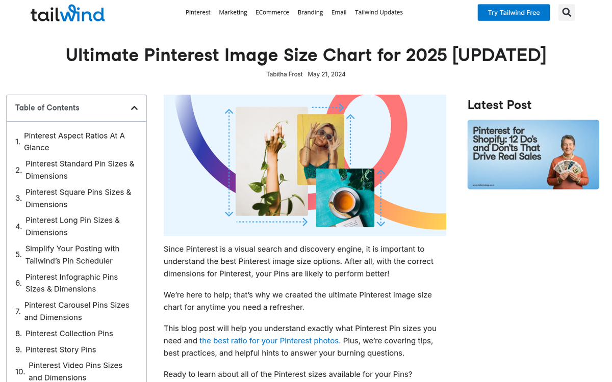
Specifically, Pinterest usually recommends images that are 2:3 in aspect ratio. The ideal Pinterest image size is 1000 x 1500 pixels, with a minimum of 600 x 900 pixels. Images that are too wide may be cropped or squished inward to fit, which distorts the image. With images that include text especially, this will be particularly frustrating.
Pinterest also has a creative best practices” guide you might be interested in reading - it covers a number of tips about how to create great pins for businesses.
Pinterest Product Specifications
Listing out the aspect ratio isn’t technical enough for some of you and that’s understandable. Just knowing about a 2:3 ratio could be fine for casual images and organic sharing. But what if you want to run ads, use other pin formats, or need to know the finer technical details? Here’s an overview of the key image specifications.
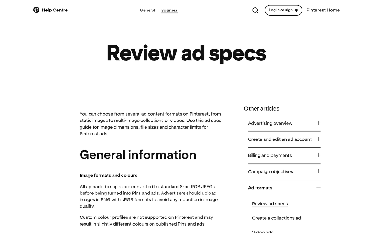
Standard Pins are your basic Pinterest post format, covering organic posts and promoted pins. These can be either PNG or JPG files. The recommended aspect ratio is 2:3, with an ideal size of 1000 x 1500 pixels and a minimum of 600 x 900 pixels. The general file size limit for Pinterest images is less than 20 MB. If you need somewhere to store these assets, check out these reliable websites to host your blog images for free.
Square Pins use a 1:1 aspect ratio, with an ideal size of 1000 x 1000 pixels. These are used for carousel formats; you can include anywhere from 2-5 images per carousel. Unlike Facebook carousels, Pinterest carousels don’t slightly overlap - only the dots below the carousel show that multiple images are present.
It’s important to remember that within a carousel, you can’t mix and match different ratios; your pin will take one format or the other and images that don’t fit won’t display. You may also want to consider getting free images for your posts with a plugin to fill these formats easily.
Story Pins (Idea Pins) use a vertical 9:16 aspect ratio at 1080 x 1920 pixels. These have a higher file size allowance - as high as 20 MB for images and 100 MB for video. Story Pins (Idea Pins) are designed for multi-page, interactive content.
Board Covers should be 600 x 600 pixels with a 1:1 aspect ratio and they keep your profile looking clean and consistent.
Pinterest in Practice
Using a 2:3 ratio for your images sounds easy. But Pinterest doesn’t always look that uniform when you visit it. There are images at a 2:3 display. But others are taller and some are square. Pinterest has a pretty fixed column width - the number of columns changes as you scale your browser, but not the width of the individual images.
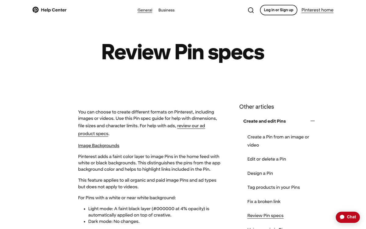
In practice, pins that are very long can stretch vertically but they don’t expand horizontally. Anything taller than a 1:2.1 ratio will be cropped. Taller pins usually still draw more engagement because they can show more interesting content and have more space for text. Of course, your pin needs to be interesting enough to justify that use of vertical space.
In terms of dimensions, stay away from uploading images that are too small. Anything below the 600 x 900 pixel minimum won’t make use of the available space. On the upper end, stay under the 20 MB file size limit and be aware that very large files can slow down your website and Pinterest’s load times.
Does Using the Pin It Button Work?
So here’s a question: does the Pinterest widget actually work for your blog? Think about it - blog format images usually work best in a horizontal format and sharing those images on social media works best when they’re horizontal. Should you switch all of your images to vertical just for Pinterest?
My answer is: probably not. Large vertical images in your blog posts take up too much space, so unless they’re images - like infographics or tutorials made up of images stitched together - they aren’t going to work well on Pinterest itself.
Here’s my recommendation and it’s two parts.
First, you want to use normal blog-format images on your site. You can use the Pinterest widget if you like and if it brings in traffic, there’s no reason not to. However, it shouldn’t usually be the main focus of your Pinterest marketing.
You’ll have to instead take control of your Pinterest presence by uploading your own custom images for your posts. Creating vertical images - best at 1000 x 1500 pixels - will work much better than stretched horizontal images or unwanted crops. You can use a vertical adaptation of the images you’re already using on your blog, or you can create entirely new images that don’t appear anywhere on your site - it’s really up to you.
For power with Pinterest, you should consider creating graphical tutorials and infographics. Infographics can be very strong because they’re tall, they carry helpful information and interesting graphic design and they welcome engagement. Tutorials work the same way and they’re easier to produce by basically stitching images together vertically and adding text. If you want more exposure, check out these ways to get more social shares on your blog posts.
Examples of Pins and Analysis
Here are a few examples worth thinking about and a basic analysis of why they work or fall short.
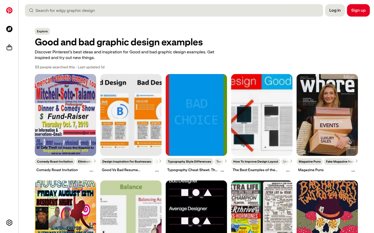
A poor pin is one that has crammed a list of items - say, “side hustles to make money” - into a plain image with no graphic design or visual hierarchy - it’s a wall of text that runs together and the only reason anyone clicks is to expand it just to read it; it’s not strong content; it’s friction.
A better example is a vertical blog post image that adapts a horizontal blog header into a tall pin format, adds the post title in readable text and gives the viewer a sense of what they’ll get if they click - it might not be deep graphic design, but it’s functional and purposeful.
A cautionary example is the pin that looks great visually - say, a list of backyard money-making tips - but clicks through to an unrelated page; it’s clickbait and Pinterest’s algorithm has become increasingly good at penalizing it. Beyond the platform consequences, it destroys trust with your audience.
A common mistake with Pinterest-formatted images is placing them as the top image of a blog post. Yes, it may look great in the feed at 1000 x 1500 pixels. But dropping a tall vertical image above your post content pushes everything below the fold and gives you a poor user experience. The SEO and usability costs are not worth it.
A great infographic pin is one that’s tall enough to be vertical, uses readable text even at the expanded preview size and is visually interesting enough to stand on its own - it doesn’t need to double as a blog header; it just needs to be strong enough to earn a click or a save.
These examples give you a helpful sense of how Pinterest works with images. Remember that pins appear small in the feed, so make sure any text in your images is large enough to be legible even at a glance - and always design with the 1000 x 1500 pixel ideal size in mind.
