Can a Popup on Your Blog Posts Hurt Your Traffic?
Published by Kenny Novak • Search Engine Optimization • Posted May 29, 2017 ContentPowered.com

I have talked before about how much I dislike pop-ups, and I’m sure I’m not alone. Millions of people browse the web and of them, over 70% feel that irrelevant popups are incredibly annoying.
And yet, if you try to mouse away from this site, chances are you’re going to get a pop-over before you leave. So why, if I don’t like them and most people out there don’t like them, am I and other people around the web still using them?
The fact is, popups work. Popups, popovers, popunders, they’re all methods to apply a call to action in a way that doesn’t take up space in the normal flow of content. In fact, a good popover can increase your email opt-ins by 400%.
The reason so many people hate them is the ways they have been misused, in the past and in the present.
Using a popup or a popover can and will hurt your traffic, if you’re using them wrong. If you’re using them right, they might drive away a few users, but they will convert far more. So how can you hurt your traffic with popups?
Using the Wrong Kind of Popup
Google doesn’t directly penalize popups, because they know as well as the rest of us that they work when used properly. However, Google has a big emphasis on usability. Popups that disrupt the ability for the user to read and enjoy the site are going to get you a penalty in the sense that your site usability will be lower, so you will be considered less valuable.
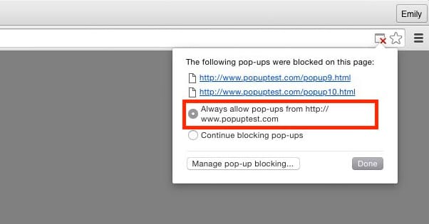
There are three main types of popups. The first is the traditional popup, which opens a new browser window (or tab, as a lot of browsers these days open new windows as by default) and displays content that way. The second is the popunder, which works the same way but is designed to not steal focus from the user; rather, it sits there until the user moves or closes their current window, showing your window beneath. The third is the popover or overlay, which is not a new window at all, but rather a lightbox overlay on top of the site content. It’s what this site and most modern sites use.
The first two, the ones that open new windows, are old technology and are generally considered a negative user experience. Popups, in the traditional sense, generally are disruptive to the user experience. You’re trying to read content and oops, there’s a new window over top of what you were reading. It doesn’t help that in the old days, that new window often had some kind of flashing colored message, maybe a sound, generally something extremely disruptive, and often something advertised unrelated to the site you were on. It was an ad network thing, not a site opt-in thing. Sometimes, they even contained porn.
Popunders have a similar effect, on a delay. Rather than disrupting you immediately, they lie in wait, like some kind of advertising land mine. Chances are, by the time you got around to actually seeing it, you had no idea what site spawned it or what clicking the button might do. Some of the more insidious versions played videos or audio in the background, but many simply had their message waiting for whenever you chose to notice them.
Software overlays are the generally accepted version of the popup for modern audiences, though they still have their potential issues. The rest of the issues in this article are all focused on exactly that: issues with site plugin overlays rather than browser popups.
Using Bully Language
Have you ever encountered one of these popups and seen some language like “Have you ever wanted 100,000 subscribers for your mailing list?” with two options, one of which is something like “Yes, that sounds great, please tell me how” and one says “No thanks, I don’t need a mailing list”? The idea is to sort of shame people into clicking your button. Either you like your business or you hate it and want it to fail, right?
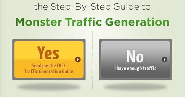
This is a kind of language bullying that brands pull when they’re marketing primarily in a B2B sphere. Similar techniques are used for B2C marketing as well, where the brand tries to shame the user into clicking the button.
Have you ever fallen for it? Do you really believe that if you click “no thanks” that you actually hate your business and want to fail? Do you feel compelled to click yes just because you’re sending the wrong message?
Of course not. We all know it’s just a yes or no, and that couching it in such shameful terms is just trying to verbally abuse and coerce you into making the choice the site wants you to make. It’s not like clicking no will send a message to your boss about how you want the brand to fail. It’s not like the site even gets real statistics about the number of times it was closed.
People don’t fall for bully language, and it generally makes them less likely to click to begin with. It might not hurt your traffic directly, but it will definitely hurt your conversion rate for your popover, so there’s no sense in trying to use it.
Using Generic Messages
The other potential issue with the message on your popover is when it’s too generic. You’ve probably gone to a site and seen a popup that has nothing to do with what you’re interested in. It happens all the time.
Say you’re a site selling all sorts of health and pharmaceutical supplements. You have whey and protein products for muscle growth, you have weight loss and diet pills, you have vitamins and supplements, and you have a diverse audience who all want different things.
Which message do you show?
If you show a popup for weight loss pills, and it shows up in front of someone looking for muscle growth supplements, they’re going to be completely disinterested. It’s a disruptive popover, nothing more. The same goes in reverse; if you show muscle growth items to people looking for multivitamins, it’s far outside of their concern and they’ll wave it off.
What you need to do is target your messaging. You need to make sure the message you’re sending is specifically aimed at providing some kind of value to the person reading it.
Unfortunately, this is tricky to pull off. You either need to be able to provide different popups on different pages, or you need a popup engine that monitors your users and provides popups to users with certain characteristics. The former is by far the easier method; simply only show popups for weight loss items while the user is browsing other weight loss items.
Making it Hard to Close
From a usability standpoint, you want your popup to be easy to close. The more disruptive it is, the more your users and Google will hate it.
You always need some way to get out of it.
- You can keep the default corner X that most lightboxes have, so the user can click the corner to close it.
- You can make two equally large options, one of which is convert, one of which is close. Make sure they’re clearly identified which is which, and again, don’t use bully text.
- You can make one large conversion box, and one small line of text to close the box and get back to the content beneath. This is hard to balance, because your closing text still needs to be large enough to see for what it is, but small enough to not disrupt the attention focused on the conversion button.
- You can allow the usually-default behavior of letting the ESC key close the popover. I know personally it’s my default “close extraneous crap” button, and if it doesn’t work, I feel less happy with the situation.
Personally, I recommend at least two of the four. I always think the ESC key should close your popovers, no matter what they are or what they’re for. It works for fullscreen video, it works for media lightboxes, it should work for popovers. I also don’t think there’s any benefit to removing the X in the corner.
Whether or not you use a button to close the popover is up to you. Often, I find that this leads to a slippery slope where you start getting closer and closer to bully text as you optimize. Be careful; you don’t want it all to backfire on you.
Disrupting the User Experience
Once again, it all comes back to the user experience. The more disruptive you are with your popover, the more likely you are to drive your users away.
There are several styles of popover you can use, each with their perks and drawbacks. Pick the right ones for your users.
- Immediate. This is pretty rare these days, but some sites still have their popups triggered immediately upon loading the site. This can be fine, if you’re targeting customers with something they might want to know. For example, Ebates has a popover running at the moment that appears immediately, to let you know they have an additional promotion going on, which might increase other conversions. However, this does still require the user to be interested in making a purchase right away.
- Time delay. The easiest kind of popover to trigger is a time delayed trigger. Set it to something like 30-45 seconds after the user loads and you’ll capture a lot of traffic from people who read your content, but won’t bother loading it to people who are dissatisfied or who are bouncing from your page right away.
- Scroll-triggered. If you want to guarantee that the people who see your popover are the same people who are reading your content, you can make it trigger only when the user has scrolled far enough down the page to actually be considered to have read it. Usually something like 60-70% of the way down the page is a good idea.
- Exit intent. This is the most complex, which means it’s generally only available with paid plugins instead of the free options. However, it also is the most refined. It doesn’t interrupt the user who is reading your posts; it only triggers when they’re about to leave, as signaled by the window losing focus or the cursor moving outside of it.
Make sure you pick an option that doesn’t disrupt users who are actually trying to accomplish something.
Restricting User Actions
This is an extension of one of the previous flaws, the lack of ability to close the popup. It’s happening a lot on mobile devices, but can occasionally be spotted on desktops as well. Basically, the popup redirects you two or three times to a destination page; this is a soft disable for the back button. Clicking “back” just returns you to the redirect back to the trap page.
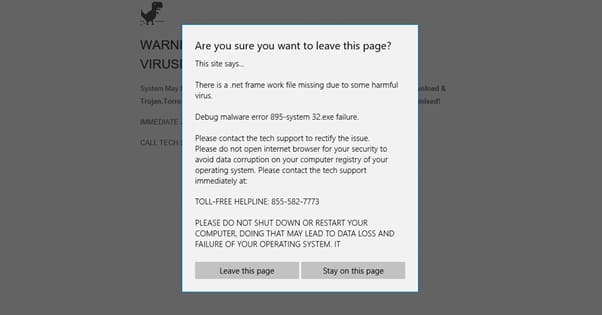
Then if you try to close the page, it pops up a box warning you about closing it. Sometimes that box will be worded in such a way as to make you unsure whether or not the button to close it actually closes it. This box also steals focus and disables clicking on the rest of the page until it is closed.
Essentially, these kinds of traps are used to serve malware or trap a user into some kind of offer they have no interest in actually completing. It’s also something that will very quickly get you penalized by Google directly.
These are all of the biggest possible flaws in using a popup or popover for your site marketing. The fact is, they can work to increase your conversions just like any other technique, but you need to optimize them for your audience and message. At the same time, if they’re disruptive in any way, it can harm your search engine ranking or drive users away. Take caution when implementing them and you should be fine.

Kenny is a blogger and networking professional. He uses blogging and content marketing as a launchpad for small businesses looking to grow their online presence.