Colors are important. No offense to the colorblind, but paying attention to colors in your marketing material is essential to optimizing your conversion rates.
- 85% of consumers say color is the primary reason for purchasing a product.
- Color ads are read up to 42% more often than the same ads in black and white.
- Color increases brand recognition by up to 80%.
- Consumers make initial judgments about products within 90 seconds of interaction, with 62-90% of that assessment based solely on color.
Of course, you have to remember that every color has its own associations, and each of those associations is very culture-specific. The most common example is literally black and white; in America, the color of death is traditionally black, with black worn for mourning. In Japan, mourning and death is predominantly white.
Key Takeaways
- Color influences 62-90% of initial product judgments, and 85% of consumers cite it as their primary purchase reason.
- Color associations are culture-specific; for example, black symbolizes death in America but white does in Japan.
- Red CTA buttons can increase conversions by up to 34%; orange also consistently performs well across industries.
- CTAs have four elements-placement, shape, message, and color-with color being the least impactful in isolation.
- Strong placement and compelling messaging can drive conversions even when button color is unappealing.
The Color Wheel and Marketing
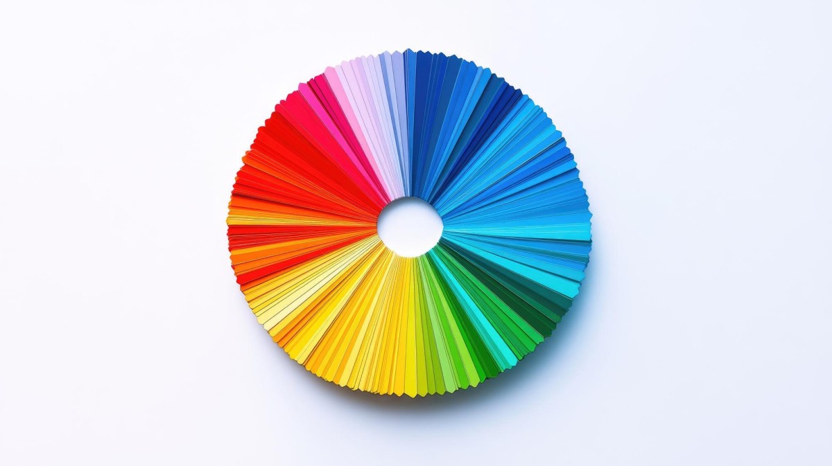
Before digging too deeply into color psychology, you should know the basics of color theory. If you've paid attention to art or physics classes, you can probably skip this section.
The color wheel is the circle of colors surrounding the three primary colors of yellow, blue and red. Mix any two and you get secondary colors, orange, green and purple. Mix those in turn with primaries and you get tertiary colors, like blue-green, magenta and red-orange. Of course, you can pare this down to exact hex values in millions of individual shades, but it's hardly useful to do so for a basic discussion.
Colors can be complementary or they can be more antagonistic. Red and blue look good together. Blue and orange clash and hurt the eyes. It's all a matter of hue and saturation, of course, but there are general color theory rules to follow. When applying these principles to your website, elements like CTA size, color, and placement can make a significant difference in how visitors respond.
North American Color Associations
Yellow is a bright and distracting color that's not easy on the eyes. It's typically optimistic, seen in advertising for the spring, and it's used to grab attention. It can stand out when combined with more muted complementary colors or other pastel shades.
Red is a forceful, vibrant color that inspires feelings of energy, urgency and in certain seasons, love. Red is typically used in advertising with a "buy now before it's gone" or clearance situation. It's also one of the most conversion-friendly CTA colors - studies have shown a red CTA button can increase conversion rates by as much as 34%.
Blue is a calming color most often associated with trust, security and the financial sector. Many banks pick either blue or green, or often a combination of both, for this reason. If you want to assure users of the reliability of your product, use blue.
Green is the color of wealth. It's also a very easy color to parse. It's easy on the eyes and it's used for relaxation and calming effects, similar to blue. Seen in banks and financial institutions for the same reasons as blue, with the association with wealth to back it up.
Orange is an aggressive color that's often used as a call to action; subscribe now, buy now, act now. It's also seen as a budget color, occasionally associated with a fair sense of affordability. It's not typically a beloved color, though it shines in the autumn months.
Pink is a romantic, feminine color that tends to be extremely gender segregated. As such, it only makes a good call to action for a very specific demographic. Among males, it is often associated with weakness and femininity. Social revolution is slowly changing this impression, but color psychology has been entrenched for decades.
Purple is a calming and soothing color. It also tends to appeal more to women than men, and is often used for marketing beauty products, anti-aging products and products for the rich and refined. Different shades of purple tend to align with different kinds of products.
Black is a powerful, sleek and luxurious color. It's used to market upper class luxury goods in print and product design. On the web, however, it tends to not stand out quite as much, due to the prevalence of black text virtually everywhere.
White is a color of purity and sterility, used by brides and doctors. On the web, it's a neutral color mostly seen in the background; a white call to action button has no chance of standing out unless the background it's set into is significantly different.
Brown is a color of wholesome earthiness, nature and natural ingredients. When used alone, it often implies boredom. When used with other colors, it has different associations. Brown and green is recycling and earth friendly design. Brown and red is autumn and harvest fertility. It's always a complementary color, not a stand-alone color.
Other colors have their own associations, but straying into individual shades grows too granular to describe.
Colors in CTAs

When you're specifically talking about the call to action, color can come into play in numerous ways. Your landing page will tend to be more graphical than the rest of your website, potentially with dynamic page layouts and animation. A lot of this should be in greens and blues, to exude calm and trust. When you reach the actual call to action button, you have some meaningful choices to make.
Studies show that red CTA buttons can increase conversions by as much as 34%, and orange buttons also consistently perform well across industries. There is, however, some important context to keep in mind. Many case studies went into the test with a control of no button at all, in which case yes, nearly any colored button will convert more. When tested side by side with a different color button but an identical design, results are far more nuanced. The broader takeaway from brands like Heinz - whose brand color change contributed to a reported $23 million increase in sales - is that color choices at scale genuinely matter.
The problem with paying too much attention to color is that it can distract from overall design quality. Color is just one piece of the puzzle, and no single shade is a universal conversion cure.
A call to action is made up of four elements. The placement of the button, the shape of the button, the message of the button and the color of the button. Of the four, color is perhaps the least meaningful in isolation. You can pick the perfect color but if you bury the button at the bottom of the page, below the fold and with a bland message, you're not going to see many conversions. Change the color to something unappealing but move the button to the top of the page with a compelling message, and your conversions will likely rise anyway.