


Your organic SEO drives people to more or less random pages on your site. All of your targeted ads, PPC ads, newsletter traffic and the like, however, ends up on a landing page. A bad landing page is like a clogged air filter; it stifles flow and chokes your funnel. According to Unbounce's Q4 2024 data across 41,000 pages and 464 million visitors, the average landing page conversion rate sits at just 6.6% - meaning most pages are leaving a lot on the table. Clear that filter by optimizing your landing page using these tips.
Key Takeaways
- Pages written at a 5th-7th grade reading level convert at 11.1%, more than double the 5.3% rate for college-level copy.
- Forms with five or fewer fields generate 120% higher conversion rates than longer forms; only ask for essential information.
- Pages loading within 2 seconds convert at 9.6%, versus 3.3% for pages taking up to 5 seconds.
- Maintaining "message match" between ads and landing pages is one of the most consistently overlooked conversion killers.
- Adding video can boost conversion rates by up to 86%; keep clips under 90 seconds and optimize for load speed.
Maintain Consistency between Ads and Page Copy
When a user clicks on your ad, it has done its job. It has attracted them with a specific message and a specific image, if applicable. The user expects to see, if not the same information, at least something that ties into it immediately upon arrival. If they click a picture of a brown dog with a message about organic dog food and your landing page is about robotic cat litter box cleaning, the disconnect drives them away instantly. This principle - often called "message match" - is one of the most consistently overlooked conversion killers.
Keep Information Consistent

This is all about credibility. If your ad says you've served over 300 businesses, but your landing page says you've served 250 businesses, the disparity erodes trust immediately. It's a simple matter to keep statistics and specific information consistent across every touchpoint - ads, landing pages, email copy, social posts. Audit these regularly, especially if your numbers are growing fast.
Test Incremental Changes
Split testing is all about incremental improvements, and you should try to be incremental with any changes you make, even in major redesigns. Abrupt changes to a landing page can confuse users mid-funnel - particularly those who may have visited before - and force them to re-evaluate. Tools like Google Optimize's successors, VWO, and Optimizely make it easier than ever to run clean A/B tests in 2026. Change one variable at a time so you actually know what moved the needle. If you're building or refining pages, it's worth exploring excellent WordPress plugins to create landing pages that support testing workflows from the start.
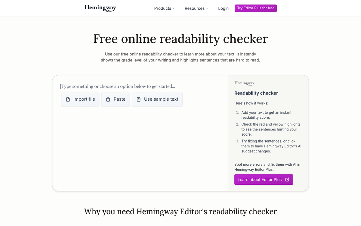
Write at a Reading Level People Actually Use

This one surprises a lot of marketers: Unbounce's Q4 2024 data found that pages written at a 5th-7th grade reading level had a median conversion rate of 11.1%, compared to just 5.3% for pages written at a college reading level. That's not dumbing things down - it's respecting your reader's time and attention. Short sentences. Plain words. Clear value. Tools like Hemingway Editor can help you check your reading level before you publish.
Keep Your Focus Narrow
A landing page is a well-oiled machine built for one purpose and one purpose only. If you're trying to do more than one thing, no matter what that second objective may be, you're diluting the focus of your page. Every word on the page, every element of design, every part of the form you want users to fill out should be focused on your one primary objective. One page. One offer. One action. If you need help getting started, check out how to create free landing pages and squeeze pages that stay laser-focused on a single goal.
Keep Your Forms Short

If your form has more than five fields, you're likely leaving conversions behind. Unbounce's data shows that forms with five or fewer fields generate 120% higher conversion rates than longer forms. Only ask for what you absolutely need at this stage of the funnel. You can always gather more information later once the relationship is established. For guidance on creating and optimizing registration forms, keeping them lean is one of the most impactful steps you can take.
Emphasize Urgency
This can be done in two ways. You can use time-sensitive language, implying that your deal is a limited time offer. You can also make the offer legitimately time-sensitive - a temporary deal, or a "first X users to sign up get a bonus" arrangement. Authenticity matters here; today's users are savvy enough to recognize fake countdown timers, and they erode rather than build trust.
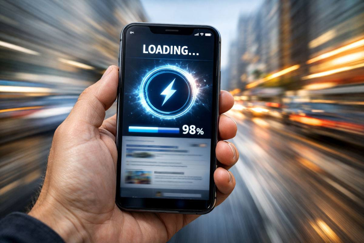
Prioritize Page Speed - Especially on Mobile
Page speed is no longer just a nice-to-have. Pages that load within 2 seconds convert at 9.6%, while pages that take up to 5 seconds to load drop to 3.3% - nearly a third of the rate. On top of that, 53% of mobile users abandon a page that takes more than 3 seconds to load. Run your landing pages through Google PageSpeed Insights and treat any score below 90 as a conversion problem, not just a technical one.
Add Video Where It Makes Sense

Adding video to a landing page can boost conversion rates by as much as 86%. A short explainer video, a customer testimonial clip, or a quick product demo gives users a richer reason to trust you and act. Keep it concise - under 90 seconds for most use cases - and make sure it doesn't tank your load time. Host it on a CDN or embed via a platform that lazy-loads, rather than dropping a raw video file on the page.
Guide the User with Directional Cues
Your design should incorporate directional elements to help encourage users to look where you want them to look, in the order you want them to look. It can be as simple as an arrow, or as subtle as a person in a photo whose gaze points toward your CTA. Visual hierarchy and flow aren't accidents - they're decisions you need to make deliberately.
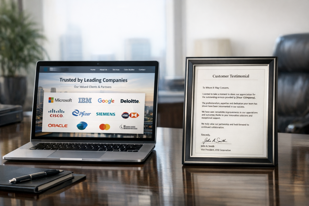
Use Credibility Indicators
There are a few strong types of credibility indicators you can use on your page. Logo badges of well-known clients you work with carry significant weight, particularly in B2B contexts. Deep, personal testimonials - a genuine paragraph from a real customer with their name and company attached - outperform generic one-liners every time. In 2026, video testimonials have become increasingly powerful and accessible. You can use award badges too, but only if they're legitimate and recognizable; too many look-alike "Top 10%" badges exist and savvy users see right through them.
Make Your Design Appealing
Something eye-catching, something vibrant, something elegant - it doesn't matter the feel, so long as the design is genuinely compelling and on-brand. You need to capture the user's attention and carry them through to your CTA. With AI-assisted design tools now widely available, there's less excuse than ever for a landing page that looks like it was built in 2014. Your design should feel like it belongs to the same world as your ads and emails.
Minimize External Distractions
Your landing page is a special page - it's not part of your site as a whole. You don't need external navigation. You don't need to link out to the study behind a statistic you cite. You don't need to hyperlink every client logo. All of these are exits. Every link that isn't your CTA is a door leading users away from the action you want them to take. Strip the page down to what serves conversion and nothing more.
Format for Ease of Skimming
Most users won't read your landing page - they'll scan it. Format accordingly. Use strong subheadings, short paragraphs, bulleted lists for key points, and visual callouts for stats. If your page is long, that's not necessarily a problem - longer pages actually give you more opportunities to build a case - but the formatting has to carry the reader through without making them work for it. Every section should reward a skim while also rewarding a full read.
Pick Appropriate Colors
Colors should match the mood and feel of your brand and remain in complementary hues throughout. The one exception is your CTA button, which should contrast sharply with everything else on the page and should be the only element of that color. This makes it impossible to miss - which is exactly the point.
Use Multiple CTAs on Long Pages
If testing shows that a longer page performs better, don't bury the conversion opportunity. Make your CTA form a sticky sidebar that scrolls with the page, or repeat the CTA button at logical intervals - after a strong value proposition, after testimonials, after pricing. There should always be a visible way to convert, no matter where the user is on the page. For longer content, consider the pros and cons of splitting your content into multiple pages before deciding on your final layout, and make sure you're using the right conversion tracking setup to measure which CTA placements are actually driving results.
Make Your Language Personal
Small language changes can have a meaningful impact on conversion rates. Switching a CTA button from "Get Your Free Trial" to "Get My Free Trial" shifts the framing from transactional to personal. It's a minor tweak that consistently tests well. The same principle applies throughout your copy - speak directly to the reader, in their language, about their problem.
Provide Contact Information
This is the one reasonable exception to the no-distractions rule: provide an alternative way to reach you. A phone number in the header and an email address in the footer give hesitant users a safety net without derailing the primary conversion path. In 2026, a well-placed live chat widget can serve a similar function - just make sure it's handled promptly, or it does more harm than good.
2 responses
Thoughtful replies only - we moderate for spam, AI slop, and off-topic rants.
Thanks for taking the time to dig these up. Interesting to go through and see what makes them successful 🙂
Hi Elliot, you're welcome! I hope your landing page is a success.