Landing pages have one thing in common, regardless of the company or the product or service. That thing is the opt-in or lead generation form. It's a singular form made to gather information about the people interested in your business, whether it's people looking to buy your product, pay for your service, download your ebook, or attend a webinar.
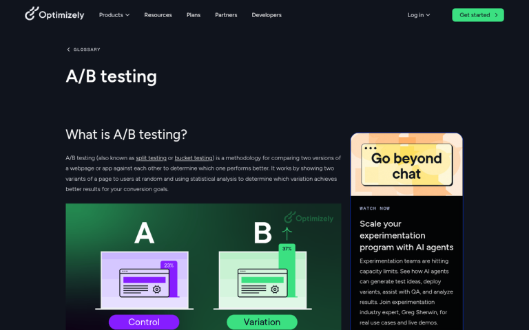
Lead generation forms are surprisingly serious business. A few simple tweaks to a form can double or halve the amount of interest it generates. According to Unbounce, one company saw a 120% increase in conversions simply by reducing their form from 11 fields down to 4. That's not a minor optimization - that's a transformation, and it happened by changing a single element.
Key Takeaways
- Fewer form fields dramatically boost conversions - reducing from 11 to 4 fields drove a 120% conversion increase for one company.
- Multi-step forms outperform long single forms, with users reporting 86% higher conversions and 17% greater lead generation satisfaction.
- Form placement above the fold matters enormously - one college achieved a 336% conversion increase simply by repositioning their form.
- A simple privacy statement near the submit button can boost conversions by nearly 20%, making trust-building essential.
- Mobile completion rates lag significantly at 32% versus 48% on desktop, requiring deliberate mobile optimization strategies.
The Essential Elements of Lead Generation Forms

Every lead generation landing page needs a form, and every form needs certain elements to be successful.
Get these right and you're ahead of 90% of the businesses out there - those that either don't use or don't optimize their lead generation funnels.
1: Form positioning. Your form should be above the fold for most devices and display resolutions. It needs to be prominent and front and center, though not literally the center of your page - you need supporting details to make it attractive. This is why so many landing pages position their form on the right side, so the natural left-to-right reading movement gets visitors to absorb the key details first, then land on the form. One career college saw a 336% increase in conversions simply by removing their primary navigation and placing the form above the fold. Don't underestimate how much placement alone can move the needle.
2: Form length. This is where most businesses get it wrong. The data is clear: fewer fields almost always win. Reducing form fields from 6 or more down to just 3 can increase completion rates by 67%. The more information you ask for, the more qualified the lead may be - but the fewer people will actually finish and submit the form. This tension is real, and it's exactly why multi-step lead generation forms have become so prominent. According to HubSpot, only 39% of marketers currently use multi-step forms, but those who do report 86% higher self-reported conversions and are 17% more satisfied with their lead generation overall. That's a compelling case for breaking a longer form into digestible steps rather than front-loading everything at once.
3: Field choice. Which pieces of information do you actually need? What does your sales team require to make a meaningful first contact? You need enough information to personalize your outreach, but not so much that the form feels intrusive or exhausting. One concrete example: adding a phone number field typically results in a 5% decrease in conversion rates. That may sound small, but at scale it adds up fast. Ask yourself whether that phone number is truly essential at this stage, or whether it's something you can capture later in the funnel.
Part of this determination comes down to one key question: "What makes a lead qualified?" A qualified lead meets your target demographics and shows signs that they have a problem your product can solve. To figure that out, you need intimate knowledge of your customers - why they seek out your product, what compels them to convert, and how to ask for that information without scaring them off.
4: Privacy statement. Trust matters more than ever in 2026. Users are increasingly aware of how their data is used, and a simple privacy assurance near your form can meaningfully improve opt-in rates. Testing has shown that phrases like "We guarantee 100% privacy. Your information will not be shared." can boost conversions by nearly 20%. Pair that with a genuine link to a real privacy policy - not buried in your footer, but right there near the submit button. With data privacy regulations continuing to tighten globally, this isn't just a conversion tactic anymore; it's table stakes.
5: Mobile optimization. This deserves its own line item in 2026. Mobile form completion rates sit at just 32% compared to 48% on desktop - a significant gap that means if your form isn't genuinely easy to complete on a phone, you're leaving a third of your potential leads on the table. Large tap targets, minimal typing, autofill support, and single-column layouts are non-negotiable for mobile forms today.
6: Submission button. You obviously need a submit button that works, but there's far more to it than simply labeling it "Submit." Your call to action has a wide range of possible optimizations. The CTA text should match the offer - "Get My Free Guide," "Claim Your Spot," or "Start My Free Trial" will almost always outperform a generic "Submit" or "Send." Test it, because small wording changes here can have outsized impacts.
Making Information Mandatory
What information should you ask for in your lead generation form? There are no universal rules, only smart guidelines. Every business is different, and you need to have a direct conversation with your sales team about what they actually find useful when reaching out to new leads.
The first thing to internalize is that every individual field in your opt-in form is essentially a step in a staircase. There's a prize at the top - whatever you're offering, whether it's a mailing list, an ebook, a coupon, or a free trial. But the stairs are steep, and the more of them there are, the more people will decide it's not worth the climb.
At the simplest level, a name and email address is all you truly need to initiate contact. Everything beyond that should be justified. Before building your form, make a full list of every piece of information you could ask for: full name, email address, phone number, company name, website URL, job title, number of employees, industry, B2B vs. B2C, and open-ended questions like "What's your biggest [industry] challenge?"
Once you have that list, ruthlessly narrow it down. Cut anything that won't directly influence how your sales team approaches the lead. Then split what remains into two buckets: absolutely essential and "nice to have." The "nice to have" fields belong either in a second step of a multi-step form or in a follow-up sequence - not on your initial opt-in.
You can also harvest some information passively, without adding form fields. Hidden fields can pull in metadata like geographic location based on IP address, device type, UTM parameters, or the referral source that brought them to your page. This kind of data is more useful for segmentation and ad targeting than for individual sales outreach, but it's worth implementing so you're not asking users to tell you things you could already know.
Implementing the Form

Now that you know what fields you need, you need to actually build and deploy the form. The landscape of form and lead generation tools has changed considerably, so here's an updated rundown of the most relevant options in 2026.
HubSpot Forms - HubSpot remains one of the most popular all-in-one marketing platforms, and their native form builder is a strong starting point for most businesses. Forms integrate directly with the HubSpot CRM, making lead management seamless. The free tier is genuinely useful, and paid plans unlock smart forms, progressive profiling (which automatically hides fields a contact has already filled out), and advanced automation workflows. If you're already in the HubSpot ecosystem, there's very little reason to look elsewhere.
OptinMonster - Still one of the most widely used lead generation tools, and for good reason. Plans start at around $16 per month and scale up with features like exit-intent popups, geolocation targeting, A/B testing, and advanced display rules. It integrates with virtually every major email platform and CRM on the market. If you want flexibility in how and when your forms appear - slide-ins, floating bars, lightboxes, inline - OptinMonster gives you a lot of control without requiring a developer.
Typeform - Typeform has become a go-to option for multi-step and conversational forms, which aligns well with the data showing that multi-step forms outperform single long forms. Their one-question-at-a-time format feels less like a form and more like a conversation, which tends to reduce friction and improve completion rates. Pricing starts around $25 per month, with business plans available for more advanced features and higher response volumes.
Formstack - Formstack remains a solid mid-tier option with a robust visual form builder, strong security, conditional logic, and integrations with Salesforce, HubSpot, and other major platforms. Pricing has shifted over the years - expect to pay in the range of $50-$100+ per month depending on the features you need. It's particularly strong for businesses that need more complex form logic or compliance-sensitive data collection.
Adobe Marketo Engage - Still the enterprise-level powerhouse it's always been, now fully under the Adobe umbrella. If you're running large-scale B2B campaigns with complex lead scoring, multi-touch attribution, and deep CRM integration, Marketo remains a top-tier option. Pricing is custom and substantial - this is not a tool for small businesses, but enterprise marketing teams will find it more capable than ever.
Klaviyo - Worth mentioning specifically for e-commerce businesses. Klaviyo's form builder is tightly integrated with its email and SMS marketing platform, making it particularly powerful for capturing leads and immediately dropping them into automated nurture sequences. If your lead generation is closely tied to product purchases and repeat customer behavior, Klaviyo is worth a serious look.
So there you have it. The fundamentals of lead generation forms haven't changed - position matters, length matters, field choice matters - but the data we have in 2026 is far more precise about exactly how much each of these elements moves the needle. Fewer fields, smarter positioning, genuine privacy assurances, and a mobile-first mindset will put you well ahead of most businesses still guessing their way through form design. If you have a tool you love or a result worth sharing, drop it in the comments.