


A conversion funnel starts wide, with broad spectrum advertising and awareness campaigns. These campaigns feed into more targeted advertising, where the user might think "hey, I've heard this name before. This is interesting, maybe I should check it out." That tier of advertising then leads to landing pages, blog posts, and other properties where you have one all-important goal: getting the sign-up.
A form, be it for registration, for mailing list opt-in, or any other form of data harvesting, is what your entire funnel leads up to. It's the tip of the inverted pyramid. If your users reach the point where they could fill out the form and don't - or worse, fill out part of the form and stop before submission - you need to optimize your forms.
I'm not going to beat around the bush. Here's a bunch of tips, in no particular order. Take the ones you can, make use of the optimizations available to you, and rake in those extra conversions.
Key Takeaways
- Minimize form fields; reducing from 4 to 3 fields can increase conversion rates by nearly 50%, per HubSpot data.
- Multi-step forms convert 86% higher than single-step forms by leveraging sunk cost psychology to maintain user commitment.
- Traditional CAPTCHAs can reduce conversions by up to 40%; invisible alternatives like reCAPTCHA v3 are far less disruptive.
- Trust signals like security badges boost overall conversions by 16% and increase new visitor conversions by 22%.
- Always A/B test form changes; marketers who test report conversion rates averaging 10% higher than those who don't.
Customize This Advice
Before I get into the specific advice, I need to say one thing. Not every tip here will fit every brand. Some of them are changes that, if you made them, would hurt your conversions. Others might have no effect. Some might not even apply to your specific situation.
Always test your changes using traditional A/B testing. If a change you make hurts your conversions, revert it and try something else. Remember: you can always change back if something doesn't work out. The key is to accumulate a representative sample of data to test any change and choose which is objectively superior. Marketers who run A/B tests on their forms report conversion rates 10% higher on average than those who don't - so if you're not testing, you're leaving performance on the table.
Remember, also, that not all tips are aimed specifically at increasing the volume of sign-ups you get. Some of the tips I'm listing today are aimed at getting better sign-ups, rather than MORE sign-ups.
Remember, if you have 100 sign-ups with a 1% conversion rate after the fact, you only have 1 conversion. If you have 50 sign-ups with a 10% conversion rate, you have 5 conversions. Even if the second scenario looks worse on paper initially, the conversion profits are better in the end. You might also want to explore a list of services to boost your conversion rate and sales to complement whatever changes you make to your forms.
Now, on with the tips!
Keep It Short
Shorter is better when it comes to a registration form. The less a person needs to read, the better. Include just the information you need the user to know - like what each box is for and what each requires - and minimize other information. Users don't need a 100-word-long paragraph about the virtues of signing up at the top of the registration form.
Each box should have a simple label, which is often a single word. You generally need your legal disclaimers, like "we do not sell personal information." Anything required by applicable privacy regulations - including GDPR, CCPA, and other regional laws that have continued to expand in scope - is important to include. Beyond that, you don't need much of anything.
Minimize Fields
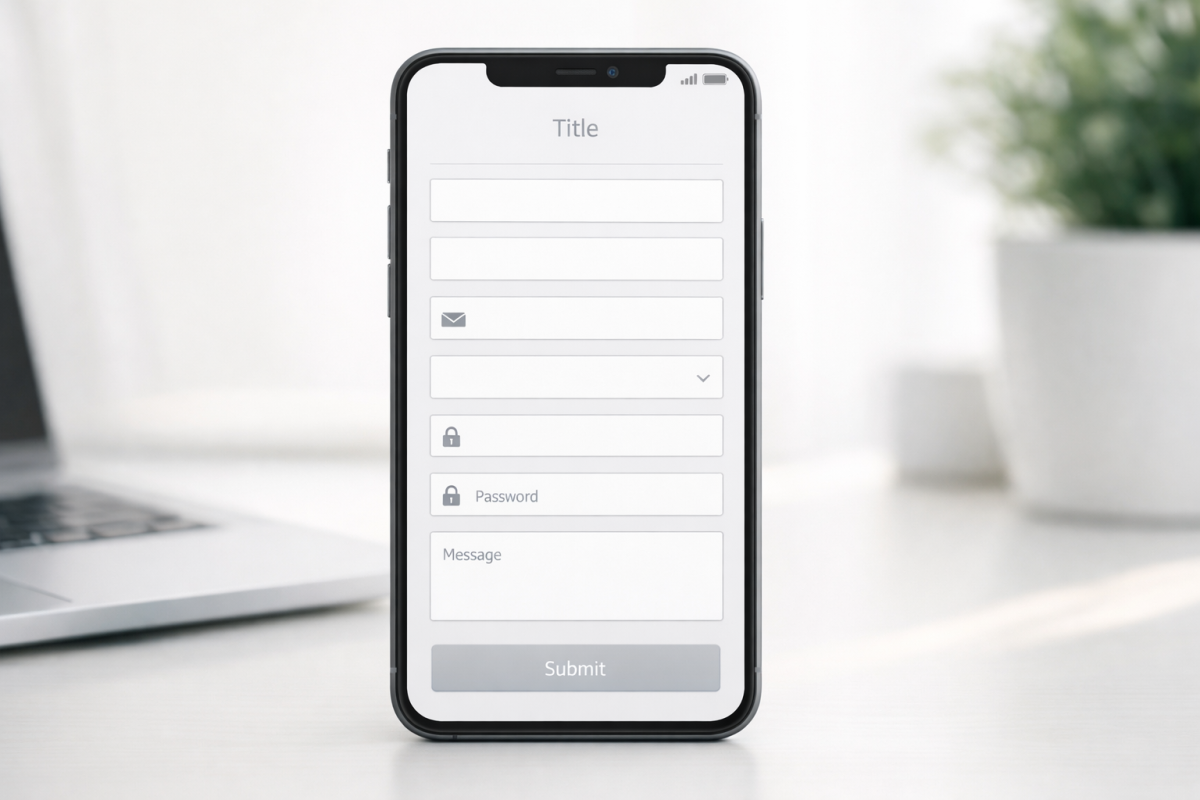
The less a user has to plug in to register, the better. According to HubSpot, reducing a form from just 4 fields to 3 can increase conversion rates by almost 50%. Their data also shows that over 30% of marketers see their highest conversion rates from forms with 4 fields or fewer. You generally need a Name field, an Email Address field, and a Password field for account registration. Anything else can be added to the user profile once the user has registered. For something like a mailing list, you don't even need a password field.
If you're using a registration form to collect qualified leads for future sales messages or calls, you'll need extra information. Company name, size, and employee count are useful to your sales team, but some users balk at giving that information. Be especially cautious about phone number fields - research from WPForms shows that 37% of people will abandon a form when asked for a phone number, unless the field is clearly marked as optional.
You should also minimize the fields you present at a time. If you need to ask for 10 pieces of information, it's better to split those across multiple steps than to present a daunting wall of fields all at once.
What you're doing is taking advantage of sunk costs. If a user plugs in five pieces of information and clicks to the next step, they feel more committed to completing the process. You'll lose some people between steps, sure, but not as many as you would lose by front-loading every field at once.
Consider Multi-Step Forms
Multi-step forms have proven to be one of the most powerful conversion tools available. HubSpot data shows multi-step forms with one question per step convert 86% higher than single-step forms, and Zuko Analytics reports they can increase conversions by up to 300% in some contexts.
The psychology here is straightforward: smaller commitments feel easier to make. A user who answers one question is more likely to answer another, and another, until they reach the end. Breaking up even a modest form into two or three focused steps can have a measurable impact on your completion rates.
Registration forms specifically have a 63% start-to-complete rate and take an average of just 1 minute and 35 seconds to finish - meaning most users who start a well-designed form will complete it. The goal is to get them started, and optimizing your opt-in approach can make all the difference.
Make Progress Visible

If you have a simple registration form, chances are it's just a single page. This is great, because the user can fill out a handful of informational fields and hit "register" to finish the process.
In other cases, you might be asking for more information across multiple steps. If so, make sure you have a visible progress indicator. Show the exact number of steps and where the user currently stands. Even a simple percentage-based progress bar gives users a sense of control and reduces the anxiety of not knowing how much is left. Users who can see the finish line are far more likely to cross it.
Minimize Distractions

Many modern sign-up forms today work either as an overlay that covers the screen, or as their own dedicated landing page with no other elements competing for attention. There's a good reason for this: it minimizes other options.
If a user is presented with a form in the middle of a blog post, they have a bunch of other potential distractions on the page. They could at any time click one of your other calls to action, an ad, or simply abandon the form to keep reading. Like a good landing page, you want your registration form to have as few exit paths as possible. Ideally, they only have four: fill out the form, hit the back button, navigate away via the URL bar, or close their browser altogether.
Indicate Signs of Trust

Trust signals are a critical part of any conversion process. Research shows that forms featuring trust badges see a 16% increase in overall conversions and a 22% conversion rate increase specifically among new visitors - people who have no prior relationship with your brand and need extra reassurance.
Here are some options:
- Include enough branding that the user knows they aren't signing up for some random site mimicking you.
- Include a clear statement that you won't sell their information, with a link to a full privacy policy.
- Include a recognized trust seal or security badge.
- If asking for sensitive information, like payment details or a password, make sure SSL is active so users see the browser-based lock indicator.
- Consider a numerical indication of other users who have signed up. Social proof works.
- If applicable, confirm up-front that you support multiple countries or languages.
Don't go overboard, though. Stacking half a dozen trust badges on top of each other can actually backfire, making users wonder what you're trying to compensate for.
Remember Mobile

Mobile users make up the majority of web traffic, and your forms need to reflect that. A form that works beautifully on desktop but frustrates a mobile user is a form that will bleed conversions.
Asking for as little information as possible is a big part of this. You also want to make each field easy to tap and fill out. Minimize typing. Use dropdowns or segmented controls where a user might otherwise have to type a common value. Set numerical fields - like phone numbers or zip codes - to trigger the number keyboard on mobile devices rather than the full QWERTY layout. These are small details that add up to a noticeably smoother experience.
A responsive design is table stakes at this point, but responsiveness alone isn't enough. Test your forms on actual mobile devices, not just a browser's emulation mode.
Validate Errors in Real Time
Form validation is a dying art in some corners of the web, and that's a shame. A user who fills out an entire form, hits submit, and is then met with a vague error message is a frustrated user - and frustrated users abandon.
You can perform field validation as the user types. Many modern forms already do this well. A username field that tells you immediately whether a name is taken, a phone number field that flags too many or too few digits, a password field that checks requirements in real time - these are all forms of inline validation that reduce friction significantly.
Pay special attention to the fields with the highest abandonment rates. The password field has the highest drop-off at 10.5%, followed by email at 6.4% and phone at 6.3%, according to Zuko Analytics. Inline validation on these fields specifically can recover a meaningful share of those lost completions.
Where possible, run validation client-side so sensitive data like passwords isn't sent to a server mid-entry.
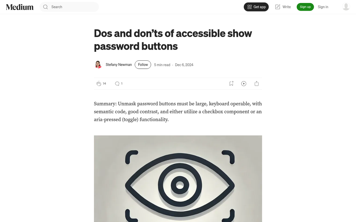
Don't Mask Passwords

One of the "best practices" from the early web was that every password field should display as a row of dots or asterisks. The thinking was that anyone could be looking over your shoulder.
In practice, shoulder-surfing accounts for a tiny fraction of compromised credentials. What happens far more often is that users mistype their password because they can't see what they're entering. They submit the form, set up an account with a password they didn't intend, and then can't log back in. Give users a visible toggle to show or hide their password. It's now a standard UX pattern and users expect it. Hiding passwords by default with no reveal option is outdated and actively hurts your completion rates.
Skip the CAPTCHA If You Can

CAPTCHAs have long been positioned as a necessary evil for fighting spam and bot submissions. But the data is hard to ignore: CAPTCHAs can reduce form conversion rates by as much as 40%. That is an enormous cost to pay for spam prevention.
Modern alternatives - like invisible reCAPTCHA v3, honeypot fields, or behavioral bot detection - can filter out the vast majority of automated submissions without putting a single obstacle in front of a real user. If you're still using a traditional image or checkbox CAPTCHA on your registration form, it's worth testing a replacement. The conversion recovery alone is likely to justify the switch.
Harvest Background Information
There are a number of ways to gather useful data about a user when they submit a form, without requiring them to type it in themselves. IP-based geolocation can infer their country or region. User agent strings reveal browser and device information. Referral data tells you how they arrived at the form. UTM parameters can tie a submission back to a specific campaign.
This ties directly into minimizing form fields and asking for less. The more context you can gather passively, the less you need to ask for explicitly. Just be thoughtful about how you use that information - leveraging it in ways that feel intrusive or unexpected will erode the trust you've worked to build.
Use One Column
Research consistently shows that single-column forms are more readable and achieve higher completion rates than multi-column layouts. Side-by-side fields introduce visual complexity and can disrupt the natural reading flow, especially on mobile.
A single-column layout also scales cleanly to smaller screens without requiring a separate mobile stylesheet to fix alignment issues.
Indicate Required Fields
Most users won't want to fill out information they're not required to provide. If your form contains any optional fields, mark the required ones clearly - whether with the traditional asterisk, a color indicator, or an inline label. Don't make users guess what they can skip.
Drop the Clear Field Option
Many older forms include a "clear" or "reset" button alongside the submit button. The intention was to offer a way to start over. The reality is that users almost never want this, and when they accidentally click it instead of the submit button, all of their entered data is wiped and their willingness to start over typically is not high enough to recover the conversion.
Modern browsers don't auto-save partially completed forms by default, meaning a page refresh accomplishes the same thing anyway. There is no meaningful reason to keep a clear button on a registration form in 2026. Remove it.


