Key Takeaways
- Prioritizing blogging generates 67% more leads and makes businesses 13 times more likely to see positive ROI.
- Successful corporate blogs align content with audience interests, not just product promotion, as seen with Starbucks and General Mills.
- Depth and quality over volume builds credibility; Buffer and First Round Review are cited heavily across the web.
- Strong visual design and brand consistency, like REI and The Verge, help blogs stand out in competitive spaces.
- Blogs don't need one format; segmented channels like PGA Tour or interconnected hubs like HubSpot scale effectively.
Blogging for business is an essential way to build and grow a presence in the digital age. But all too often businesses put it on the back burner. Think about it, it's a long and slow technique, one that can take years before it has any return on the investment - it's easy to decide it isn't worth the effort past easy maintenance and the occasional blog post. Worse, it's easy to use that mindset from the start; you throw up a template WordPress blog with a few boring posts and call it a day.
The data shows something different, though. Companies who make their blog a priority bring in 67% more leads than the ones who don't, and HubSpot reports that prioritizing your blog makes a business 13 times more likely to see positive ROI. With more than 409 million people viewing blogs each month, the opportunity is too big to ignore.
If you need some inspiration - or just an idea of what's possible across the wide internet - here are 20 examples of corporate and business blogs that stand out from the pack.
1. Wistia
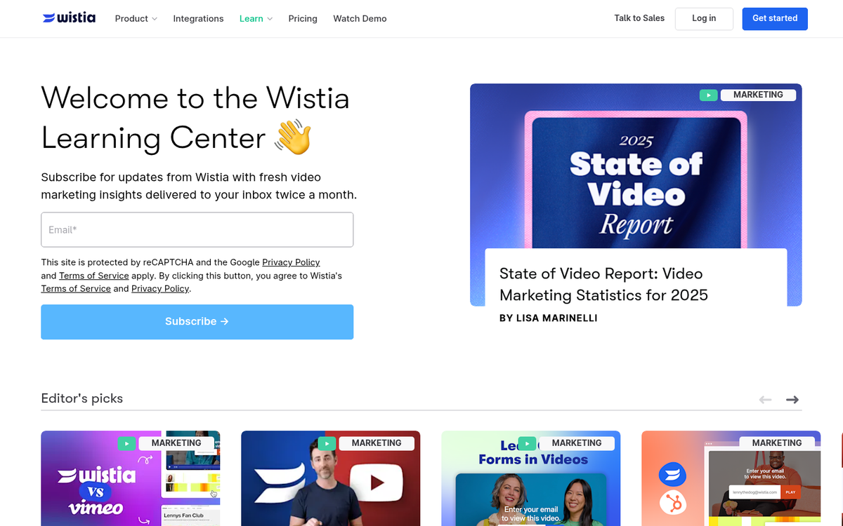
Wistia shows how you can manage a multi-author blog with different channels, and it gives every reader a number of possible content they can like. They include product-focused content and general marketing content to help educate readers. Near the bottom, they also have a helpful set of tags for new users to browse to see what the blog contains.
2. Coke

Coca-Cola merged a few blogs into one main hub. Their design makes use of soft soda imagery and comes across as a fairly dense magazine showing a number of topics, ranging from investor-focused profit recaps to nutrition breakdowns to discussions of sustainability and upcoming products.
3. Evernote

Evernote is a productivity app, and their blog supports their mission of bringing productivity-improving features to their audience. They have discussions of their own product and developments, of course. But they also cover a number of related topics. They have articles about other apps that can be used in conjunction with their own, and more general articles with tips on how to get your life together.
4. Starbucks Stories
Starbucks, founded in 1971 and now operating more than 35,000 branches globally, has a blog that isn't necessarily the kind you would expect to see. Very little of their blog is about coffee or their products. Rather, they know their audience and the concerns of those who follow them. Thus, large portions of their blog are concerned with ethical sourcing for their coffee beans, content about community impact, and how they're investing in sustainability initiatives around the world.

Where are you involved, and how can you show it?
5. Rocket Mortgage (formerly Zing by Quicken Loans)
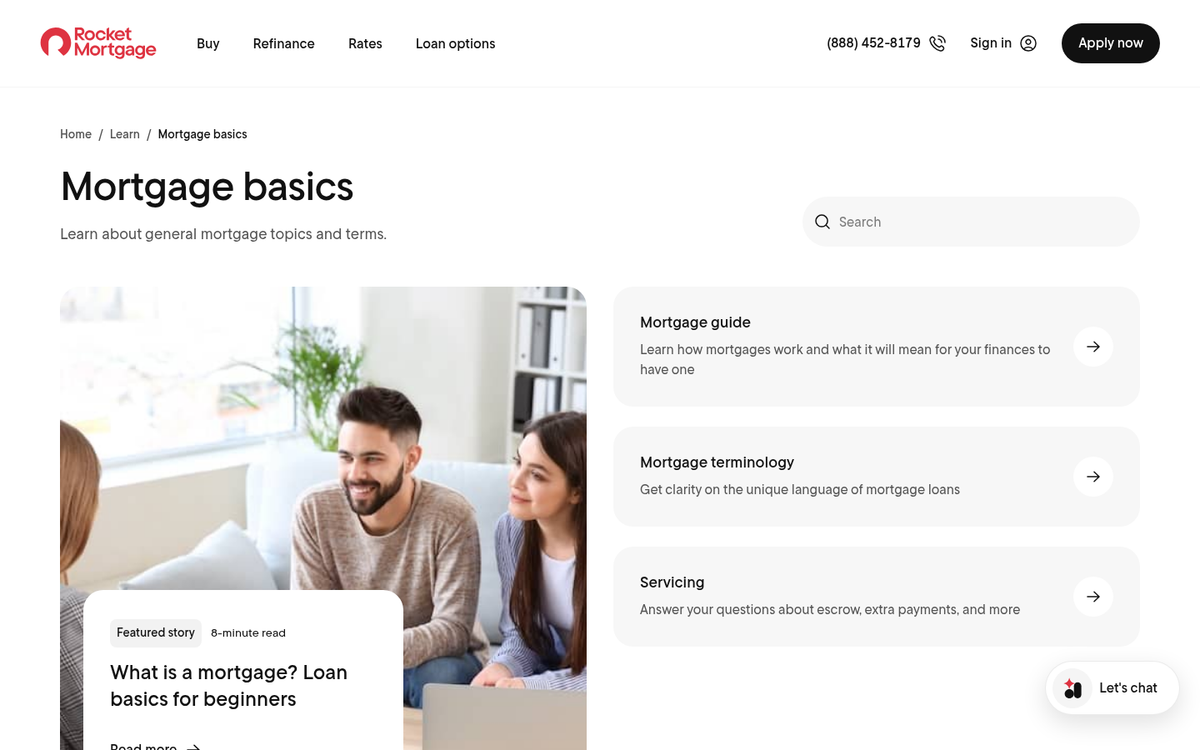
Rocket Mortgage is a financial company, and as such, their blog covers a number of financial topics of great concern to their readers - everything from mortgage rate patterns to home renovations that add value. They do a good job of sticking to helpful, educational information that serves those who are actively in the process of making financial decisions.
6. REI
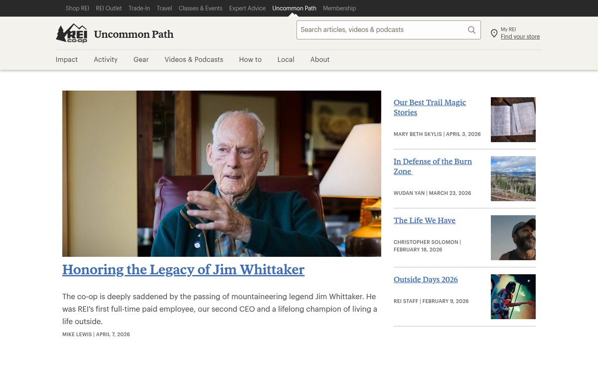
REI, at first look, seems like it should be a blog all about camping. But there's quite a bit more to it than that. They cover basically everything you would want to know about an outdoor and active lifestyle, from product reviews to skills you should learn to packing checklists. The best part of the blog is how visual it is. Every post is accompanied by a large thumbnail showing the general topic, and they have some well-produced, quality videos throughout.
7. First Round Review

First Round Review is a brand focusing on raising funding in the first round, primarily focused on new businesses. Their blog covers a number of different yet relevant topics, ranging from why startups fail to questions that drive growth. The power of the blog is in their depth. Everything they publish is a deep dive on a topic - thousands of words of great advice that are far better compared to what other blogs are willing to give you. If your own blog isn't growing fast enough, studying how First Round Review approaches long-form content is a great place to start.
8. Stonyfield
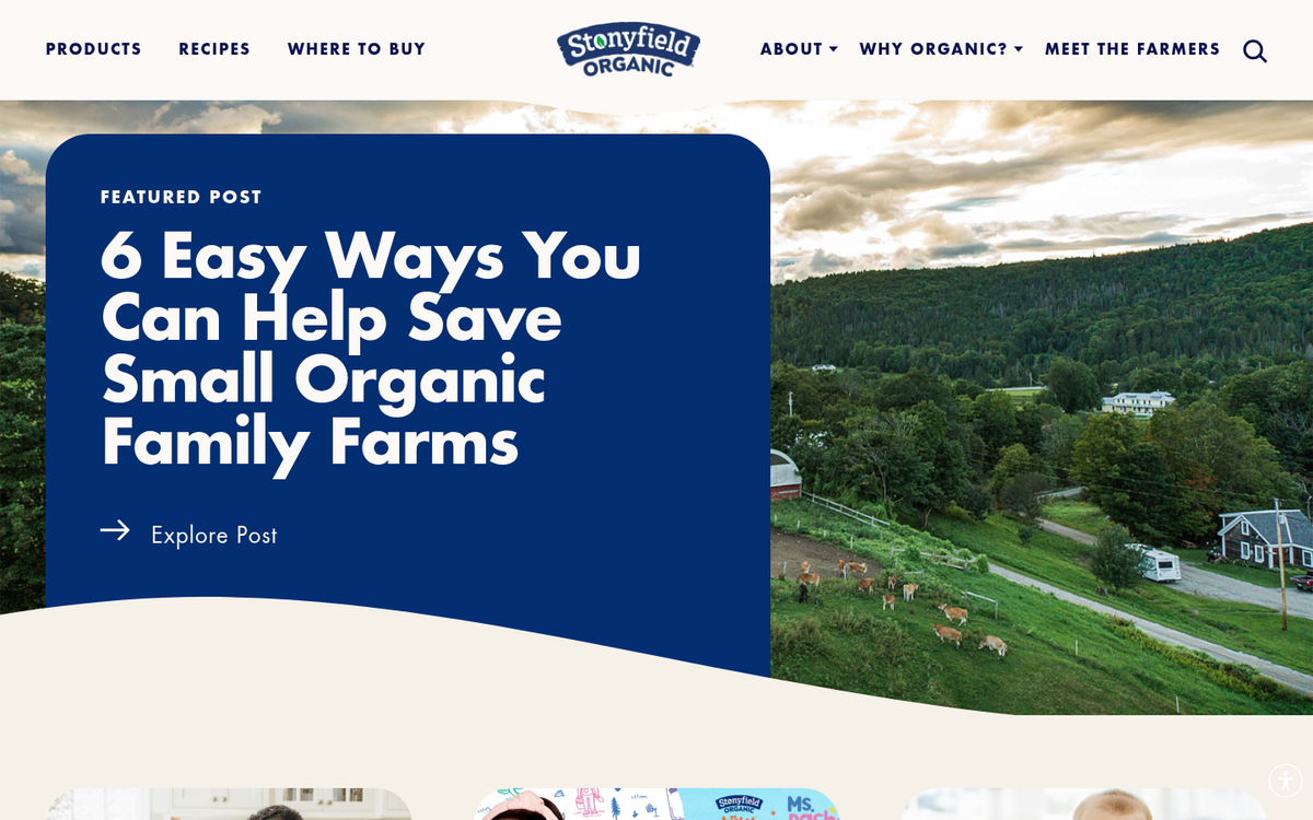
Stonyfield is an organic yogurt company, and their content aligns well with the interests you would expect them to have. They celebrate Earth Day, cover local issues, talk about what they fund, and give you ideas on how to use their yogurts. What matters most about this blog is their design - it's simple, and yet fits their brand image well, with light colors and cheerful graphic design.
9. Zillow
Zillow Research is a clean, straightforward blog that doesn't try to be cute or clever with their content. They're a real estate company and they deliver information about real estate topics, ranging from housing market patterns to data about mortgage rates and cost of living. Nobody reads Zillow's blog because they're passionate about the topic - they read it to learn about these issues while they're in the process of buying or selling a home.

You don't need anything else, as long as you satisfy that need.
10. PGA Tour

The golf association here has multiple blogs controlled by tabs at the top: the equipment report, the stats report, and the style report. All three are narrowly focused on their topics, but they go deep within them. Equipment covers everything from new product releases to personal stories from players about their gear. Stats is more what you would expect, with data and performance breakdowns for the analytically inclined. Style frames their events as a showcase and discusses player outfits and product lines.
11. General Mills
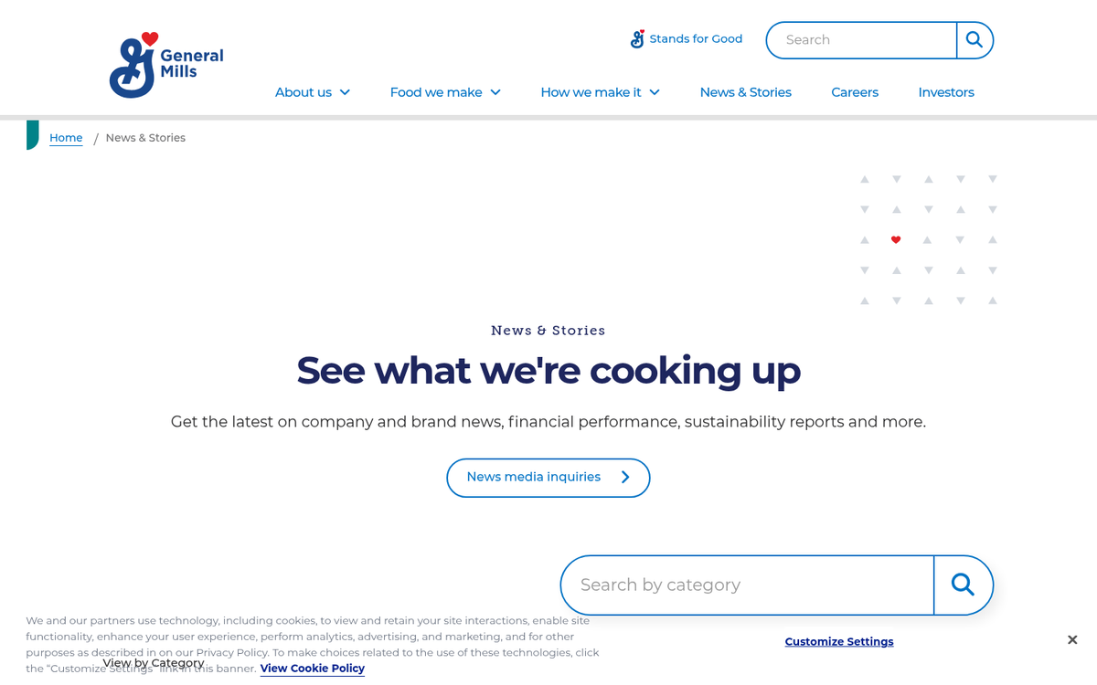
This food company's website will look familiar if you've looked at some of the above entries. Rather than talking about their products or brand directly, they talk about their widespread responsibility, research into farming, and more. They find that even though their consumer-facing businesses appeal to large audiences, their corporate blog is for an adult audience interested in sustainability, nutrition, and business practices.
12. The Wall Street Journal
WSJ is one of the foremost examples of substance over form. They're a newspaper, and they're here to give you the news. Rather than adapt to the blogging world, they've warped the blogging world around them. Their homepage looks like a newspaper, with plenty of dense stories to read and a number of topics to discover.
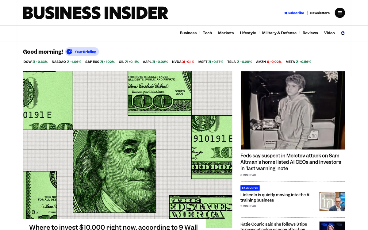
13. Business Insider
Business Insider covers business, yes. But they cover more than that as well. Click through and scroll down their homepage, and you'll see plenty of business news and widespread coverage. But you'll also see lighthearted content mixed in. Their willingness to blend reporting with more accessible, shareable pieces has helped them build a wide and loyal readership.
14. TechCrunch

One of the main differences between TechCrunch and other blogs is in the layout. Rather than following the standard navigation-across-the-top convention, TC takes a different approach with their structure - it's also a very readable design for modern devices, with clean fonts and a layout that works on desktop and mobile.
15. NPR
NPR is the National Public Radio network, and one of the things that has always set their website apart is a degree of personalization. The site uses your geographic location to surface locally relevant content and connect you with local NPR stations - an up-front way to give you personalized and locally relevant news at a national scale.
16. The Verge
The Verge is a blog about tech and pop culture, and they've set their design in that direction. A strong visual identity, strong use of color, and a layout that prioritizes their top stories makes the site look great in a crowded field. They do a good job of creating a hierarchy between their featured content and everything else on the page. If you're looking to style your own blog theme to stand out similarly, it's worth studying how sites like The Verge balance branding with readability.
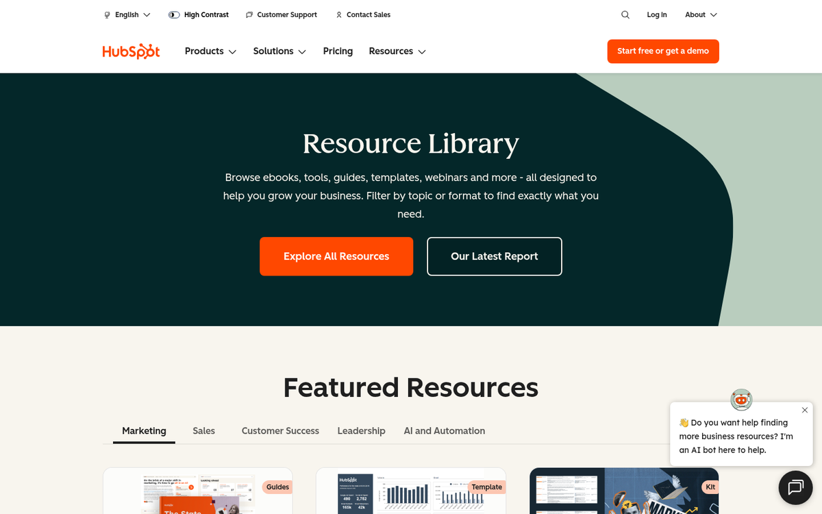
17. HubSpot
HubSpot has taken scaling their site to new heights. Over time, their blog has grown from one focused blog to a few interconnected ones, all still relevant to their audience at large. Their resource library is enormous, and they back it up with data - they're the ones reporting that businesses prioritizing blogging are 13 times more likely to see positive ROI. They practice what they preach.
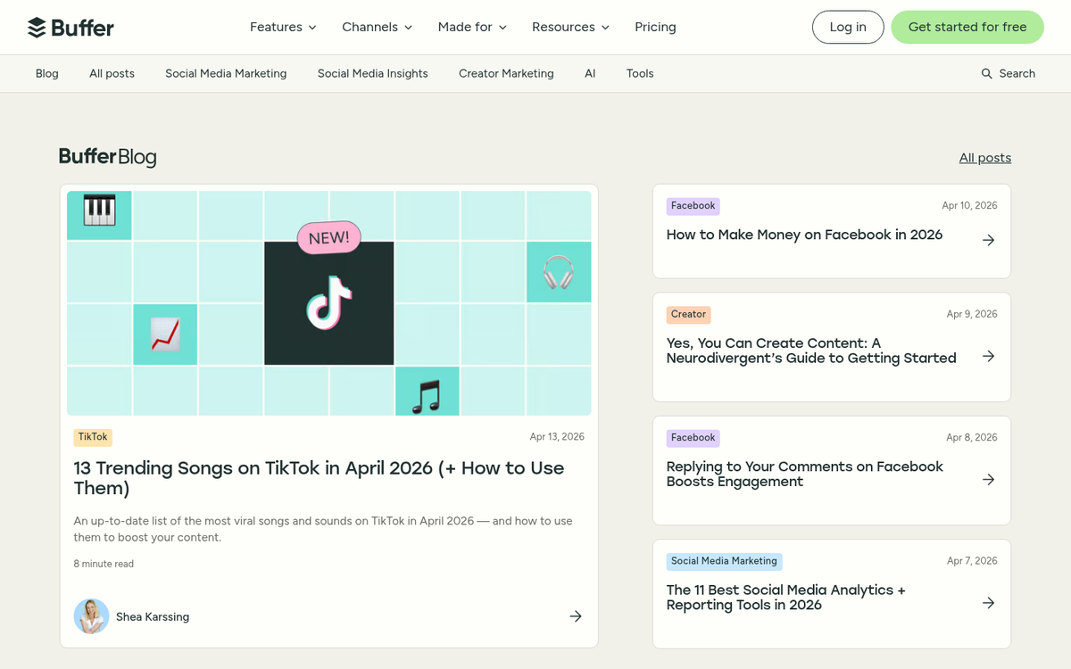
18. Buffer

There's nothing in the design that makes Buffer's blog look great. What works is the quality of their content. They don't just build case studies - they put their money where their mouth is. Every single post they publish has the potential to be a heavily cited source for dozens of other posts around the web. That builds a tremendous amount of credibility - not to mention links.
19. Figma
Figma's Resource Library is a great example of what a product-focused content hub can do when executed well. Rather than a traditional blog, they've built a destination for designers to learn, study templates, and get more out of the tool. The results speak for themselves - Figma's Resource Library has seen organic traffic value grow by over 2,000%, which makes it one of the more impressive content growth stories in the SaaS space.
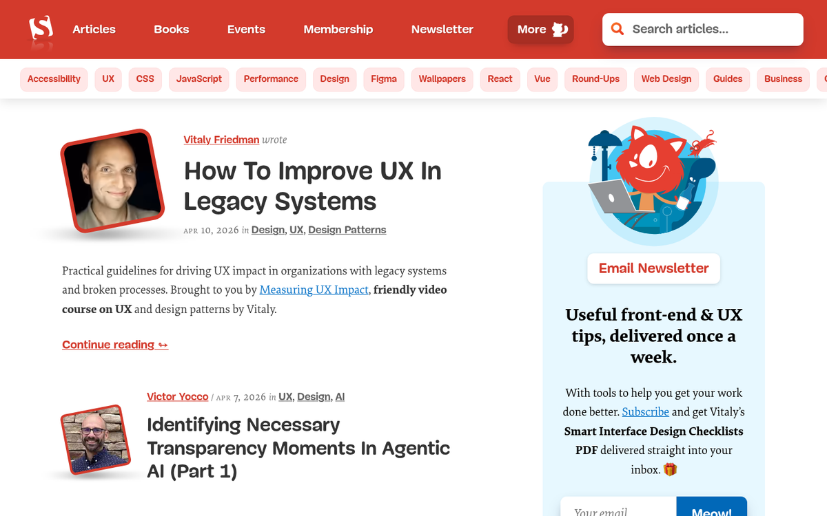
20. Smashing Magazine
Like the WSJ, Smashing Magazine takes its origin as a publication and uses it to inform their design. Unlike WSJ, they use that to bring as much style as they can to their online pages. They make full use of their screen real estate while keeping great graphic design present at all times, which results in a blog that feels as polished and considered as the design content it covers.