Should You Redirect 404 Page Errors on Your Blog?
Published by Drew Hendricks • Search Engine Optimization • Posted August 30, 2019 ContentPowered.com
Did you know that there is likely a ton of traffic coming to your blog that simply has nowhere to go? People who arrive at a broken link, people who mistype a URL, people who try to go to a page that moved or no longer exists; all of this traffic ends up on the familiar, dreaded, 404 page.
The 404 page is part of the core infrastructure of the internet. The protocol that the internet uses to route traffic and load data, the Hyper Text Transfer Protocol, has a series of standard response codes or status codes that convey information. Some of them are simple acknowledgements that a directive was processed successfully. Some of them are errors that tell people who know what they mean where in the process something went wrong. For example, a 502 error occurs when a server acting as a gateway failed to receive a response from the target server.
A server 404 error means that the destination page cannot be found. The page might have existed in the past but no longer exists, or it may not exist yet but will exist in the future. It might also be a malformed URL leading to a page that doesn’t exist.
Different websites handle the 404 error in different ways. Some of them handle it gracefully, while others do not. Let’s look at different options you have, and whether or not you should use them.
The Raw 404
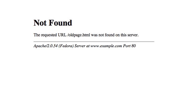
The raw 404 error is the basic browser 404 error page. This occurs on a site that does not have any 404 page configured in any way. It looks more like a browser error than a website error, and it provides absolutely zero value to the user.
Here’s an example. Rense.com is a weird page run by a guy named Jeff Rense, who is a run of the mill conspiracy theorist radio host whose knowledge of web design – and science, and politics, and reality – is virtually nonexistent. If you try to visit a page on his side that doesn’t exist, like this one, it results in a simple server 404 error. There’s nothing to it; a banner that says Server Error, the server error and its description on a light gray background.
This is the default for old web design, but most modern sites handle it a little more gracefully. If your site brings up a page like this when you visit a URL that doesn’t exist, you need to change it.
There’s absolutely zero reason to keep this style of 404 page on your site. I’ve seen some people argue that it allows you to record the number of errors from people arriving on your site, but so do formatted 404 pages. This provides zero benefits and makes it look like your site doesn’t even exist. If a simple typo in a URL or link can lead to a page like this, it’s actively harmful to your site.
The Homepage 404
One option a lot of novice marketers use is the homepage-redirect 404. Websites that do this simply direct you to their homepage when the page you’re trying to reach cannot be found.
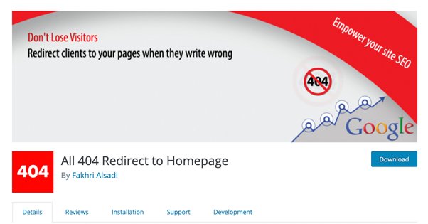
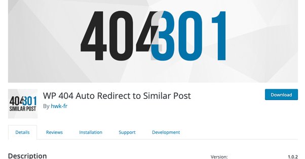
Here’s an example. CLogica is a company that creates WordPress plugins and other forms of coding and development. If you try to visit a page on their site that does not exist, for example https://www.clogica.com/web, you will be taken directly to their homepage. I found this website, by the way, because they are an example used in a WordPress plugin that implements this redirect.
Now, this isn’t a good idea for a 404 page. On the one hand, it makes sure your users know your site is alive and gives them a “fresh start” for choices of where to go. On the other hand, users who were looking for a specific piece of content might just bounce.
Additionally, Google still treats this as a 404 error. They know about the redirect, and they still choose to treat your homepage as a soft 404 page. This doesn’t necessarily penalize you, at least not much, but it’s needless complexity and it doesn’t benefit you much at all. For that reason, I don’t recommend this option.
The Graceful 404
The graceful 404 is what most modern website platforms use. At least, it’s what modern platforms like WordPress use by default, unless you configure it differently.
Many sites based on WordPress handle 404s this way. When you try to arrive at a URL that does not exist, you still get the basic template for content on the page. This beauty blog based in the UK is a good example. There’s no content on the page, simply a 404 error. However, you still have the title of the blog, the header with navigation, and the footer with any information you choose to add to it, which in this case is just a copyright and theme credits.
Chances are, this is the kind of 404 page your site currently uses. It still allows you to record information about 404 errors on your site, but it also gives your users some options. Rather than thinking the site doesn’t exist, they know the site exists, even though the content they were looking for does not. They can choose to browse your site through the navigation if they want.
This is generally a decent baseline option. It’s not the best option, but it’s better for users than the raw 404. On the other hand, you can get a lot more value out of your 404 pages, so I don’t recommend this option either.
The Landing Page 404
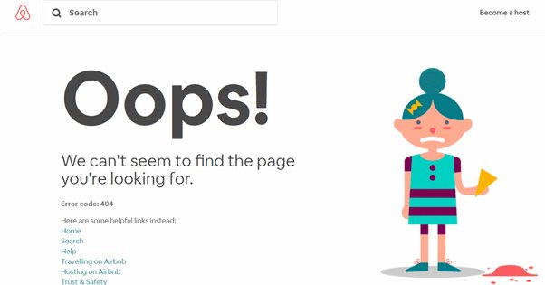
The landing page 404 is a style of 404 page that converts your 404 into a basic landing page. This may not even look like a 404 page to some users, though in general it still has some basic 404 information on it.
Nike is actually an example of this. In their online store, if you try to visit a page for a product that doesn’t exist, you are taken to a 404 page. This page, specifically. It has a header that makes it clear that the product the user was looking for is not available, but it offers other products the user might be interested in. It also has the usual top bar header and bottom bar footer full of navigation if the user wants to browse instead.
There’s a variation of this that many pages use that, instead of providing a few products as a landing page, provides a search. Moz is a good example of this one. When you visit a URL that doesn’t exist – like the link I provided – it brings you to a page formatted with all of their usual top and bottom navigation, but also a search bar in the middle of the page. If you know what you were looking for, you can search for the real page quickly and easily.
Neil Patel even recommends the option of using an exit intent pop-over with a coupon or offer code for people who arrive on your 404 pages. If a user lands on your 404 and has any intent at all to buy, giving them an offer can feel almost like an easter egg. It’s a clever use of space that otherwise wouldn’t be useful.
Both of these options are, to me, better than a graceful 404 by a mile. They provide additional options and value to users, without confusing them about the lack of the original content they were looking for.
The Resource 404
One step up from the landing page 404 is the resource page 404. The concept of this kind of 404 is pretty simple. You acknowledge that the page the user was looking for does not exist, but then you provide them with a series of other options for content they might want to find. Moz, up above, is almost like this. That’s because their footer has a ton of evergreen links to content people generally want to see. However, since that’s part of their general footer, I don’t consider it a true resource page 404.
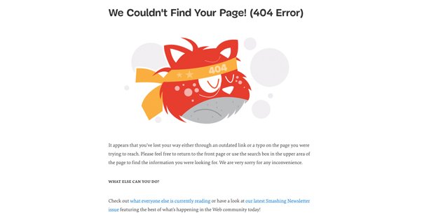
Another possible example is Smashing Magazine. Their 404 page apologizes for being a 404 page, but it gives you a few other options. You can click a link to see their homepage, view their latest newsletter, or take action to report the 404 through Twitter or their contact form.
I consider the resource page 404 to be one of the best options for a 404 page. You can customize the page to include a series of evergreen pieces of content, as well as options for getting in touch with you, and some more timely content the user might want to see.
Yoast is a similar example. Their 404 page offers some tips for getting the URL right a second time, a link to the homepage, and all of their typical header and footer information and links. Additionally, they have the search bar, and they have a widget that shows off recent posts. This page is almost a full resource hub, if not for the fact that it’s missing the core content.
The Smartly Redirected 404
The option I prefer the most, and the option we have implemented on the site you’re reading right now, is the intelligent redirect 404 option.
This option redirects your 404 pages, but rather than sending users to the homepage and creating a detrimental soft 404 page, it analyzes what they were probably going for and brings them to that page. It makes URLs “fuzzy” in a sense; similar URLs redirect to the proper, canonical URL.
For example, here’s a recent post we wrote. The full URL is https://blogpros.com/blog/2019/08/start-travel-blog-money. However, if you do something like remove the date, you get https://blogpros.com/blog/start-travel-blog-money. That link directs to the canonical link appropriately. It even works if you cut out most of the URL, so you’re just left with https://blogpros.com/blog/start-travel. Incredible, right?
It takes a lot to confuse this kind of plugin. If there’s no page with a similar URL – something like https://blogpros.com/blog/blah-blah-blah – then the plugin won’t properly redirect to anything. This is where having a secondary backup plan is helpful as well. Ours, as you can see, is a graceful 404 with a search box, the header and footer navigation, and the sidebar we have on every page.
Admittedly, we could improve it, but why? 99% of the time, people arriving at broken URLs will be redirected to the appropriate URL. In this case, we could even get away with redirecting other 404s to our homepage, because there’s no clear intention of where the user wants to go in those cases.
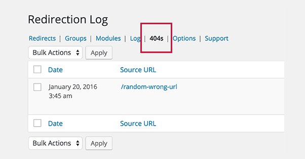
It’s worth noting that you can still see referrals linking to pages that don’t exist, so you still have 404 data you can use to troubleshoot. I still recommend contacting people who use broken links to point to your site, just in case their users use a redirect-blocker or no-script plugin that stops redirects. It’s always better to use a proper link whenever possible. It’s just a good fallback.
Over to You
Your turn. Show off your 404 pages! What kind of 404 page do you have, and what kind do you want to have, if you could put one together? Have you found one method to be more effective than another? Personally, I’m a big fan of our current smart redirect. It’s graceful, it helps fix basic link copying errors, and it still provides value if the user gets past it.

