


Key Takeaways
- Google’s Mobile Usability Report flags pages as Valid or Error, but Valid pages may still have minor usability issues worth investigating.
- Use the URL Inspection Tool alongside the Mobile Usability Report to catch smaller errors that the wider report may not surface.
- Prioritize the most common errors first, since one underlying fix can resolve hundreds of flagged pages simultaneously.
- Key mobile errors include incompatible plugins, viewport issues, content wider than screen, small text, and clickable elements too close together.
- WordPress-specific issues include Google indexing unnecessary folders; deindexing attachment pages and keeping themes updated resolves most problems.
Mobile internet usage has continued to climb year over year, and as of 2026, well over 60% of all global web traffic comes from mobile devices. Google has reflected this reality in its ranking systems for years, and if your site isn’t delivering a mobile experience, you’re leaving rankings and users on the table.
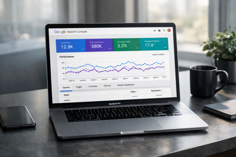
Of course, there’s more to mobile success than just mobile compatibility; it’s why Google has a Mobile Usability Report. You can run this report on your website and it will give you a rundown of any errors, problems, or bugs you’ll have to work out to make your site the best it can be.
A lot of what I’ll be referencing comes from either the Google Search Console help documentation or the mobile usability report itself. To access the mobile usability report, you’ll have to have your website added to Google Search Console. Once that’s set up, you can view your report directly within the Search Console dashboard.
Two Step Process
There is actually something of a two-step process involved with mobile compatibility.
At the top level you have the Mobile Usability Report in Google Search Console - a top-level scan of your entire site that will produce a report with up to 1,000 rows of data. Every page, up to 1,000, on your website will be labeled as either Valid or Error.
An Error page means that your page has some mobile usability error on it. In the summary view that shows errors and the number of pages affected, the pages will be listed as well.
A Valid page does not mean the page is perfect. A Valid page is basically one that does not have any of the top-level errors Google checks for - it may still have minor usability issues, which is why the second step of this process matters.
The Usability Report will flag pages that fall below minimum usability thresholds. If a page meets those minimum thresholds, it may still show as Valid even with minor imperfections. If it drops low enough, its errors will be surfaced.
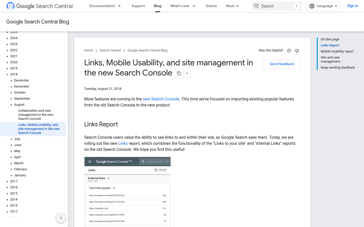
The second step of the process is Google’s URL Inspection Tool, built directly into Search Console - this tool lets you test a URL and see how Google renders and evaluates that page, including mobile usability signals. You can use it to spot-check individual page types like landing pages, blog posts, category pages, and so on, to make sure they’re free of smaller errors the wider report might not surface.
In short, you want to use the Mobile Usability Report to check that your site meets basic minimum usability standards for mobile users. Once you’ve diagnosed and fixed those errors, you can use the URL Inspection Tool to verify that individual pages are rendering correctly and cleanly.
General Tips
Google has a few general tips, and I’ve a few more, for tackling mobile problems as they come up.
First, get a prioritization pass. Google will sort out the errors on your site based on their occurrence rate. The more common an error is, the higher on the list it will be. Tackle the most common problems first to get the largest improvement in your site’s validity score.
Don’t get overwhelmed or discouraged by large numbers. If your website has 500 pages and they all share one common error, Google will tell you your site has 500 errors, which can seem a bit scary. However, fixing that one underlying issue clears up everything at once, so it’s much easier than the number seems.

Remember that your data is limited. The error reports can only surface up to 1,000 rows, so if you have a website with, say, 1,500 pages and 1,200 of them have an error, you’ll only see 1,000 errors listed. You’ll need to fix problems and then re-run the report to make sure that you’ve caught everything.
Don’t be afraid to do more research - each error type in Search Console includes a link to Google’s help documentation describing the error, its causes, and common fixes. Since we’re talking about WordPress, you can count on there being great third-party documentation available as well, given how widely used the platform is. You might also consider running your WordPress blog from your phone to test how your site feels to real mobile users.
Sometimes your report will show a sudden spike in the number of pages flagged as errors even if you didn’t change anything on your site - this usually happens when Google adds a new check to their evaluation criteria. Think of it this way: if Google has a 10-point checklist and you pass all 10, but they add an 11th that you fail, you’ll see a spike in errors even though you haven’t changed a thing.
Google moving the goalposts is frustrating, but it’s part of the reality of running a website that depends on organic search. Google has been continuously updating its standards for years, from algorithm updates like Panda and Penguin all the way through to the mobile-first indexing rollout and the Core Web Vitals initiative. Mobile usability has been an official ranking factor since April 21, 2015, and the bar has only risen since then. Keeping up with these changes is also why it pays to work on improving the indexing of your blog posts on an ongoing basis.
Errors, Causes, and Solutions
So what kinds of errors can you see in the Mobile Usability Report? Here are the main errors that currently appear. Google can add new checks at any time, so if something new shows up that isn’t covered here, drop a comment and I’m happy to dig into it.
Uses Incompatible Plugins - this error means that your page uses a plugin or technology that’s incompatible with mobile web usage. The most common historical culprit was Adobe Flash, which reached official end of life at the end of 2020 and is no longer supported by any browser. Other outdated multimedia plugins like Silverlight fall into this category as well. If you somehow still have Flash-based content on your site, it needs to go. Replace it with HTML5 video, CSS animations, or JavaScript-based alternatives. There is no viable path forward for Flash on the modern web.
Viewport Not Set - this is a sizing and scaling error. The viewport meta tag tells the browser how to scale and display the page content on the device being used.
Setting the viewport is a foundational ingredient of responsive web design. The old strategies of building a separate mobile site on an m. subdomain or creating a handful of fixed-width adaptive layouts are no longer viable. The number of screen sizes across phones, tablets, and foldable devices makes it impossible to manually account for every variation.
The viewport is configured in your page’s meta tags, usually set to width=device-width with an initial scale of 1.
A related error is Viewport Not Set To Device-Width, which means your viewport is configured with a fixed width instead of the device-width value. This is seen in older fixed or adaptive designs and needs to be updated for modern mobile standards.
Content Wider Than Screen - this error means that whatever mobile device is visiting your site has to scroll horizontally to see your content. Horizontal scrolling on mobile is a poor experience - it makes reading tedious and prevents users from taking in wide content like images or tables at a glance.
This error usually comes from fixed pixel widths or absolute CSS positioning. For example, an image set to start 500 pixels from the left edge of the screen will look fine on a desktop monitor but will push content off-screen on a phone. The fix means replacing absolute positioning and fixed widths with relative units and flexible layouts as part of a responsive design approach. A plugin can help make your WordPress blog mobile friendly if you’re not comfortable editing CSS directly.
Text Too Small To Read - this error is triggered when your body text is too small for comfortable reading on a mobile screen without zooming in. Forcing users to zoom in also forces them to scroll horizontally, compounding the previous error.
Google flags text as too small when it falls under 12 pixels, which is the minimum threshold. But 16px is the more broadly recommended font size for comfortable mobile reading. The answer isn’t simply bumping up a single font-size value - it means implementing scalable, responsive typography so text sizes adjust fluidly based on the device and viewport. Google’s guidance suggests targeting roughly 70 to 80 characters per line, or about 8 to 10 words of English text, as a readability target for line length at mobile sizes.
Clickable Elements Too Close Together - this is the final error type in the report. When links, buttons, or other tappable elements are positioned too close to each other, users frequently tap the wrong one, which is frustrating and erodes trust in your site.
Google’s standard for tap targets is a minimum size of 48 CSS pixels (approximately 7mm), with adequate spacing between targets that fall below that threshold. This applies to navigation links, buttons, form elements, and any other interactive element on the page. Elements that meet this size and spacing standard are much easier to tap accurately on a touchscreen without accidentally triggering adjacent elements. If you’ve recently made changes and noticed a drop in traffic after addressing these issues, it’s worth knowing how to fix a drop in traffic on a blog post.
WordPress Errors
All of the above can be problems with WordPress, but WordPress can introduce a few extra scenarios that trigger these errors. For example, if Google is indexing your wp-content/uploads folder, it may see raw media files or attachment pages that trigger usability flags - even though these aren’t pages your users actually need to visit. The answer is to deindex folders and page types that serve no value to users. Blocking unnecessary paths in your robots.txt file and configuring your SEO plugin to noindex attachment pages are good practices here.
Beyond that, keeping your theme and plugins up to date, auditing for any legacy shortcodes or embeds that might reference outdated technologies, and ensuring your theme is built on a legitimately responsive framework will address most mobile usability errors in WordPress. Once you have a responsive foundation in place, most of these problems simply don’t come up.