


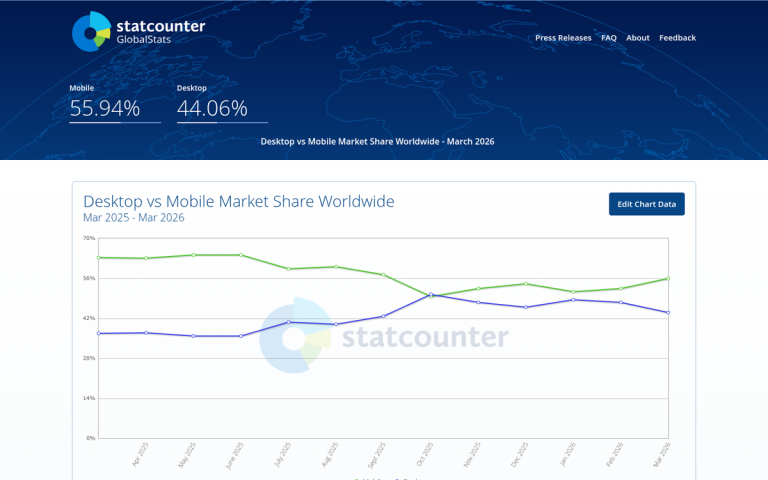
These days, if you don't have a mobile-friendly website, you're leaving an enormous amount of traffic on the table. Mobile devices now account for over 70% of global web traffic, with e-commerce alone seeing mobile account for nearly 72% of all traffic according to Contentsquare's 2024 analysis. That number has grown dramatically over the past decade and shows no signs of slowing down. Mobile traffic is especially valuable for local businesses, as a huge portion of mobile use is driven by local search intent. If that's not reason enough, consider this: since 2016, Google has used mobile-first indexing, meaning it primarily uses the mobile version of your site for ranking purposes. A poor or missing mobile experience doesn't just cost you visitors - it directly hurts your search rankings.
Convinced? Here are some ideas on how you can cater to mobile traffic.
Key Takeaways
- Mobile devices account for over 70% of global web traffic, and Google has used mobile-first indexing since 2016.
- Responsive design is Google's recommended approach, dynamically adapting layouts across all devices rather than maintaining separate mobile sites.
- Optimize for conversational, voice search, and local keywords, as mobile users frequently ask full natural-language questions.
- Page speed is critical - a 5-second load time causes a 90% higher bounce rate compared to a 1-second load.
- Leverage mobile-specific features like click-to-call, store locators, and one-tap actions to reduce friction and boost conversions.
Decide Between a Dedicated Site or a Responsive Design

The first choice you need to make is between having a dedicated mobile site on a subdomain, or a responsive design that works for all devices.
A dedicated mobile website is comparatively straightforward to create, as it's essentially a streamlined, pared-down version of your site. It displays on a URL of its own, such as m.example.com. A mobile site has notable drawbacks, however - you have to maintain two sites on two URLs instead of one. If you update a piece of content, you need to update it in both places. It also needs to work across a wide variety of devices with different capabilities and screen sizes.
A responsive site is much more dynamic. It uses flexible code that detects the size of the user's browser window and adapts the layout accordingly - reorganizing text and images, pruning heavy multimedia on smaller screens, and delivering a clean experience across all device types. Responsive design is the approach Google recommends, and it's become the industry standard for good reason. While it may require more upfront development investment, the cost to make a site mobile friendly is worth it long-term and performs better across the ever-expanding range of devices in use today.
Whichever you pick, you need to implement other aspects of mobile SEO.
Keyword Emphasis: Conversational and Voice Search Keywords
Mobile search behavior has evolved significantly. While shorter keywords still matter, the rise of voice search via Siri, Google Assistant, and other tools has made conversational, natural-language queries increasingly important. Mobile users frequently ask full questions rather than typing fragmented keywords - think "best pizza place near me open now" rather than just "pizza." Optimizing for these longer, intent-driven phrases is now just as critical as targeting short keywords. Focus on a mix: concise keywords for typed search, and natural, question-based phrases for voice search.
Keyword Emphasis: Local Keywords
Another emphasis you should make when catering to mobile devices is local. A huge amount of mobile search traffic is specifically geared towards local traffic. If your business has no local presence to play on, you're out of luck here. On the other hand, if you have a physical location and can optimize around it, you'll have a clear advantage over general or global companies that don't serve your area. Make sure your Google Business Profile is claimed, accurate, and optimized - it plays a major role in how you appear in local mobile search results. A mobile-friendly website can also help you capture more of that local search traffic before it goes to a competitor.
Keyword Emphasis: Semantic Search

Semantic search has matured well beyond its early days. Rather than matching a handful of keywords, Google now deeply interprets user intent - understanding context, phrasing, and the relationship between concepts. Semantic search is your opportunity to cater to users asking plain English questions, and it's especially relevant on mobile where voice queries are common. Creating content that directly and clearly answers specific questions will position you well for both traditional and AI-assisted search results.
Front-Load Content Value

Mobile users don't like having to dig for their content. They don't like scrolling through lengthy, poorly formatted pages to find what they need. Research shows that 61% of users are unlikely to return to a mobile site they had trouble accessing, and mobile users are five times more likely to abandon a task if the site isn't optimized. The closer to the top of the page your key information sits - and the better it's formatted for quick skimming - the more likely users are to stay, convert, and return.
Make Use of Mobile Features
Mobile devices offer a number of features that aren't applicable to the standard desktop user. You should configure your mobile site to take advantage of those features. For example:
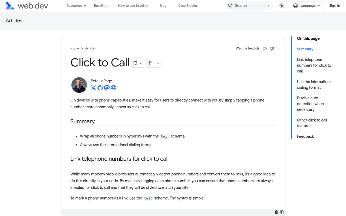
- Click to call functionality allows a user to tap a phone number and have their smartphone automatically dial it - essential for local businesses tracking phone calls.
- Mobile coupons and offers allow users to access special in-store promotions via their smartphone, driving foot traffic and immediate conversions.
- Store locators aren't unique to mobile, but making them prominent in your mobile experience directly serves one of the most common reasons people visit a local business's site.
- One-tap actions such as directions, appointment booking, or instant messaging integrations reduce friction and make it easier for mobile users to take the next step without typing.
Consider a Task App
Do your users typically visit your mobile site with one or two particular tasks in mind? Consider creating an app that allows them to perform those tasks efficiently. You can offer it for free to improve retention, or charge a small fee to create an additional revenue stream.
One thing you should avoid, however, is hiding your website content and forcing users into the app. Google's crawlers index your website, not your app. If you move key functionality exclusively into an app, you'll lose the organic search traffic that would have found it on your site.
Prioritize Speed - It's Non-Negotiable
Your mobile site needs to load fast. Research shows that a 3-second load time results in a 32% higher bounce rate compared to a 1-second load, and a 5-second load time spikes that to a 90% higher bounce rate. Mobile users have even less patience than desktop users - they're often on the go, on slower connections, and looking for quick answers. Compress images, minimize unnecessary scripts, use a content delivery network (CDN), and consider implementing technologies like lazy loading to keep your load times as short as possible. Every second you shave off your load time has a measurable impact on engagement, conversions, and rankings.
Test on Various Devices

There are hundreds of device and browser combinations in active use. You have smartphones, tablets, and hybrid devices across a wide range of screen sizes. You have iOS and Android users, Chrome and Safari browsers, and varying network speeds. You need to test your website across a broad range of these configurations to ensure it functions properly for as many users as possible. Tools like Google's Mobile-Friendly Test and BrowserStack can help you identify and fix issues without needing physical access to every device. At a minimum, test across the most commonly used device categories and browsers to catch the most impactful problems before your users do.