Key Takeaways
- Landing page friction falls into four categories: Trust, Effort, Cost, and Technical - each requiring different fixes.
- Every landing page should have exactly one call to action; multiple options create indecision and increase abandonment rates.
- Page speed matters significantly - slow, image-heavy pages actively suppress conversions, with converting pages having 38% fewer images.
- Always be transparent about pricing; hidden fees erode trust and destroy both conversions and long-term customer relationships.
- A/B test every change individually, letting data guide decisions rather than assumptions about what your audience finds problematic.
15 Elements of Landing Page Friction (and How to Fix Them)
The first impression matters. In many ways, your landing page is that first impression. A link on social media, a paid search ad, a sponsored post - these could be considered a first impression, but they're more like an introduction. Someone clicking an ad link and arriving on your landing page is the opportunity you've been waiting for. It's a chance to make that good impression, and convert that user into a follower, subscriber, or customer.
Landing page friction is a concept tied into the sales funnel. Your sales funnel is an inverted pyramid. At the top, the widest part of the funnel, you have all of your various marketing efforts, putting your name in front of people who may have never heard of you before.
In order for those people to slide further in, they need an easy way to do so. A link, a phone number, whatever it is, it slides them to the next level of the funnel. This one would be a narrower level, fewer people in it, involving your landing pages.
Landing page friction is friction in the sales funnel preventing users from sliding even further down, to the inverted peak, where they have become customers. It's roadblocks, it's unanswered questions, it's poor landing page design, it's asking too much in opt-in forms. Anything that stops a user in their tracks and makes them pause the conversion process is friction.
Some elements of friction you can control. If your landing page design is making it hard for users to figure out what the next step they should take even is, then you can redesign your landing page. On the other hand, if the roadblock is the user's own financial situation, it's not really something you can fix. It's a sign you may need to target different demographics in your advertising, but it's not something you can fix on your landing page itself.
What I've done with this post is created a list of common causes of landing page friction, and suggestions of what you can do about them. This is by no means every possible cause, nor every possible solution. For that, you're going to want to really dig into landing page optimization. Still, even just identifying and fixing a couple of these issues will help a lot.
I've tried to categorize every element of landing page friction into one of four categories. The four categories are:
- Trust. A user has to trust you to be willing to convert, so anything that causes them to be skeptical of your landing page can turn them away. This can be anything from poor wording in a guarantee to a script error or strange URL that makes them think you might actually be a phishing site looking to steal their information.
- Effort. The more effort it takes for a user to convert, the less likely a user is to convert. This is why Amazon introduced - and patented - one-click purchasing. Every additional click, every additional form fill, every additional TOS to read; it's all additional points of friction that will turn off a certain portion of people who landed on the page in the first place.
- Cost. This one is obvious, and there's not usually a lot you can do about it. The cost of opting in or of making a purchase is going to be a roadblock for many people. Some elements can be changed, though, like being up-front with additional costs or fees instead of hiding them in footnotes or in the finalized cart.
- Technical. This one should be pretty obvious. If a user tries to click a button and nothing happens, that's a big element of friction. If they try to fill out a form and get an error, or if you don't accept a payment method they want to use, or a redirect is broken and they don't even land on the right page, these are all issues that have technical problems at their core. Fix them for an improved landing page conversion rate.
Most elements of landing page friction will fall into one of these categories. Think about all of them as you audit your own landing pages.
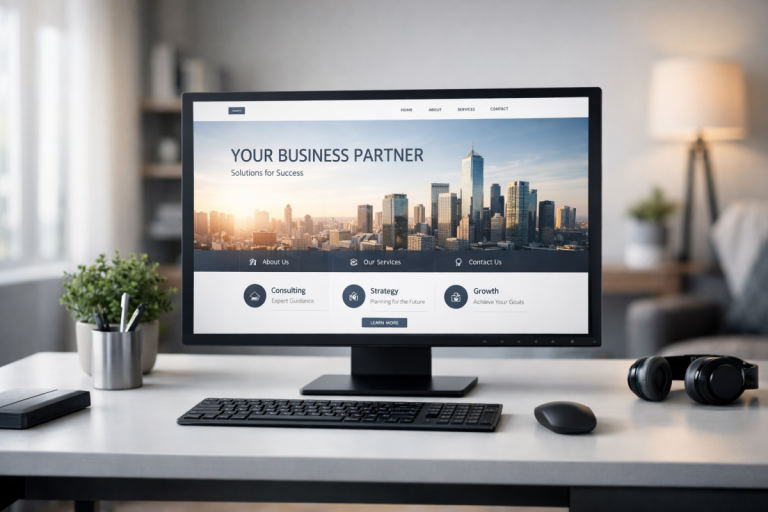
1. Is Your Branding Consistent?
Branding is part of Trust. Your landing page needs to have consistent branding with the rest of your company and website. Make sure your content is written in the same level of formality and tone, your color scheme is consistent with the rest of your branding, and so on. Remember, any little sign of inconsistency is enough to make many people skeptical, which will prevent conversions.
Don't forget to actually include your branding! I've seen a few landing pages where, if I didn't know the brand and the product, I would have no idea what the page was trying to sell me. It's one thing to include context from ads and other sources, but it's quite another to rely on it entirely.
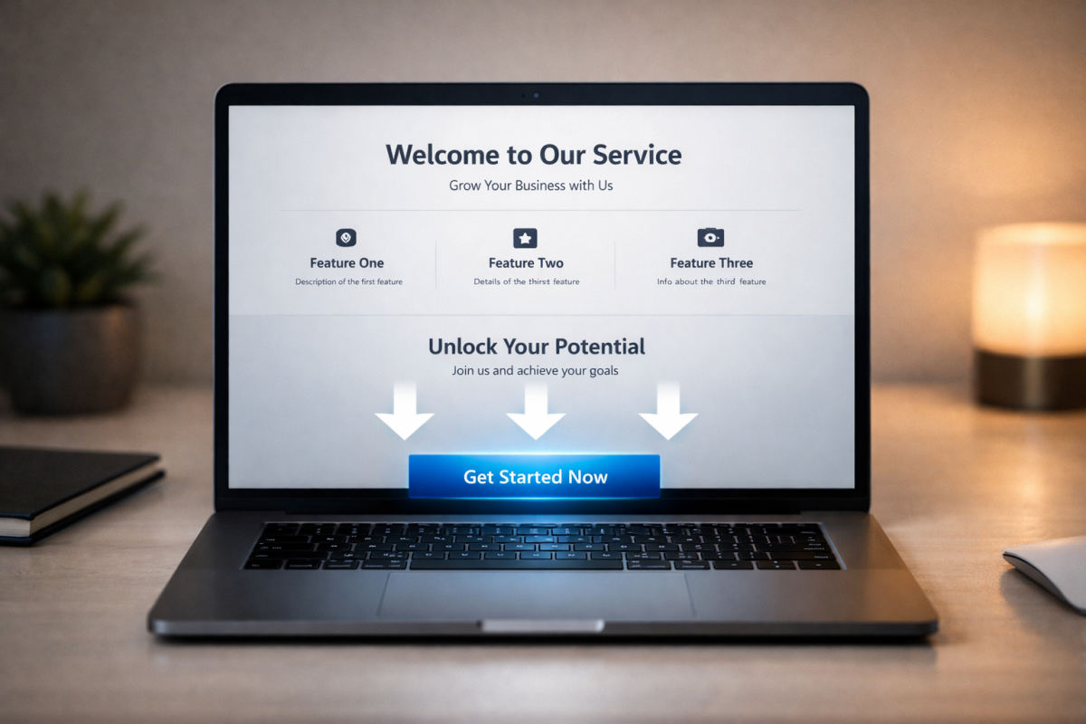
2. Do You Have Too Many Possible Actions?
Action focus is an element of Effort. Every landing page should have a call to action, but more importantly, every landing page should have exactly one call to action. Even if you make that same call to action five different times on the page, it's all the same call to the same action.
For example, if you have a form for a user to fill out to subscribe to your newsletter, but also a button they can click to add your product to cart, you're muddying the waters. Your copy won't be focused on one or the other, but will try to push both, to the detriment of both. Some users will be caught in indecision and will instead choose the third option, which is to leave.
3. Are You Asking For Too Much?
This is another element of Effort. Specifically, whenever you have a web form you need filled out by the user, try to get away with asking for as little information as possible. Some information you can harvest in the back end, like rough geographic location. Other pieces of information you need, like email address and name. Still others are extraneous, unnecessary pieces of information, like company name, number of employees, and so forth.
You can experiment with asking for that information but making it non-essential for submission of the form. Alternatively, simply ignore that information and ask for it at a later point in the conversion process. Figure out what works for you.
4. Does Your Landing Page Work?
I have to include this one as the representative of the fourth category, Technical. Always make sure to test your entire conversion process. Start with the ad that leads to the landing page; does it work? Does it redirect you properly, if there's a redirect? Do any split-tested variants work? Once you're on the landing page, are there tracking scripts or dynamic content, and do they work? Does your form or purchase process work?
Make sure to test every element every step of the way, and use multiple different devices and browsers. Make sure it works on mobile, works on Chrome, Firefox, Edge, and Safari, and so on. With mobile traffic continuing to dominate in 2026, testing across a range of screen sizes is no longer optional - it's essential.
5. Is Your Page Too Heavy to Load Quickly?
Page speed has grown into one of the most significant - and most overlooked - sources of Technical friction. Google's own research found that 36% of pages are larger than 2MB and 12% are over 4MB. Loading a 1.49MB page over a fast 3G connection can take as long as 7 seconds. Every additional second a user waits is another moment they might abandon the page entirely.
Closely related to this: research has found that pages capable of converting visitors have 38% fewer images compared to pages that couldn't convert. Bloated pages loaded with large images, autoplay videos, and heavy scripts are not just slow - they actively suppress conversions. Audit your page weight, compress your images, defer non-essential scripts, and use a content delivery network wherever possible.
6. Do You Require Too Much Time?
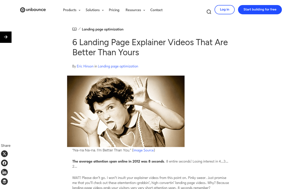
One problem I see with many landing pages is an over-reliance on an explainer video. Explainer videos can be a great way to convey potentially complex information in a small amount of space, and that's fine. However, a good landing page does not rely on the video to do the selling. Plenty of people might not have the time to watch the video, or they might not be in a position where they can afford the bandwidth, or they might not be able to listen to it. As an element of Effort and Cost, requiring too much time and investment from your viewers to even figure out what the landing page is about will suppress plenty of potential conversions.
7. Are You Hiding Price Information?
There are a few ways I've seen websites violate this element of Cost. If you have a landing page that specifies your product is $99*, where the * is fine print saying you have a per-month charge or a steep setup fee, that's deceptive and will drive users away.
If you have any sort of hidden costs or fees, don't try to hide them. Be up-front with the total costs of your service, so users know what they're getting into. In an era where consumers are increasingly savvy and quick to distrust, any hint of bait-and-switch pricing can destroy both the conversion and any chance of a long-term relationship.
8. Do You Have Social Proof?
This is an element of Trust. A good landing page includes elements of social proof to indicate that your brand is trustworthy. A notable client list, realistic reviews from real, identifiable people, case study snippets, or verifiable star ratings are all strong elements of proof. If you don't have any reputable sources yet, avoid fabricating social proof. Fake-looking testimonials are easy to spot and do more damage than having none at all.
9. Are You Encouraging Urgency?
Urgency is an element of Effort, though it flips the equation on its head. Rather than being a roadblock based on getting the user to expend effort, it forces a change in their own cost-benefit analysis.
When you express urgency - by offering a time-sensitive deal or a limited availability offer - you tell the user that sure, it might take effort to convert now, but it will be more effort and more cost later if they don't act. This encourages conversions. Just make sure any urgency you introduce is genuine. Fake countdown timers that reset on every visit have become widely recognised as a dark pattern, and in 2026 they erode trust more than they drive action.
10. Does Your Landing Page Have Flow?
This is actually a Technical element. Using directional elements like arrows and graphics can help keep users reading the page, progressing through the landing page towards conversion. Coupled with a heatmap to show what users are doing and where they're clicking, you can optimise how users experience your landing page. This also helps you identify and avoid instances where users are clicking the wrong thing, thinking it might progress the call to action.
It's also worth noting that the placement of your call-to-action form matters more than many people assume. A well-known A/B test by conversion optimiser Michael Aagaard found that moving a sign-up form below the fold on a B2C landing page resulted in a 304% conversion lift. The lesson: don't assume above the fold is always best. Let your audience and your testing guide the layout.
11. Does Your Landing Page Match Its Traffic?
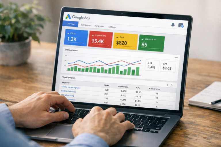
Matching the messaging of your ads and your landing pages is a big deal for two reasons. First, it's an element of Trust. If a user clicks an ad telling them you have Product A for $50, and your landing page is offering them Product B for $75, they feel misled. Secondly, consistency in keywords and page elements between your ad and your landing page is an element of quality scores for ad networks like Google Ads and Meta. Poor quality scores hurt your ad costs and reach, so always strive for accuracy and alignment in messaging.
12. Is Your Value Proposition Clear?
This is an element of Cost, in the same way that urgency is an element of Effort. You need a clear value proposition so that the user has something concrete to compare against the cost they have to spend.
This is why a lot of bundles and add-ons for purchases say "over $50 worth of free accessories" or similar. The additional free value skews the cost-benefit analysis in favour of an immediate conversion. If a user cannot immediately articulate what they're getting and why it's worth it, you've lost them. If you're struggling with this, learning how to improve the quality and value of your leads can help clarify what makes your offer compelling.
13. Do You Know Your Traffic?
This one isn't purely a landing page optimisation issue, so much as it is a back-end element of planning. In a sense, it could be considered a Technical element. Essentially, you need to know who you're reaching with your ads or other traffic sources. With that knowledge, you can more appropriately tailor your content to their needs and expectations. Just as you don't want to try to sell a $100 piece of software to someone searching for a free open-source alternative, you don't want to speak to enterprise buyers with copy written for solo freelancers.
14. Is Your Copy Compelling?
There are only so many ways to discuss the quality of the content on your landing page, but it remains one of the highest-leverage variables you can control. Compelling copy in the headline, in the body text, in any video scripts, and even in the form submit button itself, is crucial.
Any time you can rephrase something to be more specific, more benefit-driven, and more relevant to your specific audience, you want to do so - and then test it to confirm.
15. Are You Testing Alternatives?
It's one thing to identify potential problems, but you also need to test to make sure they're actually problems, and that fixing them has a measurable positive impact. Use A/B or split testing to make one change at a time to your landing page, and iterate upon the most successful version. Sometimes a problem you identified isn't really a problem for your specific audience, or at least isn't on their radar until you point it out. Let the data lead the decisions.
A healthy landing page will typically produce a bounce rate somewhere between 26% and 40%. If you're sitting well above that range, it's a strong signal that friction is present and worth investigating systematically.
Bonus: Are You Considering Positive Friction?
Some elements of friction can actually be beneficial. For example, charging a nominal fee for a webinar can be a positive filter if that webinar is another step in your sales funnel. Introducing friction at sign-up will naturally attract a more committed, higher-intent audience, which decreases friction at the actual conversion point inside the webinar. If the webinar were open to everyone, average engagement and conversion rates would likely be lower. You need to weigh up when friction serves as a valuable qualifying tool rather than simply a barrier to more conversions.