Key Takeaways
- Canva's free tier offers 7,700+ infographic templates, 2M+ assets, and 20+ chart types without requiring design skills.
- Successful infographics require knowing your audience first - the same data should be framed differently for different reader groups.
- Keep infographics focused and digestible; overly complex or overly simple graphics both undermine the format's effectiveness.
- Use accurate, relevant, and genuinely surprising data - one bad statistic can undermine the entire piece's credibility.
- Publishing is just the beginning; outreach to bloggers, journalists, and relevant Reddit communities drives lasting backlinks and traffic.
How to Make a Free Infographic with Canva in 2026
Infographics remain one of the most effective content formats for driving traffic and earning backlinks. Yes, the gold rush era of infographic marketing has cooled off somewhat, but that's actually good news - it means there's less noise to compete with, and a well-crafted infographic still stands out and gets shared. The barrier has always been creation. Working with a freelance graphic designer means hunting for the right person, managing revisions, and paying by the hour. Hiring a specialized infographic firm gets even more expensive. And doing it yourself used to mean knowing your way around Photoshop or Illustrator.
That's where Canva comes in. It's come a long way since its early days, and in 2026 it's genuinely one of the most capable design tools available - free or otherwise. Here's how to use it, and how to make something worth sharing.
How Canva Works in 2026
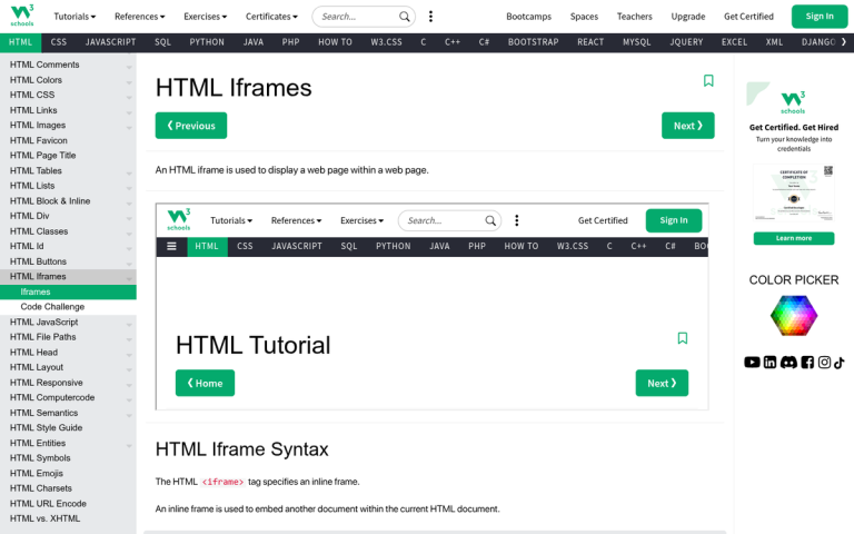
Canva is a browser-based drag-and-drop design tool. You don't need to install anything, and you don't need a design background to use it. It's grown enormously since its early days - the platform now offers over 7,700 statistics-related templates alone, a library of over 2 million photos, icons, and illustrations, and more than 20 types of customizable graphs and charts built specifically for data visualization. There are also 3,000+ fonts to work with, including a solid selection that are completely free.
To get started, create an account. You can sign up with an email address or connect through Google. Once you're in, you'll land on the main dashboard where you can browse templates by category or search directly for infographics.
Canva operates on a freemium model. The free tier is genuinely useful - most of the core tools, many templates, and a large portion of the asset library are available without paying anything. The paid tier, now called Canva Pro, unlocks the full asset library, brand kits, background remover, premium templates, and more advanced team collaboration tools. It's worth it if you're producing content regularly, but for occasional infographic creation, the free plan holds up well. If you're looking for other options, there are also tools to help create an infographic in an hour or less worth considering.
When you open the infographic editor, you're presented with a blank canvas sized to infographic dimensions. For blog posts, Canva recommends 663 x 2,000 pixels as a solid starting point. If you're planning to repurpose the graphic for social media, note that optimal dimensions shift - 1,200 x 628 pixels works best for Facebook, and 1,104 x 736 pixels for LinkedIn. Canva makes it easy to resize your design for different platforms without starting from scratch.
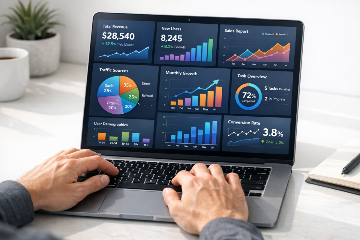
The editing experience is intuitive. You can click any element - a chart, an icon, a text block, a photo - and manipulate its size, position, rotation, transparency, and color. Charts pull in your data and visualize it automatically across more than 20 different chart types. You're not touching a brush or a fill tool. The heavy lifting is handled by the app; you're making decisions about what goes where and what it looks like.
One thing worth noting: Canva's AI features have expanded significantly. The platform now includes AI-powered design suggestions, a text-to-image generator, and a "Magic Design" feature that can generate a full infographic layout from a prompt or a data set. These aren't gimmicks - they're legitimately useful for getting a starting point fast, especially if staring at a blank canvas is the biggest obstacle between you and publishing. For more AI-assisted workflows, an AI optimization prompt library can help you move even faster.
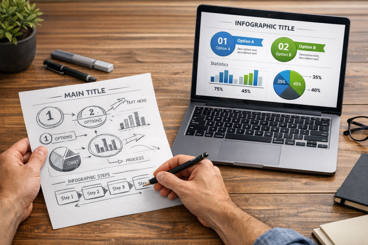
Making a Kickass Infographic

Canva gives you the tools. But there's a lot more to a successful infographic than just the platform you build it on. Here's the process I recommend.
Identify Your Audience
Before you touch the editor, know who you're making this for. If you've built out buyer or reader personas for your marketing, use them here. If not, take the time to think through who actually reads your content, what they care about, and what level of familiarity they have with your topic.
The reason this matters is that the same data can be framed a dozen different ways. A graphic about rising healthcare costs hits differently if it's aimed at HR managers versus individual consumers versus policy researchers. Your audience should shape which data points you lead with, the tone of your copy, and even the visual style you choose.
Think of it like a political campaign. Candidates don't broadcast generic messages to everyone - they craft specific messages for specific groups. Your infographic should do the same.
Establish an Ideal Level of Complexity
This applies to both the information and the design. Infographics work because they make complex information easier to digest. If the graphic itself becomes hard to follow, you've defeated the purpose.
- Don't confuse your readers. If someone needs to study your infographic to understand it, it's too complicated. Why your infographic isn't getting new links often comes down to this exact issue.
- Don't make it too simple either. A couple of pie charts with no narrative or context doesn't justify the infographic format. You need enough to tell a visual story.
- Keep scope manageable. A tightly focused graphic on one clear topic will almost always outperform a sprawling one that tries to cover everything. Once you've nailed the format, consider legitimate ways to build links to your infographic.
Maintain Focus
An infographic is a visual story told through facts and research. The best ones have a clear narrative arc - a beginning, a middle, and a conclusion the reader arrives at naturally. Think of it more like a comic strip than a slide deck.
Start with what you want the reader to walk away understanding. Then work backwards. What facts support that conclusion? What context does the reader need first? Cut everything that doesn't serve the story. That extra data isn't wasted - save it for the supplemental blog post you'll write to accompany the infographic.
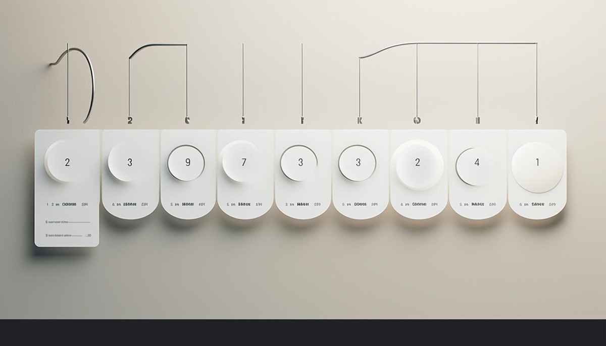
Don't let the written content crowd out the visuals, either. Canva gives you more than 20 chart types and a massive icon library for a reason. Use them. Infographics are processed faster by the brain than text alone, making visual clarity essential to your message landing.
Compile Great Information
The information you use needs three qualities: it needs to be accurate, it needs to be relevant, and it needs to be worth knowing.
- Accurate: Fact-check everything. Use primary sources and authoritative references. One bad statistic undermines the entire piece. With AI-generated and spun content flooding the web in 2026, readers and other bloggers are more skeptical than ever - your sourcing matters.
- Relevant: The data should connect directly to your audience's interests or challenges. Interesting-but-irrelevant facts waste space and dilute focus.
- Worth knowing: Don't rehash common knowledge. The best infographic data is the kind that makes someone say "I didn't know that" or "I never thought about it that way." For context: 65% of the world's population are visual learners, which is exactly why this format works so well when the information is genuinely illuminating.
If you've compiled original research or data, publish the underlying findings in a separate post. That way the infographic can reference and link to it, and others who embed the graphic can do the same.
Maintain Clear Design
With Canva's library of millions of elements, it's tempting to overdo it. Resist that urge.
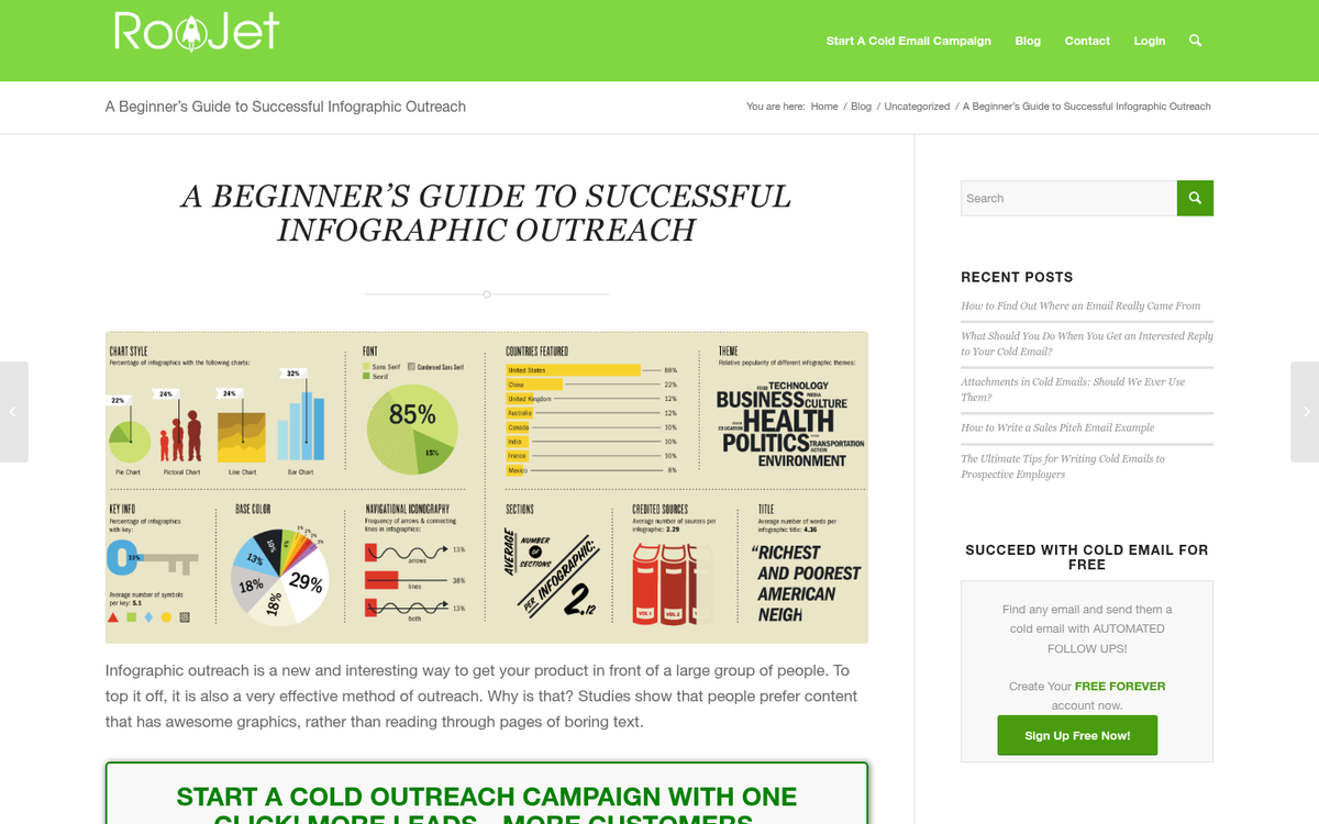
- Limit your color palette. Two or three primary colors with one accent will almost always look more professional than a rainbow. Color should direct attention, not decorate.
- Use charts purposefully. Canva's 20+ chart types give you options beyond the tired pie chart. A waffle chart, a bubble chart, or a timeline visualization can make the same data feel fresh. But pick the format that actually suits the data - don't choose something exotic just because it looks interesting.
- Maintain a logical flow. The reader's eye should move naturally from top to bottom. If you need context from section three to understand section one, reorganize.
- Watch your height. A good rule of thumb is to cap your infographic around 5,000 pixels tall. Beyond that, you're likely padding rather than adding value. Canva's template dimensions help enforce discipline here.
Be Original
In blog writing, "do it better" is solid advice - find a top 10 list and write a top 20. That logic doesn't translate to infographics.
Infographics are designed to be shared widely. If you take someone else's concept and repackage it with different colors, people will notice - especially the audience who already saw the original. It looks lazy and it undermines your credibility. The research and design effort that goes into a good infographic only pays off if the concept itself is yours.
Find an angle no one has covered, or combine data from multiple sources in a way that hasn't been done before. That's what earns shares and backlinks.
Market and Promote
Publishing the graphic is the beginning, not the end. Promotion is where most infographics succeed or fail.
Share it across all your social channels, and don't assume one post does it. Different segments of your audience are active at different times - schedule multiple posts across different formats (the full graphic, a cropped detail, a short-form video walkthrough for Reels or TikToks).
Beyond social, do blogger and journalist outreach. Identify writers covering your topic and send them a personal note with the graphic attached. Make it as easy as possible for them to embed it - include the embed code in your email. This is still one of the most reliable ways to earn editorial backlinks in 2026.
You can also submit to infographic directories and aggregators, which still drive niche traffic and occasional syndication. Don't overlook Reddit, either - relevant subreddits can send serious traffic to a genuinely useful, non-promotional graphic.
Promotion is what separates an infographic that earns links, traffic, and authority for months or years after publication.