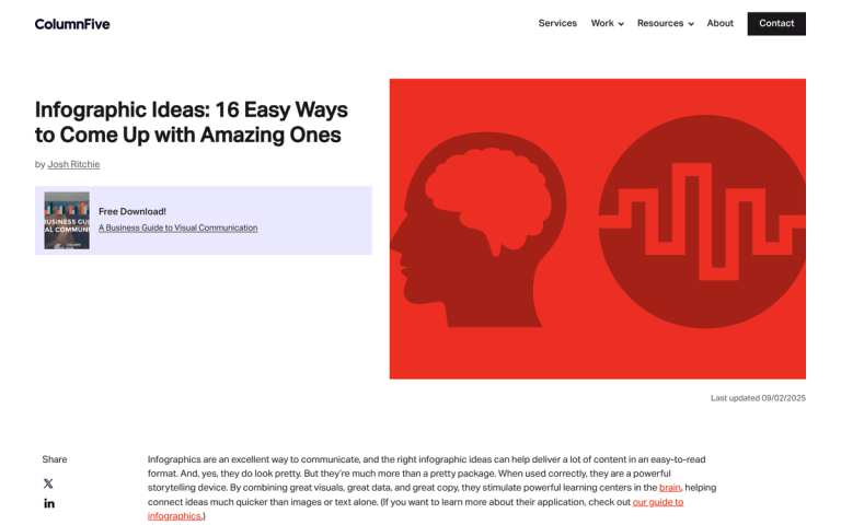
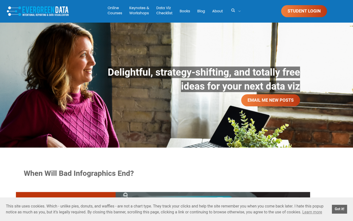
Infographics are still a powerful marketing tool, but the landscape has changed dramatically. They're easy to share, easy to embed, and present potentially complex information in a simple and intuitive way - articles featuring infographics still receive 178% more inbound links compared to text-only content. But here's the reality: the infographic market hit peak saturation around 2017, and by 2021 it was widely considered oversaturated. That doesn't mean infographics are dead - far from it - but it does mean the bar for what makes a good one has risen considerably.
These days you have interactive infographics, animated infographics, AI-generated data visualizations, and motion graphics hybrids. Standing out in 2026 requires more than just slapping some stats onto a colorful template. So why isn't your infographic getting the views, links, and shares it deserves?
Key Takeaways
- Infographics still earn 178% more inbound links than text-only content, but the market has been oversaturated since around 2017.
- Common content flaws include covering already-documented topics, focusing too heavily on your own company, and choosing uninteresting subjects.
- Design mistakes like scattered color palettes, unreadable fonts, excessive copy, and poor logical structure significantly reduce shareability and embeds.
- Faulty or uncited data destroys credibility; every statistic should be verified, sourced, and clearly attributed directly on the graphic.
- Without active distribution-aggregators, Pinterest, Reddit, LinkedIn-and embedded sharing prompts, even well-made infographics fail to reach their potential audience.
Your Subject Has Been Covered Already
This is a flaw with not doing enough research before you start making a graphic. It's easy to get an idea, run with it, implement it, and start trying to share it - only to find that someone else made a graphic on the same topic months or years ago and covered it in greater detail with better design.
That's not to say you can't compete on the same topic; you just need to be aware the ground has been covered, so you can step up and ensure your graphic out-does theirs in every possible way. Use more recent data, make your design sharper, cite stronger sources, and push it to more channels. In 2026, "more recent data" matters more than ever - audiences are savvy enough to notice when your statistics are three years old.
Your Subject is Primarily Yourself
This is a flaw with intention. When you're making an infographic, you're presenting information in a way that makes it easy to digest. The presentation makes the topic shine, but the topic carries the graphic. If you're building a graphic around yourself or your business, you had better already have a substantial audience that cares.
Company history timelines and internal milestone graphics are interesting only to a narrow subset of people and have virtually no chance of going viral. What works in a self-focused infographic is real, usable data - a transparent breakdown of your marketing strategy, a case study with honest wins and losses, or benchmarks that others in your industry can reference. Make your graphic something people will actually cite.
Your Subject Isn't Interesting

This is a flaw with perspective. Just because you find a topic fascinating doesn't mean your audience will. This is why science communicators like Neil deGrasse Tyson or the late great Carl Sagan have always resonated - they take deeply complex topics and make them feel urgent and accessible. An infographic lives or dies on presentation.
Before you commit to a topic, ask yourself: would someone share this with a friend? Would it spark a conversation? Would it change how someone thinks about something? If the honest answer is no, rethink the topic entirely.
Your Idea is Too Complex for a Simple Graphic
Some ideas require too much background knowledge to work as a standalone visual. You can't explain the mechanics of programmatic advertising without first establishing what it is. You can't visualize AI model training without some baseline context.
Topics that require heavy prerequisite knowledge will only resonate with a narrow slice of readers - those with enough background to follow along but who still benefit from a visual explanation. Everyone else bounces. If your topic falls into this category, consider breaking it into a series, or pairing the infographic with a robust companion article that does the heavy lifting contextually.
Your Implementation is Too Simple
This is the most common flaw among newcomers to the infographic space. The assumption that any graphic is good enough is how you end up with bland rows of pie charts and bar graphs with a bit of copy sandwiched between them.
Ask yourself: if you stripped out the visuals, would this work fine as a plain blog post? If yes, your implementation is too simple. If it looks like a PowerPoint deck from a corporate boardroom, you're nowhere near the mark. Good infographics take real inspiration and graphic design experience - and in 2026, with AI design tools widely available, there's less excuse than ever for a mediocre visual output. Tools like Canva, Adobe Express, and AI-assisted platforms like Looka or Visme have raised the floor significantly. That means the ceiling expectations have risen too.
Your Infographic Has No Message
Infographics need more than data - they need a point. If a reader finishes your graphic thinking "well, that was interesting" and moves on, you've failed. The graphic needs to lead them somewhere. Present data, build toward an argument, and let them arrive at a conclusion that feels earned.
The hard part is ensuring your data logically supports that conclusion without feeling manipulative. If a reader can spot a gap in your logic or walks away with an unanswered question, you need to go back and refine. A strong message is what converts a casual viewer into someone who shares, embeds, or links to your graphic.
Your Graphic is Too Long

Some infographics simply go on too long. Longer graphics are heavier to load, difficult to display natively on social platforms, and push the limits of most readers' attention spans. With mobile browsing now dominant - and 79% of users abandoning sites that aren't responsive - an oversized infographic that doesn't render well on a phone is essentially invisible to a huge chunk of your potential audience.
A general upper limit of around 8,000 pixels in height still holds as a reasonable guideline. Beyond that, you're almost certainly trying to cram in more than is necessary. Width should align with standard blog layout widths, since that's where most embeds will live.
Your Font is Unreadable
For the sake of your readers, get someone with typography experience to review your font choices. Some fonts look great on a large desktop monitor and become illegible at thumbnail size on mobile. Some are too thin, too decorative, or too condensed to scan quickly. A clean, legible sans-serif is generally your safest choice, though you can layer in personality with display fonts for headers as long as body text remains readable at any screen size. If you're struggling with font selection, learn how to add custom fonts to your WordPress blog to expand your options beyond the defaults.
Your Design is Too Scattered
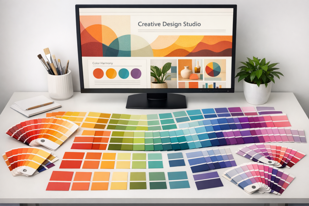
A common mistake among novice designers is reaching for too many colors or defaulting to a muddy single-color palette. Both approaches make a graphic feel chaotic or flat. A cohesive, balanced color palette is essential, and using tools to get there is completely legitimate.
Paletton remains a solid option - choose a primary color and it generates harmonious variants based on color theory. Coolors and Adobe Color are also excellent in 2026. The goal is a palette that feels intentional and consistent throughout, not one that looks like each section was designed by a different person.
Your Copy Doesn't Grab Attention
You're not writing a blog post. Infographic copy should be the shortest, punchiest version of your message possible. When in doubt, cut. Every word that can be replaced by a visual element should be. Save the nuance for a companion article or your data sources section.
This discipline also applies to your data. Not all data points are visually interesting on their own - part of the craft is figuring out how to frame numbers in ways that feel significant at a glance.
You're Writing Too Much
If your graphic is dense with paragraphs, something went wrong in the planning stage. Heavy copy usually appears when there isn't a clear visual metaphor for the data - so instead of finding one, the designer just writes it out. That defeats the entire purpose.
There are services with experienced graphic designers who specialize in data visualization and can find innovative presentations for complex information. These services aren't cheap, but the output is usually worth it. Alternatively, AI design assistants have become genuinely useful for generating layout concepts - though human refinement is still essential for quality output.
Your Graphic Isn't Subdivided
Like a good article, an infographic should flow logically from one point to the next. Think of it as having visual subheadings - clear sections that guide the reader through your argument in sequence. Start with the logical entry point, map out the conclusion, and identify the key steps needed to connect them. Dedicate a distinct visual section to each step. This structure keeps readers oriented, makes the graphic easier to scan, and dramatically increases the chance someone will embed or share it.
You're Not Submitting to Aggregators
There are still many sites where you can submit your graphic for additional exposure - infographic directories, niche blog aggregators, and content communities in your industry. This is table stakes distribution, not a growth strategy on its own, but it matters. There are hundreds of platforms that will give your graphic additional surface area to be discovered. Make sure your source URL is clearly visible on the graphic itself, since many aggregators strip out surrounding context.
In 2026, don't overlook distribution through platforms like Pinterest, LinkedIn newsletters, Reddit communities, and niche Substack writers who regularly curate visual content. These have become significant discovery channels for well-made infographics.
You're Not Targeting Your Audience
Always design with your seed audience in mind. These are the people who will first encounter your graphic, and if it doesn't resonate with them immediately, it won't spread. A B2B-focused infographic shared primarily with a consumer audience is a classic mismatch. Know exactly who you're designing for before you pick your topic, your tone, your color palette, or your data points.
The average CTR for infographics sits around 2%, and nearly 37% of users click the first link within an infographic - which means a precisely targeted graphic with a well-placed call to action can drive meaningful traffic if it lands in front of the right people.
You're Not Encouraging Sharing
Is your graphic surrounded by social sharing options when you post it? If not, you're leaving easy shares on the table. Include an embed code below the graphic on your site so other bloggers can republish it with attribution. Add sharing prompts. On platforms like LinkedIn, a direct ask to share or save genuinely increases engagement. Don't assume people will take the extra steps on their own.
Your Data is Incorrect
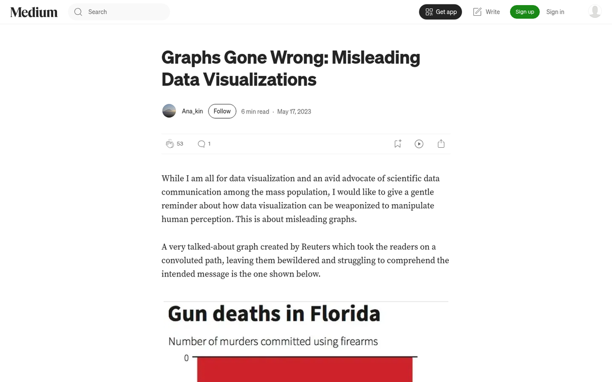
Faulty data is a credibility killer. This is especially visible in infographics covering politically or socially contentious topics, where statistics are frequently misrepresented, taken out of context, or displayed on a skewed axis. Anyone who fact-checks your graphic and finds an error will call it out publicly - and in 2026, that kind of callout spreads fast. Get your numbers right, or don't publish.
You're Not Citing Your Data
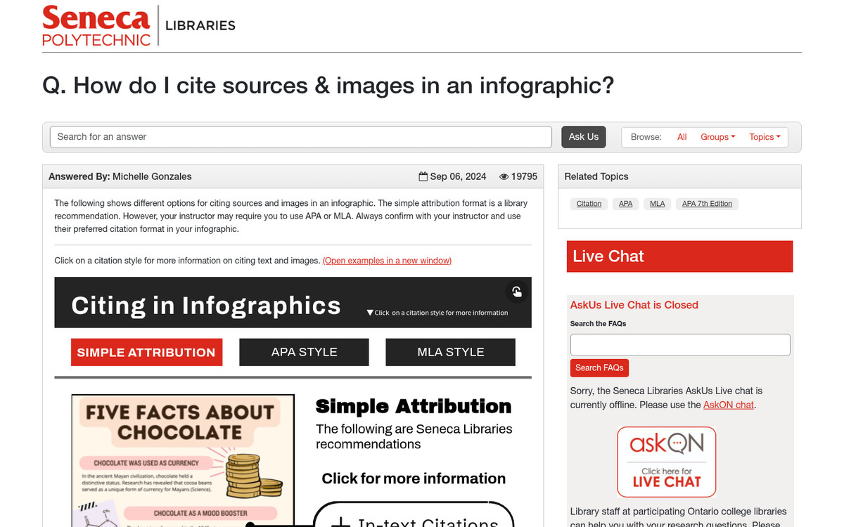
Every data point you use should be verified, sourced to a credible origin, and cited clearly on the graphic. Don't skip this step. Citing sources does three things: it legitimizes your graphic, it gives you a reason to reach out to the data's originator (who may then share your work), and it protects you if anyone challenges your figures.
Beyond that, keep in mind that roughly 18.5% of all images have no alt text whatsoever - meaning they're essentially invisible to search engines and screen readers. Always add descriptive alt text to your infographic when you publish it. It's a small step that meaningfully improves both accessibility and discoverability.
Fix these issues before you publish, and you're set up for a significantly stronger result - and possibly something that actually spreads on its own.