


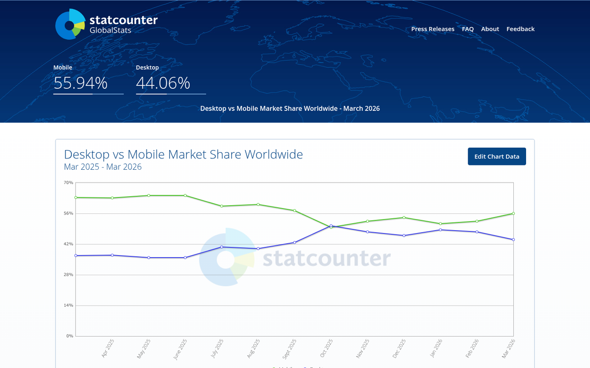
Smartphones and tablets now dominate the internet. Mobile traffic has long since overtaken desktop as the primary way people access the web, with mobile devices generating over 62% of global website traffic as of Q4 2024, and 96.2% of internet users worldwide accessing the internet from a mobile device. If you don't have a mobile-optimized website in 2026, you're not behind the curve - you've fallen off it entirely.
Key Takeaways
- Mobile devices generate over 62% of global website traffic, with 96.2% of internet users accessing the web via mobile.
- Mobile accounts for 71.8% of e-commerce traffic, meaning non-optimized sites lose significant potential revenue.
- Google uses mobile-first indexing by default, making mobile optimization essential for search rankings and visibility.
- Local businesses especially need mobile-optimized sites with click-to-call functionality and clearly visible contact information.
- Responsive design is now standard; a full mobile-first redesign is the most sustainable long-term solution.
Accessing Via Mobile
The question is no longer why make a mobile website - it's why haven't you already. Mobile traffic has grown by 75% since 2015, and the gap between mobile and desktop continues to widen. While modern smartphones are technically capable of rendering a desktop site, forcing users to pinch, zoom, and scroll sideways creates a frustrating experience that drives them straight to your competitors.
Beyond convenience, many desktop site elements simply don't translate well to mobile. Certain scripts, dynamic content, and embedded media can behave unpredictably across different devices and operating systems. A properly built mobile experience eliminates these variables entirely.
Page load speed is another critical factor. Even on fast 5G connections, a bloated desktop site can load significantly slower than a streamlined mobile version. Users on older networks or less powerful devices are even more affected, and slow load times are one of the fastest ways to lose a visitor permanently.
There's also the reality that not everyone is using the latest flagship device. A mobile-optimized site ensures you're not unintentionally excluding a portion of your audience based on their hardware.
Social and E-Commerce Traffic

Social media referral traffic is overwhelmingly mobile. When users encounter your links on platforms like Facebook, Instagram, TikTok, or X, the vast majority are tapping those links from a phone. Sending that traffic to a site that isn't optimized for mobile is like opening a storefront with a broken front door.
The e-commerce implications are just as significant. According to Contentsquare's 2024 analysis, mobile devices account for 71.8% of e-commerce traffic. If your product pages, checkout flow, or conversion elements aren't built for mobile, you're leaving a substantial portion of your potential revenue on the table. In sectors like Media and Publishing, mobile accounts for 66.2% of traffic; in Travel and Hospitality, mobile usage continues to dominate at 58.5%. These aren't edge cases - mobile is the primary channel, and a well-optimized mobile site can meaningfully improve your overall marketing performance.
Local Usage and Information Immediacy

Consider what a user needs when they search for your business on their phone. They want your address, your phone number, your hours. They want that information immediately, without having to navigate a desktop layout on a small screen. If your site makes that process difficult, they'll assume the worst and move on to a competitor whose site gives them what they need in seconds.
For local businesses especially, a mobile-optimized site isn't a luxury - it's the baseline expectation. Static pages with clearly visible contact details, click-to-call functionality, and easy-to-read store information can be the difference between a customer walking through your door and one walking into a competitor's.
The same logic applies to content-driven sites. Blog posts, product pages, and landing pages all need to be readable and navigable on a phone. A mobile-optimized site makes every piece of content an accessible entry point for new visitors.
Apps and Progressive Web Apps
If your users are returning regularly to perform specific tasks - checking account information, making reservations, renewing subscriptions - a dedicated app experience is worth considering. The traditional model of a free basic app paired with a paid premium version still holds merit, but the landscape has evolved.
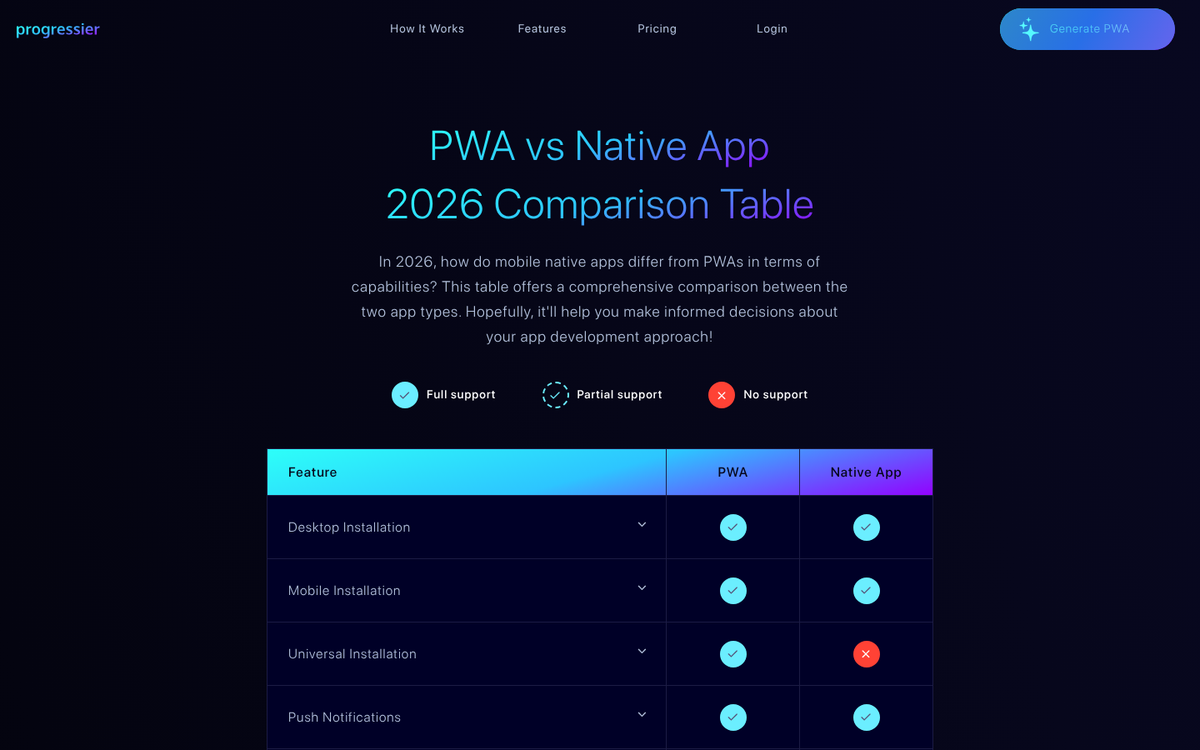
Progressive Web Apps (PWAs) have become an increasingly practical middle ground. A PWA behaves like a native app - it can be added to a home screen, work offline, and send push notifications - but it's built with standard web technologies and doesn't require submission to an app store. For many businesses, a well-built PWA delivers the convenience of an app without the overhead of maintaining separate iOS and Android codebases.
That said, if your primary goal right now is simply getting a mobile-optimized site live, that comes first. Apps and PWAs are the next step, not the starting point.
Google's Mobile-First Indexing
There's a straightforward SEO reason to prioritize mobile: Google requires it. Google has made mobile-first indexing the default across the board, meaning it uses the mobile version of your site as the primary basis for how your pages are indexed and ranked. If your mobile experience is poor or nonexistent, your search rankings will reflect that - regardless of how polished your desktop site is.
With 55-60% of all Google searches now performed on mobile devices, the math is simple. A site that isn't built for mobile is a site that Google is less inclined to surface, to an audience that is predominantly searching on a phone. Mobile optimization is no longer a ranking bonus - it's a baseline requirement. If you're struggling with visibility, it may be worth looking at why your blog content still isn't ranking well, as mobile readiness is often a contributing factor.
Creating a Mobile Website
The good news is that building a mobile-ready site has never been more straightforward. Responsive design - where your site's layout dynamically adjusts to fit the screen it's being viewed on - is now the standard approach, and most modern website platforms and frameworks support it out of the box.
If you're starting from scratch or redesigning an existing site, responsive design should be the default, not an afterthought. CSS frameworks, modern CMS platforms like WordPress, and website builders like Squarespace or Webflow all support responsive layouts without requiring you to build or maintain a separate mobile site.
If a full redesign isn't feasible right now, there are conversion services and plugins that can apply a responsive layer to your existing site. These vary in quality, but for a quick and functional improvement, they can serve as a bridge while you plan a more comprehensive update.
The more sustainable long-term solution is a proper mobile-first redesign. This doesn't necessarily mean scrapping everything - it means rebuilding with mobile as the primary consideration, ensuring that every element of your site performs well on the devices most of your users are already using. Given where traffic patterns have settled, this isn't optional anymore. It's simply good web practice.