Key Takeaways
- Ad placement matters as much as niche; the right layout can mean the difference between $3 and $15+ RPM.
- Best-performing fixed formats include the 300x250, 300x600, and 728x90 - covering sidebar, content, and header placements.
- Google's "Top Heavy" algorithm penalizes pages where ads dominate above-the-fold content, making balance essential.
- Aggressive layouts can maximize revenue in high-CPC niches like finance, but risk higher bounce rates if misapplied.
- Mobile-first layouts using responsive units are increasingly critical, as mobile CPCs are typically lower than desktop.
AdSense remains one of the most accessible ways to monetize a blog, and for good reason. The revenue share is transparent - publishers receive 68% of what Google charges advertisers for display ad clicks - the barrier to entry is low, and it scales meaningfully with traffic. You can trust Google to pay reliably, hitting the payment threshold is straightforward, and getting set up is easy even for non-technical bloggers.
That said, it's never as easy as slapping a few ad units on your page and watching the money roll in. Your niche matters enormously - finance, insurance, and legal blogs can draw advertisers paying $5-$50+ per click. But a lifestyle blog covering topics like healthy breakfast ideas might average under $1 CPC. Your layout matters just as much. The right combination of ad units in the right positions can be the difference between a $3 page RPM and a $15+ one. Roughly 25% of AdSense publishers achieve over $15 RPM, which means $1,500 or more per 100,000 page views - but that doesn't happen by accident.
Remember that some layouts might not fit your design or niche. Use them as a starting point, adapt them to your needs, and always A/B test over an actual period - at least two weeks - before drawing conclusions.
Most monetized blogs share a recognizable structure: a logo and header at the top, a horizontal navigation bar below it, and then a two-column layout with a wide content area and a narrower sidebar. Posts live on their own individual URLs to maximize pageviews, instead of being stacked on a single scrolling homepage - this is the structure I'll be working with throughout this post.
Within that structure, there are a few natural ad placement zones: above or below the navigation bar, alongside the logo, within the sidebar, embedded in the content itself, between paragraphs, and just above the comments section. The challenge is picking which zones to activate, which ad formats to use in each, and how to balance revenue with user experience.
Before I get into the layouts, let me cover which ad units are out there and what restrictions apply to their use.
AdSense Ad Units in 2026
Google has streamlined its ad unit lineup considerably over the years, and in 2026 the emphasis is on responsive and auto-sized units. That said, fixed-size units are still available and still helpful for layout situations. Here's where things stand:
Responsive ad units are now Google's default recommendation. You define a container, and Google automatically serves the best-fitting ad size based on the available space and the user's device. For most modern blogs - especially those with mobile traffic - responsive units are the sensible choice. They cut back on the guessing around format selection and perform well across screen sizes.
Fixed-size display and text ad units are still available for situations where you need precise control over layout. The best-performing fixed formats, according to Google's own data and third-party publisher research, are:
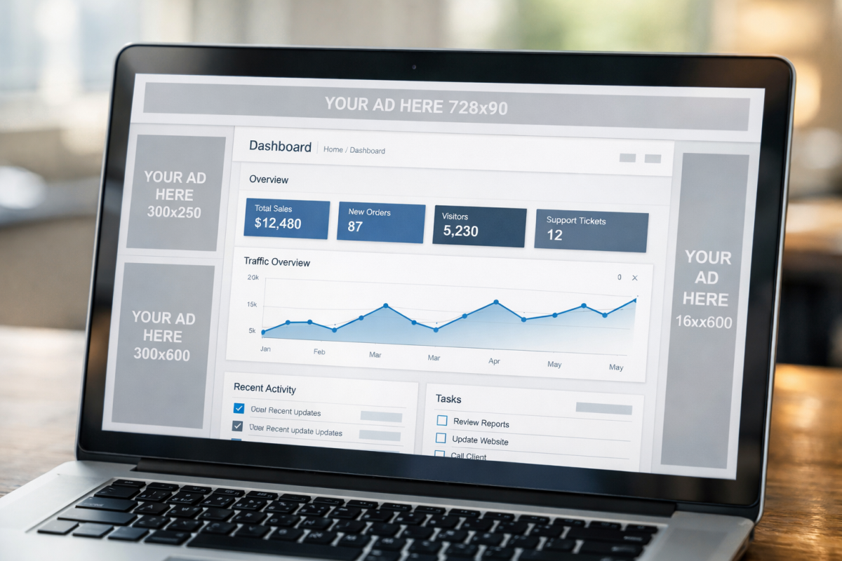
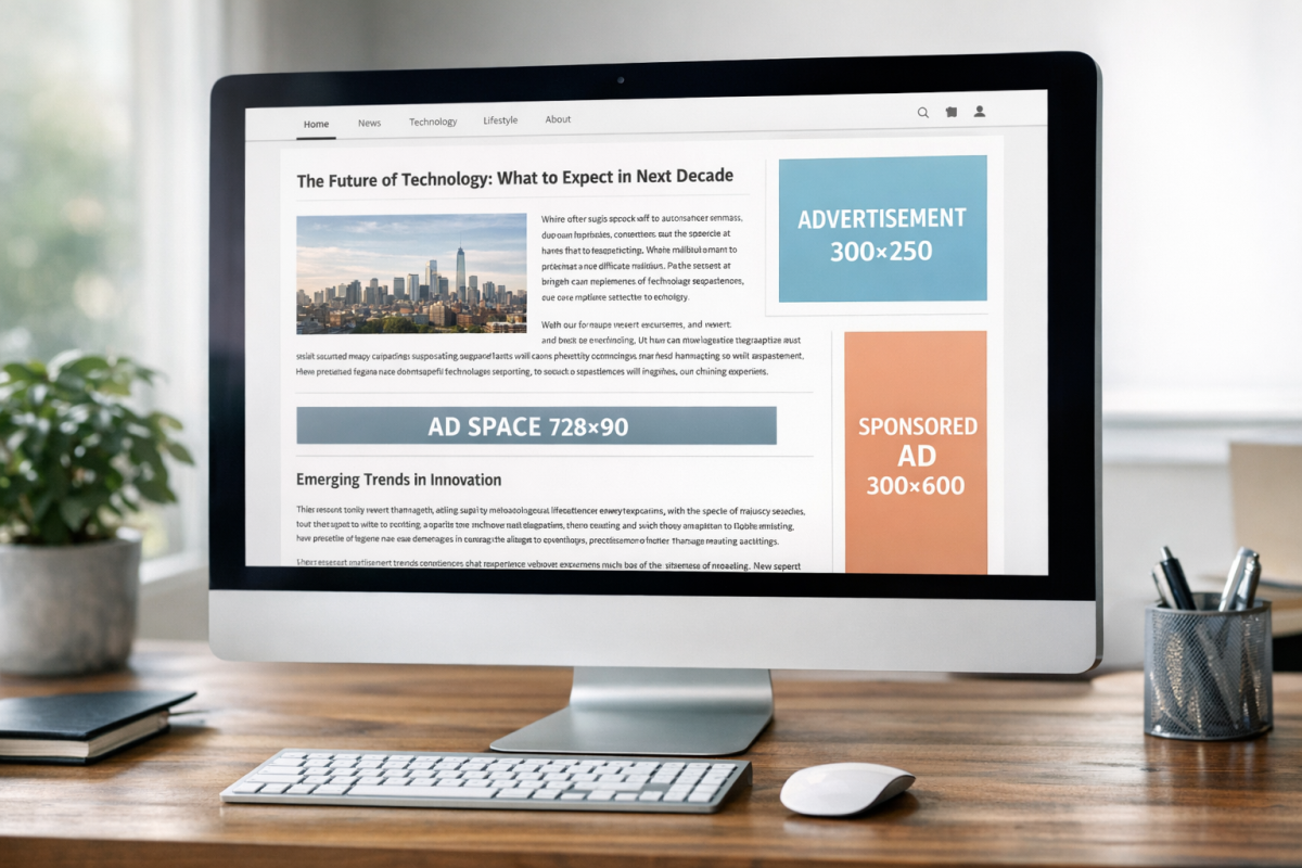
- Medium Rectangle - 300x250 pixels. Consistently the top-performing format. Works in sidebars, embedded in content, and on mobile.
- Large Rectangle - 336x280 pixels. Slightly larger variant of the above, useful in wide content columns.
- Leaderboard - 728x90 pixels. Classic horizontal banner, best placed below the navigation bar or above the footer.
- Large Leaderboard / Billboard - 970x250 pixels. A high-impact header unit that commands attention and tends to attract premium display advertisers.
- Half Page / Large Skyscraper - 300x600 pixels. One of the highest-earning fixed formats. Dominates the sidebar and is preferred by brand advertisers.
- Wide Skyscraper - 160x600 pixels. Useful for narrower sidebars where a 300x600 won't fit.
- Mobile Banner - 320x50 pixels. Standard mobile unit, though responsive ads have largely replaced the need to manually specify this.
If you're building a layout with fixed units, the consensus best-practice combination is a 970x250 or 728x90 in the header, a 300x600 in the sidebar, and a 300x250 embedded in the content. That combination covers high-visibility placements with formats that premium advertisers actively bid on.
Link units have been discontinued. Google retired link ads in early 2021, so any older advice you've read about placing link units below your navigation bar or stacking them in sidebars no longer applies. If you've been running link units, they've long since stopped serving.
Auto ads are worth mentioning as a 2026 reality. Google's Auto Ads feature uses machine learning to automatically find and insert ad units on your page without manual placement. For publishers who don't want to manage layouts manually, it's a viable option. However, Auto Ads can be aggressive with placement and may hurt user experience if left unchecked. Most experienced publishers use a hybrid strategy: manually placing core units in high-value positions and allowing Auto Ads to fill in extra inventory, with frequency and format controls applied in the AdSense dashboard. If you'd prefer more direct control, automatically injecting ads into your WordPress posts is another approach worth considering.
Ad styling and customization has also evolved. Google now has a visual ad style editor that lets you match ad unit borders, backgrounds, and text colors to your site's design. Ads that blend with your content - without being deceptive - tend to outperform jarring, out-of-place units; this is especially true for text-based ad formats. Pairing good ad styling with a well-considered layout for share buttons can also help keep your overall page design clean and purposeful.
Restrictions on Ad Placement
Google's placement policies have evolved over the years, and some of the older hard limits - like the "maximum three ad units per page" rule - were officially retired in 2016. That cap no longer applies. However, that doesn't mean anything goes.
The restrictions that matter in 2026 are as follows:
- Ads must not outnumber content. Google's quality guidelines make clear that pages where ads are the dominant element - particularly above the fold - risk manual penalties and algorithmic ranking suppression. The "Top Heavy" algorithm update, first launched in 2012, has been refined many times since and remains active. If a user lands on your page and sees mostly ads before any meaningful content, you're at risk.
- Ads cannot be placed to deceive users. This includes positioning ads so they look like navigation menus, making them indistinguishable from content, or placing them in ways designed to generate accidental clicks. Google is increasingly good at detecting this, and violations can result in account suspension.
- Certain page types are still off-limits. You cannot place AdSense ads on login pages, thank-you pages, error pages, or in pop-ups or pop-unders. Ads in emails are also prohibited.
- Invalid click activity remains a serious policy violation. Auto-refreshing ads, incentivizing clicks, or clicking your own ads will get your account banned. This hasn't changed.
- Content policies apply at the page level. Even if your site is approved overall, individual pages with policy-violating content - including AI-generated content that violates Google's spam policies - can result in ads being suppressed on those pages or account-level action.
Beyond a certain threshold, extra units cannibalize each other's CTR, degrade user experience, and invite algorithmic penalties. The publishers earning above $15 RPM are usually those with well-placed, quality units in niches with strong advertiser demand - not those with the most ad units per page.
With that context established, here are five layouts to use as a foundation for your own testing.
Layout 1: The Standard
This is the most commonly used layout on the web for good reason - it balances visibility with user experience and works across a large number of niches.

- A 728x90 leaderboard or 970x250 billboard below the navigation bar, spanning the full width of your content area. This is one of the highest-visibility placements on any page, capturing attention as users begin to engage with your content. Use a display ad here for maximum visual impact.
- A 300x600 half-page ad in the sidebar. This is currently one of the strongest-earning fixed formats. Brand advertisers prefer it, which means higher CPCs. If your sidebar is too narrow for a 300x600, a 300x250 is a solid fallback.
- A 300x250 medium rectangle embedded in the content, floated to the right, positioned within the first two or three paragraphs. This placement captures users while they're actively reading and engaged with your page. Avoid floating it left, as this disrupts reading flow from the opening sentence.
- A responsive ad unit placed just above the comments section, spanning the full content width. Users who scroll to the comments are highly engaged and represent a strong click opportunity. A leaderboard or responsive unit works well here. Comments can also improve your blog post rankings and traffic, making this a doubly valuable area of your page.
This layout uses four placements that complement each other without stressing the page - it's a strong default for most blogs and a reliable baseline for further testing. To decide which social buttons to display on your posts, apply the same methodical thinking you use when choosing ad placements.
Layout 2: The Wrap
This layout is more visually assertive and works best on sites with strong, steady branding and a layout wide enough to accommodate ads flanking the main content column.

- A 970x250 billboard ad spanning the header area, below the logo and navigation. Make this a display ad. Premium advertisers regularly bid on this format, and its large footprint makes it hard to miss.
- Wide skyscraper or 300x600 ads in the left and right gutters outside the main content column. This works best when your layout has symmetrical space on both sides of the content. Use display ads for a cohesive visual effect. If you only have a sidebar on one side, place the skyscraper there and skip the opposite gutter.
- A 300x250 embedded in the content midway through the article. With two large display ads flanking the page, a single in-content unit completes the layout without tipping into overload.
The appeal of this layout - used by large publishers like news and entertainment sites - is that all display ads can be part of a coordinated campaign and give you a wraparound brand experience. If you ever move toward private ad deals, this layout gives you a strong visual product to sell.
Layout 3: Pure Aggression
This layout prioritizes ad visibility above all else and places its heaviest units immediately in the user's eyeline. It carries risk - users who are turned off by prominent ads will bounce - but in high-CPC niches like finance or insurance, the math can work strongly in your favor even with a lower CTR.

- Two 300x250 medium rectangles placed side by side directly below the post title and above the first paragraph of content. This forces any user who wants to read your article to visually pass over your ads. Use display ads here for maximum impact - video ads are also worth testing if your audience is receptive.
- A 300x600 in the sidebar, positioned at the top so it's immediately visible without scrolling. In a high-CPC niche, a single well-placed 300x600 in the sidebar can outperform multiple smaller units.
- A responsive unit above the comments section to capture engaged readers at the bottom of the page. Comments can also improve your blog post rankings and traffic, so this placement gets double duty.
Monitor bounce rate and session time closely with this layout. If users are leaving faster than usual, dial it back. If engagement holds steady and RPM climbs, it's working - this layout rewards niches where users arrive with high intent and aren't deterred by advertising.
Layout 4: Content Emphasis
This layout prioritizes the reading experience and treats ads as secondary to content. It's the safest option from a Google algorithmic perspective and tends to perform well on blogs where trust, authority, and repeat readership are the primary growth engine.
- A 728x90 leaderboard below the navigation bar, or alternatively a responsive unit in the same position. This is unobtrusive and captures attention before the user is fully immersed in the content.
- A 300x250 or 300x600 in the sidebar, positioned roughly in the middle of the sidebar rather than at the very top. This keeps the top of the sidebar available for trust signals - author bios, email signup forms, social proof - while still capturing ad revenue from users who scroll.
- A single horizontal banner or responsive unit at the foot of the content, between the final paragraph and the comments section. This captures users at the natural end of the reading experience, when they're deciding what to do next.
This layout tends to generate lower RPM than the more aggressive options. But it preserves user experience, cuts back on bounce risk, and is a good fit for blogs where long-term audience building matters as much as short-term ad revenue - it's also the layout least likely to draw quality penalties from Google's ad experience evaluations.
Layout 5: Mobile-First
With the majority of blog traffic now arriving on mobile devices, a layout designed specifically around the mobile experience is increasingly the most important one to get right. Desktop layouts don't translate directly to mobile - a 970x250 billboard that looks great on a widescreen monitor can become a small, ineffective strip on a phone.
- Use responsive ad units throughout. Let Google dynamically serve the appropriate format for the user's screen size. On mobile, this typically means 300x250 rectangles and 320x50 or 320x100 mobile banners - formats that fit within a vertical scroll without breaking the reading experience.
- Place a responsive unit immediately below the post title. This is prime real estate on mobile, where users are focused and scrolling has just begun.
- Place a second responsive unit at the midpoint of the article, between paragraphs. On long-form content, this captures users who are actively engaged and haven't bounced.
- Place a third responsive unit above the comments section. Same rationale as in other layouts - highly engaged users represent a strong click opportunity.
- Use Auto Ads conservatively to fill additional inventory, but cap the number of Auto Ad insertions in your AdSense settings to avoid the page feeling cluttered on smaller screens.
Mobile CPCs are usually lower than desktop in most niches, which makes layout efficiency even more important. Fewer, better-placed units usually outperform a high volume of poorly positioned ones. Test anchor ads - the sticky banner that pins to the bottom of the screen on mobile - as an extra unit, as these tend to have strong viewability rates and can meaningfully improve mobile RPM.
So there you have it: five layouts built for how blogs actually look and perform in 2026. Take them as starting points rather than finished solutions. Test them against each other, measure RPM and CTR over at least two weeks per variant, and pay attention to how layout changes affect your wider engagement metrics. The best AdSense layout is ultimately the one that earns the most without costing you your audience.