Your call to action is an essential part of your marketing. Everything else just leads users to a point where they're exposed to your CTA. Ideally you'll have spent their time in the funnel warming them up and making them more receptive to your push, but in the end, it's the push that really matters.
We've written before about creating a good call to action. How about we take a look at some standout CTA examples and what the data tells us actually works in 2026?
Before we dive in, a few numbers worth keeping in mind. HubSpot analyzed over 330,000 CTAs and found that personalized CTAs convert 202% better than generic ones. Campaign Monitor data shows that limiting emails to a single CTA can result in up to 371% more clicks than emails cluttered with multiple competing buttons. These aren't small margins. The difference between a good CTA and a bad one is enormous, and the examples below illustrate exactly why.
Key Takeaways
- Personalized CTAs convert 202% better than generic ones; single CTAs can drive 371% more clicks than multiple competing buttons.
- Crazy Egg and Basecamp succeed through restraint and honesty-eliminating noise and surrounding CTAs with specific, credible social proof.
- Uber's CTA reflects its product experience: fast, mobile-first, and frictionless, routing different audiences without creating confusion.
- OKCupid's use of "continue" instead of "sign up" lowers psychological barriers by framing action as momentum rather than a new commitment.
- Small wording changes, video CTAs, and button color testing can dramatically lift conversions without requiring full design overhauls.
Crazy Egg
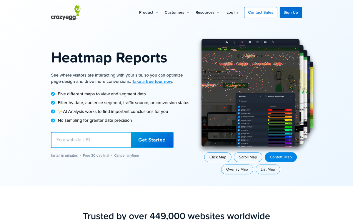
Crazy Egg, the heat mapping and website analytics tool, has long been a go-to example of a clean, focused homepage CTA. The premise is simple: one question, one input box, one action. What's making your visitors leave? That's the value proposition. The answer is right there in the product itself.
What makes it work is the total absence of noise. There's no competing offer, no secondary banner, no pop-up fighting for your attention. Existing users have a small, unobtrusive sign-in link tucked in the corner that doesn't steal focus from new visitor conversions. Every element on the page exists to serve a single goal.
It's a masterclass in restraint, and that restraint is exactly what makes it convert.
Basecamp
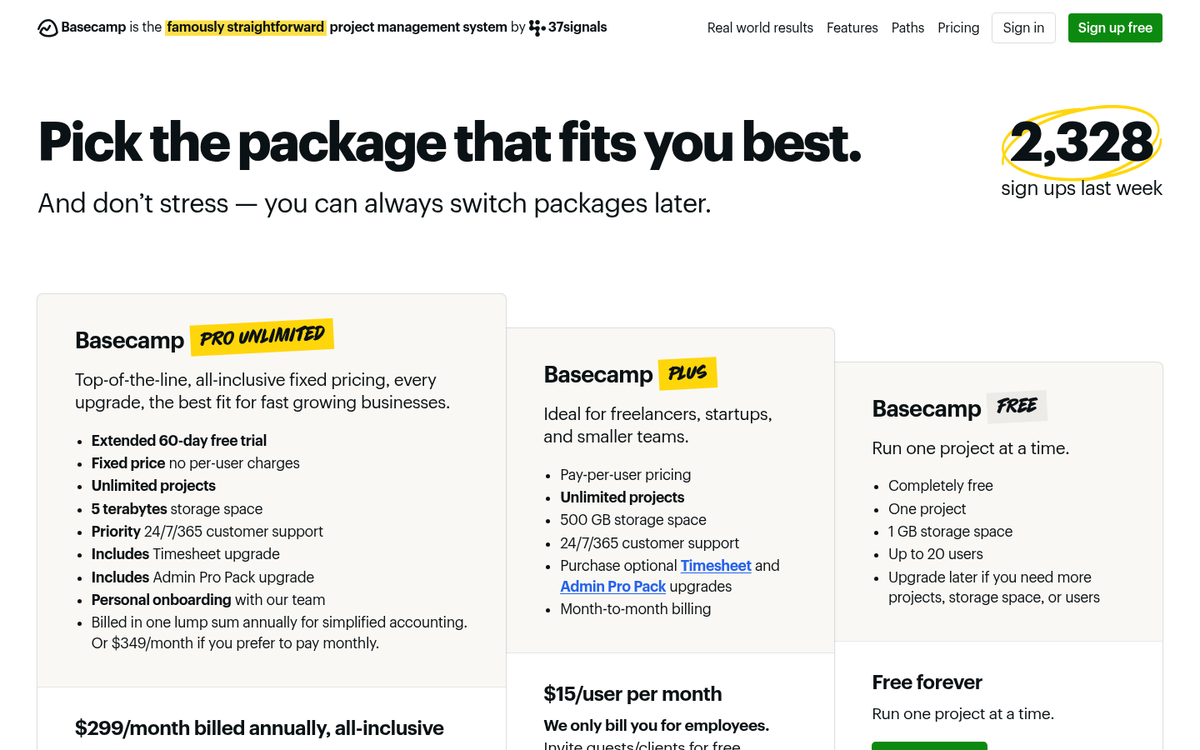
Basecamp has always done something interesting with its landing pages: it leans into social proof harder than almost anyone else in the SaaS space. Their homepage is built around a simple, direct CTA to start a free trial, but what surrounds that CTA is what makes it land.
Real customer quotes, plainly written and specific, do the heavy lifting. There are no stock photos or abstract claims about productivity. It feels honest, which is increasingly rare and increasingly valuable. The page has evolved over the years but the core philosophy hasn't changed: make the free trial feel like the obvious next step, not a commitment.
If you're building a landing page for a service product, Basecamp's homepage is still worth studying closely in 2026. You might also want to think about how to increase sales from your landing page once you have the basics in place. social proof is one of the most well-documented drivers of online purchasing decisions, and free trial conversion benchmarks suggest that reducing perceived commitment is key to getting users through the door.
Uber
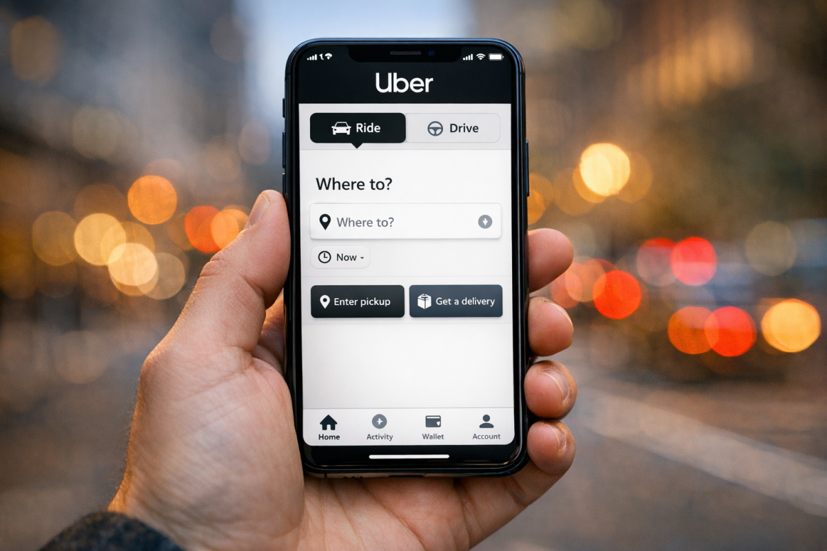
Uber's homepage CTA has shifted considerably over the years as the company itself has expanded well beyond ride-sharing. Today the page splits its focus between riders and drivers, with a clean toggle-style layout that routes different audiences toward different conversion paths without creating confusion.
The mobile-first design philosophy is still front and center, which makes sense given that the vast majority of Uber's users interact with the product entirely through their phones. The CTA isn't just a button - it's a design language that mirrors the speed and simplicity of the app itself.
It's a useful reminder that your CTA should reflect the experience your product actually delivers. If your product is fast and frictionless, your conversion path should feel the same way.
OKCupid

OKCupid's homepage CTA is still a strong example of copy doing real work. The use of the word "continue" rather than "sign up" or "register" is a small but meaningful choice. It makes the user feel like they're already partway through a process, which lowers the psychological barrier to completing it. That kind of micro-copy decision is easy to overlook and surprisingly powerful.
The page keeps the initial ask minimal - just enough information to get you started - and saves the heavier profile-building for later. That progressive commitment approach is smart design, and it's a pattern that converts well across many different industries, not just dating apps.
If you're looking for a simple, replicable CTA lesson here, it's this: reduce the ask to the smallest possible first step, and use language that frames it as momentum rather than a beginning. If you run a dating site yourself, there are also plenty of ways to monetize that traffic once users are on board.
What the Data Says About CTA Design in 2026
Rather than pointing you to a third-party roundup of email examples that may or may not still be live, let's talk about what recent testing actually shows, because the findings are specific enough to be genuinely useful.
Wording matters more than most people think. PartnerStack increased conversions by over 111% simply by changing "Book a Demo" to "Get Started." Mailmodo saw a 110% lift by changing "Book a Demo" to "Talk to a Human." Neither of those required a design overhaul. Both required paying close attention to how the CTA framed the action from the user's perspective.
Video CTAs dramatically outperform static ones. Wistia found that adding a CTA to the end of a video generates up to 380% more clicks than a static image or text-based CTA placed in the same position. If you're producing video content and not including a direct CTA, you're leaving a significant amount of conversion on the table.
Even button color has measurable impact. ConversionXL A/B tests found that red CTA buttons outperformed green ones by 21% on certain landing pages. The specific color matters less than the contrast and visibility, but the point is that visual details like color that seem trivial are worth testing systematically.
The takeaway from all of these examples, whether we're talking about Crazy Egg's single-input homepage or a data-backed button color test, is the same one it's always been: a great CTA is focused, clear, and built around what the user actually wants to do next. Everything else is just getting them to that moment.