Key Takeaways
- Landing pages interrupt browsing by failing to answer questions, causing immediate abandonment-especially on slow-loading mobile pages.
- Excessive ad density across the web erodes trust before visitors even reach a landing page, making conversions harder.
- With an average 2.35% conversion rate, landing pages offer no middle path-unlike content pages that nurture leads gradually.
- Forms requesting too many fields dramatically hurt conversions; pages with five or fewer fields convert 120% better.
- Landing pages misrepresent companies by showing only one-sided messaging, undermining credibility with research-savvy modern buyers.
6 Reasons Everybody Hates Landing Pages
You know what a landing page is, right? I'm not using the broad definition of "anything an ad leads to" here. I'm talking about specific pages built with one singular goal: getting people to fill out a form. No navigation, no social sharing buttons, no links out to anywhere else. Just information, a form, and the implicit demand that you hand over your details.
When was the last time you landed on one of those pages and actually felt good about it? When was the last time you eagerly filled out the form? Sure, you've signed up for things online - but chances are you did it through an inline blog embed, a well-timed notification, or a native checkout flow. The traditional standalone landing page feels increasingly like a relic of a different internet era.
That's not to say landing pages are dead. There's still a valid role for them at certain points in the funnel, for certain types of businesses. But in 2026, too many marketers are still treating the landing page as a default tool rather than a last resort - and they're paying for it in bounce rates, ad spend, and lost trust.
Landing Pages Often Interrupt Browsing
The core problem with landing pages is that most people arriving on them weren't looking for a landing page. They were looking for an answer. Probably 99% of searches have an ideal destination in the form of a blog post, a product page, a video, or a detailed resource. When someone clicks a result and lands on a stripped-down page designed purely to capture their email, the mismatch is immediately jarring.
I often open several tabs when researching something. One of those tabs turns out to be a landing page. It doesn't answer my question - it just tells me the product is great and asks for my details. What do I do? I close it within seconds. If you answered "immediately close the landing page," you're correct.
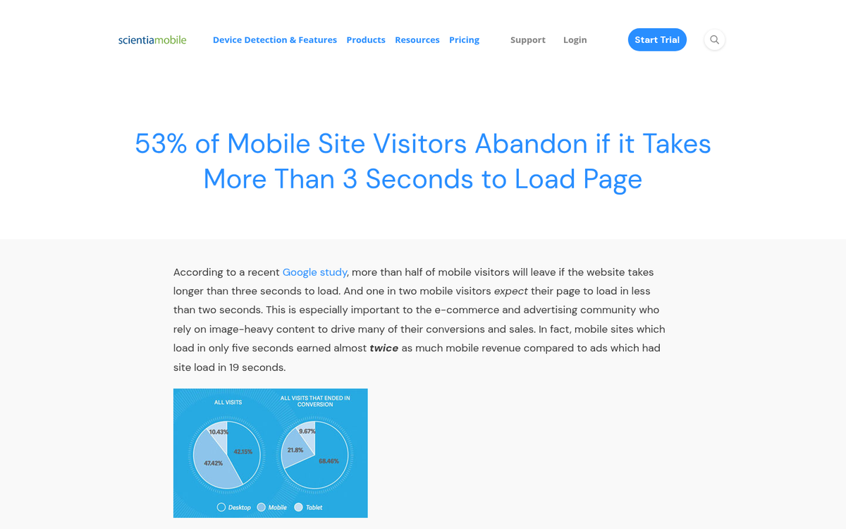
This disconnect is even more damaging on mobile. According to Google, the average time to load a mobile landing page is 15 seconds - and 53% of mobile users will abandon a page that takes longer than 3 seconds to load. So before a visitor even sees your carefully crafted copy and form, there's a good chance they're already gone.
Then there are the deliberate redirects - clicking a link only to find yourself routed to a landing page you never asked for. It's a bait and switch, and users in 2026 are far less tolerant of it than they used to be.
There's Too Much Advertising Everywhere

One major compounding problem is that when you do make it past a landing page and find the actual website, you're often greeted by another layer of advertising - a sticky banner, a delayed lightbox, a push notification prompt, and a cookie consent wall all fighting for your attention simultaneously.
This has only gotten worse. In the past, the concern was pages crammed with banner ads and AdSense units. Today, it's behaviourally triggered overlays, retargeting pop-ups, and AI-personalised interstitials all stacked on top of one another. It's like hacking through undergrowth trying to find the actual content.
Google has taken action on this over the years - penalising intrusive interstitials in mobile search rankings, and factoring page experience signals into ranking algorithms. But the ad density problem hasn't gone away; it's just moved and mutated. And when visitors already feel bombarded before they reach your landing page, asking them to hand over personal information is a very hard sell.
I'll be honest: I've blacklisted certain sites from both casual and professional browsing purely because of ad density. I run ad blockers, script blockers, and I'm not alone. According to multiple industry reports, ad blocker usage continues to climb year-on-year. The market is speaking - and it's saying it's had enough.
They Don't Give Enough Information

One of the cardinal sins of a landing page is not having enough information, and yet it remains a persistent problem. Plenty of celebrated "high-converting" landing pages are little more than a headline, a single image, and a form. Yes, the service might be simple - but that doesn't mean users don't have questions.
The average landing page conversion rate across all industries sits at just 2.35%. Part of why that number is so low is that landing pages are optimised for a binary outcome: convert or bounce. There's rarely a third path - no way to explore further, no links to case studies or FAQs, no way to build genuine trust before committing. If you want to understand what's driving visitors away, there's a lot you can learn from your bounce rate.
Here's the thing. A well-built resource page or blog post with a contextual call-to-action embedded in it offers three outcomes: convert now, explore more and convert later, or leave. That third outcome - becoming a lead through deeper engagement - is completely invisible in traditional landing page metrics, and it's exactly why so many businesses undervalue content-led conversion.
Lead generation is just as important as immediate conversions. In many cases, the conversion you're optimising for on a landing page is only the start of a longer sales process anyway. If you're capturing an email address just to then nurture a lead through weeks of email sequences, why not let the website itself do some of that nurturing work first? Investing in the best lead generation tools and software can help bridge that gap between a passive visitor and a committed prospect.
This matters more than ever in 2026. Gen Z and younger millennials - who now make up an enormous share of buying power - don't want to be pushed into decisions. They research extensively, they compare options, they read reviews, and they resent high-pressure funnels. A landing page that gives them nothing to work with except a form isn't just unhelpful - it's actively off-putting to a huge segment of the market.
They Ask For Too Much Information
Some landing pages overcorrect and load up on content, which in itself isn't a bad thing. But then you reach the form, and everything falls apart.
The data is clear on this: landing pages with five or fewer form fields convert 120% better than those with more. Conversion rates have been shown to drop sharply - from over 10% down to 5-6% - when forms start asking for information like birth dates and gender. Every single field you add is a stumbling block. Every one.
Asking for an email address is fine. Adding a name field is acceptable. Adding company name, job title, company size, phone number, and annual revenue? You're essentially asking someone to fill out a job application before they've decided if they even like you. Most people - especially anyone under 35 - will close the tab without a second thought. They know exactly where that information is going, and they're not interested in the spam emails and cold calls that will follow.
The best performing forms in 2026 are minimal, frictionless, and ideally embedded in a context that already makes the visitor want to convert. Think about how the best e-commerce and SaaS product pages work - the "get started" button takes you directly into a signup flow, not onto a separate landing page demanding your life history. If you want to improve results, follow best practices for creating and optimizing registration forms before you launch.
They Rely on Autoplay Video and Outdated Tactics
You've seen it. The long-form sales page with six fonts, eight colours, and a wall of bolded testimonials. At the top, an autoplay video kicks in - often narrated, often featuring someone claiming extraordinary results - and you frantically search for the pause button while quietly judging every decision that led to this moment.
Autoplay video remains one of the most reliably annoying things you can put on a page. Browsers have actually cracked down on this over the years - most now block autoplay with sound by default - but marketers keep finding workarounds, and the underlying impulse to hijack someone's attention hasn't gone away.
The broader issue here is that many of the tactics baked into traditional landing page design were built around a kind of friction-as-persuasion philosophy: remove all exits, create urgency, overwhelm with social proof, and demand action now. That approach can still work in narrow contexts, but it produces the kind of experience that sends most modern users running - and it actively damages brand trust with anyone who doesn't convert.
They Misrepresent a Company

The fundamental problem with a landing page is that it only ever tells one story: "We're the best, our thing is the best thing, you should want our thing." There's no room for nuance, no acknowledgement of limitations, no sense of a real company behind the curtain.
In 2026, that's a serious credibility problem. Anyone seriously considering a product or service is going to look you up. They're going to check third-party reviews on G2, Trustpilot, Reddit, and wherever else their community hangs out. They're going to look at your LinkedIn, your Glassdoor rating, and how you respond to negative feedback. They're going to ask in forums and Discord servers. A polished landing page telling them how great you are isn't going to move the needle - and if it's the only face your company shows online, it's actively going to raise red flags.
A company with a strong content presence, transparent pricing, real case studies, and an active community presence will outperform a company with a well-optimised landing page almost every time over the long run.
There's still a role for landing pages - particularly in paid campaigns where a focused, distraction-free experience genuinely helps conversion, or in B2B contexts where intent is already high and the audience is ready to act. But the idea that a landing page is always the right tool for the job? That thinking belongs in 2010, where it started.