Your landing page is the lifeblood link between your customers and your profit line. Without it, you have to hope something on your blog catches their eye well enough to hook them into a product, or you have to hope your sales team can connect with the right people at the right time to make a purchase.
Obviously, you need to make sure your landing page is as focused and optimized as possible. You don't have to worry too much about SEO, beyond the traditional steps to avoid copied content or spam. Just worry about conversion rate and optimize your site as best you can.
Key Takeaways
- Simplify landing page design with minimal navigation, bullet-point copy, fast load times, and focused layout to maximize conversions.
- Personalized, action-oriented CTAs with contrasting colors perform significantly better than generic buttons; use multiple instances or sticky placement.
- Adding social proof-testimonials, case studies, user counts, logos, and review widgets-can increase conversions by up to 34%.
- Reduce form fields to only essentials; removing just one field can increase form conversions by up to 50%.
- Adding a short explainer video can boost conversions by up to 86% while replacing dense copy and answering visitor questions.
1. Improve your Page Design
The design of your landing page says a lot about your audience and your product. Some products are simple and don't require more than 100 words in bullet points to get everything across. Some services are much more detailed and require a lot more information.
Your landing page should be easy to navigate. Ideally, the only navigation the user has to do is scroll down. Interactivity should be limited to scrolling, filling out the CTA form, or clicking play on a video. Every additional step is a roadblock to conversions. In fact, Unbounce data backs this up hard: pages with just one link converted at 13.50%, while pages with five or more links dropped to an average of 10.50%. Keep it focused.
Make sure you format information in bullet points rather than paragraph format. Short and sweet. Full sentences are nice, but your readers skim. They might not even read your copy if it looks too dense.
Use images and layout cues to direct user attention to each part of the page in turn. This can be as subtle as a clever use of whitespace, or as overt as a cartoon graphic pointing the way.
Don't overlook page speed either. WordStream found that a single one-second delay in load time results in a 7% reduction in conversions. In 2026, users expect pages to load almost instantly, and Google's Core Web Vitals continue to factor into both rankings and user experience. Run your page through PageSpeed Insights regularly and act on what it tells you. If you're still building out your pages, check out these free landing page templates you can download to get a head start on a clean, conversion-ready design.
2. Design a Better CTA
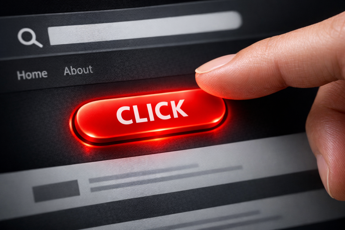
Your call to action is the final word, the driving sentence, the bright neon button that gets users to take the plunge and register for your site, download your ebook, or buy your software. As such, it's arguably the most important part of your landing page.
One of the most impactful things you can do here is personalize it. HubSpot found that personalized CTAs perform 202% better than generic ones. Instead of a bland "Submit" or "Sign Up," think about what your specific user actually wants at that moment and speak directly to it.
Don't try to cram it in above the fold if you don't have to. You're free to test placement yourself, but putting it below the fold after you've built up some context often outperforms a rushed above-the-fold push.
I recommend putting multiple instances of your CTA on the page, or using a sticky CTA that remains visible as users scroll. This way, even if you have a long landing page, there's always a clear next step visible no matter where the user is on the page.
Your CTA button needs to stand out. The easiest way to do this is to make it contrast color-wise from the rest of your page. A grayscale page with a red button, a blue page with an orange button, and so on. Make sure it's the only element on the page using that color so it's impossible to miss. If you want to dig deeper into this, check out our guide on color psychology and how it affects sales conversions.
Don't forget to optimize the language of your CTA as well. Action-oriented, benefit-driven copy consistently outperforms passive or vague phrasing.
3. Add Social Proof
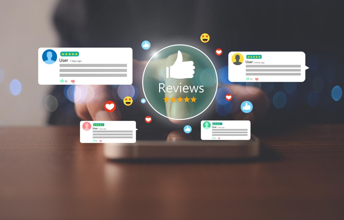
Social proof is social reinforcement of the trustworthiness of your brand. You've probably seen it all over the place without realizing exactly what it is. According to Unbounce, adding social proof to a landing page can increase conversions by as much as 34%. You should strive to use legitimate social proof on your page so users feel more confident in your brand and your product. Here are a few ideas:
- Use customer testimonials. Don't just write a generic "I loved it!" from Joe Blow - solicit real testimonials from real, high-profile users. If you can get someone influential in your industry to review your product, that carries serious weight. A couple of sentences, something personal, even a longer paragraph works well.
- Take the testimonial concept one step further and solicit case studies from people who use your product. A legitimate user with a real business, using your product to boost their sales or increase productivity, says a lot when they're willing to vouch for you publicly.
- List a raw numerical stat for the number of downloads or users of your product. When visitors see that thousands or millions of others already use your product, they'll feel far more confident moving forward.
- Show recognizable logos. If well-known companies use your product, display their logos. If you've been featured in notable publications, show those too. Trust signals like these go a long way, especially for newer or less established brands.
- In 2026, review platform widgets from sources like G2, Trustpilot, or Capterra carry real weight. Embedding a live star rating or review count pulls in third-party credibility that visitors trust more than anything you write about yourself.
4. Don't Forget SEO
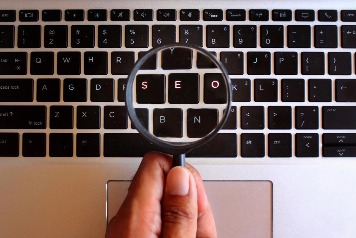
Landing page SEO is a unique beast because you don't have much space to work with. You'll want to focus on certain keywords, of course, but you can't overdo it because you have limited space for any sort of keyword density. Try to make sure your keyword appears in your meta title and description, as well as once or twice in your text, but don't go out of your way to shoehorn it into the copy.
With Google's continued evolution toward intent-based ranking and AI-driven search features like AI Overviews, your landing page copy needs to be genuinely helpful and clearly structured. Lean into clarity. If someone lands on your page from search, they should immediately see that they've found exactly what they were looking for.
Don't forget video SEO if you include a video hosted on YouTube or another platform. Likewise, optimize your images and include descriptive alt text with a relevant keyword where it fits naturally.
5. Simplify Your Forms
If your landing page includes a form - whether for a free trial, a download, a demo request, or a purchase - the number of fields you include has a direct and measurable impact on your conversion rate. Research shows that removing just one field from a form can increase conversions by up to 50%.
Ask yourself honestly: do you actually need every field you're asking for right now? In most cases, a name and email is enough to get someone into your funnel. You can collect additional information later once trust is established. The more friction you remove from the initial conversion step, the more people will complete it.
This applies to checkout flows too. Every extra step, every additional field, every unnecessary click is an opportunity for someone to abandon the process entirely. If you want to go deeper, review best practices for creating and optimizing registration forms to make sure you're only asking for what you truly need.
6. Use an Explainer Video
An explainer video is a short video, typically 60 to 120 seconds in length, that explains your product or service. These are often animated, though live action product demonstrations work extremely well depending on what you're selling. Adding a video to your landing page can increase conversions by as much as 86%, making it one of the highest-leverage things you can add to the page.
The video helps keep people on your site longer, replaces tedious blocks of copy about how your product works, and proactively answers the questions visitors are most likely to have before committing.
Production quality matters more than it used to. With tools like Synthesia, HeyGen, and a range of AI-assisted video production platforms now widely available, there's less excuse for a low-effort video in 2026. You don't need a massive budget, but you do need something that looks intentional and professional. Keep it concise, lead with the problem you solve, and end with a clear call to action. Before committing to a production service, it's worth reviewing what to know before buying an explainer video so you get the most out of your investment.