Key Takeaways
- Infographics still work for backlinks in 2026, with articles including them earning 178% more inbound links than those without.
- 53% of SEO specialists produce infographics specifically to earn backlinks, and 84% of marketers report them as effective.
- Infographics rooted in original research and distributed via digital PR campaigns sit at the intersection of the most effective link-building strategies.
- Common failure modes include weak or outdated data, poor graphic design, and lacking a deliberate multi-channel promotion plan.
- Bulk infographic production services are heavily commoditized and can damage your site's authority profile if used carelessly.
Infographics have had quite a journey in the world of digital marketing. When they first exploded in popularity around 2010-2013, everyone and their mother was making one. They were everywhere - on Facebook, Pinterest, LinkedIn and every blog under the sun. Predictably, the market became utterly saturated and a wave of poorly executed graphics nearly killed the format entirely.
Fast forward to 2026 and infographics have survived - they've matured into one of the most reliably helpful content formats in a modern SEO and link-building strategy. The difference now is that the bar is higher, the competition is smarter and the marketers still using them are largely doing it right.
Are Infographics Still Worth It for Backlinks in 2026?
The short answer is: yes - but with caveats. The data has proven this too:
- Blog articles that include infographics produce 178% more inbound links than those that don't.
- 53% of SEO specialists produce infographics specifically to earn backlinks, according to the Content Marketing Institute.
- "Why," "What," and infographic-style posts earn 25.8% more links than videos and "How-to" guides.
- Infographics can increase website traffic by up to 12%, and original graphics remain the top-performing visual content type across platforms.
- 84% of marketers who have used infographics report them as effective.
It's also worth mentioning the wider link-building context: Digital PR has emerged as the single most helpful link-building tactic heading into 2025 and beyond, chosen by 48.6% of respondents in recent industry surveys - well ahead of guest posting at 16% and linkable asset creation at 12%. Infographics that are rooted in original research and distributed via online PR campaigns sit at the intersection of all three of those strategies, which is why they remain so effective when executed well. There are also services that can help you earn more links to your content if you want to amplify your distribution efforts.
The caveat, as always, is that you need to execute them well - it's very easy to produce a bad infographic that goes nowhere. If you could recreate your infographic as a generic PowerPoint slide deck with a few pie charts and clip art, start over. The same principle applies to removing underperforming content from your blog - quality always wins over quantity.
The Benefits of Infographic Marketing
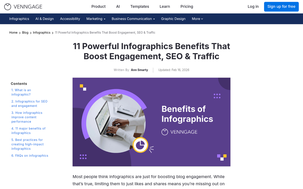
There's more to running an infographic campaign than just earning backlinks. Links are one of a few compounding benefits you can extract from a single well-made graphic. Let's talk about what's on the table:
- Brand recognition. A consistently high-quality infographic output builds a reputation over time. People begin to associate your brand with authoritative, well-presented information - particularly valuable in B2B contexts, but equally effective for consumer brands when the topic and tone are right.
- Social media shares and viral traffic. Infographics perform well across visual platforms. Pinterest remains a strong distribution channel, and LinkedIn has become increasingly important for B2B infographics. Short-form vertical clips derived from infographic content also translate well to Instagram Reels and TikTok, giving you additional distribution angles that weren't available in the early days of the format.
- Evergreen traffic for certain topics. Choose the right subject and your infographic can circulate for years, generating ongoing referral traffic and links long after publication. Pair this with timely, newsjacking-style graphics and you have a two-speed content engine that covers both long-term authority and short-term traffic spikes.
- A reputation for quality graphic design. Well-designed infographics signal craft and credibility. The best ones have more in common with editorial illustration than with spreadsheet exports, and that quality is noticed - both by readers and by the publishers you want linking to your content.
- Education and trust-building. Complex industry data, processes, or comparisons become far more digestible in visual form. Explaining something clearly and visually positions your brand as an authority and builds the kind of trust that drives conversions over time.
- Content repurposing value. The research behind a strong infographic can be repurposed into blog posts, white papers, email newsletters, SlideShare decks, short-form video, and more. One solid research effort can fuel an entire content calendar across multiple formats and channels.
- And yes - the links.
Reasons Infographics Can Fail
The failure modes for infographics haven't changed much. But they're worth revisiting because the consequences of getting it wrong are steeper now that audiences are more refined and Google's quality signals are sharper.
1: The data is weak, wrong, or outdated. This is the most common and most damaging failure. Misleading statistics, unverifiable sources, or stale data will either kill engagement quietly or - in a worst-case scenario - earn you the wrong viral attention. Always cite primary sources, check publication dates on your statistics and where possible, commission original research. Original data is the single biggest differentiator in infographic quality in 2026 and it's far more likely to draw editorial links from high-authority publishers.
2: The graphic design is poor. An infographic is not a set of bar charts dressed up with a color scheme - it should have a visual narrative, a logical flow and genuine design craft. If it looks like something assembled in Canva in 45 minutes using default templates, it will perform like it too. Invest in professional design - more on that below.
3: There's no promotion plan. Publishing an infographic and hoping it spreads is not a strategy. In 2026, distribution requires an intentional, multi-channel strategy: targeted outreach to relevant publishers and journalists, social seeding, email amplification and ideally an online PR angle that makes the content legitimately newsworthy. The promotion process deserves as much planning as the creation process - if not more.
Designing an Infographic in 2026
The fundamentals of infographic creation haven't changed dramatically. But the standards have risen and the tools have evolved. Here's the process:
- Brainstorm and select a topic. Identify something with genuine audience interest that you have the authority to cover. Decide early whether you're going for evergreen depth or timely relevance - both are valid, but they require different research approaches, design timelines, and promotional strategies. At this stage, also consider whether original proprietary data is available to you, as this dramatically increases link-earning potential.
- Do the research. Gather more data than you think you'll need. Pull from credible, verifiable primary sources. Where possible, conduct surveys, analyze your own platform data, or partner with a research organization to generate findings that don't exist anywhere else. Original research is the gold standard for infographic content in 2026.
- Filter and verify your data. Cut anything that doesn't hold up to scrutiny. Check that your statistics are current - data from even two or three years ago can feel stale in fast-moving industries. Test your content concept with a small sample audience before committing to full design.
- Define an emotional angle. What should the reader feel? Surprised? Validated? Concerned? Inspired to act? This emotional intent should drive every design and copy decision that follows.
- Build the narrative. Every great infographic tells a story. Define your hook, your through-line, and your conclusion. Readers should feel like they've been taken somewhere by the time they reach the bottom of the graphic.
- Map out the visual details. Decide how data will be represented visually - iconography, illustrated comparisons, timelines, diagrams, maps. Avoid defaulting to standard chart types unless they genuinely serve the story better than a more creative visual solution.
- Write the copy. Keep it tight. Every text element should be brief, punchy, and shareable. A useful test: could each major stat or statement be posted as a standalone social media update? If yes, you're in the right territory.
- Find and hire a designer. Freelance platforms like Upwork remain useful for finding talent, but in 2026 you also have strong communities on Behance, Dribbble, and various design-specific Discord and Slack communities. Review portfolios carefully and prioritize designers with demonstrable experience in data visualization and editorial illustration rather than general graphic design. AI-assisted design tools have improved significantly, but for high-stakes infographic campaigns, human design judgment still produces better results.
- Develop a wireframe or outline before full production. Align on layout, flow, logo placement, source citations, and any embedded CTAs before the designer moves into final execution. Changes at wireframe stage are cheap. Changes at final production stage are not.
- Finalize, publish, and promote. Pay your designer fairly and on time - if you want to build a reliable content production operation, treating your creative partners well is not optional. Then execute your promotion plan with the same rigor you applied to the creation process.
One important modern note: stay on top of businesses that sell bulk infographic production as a link-building service. This space has been heavily commoditized and, in some cases, gamed. The same process that made cheap guest posts a liability applies here. Low-effort, templated infographics distributed through private networks are at best a waste of budget and at worst a danger to your site's authority profile. Quality and genuine editorial placement are what matter.
For most content teams, a basic development cycle for a quality infographic is two to four weeks from concept to publication. Once you've streamlined the process with a reliable designer and a research workflow, that timeline can compress - but don't sacrifice quality for speed unless you have a genuine newsjacking opportunity that requires it.
Done right, infographics remain one of the highest-ROI content investments available to a modern SEO and content marketing strategy. The format has essentially grown up - and so should your approach to it.