Key Takeaways
- Popups work despite being unpopular-overlays can increase email sign-ups by 400% when implemented correctly.
- Google actively penalizes intrusive interstitials; sites have lost 10+ search positions and 20% mobile traffic from faulty popups.
- Bully language in popup copy doesn't convert users-it actually makes them less likely to click your call-to-action.
- Generic, untargeted popup messages feel disruptive; showing relevant offers based on the page being viewed improves results.
- Popup timing matters-scroll-triggered and exit-intent triggers are less disruptive than immediate popups, which risk Google penalties.
I have talked before about how much I dislike pop-ups, and I'm sure I'm not alone. Millions browse the web and of them, over 70% feel that irrelevant popups are very annoying.
But if you try to mouse away from this site, chances are you're going to get a pop-over on your way out. So why, if I don't like them and people out there don't like them, am I and other sites around the web still using them?
The fact is, popups work. Popups, popovers, popunders - they're all methods to apply a call to action in a way that doesn't take up space in the normal flow of content. A popover can increase your email sign-ups by 400%.
The reason so many hate them is the ways they have been misused, in the past and in the present.
Using a popup or a popover can and will hurt your traffic, if you're using them wrong. If you're using them right, they might drive away a few users. But they will convert far more. So how can you hurt your traffic with popups?
Using the Wrong Kind of Popup
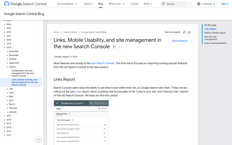
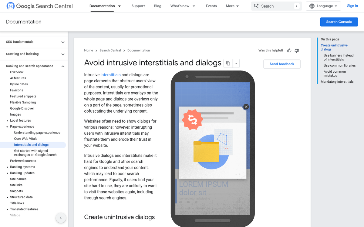
Since January 10, 2017, Google has actively penalized websites that use "intrusive interstitials" - popups that disrupt the user experience and negatively affect usability. SEO consultant Glen Gabe at G-Squared Interactive documented sites losing 10 or more positions in mobile search rankings as a direct result of this penalty, potentially costing thousands of visitors per day. One Kinsta client reported a 20% drop in mobile traffic, losing nearly 2,000 visitors in just three days because of a faulty popup plugin.
The penalty was further reinforced through Google's 2023 Helpful Content Update, which caused dramatic ranking drops or total traffic loss for sites leaning heavily on disruptive popup experiences. Google's John Mueller has confirmed that intrusive interstitials are a "softer negative ranking factor". That said, penalties "wouldn't be applied across the whole website," but the page-level damage can be very real. As a general rule of thumb, popups taking up less than 15% of the screen are within Google's permitted guidelines.
There are three main types of popups. The first is the traditional popup, which opens a new browser window (or tab, as most browsers now default to) and shows content that way. The second is the popunder, which works the same way but was built to not steal focus from the user; it sits there until the user moves or closes their current window, showing your window beneath. The third is the popover or overlay, which is not a new window at all, but a lightbox overlay on top of the site content - it's what this site and most modern sites use.
The first two, the ones that open new windows, are old technology and are usually considered a negative user experience. Popups, in the traditional sense, are disruptive. You're trying to read content and suddenly there's a new window on top of what you were reading - it doesn't help that historically these windows featured flashing colored messages, audio, and unrelated advertisements - frequently spawned by ad networks instead of the site itself.
Popunders have a similar effect, on a delay. Rather than disrupting you immediately, they lie in wait. By the time you see one, you usually have no idea what site spawned it or what clicking the button might do. Some of the more insidious versions played videos or audio in the background, but basically had their message waiting for whenever you chose to see them.
Software overlays are the generally accepted version of the popup for modern audiences, though they still have their problems. The rest of the problems in this post are all focused on that: problems with site plugin overlays instead of browser popups, and how they can create mobile usability issues that cost you traffic.
Using Bully Language
Have you ever run into one of these popups and seen some language like "Have you ever wanted 100,000 subscribers for your mailing list?" with two options, one of which is something like "Yes, that sounds great, please tell me how" and one says "No thanks, I don't need a mailing list"? The idea is to sort of shame you into clicking the button. Either you like your business or you hate it and want it to fail. Right?
This is a language bullying tactic that businesses pull when they're marketing primarily in a B2B sphere. Similar techniques are used for B2C marketing as well; the brand tries to shame the user into clicking the button.
Have you ever fallen for it? Do you believe that if you click "no thanks" that you actually hate your business and want it to fail? Do you feel compelled to click yes just because you're sending the wrong message?

Of course not. We all know it's just a yes or no, and that couching it in these shameful terms is trying to verbally abuse and coerce you into making the choice the site wants you to make - it's not like clicking no will send a message to your boss about how you want the brand to fail.
People don't fall for bully language, and it usually makes them less likely to click. It might not hurt your traffic, but it will hurt your conversion rate for your popover, so there's no sense in it.
Using Generic Messages
The other possible issue with the message on your popover is when it's too generic. You've probably gone to a site and seen a popup that has nothing to do with what you're interested in - it happens all the time.
Say you're a site selling all sorts of health and pharmaceutical supplements. You have whey and protein products for muscle growth, you have weight loss and diet pills, you have vitamins and supplements, and you have a different audience who all want different things.
Which message do you show?
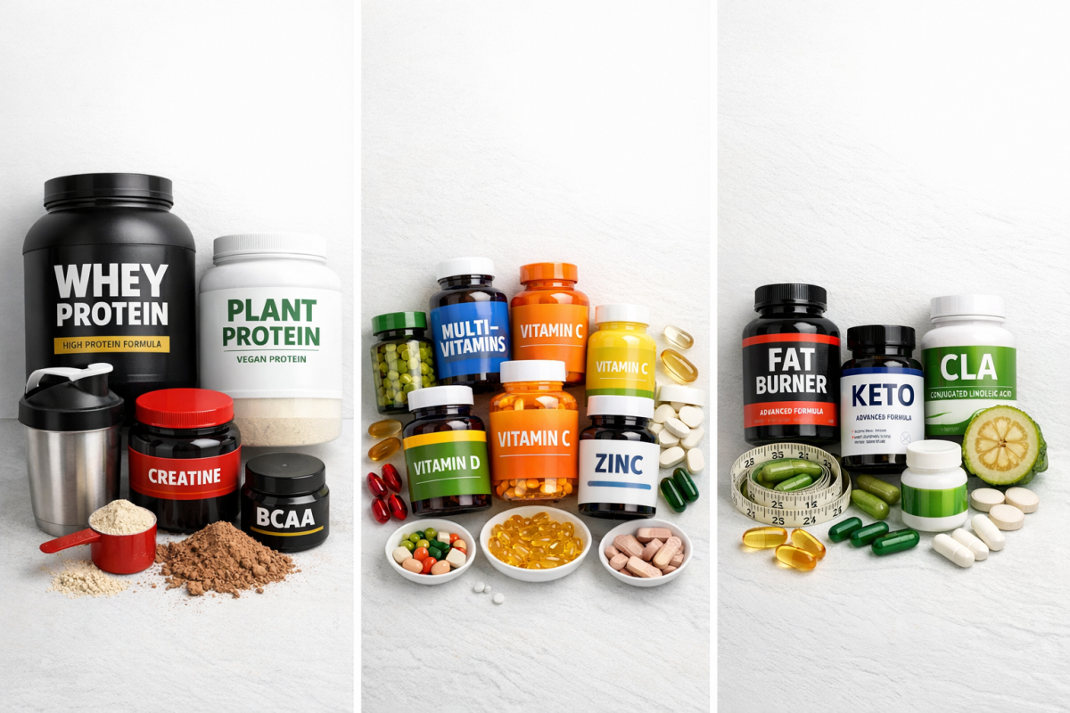
If you show a popup for weight loss pills and it shows up in front of people looking for muscle growth supplements, they're going to be disinterested - it's a disruptive popover, nothing more. The same goes in reverse; if you show muscle growth items to people looking for multivitamins, it's far outside of their concern and they'll wave it off.
What you need to do is target your messaging. You need to make sure that the message you're sending is specifically focused on giving some value to the person reading it.
Unfortunately, this is hard to pull off. You either need to be able to show different popups on different pages, or you need a popup engine that monitors your users and gives popups to users with relevant characteristics. The former is by far the easier strategy; basically only show popups for weight loss items while the user is browsing other weight loss items.
Making it Hard to Close
From a usability standpoint, you want your popup to be easy to close. The more disruptive it is, the more your users and Google will penalize you for it.
You always need some way to get out of it.
- You can keep the default corner X that most lightboxes have, so the user can click the corner to close it.
- You can make two equally large options, one of which is convert, one of which is close. Make sure they're clearly identified which is which, and again, don't use bully text.
- You can make one large conversion box, and one small line of text to close the box and get back to the content beneath. This is hard to balance, because your closing text still needs to be large enough to see for what it is, but small enough to not disrupt the attention focused on the conversion button.
- You can allow the usually-default behavior of letting the ESC key close the popover. It's a default "close extraneous crap" reflex for a lot of users, and if it doesn't work, it leaves people feeling frustrated with the experience.
Personally, I recommend at least two of the four. I always think the ESC key should close your popovers regardless of what they are or what they're for - it works for fullscreen video, it works for media lightboxes, it should work for popovers. I also don't think there's any benefit to removing the X in the corner.
Whether or not you use a button to close the popover is up to you. In most cases I find that it will cause a slippery slope where you start drifting closer and closer to bully text as you optimize. Be careful; you don't want it all to backfire on you.
Disrupting the User Experience
Once again, it all comes back to the user experience. The more disruptive you are with your popover, the more likely you are to drive your users away - and the more likely Google is to take notice.

There are a few styles of popover you can use, each with their benefits and drawbacks. Pick the right ones for your users.
- Immediate. This is pretty rare these days, and for good reason. Triggering a popup the moment someone lands on your page is one of the more likely ways to fall foul of Google's intrusive interstitial guidelines. Unless the message is genuinely critical and time-sensitive - such as a site-wide sale or legal notice - avoid this approach entirely.
- Time delay. The easiest kind of popover to trigger is a time delayed trigger. Set it to something like 30-45 seconds after the user loads and you'll capture a lot of traffic from people who read your content, but won't bother loading it to people who are dissatisfied or who are bouncing from your page right away.
- Scroll-triggered. If you want to guarantee that the people who see your popover are the same people who are reading your content, you can make it trigger only when the user has scrolled far enough down the page to actually be considered to have read it. Usually something like 60-70% of the way down the page is a good idea.
- Exit intent. This is the most complex, which means it's generally only available with paid plugins instead of the free options. However, it also is the most refined. It doesn't interrupt the user who is reading your posts; it only triggers when they're about to leave, as signaled by the window losing focus or the cursor moving outside of it.
Make sure you pick an option that doesn't disrupt users who are actually trying to accomplish something. And regardless of which trigger you choose, keep the popup itself small - remember, Google's guidelines permit popups that take up less than 15% of the screen, so staying within that threshold keeps you on the right side of any ranking penalties.
Restricting User Actions
This is an extension of one of the previous flaws, the inability to close the popup - it's happening quite a bit on mobile devices, but can occasionally be spotted on desktops as well. In some cases, the popup redirects you two or three times to a destination page; this is a soft disable for the back button. Clicking "back" just returns you to the redirect back to the trap page.
Then if you try to close the page, it pops up a box warning you about closing it. Sometimes that box will be worded in such a way as to make you unsure whether or not the button to close it actually closes it - this box also steals focus and disables clicking on the rest of the page until it's closed.
Essentially, these kinds of traps are used to serve malware or trap a user into some action they have no interest in actually completing - it's also something that will very quickly earn you a direct penalty from Google.
These are the biggest possible flaws in a popup or popover for your site marketing. The fact is, they can work to increase your conversions just like any other technique. But you'll have to optimize them for your audience and message. At the same time, if they're disruptive in any way, it can harm your search engine ranking or drive users away - and Google has made it increasingly clear over the years that it takes this seriously. Take caution when putting them up and you should be fine.