Explainer videos have become one of the most powerful tools in a marketer's arsenal. These short, engaging videos are designed to showcase and explain a product or service - and they work. According to Wyzowl, 96% of people have watched an explainer video to learn about a product or service, and 85% say they've been convinced to buy after watching one. Landing pages with explainer videos convert up to 86% better than those without, and 73% of video marketers say explainer videos are their top use case.
Most explainer videos skip the camera entirely, relying instead on animation, motion graphics, or whiteboard-style visuals to get the message across clearly and memorably. Done right, they can go viral - the Squatty Potty unicorn video, for example, racked up 36 million views and generated $15 million in first-year sales.
What does a good explainer video look like? Here are a dozen or so examples worth studying. Use them to brainstorm ideas for your own!
Key Takeaways
- Explainer videos are highly effective: 96% of people watch them to learn about products, and 85% have been convinced to buy.
- Most explainer videos use animation or motion graphics rather than live-action footage to communicate clearly and memorably.
- Dropbox's two-minute animated explainer grew waitlist signups from 5,000 to 75,000 almost overnight, proving their conversion power.
- Educational explainer videos, like TED-Ed's, can build brand trust and authority without being directly promotional.
- Effective explainers anticipate viewer objections, match tone to their audience, and ideally run under two minutes.
Dollar Shave Club
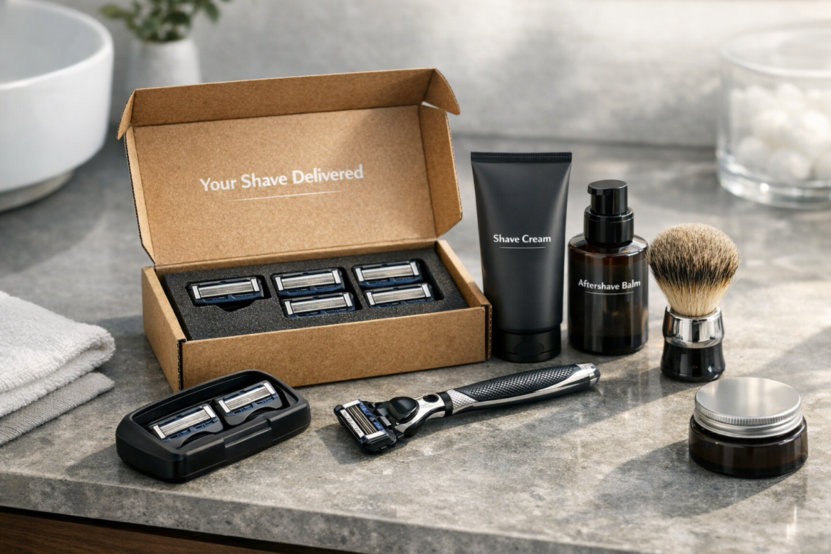
The Dollar Shave Club video is a masterclass in explainer video marketing. The concept - pay a low monthly fee and get razor blades shipped to your door - is simple, but the video answers every potential objection in a funny, irreverent, and highly shareable way. It's live-action rather than animated, which is less common for explainer videos, but it works brilliantly here. This video is widely credited with helping DSC explode in growth almost overnight, eventually leading to its $1 billion acquisition by Unilever.
Coca-Cola
This is less of a consumer-facing marketing video and more of an internal or thought-leadership piece. It uses a hybrid style - part whiteboard, part animation - where a hand draws on screen but the content itself is partially animated rather than purely hand-drawn. One thing to note: this video is exceptionally long by explainer video standards. Most effective explainers clock in at under two minutes, so if you take anything from this one, it's the visual style rather than the length.
TED-Ed: Is 1 a Prime Number?

This video from TED-Ed is a great example of an animated explainer that isn't directly tied to a product or service. Instead, it's educational - designed to explain a mathematical concept to a curious audience. It's a good reminder that explainer videos don't have to be purely promotional. If your brand has something genuinely interesting to teach, an educational explainer can build trust and authority just as effectively.
Virgin America Safety Video

This is a clever example of an explainer video used in an offline-online hybrid context. While it's available online, it was primarily designed as an in-flight safety video - replacing the traditional flight attendant demonstration with something passengers might actually pay attention to. The animated style is eye-catching, the tone is humorous, and the information sticks. Virgin America is no longer operating as a standalone brand following its merger with Alaska Airlines, but the video remains a well-cited example of creative explainer content.
Panorama9
Panorama9 is a network management suite aimed at IT professionals. Rather than a dry product walkthrough, this animated explainer leans into nostalgia - using a retro video game visual style and voice-over that appeals directly to its audience. It packs a lot of feature information into roughly three minutes without feeling overwhelming. A great example of matching the tone and style of your video to your specific audience.
Mint
Mint is a personal finance app that handles budgeting, tracking, and account management in one place. This animated explainer walks through a lot of functionality quickly and clearly, while also addressing a critical concern for any finance app: security. It's a well-rounded video that anticipates viewer questions and answers them before they become objections - a technique every good explainer should use. If you want more people to discover your app, check out this list of 50+ app directories to submit your mobile app to.

Pinterest wasn't always the household name it is today, and this early explainer video was their way of introducing the platform to a new audience. It tells you upfront how long the video runs, which is a nice touch. The script could be tighter and the narration clearer, but as an example of how even a rough explainer can help a new product gain footing, it's worth watching.
Student Hut
Student Hut is a platform that lets college students rate and review course modules to help each other make better decisions. The concept is simple, and the video reflects that - straightforward animation, a clean voice-over, and a clear value proposition delivered without any unnecessary complexity. Sometimes the best explainer video is the one that gets out of its own way. If you want viewers to stick around long enough to absorb that message, it helps to know how to grab attention and reduce bounce rate from the start.
FileExpert
This video promotes an Android file manager competing in a crowded field of similar apps. It's a perfect case study in why explainer videos matter in competitive markets: when two comparable products go head to head, the one with a clear, well-made explainer video will almost always win more conversions. The animation is clean and focused, showing exactly what the app does without unnecessary filler.
Olark
Olark is a live chat tool for websites, and this explainer does a great job of walking through what it does and why it matters. The narration and animation are both solid, but the standout detail is the special offer presented at the end of the video - rewarding viewers who watch all the way through. It's a small touch that adds real conversion value and is worth borrowing for your own videos.
Amazon Echo
When Amazon first launched the Echo, there was no easy way to describe it - there was simply nothing else quite like it. This explainer video solved that problem by showing the device in real-life use across a variety of everyday scenarios. It's a great example of how a well-made video can introduce an entirely new product category without leaving the viewer confused. Given how dominant smart speakers have become since, it's interesting to look back at how Amazon first framed the concept.
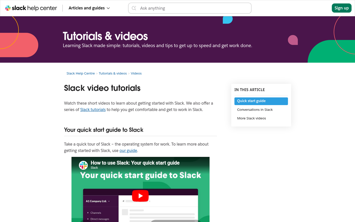
Slack

Slack's explainer video is frequently cited as one of the best in the SaaS space. It focuses not on features, but on outcomes - showing how teams communicate more effectively and spend less time buried in email. The animation is clean, the pacing is tight, and the script is sharp. It's a strong model for any B2B product looking to explain a workflow-changing tool without getting bogged down in technical detail.
Dropbox
Dropbox's original explainer video is a legendary example in the marketing world. A simple two-minute animated video explaining a then-unfamiliar concept - cloud file storage - is credited with helping Dropbox grow from 5,000 to 75,000 waitlist signups almost overnight. It's a powerful reminder that a clear, well-crafted explainer can do the heavy lifting that even a great product sometimes can't do on its own.