Key Takeaways
- Social sharing buttons have very low usage rates - only 0.2% of mobile users share content, so placement must be intentional.
- With over 60% of traffic coming from mobile, buttons must be fully responsive or they'll fail most visitors.
- Only display buttons for social platforms you actively maintain - dormant profiles erode visitor trust and confidence.
- Choose plugins that don't harm page speed; tools like Shareaholic achieve 100/100 PageSpeed scores while remaining functional.
- Always test buttons on multiple real devices, checking appearance, responsiveness, and actual sharing functionality before going live.
One of the most basic things you can do to integrate your social media accounts and your website is install social sharing buttons. However, there's probably well over a hundred different plugins and methods for social sharing buttons out there, and many of them are out of date. They look fine and they work. But they have a few drawbacks - and in 2026, those drawbacks matter more than ever.
Before we get started, it's worth being honest about something: social sharing buttons are used far less than assumed. According to Marketing Insider, only 0.39% of mobile users and 0.60% of desktop users actually tap share buttons. Across 61 million mobile sessions studied, only 0.2% of mobile users performed any social sharing at all - meaning users are 11.5 times more likely to tap an advertisement than a social sharing button on mobile; it's a sobering statistic. But it doesn't mean buttons are worthless - it means you'll have to be thoughtful about how and where you use them.
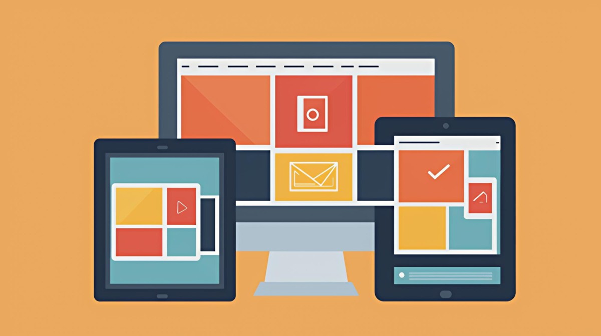
One drawback of outdated social sharing implementations comes from the fact that the web is now overwhelmingly mobile. As much as 60% or more of your traffic likely comes from mobile devices - smartphones, tablets, and more. If your social sharing buttons aren't responsive, they'll break or fail to display correctly for the majority of your visitors. AI-driven content discovery and social algorithms have changed how content spreads, which makes it even more important that the sharing experience is frictionless when a user does want to share.
How can you go about putting up social sharing buttons that respond to the device the user is browsing with, without bloating your site or hurting performance? It's actually not as tough as it may seem.
Step 1: Have a Blog
The first step is, obviously, that you'll have to have a blog. But past having one, your blog needs to be built with the mobile experience front and center - because that's where most of your readers are.
As a mobile browser myself, one of the worst things you can do is clutter your blog with intrusive advertisements - it's one thing to have a banner ad or a mid-content box ad, but it's quite another to have pop-ups and finicky little ads layering over each other. I've browsed pages so overloaded with ads that it became a minefield trying to close them. I blacklisted those sites immediately. Google also actively penalizes poor ad experiences on mobile, so this is both a user experience and an SEO issue.
Usability is huge with the web experience, and in 2026 it matters more than ever. AI-powered search tools like Google's AI Overviews and other generative search experiences are increasingly surfacing content based on quality signals - like page experience metrics. A poor mobile experience will cost you users and rankings.
There's also the consideration of mobile-friendly content. Simple blog posts are fine. But your topics may need to account for mobile audiences. If you're writing about how to use an app or tool, many of your users will be accessing it on mobile. Include mobile-specific steps or screenshots where relevant. In 2026, this also extends to voice search and AI assistant queries - writing in clear, direct language helps your content get surfaced by AI tools that summarize and recommend content.
Another thing to keep in mind is locality and context. Mobile users are usually browsing on the go. They want content that's immediately helpful, easy to skim, and relevant to their current situation. Keep paragraphs short, use headers generously, and get to the point faster.
I'm not saying you should dedicate your entire site to mobile users. What I'm saying is that you should put them at the front of every content and design choice you make.
Step 2: Have Social Media Accounts
The second thing is to make sure that you have the relevant social media accounts set up and actively maintained. If you're not active on an account, don't put a button on your site to promote it. People will click through, see a dormant profile, and immediately lose confidence in your brand.
The social media landscape has shifted considerably. Twitter/X has fragmented its user base, with users migrating to places like Bluesky, Threads, and Mastodon. LinkedIn has grown as a content platform. TikTok remains popular but has faced significant regulatory pressure in a few countries. Pinterest continues to perform well for visual and lifestyle content.
If you're only active on one or two social networks, make sure that you're only showing like buttons for those. A row of buttons for places you don't use is worse than no buttons at all - every click that leads nowhere is a small erosion of trust.
If you're only active on one or two networks, you might not even need a full social sharing plugin. Individual network buttons are usually lightweight, responsive, and sufficient. You can also think about other forms of social integration that go beyond a standard sharing bar:
- A Facebook Page plugin in your sidebar can show visitors mutual connections who follow you, acting as social proof and encouraging follows without requiring a share.
- A click-to-share quote block - whether for X/Twitter, Threads, or Bluesky - lets you highlight a key sentence from your post that readers can share with one tap. These tend to perform better than generic share buttons because the content is pre-framed and shareable.
- Pinterest's "Pin This" image overlay works well for visual content. If a user sees an image they want to save or share, they can tap it and pin it directly - frictionless and effective for the right audience.
These integrations let you stay social without loading your site down with a heavy plugin supporting dozens of networks you'll never use.
Step 3: Find the Right Social Media Plugins
You're going to have to do some searching to find a plugin that fits your particular needs, theme, and performance requirements. Page speed matters enormously in 2026 - for SEO and for user experience - so you can't afford to install a bloated sharing plugin that drags down your Core Web Vitals scores.
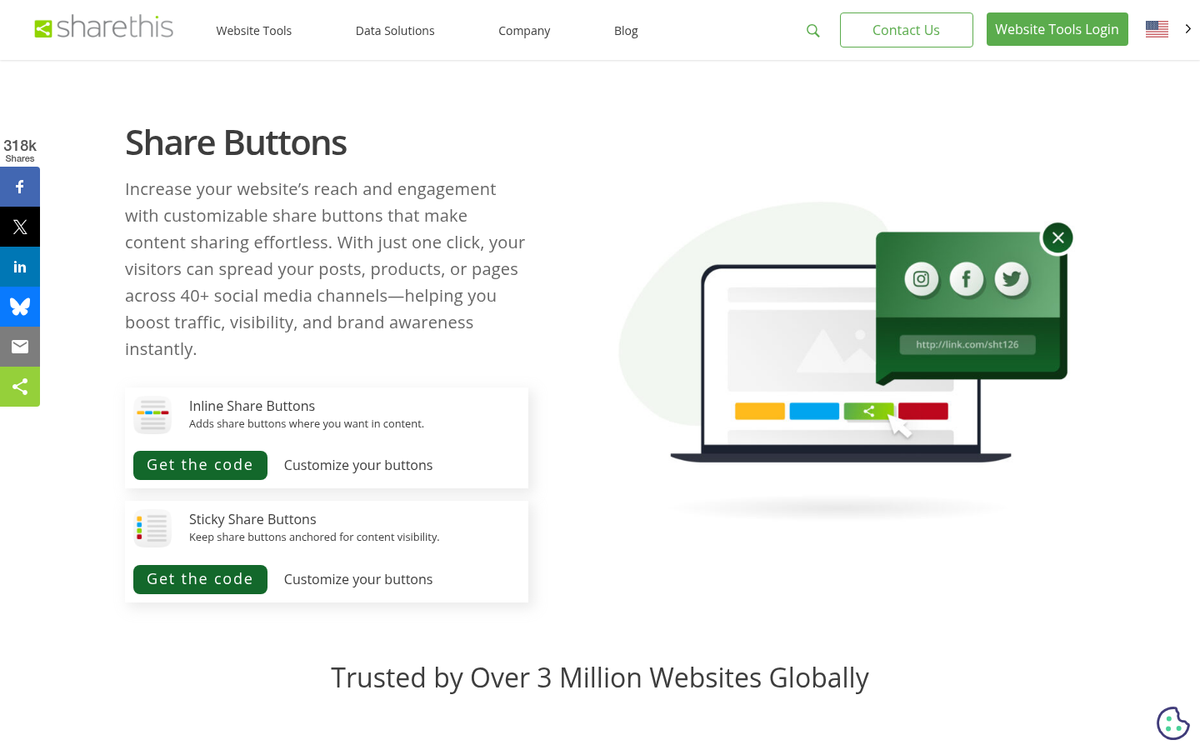
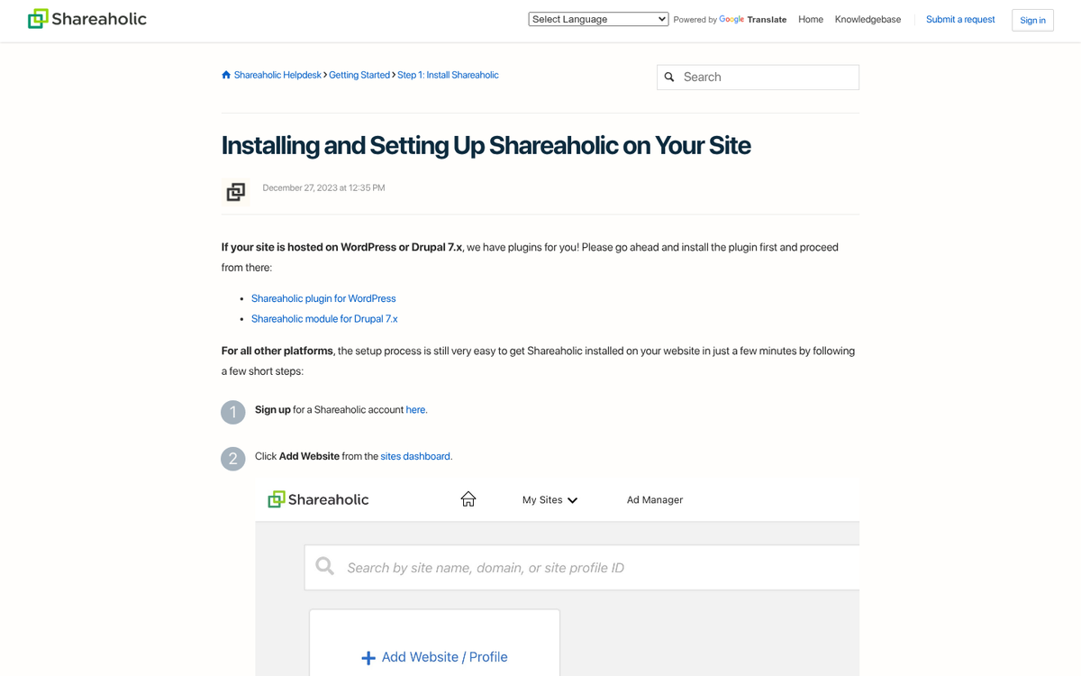
Two options worth learning about are Shareaholic and ShareThis. Shareaholic is trusted by over 300,000 websites and reaches over 350 million users each month. Notably, it achieves a 100/100 Google PageSpeed Insights score on desktop and above 95 on mobile - which is exceptional for a social plugin and means it won't tank your performance metrics. ShareThis has been providing free share buttons since 2007 and supports buttons from over 45 of the most popular social channels, which makes it a strong option if you need broad network coverage. You can also explore alternatives to popular share button plugins if neither of these fits your needs.
For WordPress users, finding a quality plugin is easy - the plugin directory is robust, and options like Shareaholic are easy to install and configure. For non-WordPress setups, you'll want to look for lightweight JavaScript-based services or use the native sharing APIs provided by each social network.
Regardless of what plugin or solution you choose, make sure it meets these criteria:
- It must be fully responsive. Buttons that look great on desktop but break on mobile are worse than no buttons at all. Check the documentation and test on real devices before committing.
- It must not harm your page speed. Run your site through Google PageSpeed Insights or a similar tool before and after installing any sharing plugin. If your scores drop significantly, find an alternative. A fast-loading implementation is ideal.
- It needs to be customizable in terms of color, size, and style. Your buttons should feel like part of your site's design, not a foreign element dropped in from somewhere else.
- You need to be able to choose which networks are displayed. Only show buttons for platforms you're actually active on. Quality over quantity.
- You need flexible placement options. Whether you want buttons in the sidebar, above or below post content, or floating alongside the page on desktop - make sure your solution supports the layouts that work for your audience.
Step 4: Follow the Steps to Implement the Code
Installing social sharing buttons can vary depending on the solution you choose.
For WordPress plugins like Shareaholic or ShareThis, installation is easy. Upload or install from the plugin directory, activate, and configure through the dashboard. You'll be able to connect your social profiles, choose which networks to display, customize the appearance, and choose where buttons appear - all without touching any code.
More minimal services may need manual configuration through code. Color and sizing adjustments in particular are sometimes handled through CSS instead of a visual interface. If you're not comfortable editing code directly, either stick with a GUI-based plugin or have a developer help. The documentation for most modern plugins is thorough enough that you can work through it.
For non-WordPress platforms - whether that's Webflow, Squarespace, a headless CMS, or a custom build - your options will vary. Most platforms now have their own app marketplaces or integration options. For custom-built sites, each network's official sharing API or a lightweight JavaScript library gives you the most control and usually the best performance.
If you're pulling code directly from a social network - like Facebook's developer center for their Page plugin - the process is usually as easy as generating the embed code, copying it, and pasting it into the appropriate place in your site's HTML or template. Just make sure that the placement makes sense on desktop and mobile before going live.
Step 5: Test Your Buttons on Various Platforms
This is the final step, but it's perhaps the most important. You need to test your buttons on multiple devices. At minimum, test on a desktop browser, a tablet, an Android phone, and an iPhone. If your audience includes TV browsers or other non-standard devices, test there too if possible.
In 2026, you also have access to browser-based testing tools. Chrome DevTools' device emulator is helpful for a quick check across screen sizes, and tools like BrowserStack let you test on real device environments remotely. Use them - don't assume things look right.
There are three things to review during testing. The first is appearance. Do the buttons look correct on each device? Are colors, sizes, and positioning rendering as intended? Do they look like a natural part of your design?
The second is responsiveness. On desktop, resize your browser window to simulate different screen widths. On mobile, check portrait and landscape orientations. Make sure the buttons reflow or resize appropriately and don't overlap with other content or get cut off.
Finally, and most importantly, test functionality. Tap or click each button and confirm it opens the correct platform, pulls in the right URL and title, and completes the share as expected. On mobile, sharing buttons should ideally open the native app if installed, instead of bouncing the user to a mobile browser. If anything doesn't work correctly, check the documentation, verify your configuration, and if needed, try a different plugin. A broken share button is worse than no share button.