Key Takeaways
- Effective CTAs inspire urgency, stand out visually, stay simple, and appear above the fold to maximize conversions.
- Shopify blogs offer multiple CTA placements: inline links, clickable buttons, sidebar ads, top banners, and scroll-triggered sliders.
- Exit intent pop-ups and recent sales widgets leverage urgency and social proof to recapture hesitant or browsing visitors.
- Not all CTAs need to sell products; newsletter opt-ins, comment prompts, and social media follows build long-term audience engagement.
- Avoid overloading pages with CTAs, as too many can appear spammy and negatively impact both user experience and SEO.
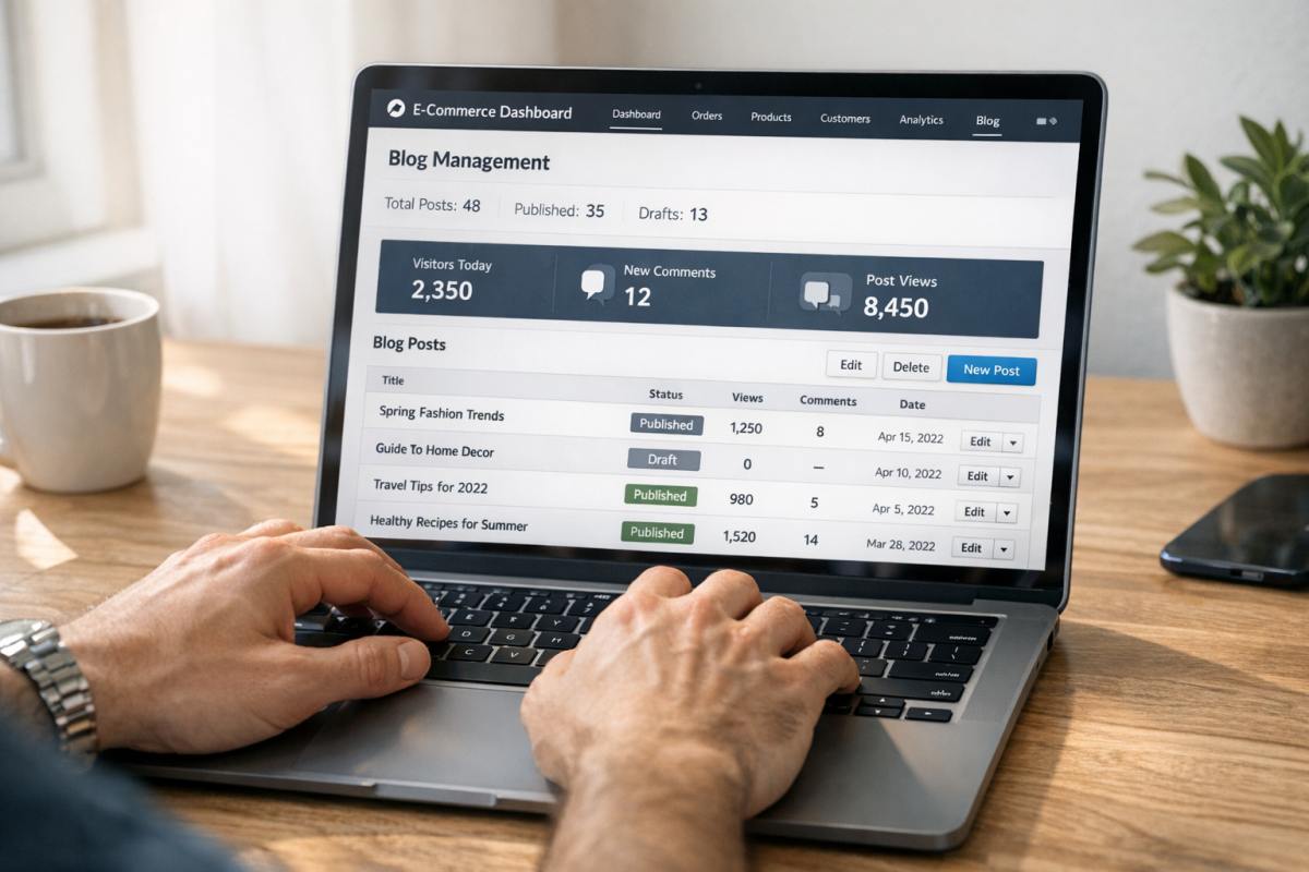
A Shopify blog is basically just like any other blog on the web. You have your core theme, you have your navigation, you have your blog post content, and you have a number of different widgets you can use to improve and expand functionality.
All you need is to get it to work. The trick, here, is the call to action. A call to action mobilizes the user, convincing them that now is the time to take action - not later. Different calls to action have different properties, and how you formulate it all can depend on your goals.
Before we get into ways to include calls to action, let's first talk about what makes a call to action.
- It inspires urgency. A good call to action either states or implies that there's some reason why the user should take action now, rather than later. In fact, a study by ConversionXL found that using urgency phrases on a website can increase conversions by as much as 332%.
- It stands out. A good call to action draws user attention, either by positioning, animation, or color. Research shows visitors form an opinion about a page in as little as 50 milliseconds, so your CTA needs to make an immediate impression.
- It's simple. Many people will only glance at a call to action, so it needs to convey its message at a glance.
- It's above the fold. A lot of people will fail to scroll your page at all, so a call to action placed too low on the page won't attract attention. There are some exceptions to this, as I'll mention below.
Now let's talk about positions and methods for a call to action on your blog. If you put too many on your page at once, you look like a spam page trying harder to sell something than get across information; it's bad for your users, and it's bad for Google, so it's bad. Find the most helpful options you have and stick with them.
1. Link to Products in Blog Posts
The simplest and most common form of call to action is a link in your blog posts. You're probably so used to this you might not even think of it as a call to action. All you need to do is mention your services - like blog promotion - with a link to your service page, or product page, or what have you.
See what I did there?
The tough part with this is that blog post links don't look great; just one link in any given post, and not even the only internal link. You can't necessarily make it look great, but it doesn't make your blog posts distracting. I always say you should include this call to action. But make sure that you're not relying too heavily on it.
2. Create a Shopify-Based Clickable Button
Shopify gives instructions on a regular basis for creating a clickable call to action button for your Shopify store. Their help documentation walks you through the entire process at a mechanical level, and with Shopify's continued theme updates, adding buttons is easier than ever through the built-in theme editor.
Typically, this button is placed on or next to a header that's an example of a product. You show a product with an image and include some reason why the user should click; maybe it's a limited edition product, just to give you an example. You then give the button text like "get yours now" or "shop today" or whatever text happens to work best for your audience.
3. Use a Scroll-Triggered Slider Call to Action
You've probably been on a website before where, as you're scrolling down through the content, you see a box that slides in to the side and hovers in the corner. It's just a script that triggers when the user gets far enough down the page, and all it does is make a small box of content appear. You can do this with tools like OptinMonster, Privy, or Klaviyo's on-site messaging features - which integrate well with Shopify.

This is one example of a call to action that can be below the fold. Because it doesn't appear until further down the page, it tends to only capture the attention of your most involved users. As a result, it will probably have a lower view rate, but a higher click rate than other CTAs. If you're concerned about how these additions affect performance, it's worth understanding why certain site elements slow down your website's load time.
4. Use a Hello Bar or Announcement Bar
Hello Bar is one of a few similar tools that gives you a colored banner across the top of your page, usually with a slight scroll-in effect and always with a call to action button on it. Shopify's own native theme editor also now includes a built-in announcement bar section, which makes it easy to add one without any third-party plugin.
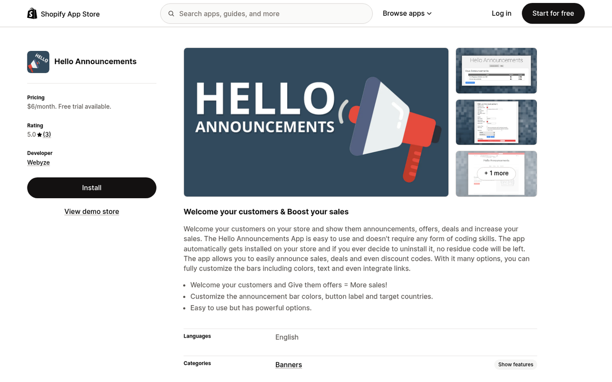
You can customize the color and the text and the destination of the button. Hello Bar remains a popular standalone option with more robust targeting and A/B testing features, though those come at a cost.
5. Use a Top Banner CTA
Unlike a Hello Bar, a top banner call to action is more like a banner ad. You can make these small and position them above or below your navigation. You can make them bigger and have them take up a bigger portion of the top of your site. Different styles demand different types of attention. But the main benefit is that they're big, they're up front, and they're obvious - it's impossible to ignore these kinds of top banners, though whether or not they get any attention is another matter entirely. If you're looking to sell ad slots on your blog, top banners are a great placement to consider.
6. Deliver an Offer on Exit Intent
One of my favorite semi-annoying methods for capturing user attention is the exit intent pop-over. These pop-ups are easy to set up through tools like OptinMonster, Privy, or Klaviyo, which give you Shopify integrations.
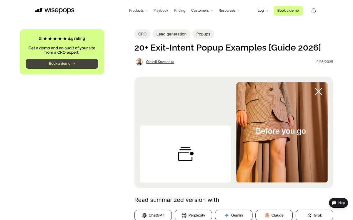
When the user's cursor moves outside of the active window - like towards the X that closes the tab or window - the pop-over appears in a lightbox. This disrupts the user's action and makes them look a second time at the site. You can then capture them with a strong offer, a time-limited deal, or just a guilt trip asking them not to leave alongside a picture of a sad kitten. You know, whatever works best.
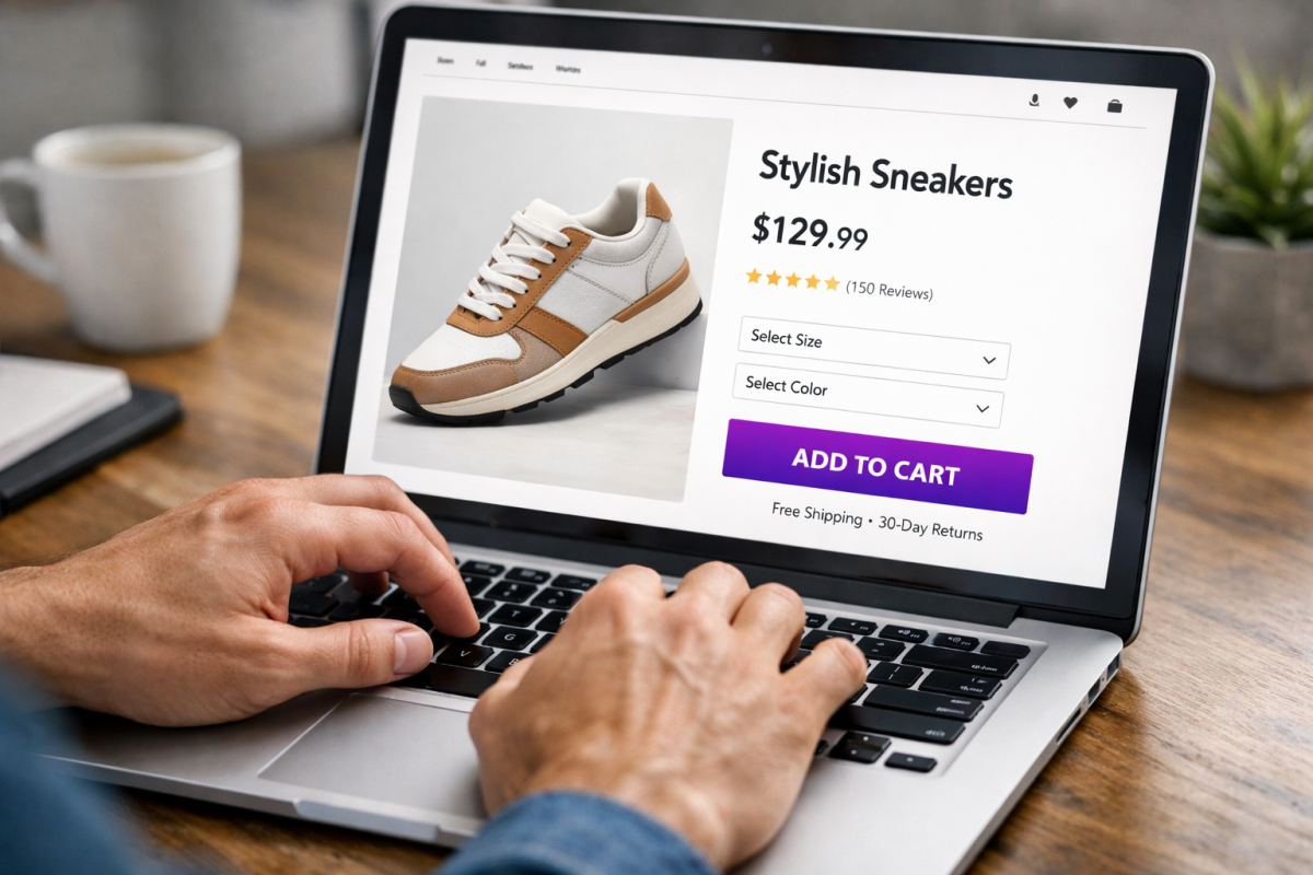
7. Turn Product Images into Links to Pages

Since you're likely writing about your niche for your Shopify blog, you can probably find a way to include a picture of one of your products. Any time you include this picture, you can make it into a call to action. The picture itself can be a link to the product page for that product, and you can use the caption to be a text-based call to action as well. There's a reason those Amazon product boxes work, and they do. Right?
8. Use a Sidebar Ad for Your Own Products
Sidebar ads are familiar to just about everyone, and sidebars tend to be pretty wasted space. In addition to a hovering box of social media buttons - more on those later - you can also have a bigger tower-style ad for your own products. This works especially well for promoting a signature product, a seasonal offer, or an email sign-up.
The downside to this is that they aren't necessarily going to be visible on mobile. Mobile is a vertical format, and one of the first things to go with a responsive design is the sidebars. It means your call to action in the sidebar is necessarily going to be focused primarily on desktop users, so keep that in mind.
9. Use a Recent Sales Widget
A lot of small-scale stores use social proof apps like Sales Pop or Nudgify. What do they do? Even though your users are browsing your site, they continually pop up a message in the corner every few seconds - you can set the timing - with a sales notification. It's usually something simple, like "MWebb42 just purchased Product Name. 3 minutes ago." It might also have a thumbnail of the product. You can customize it, of course.
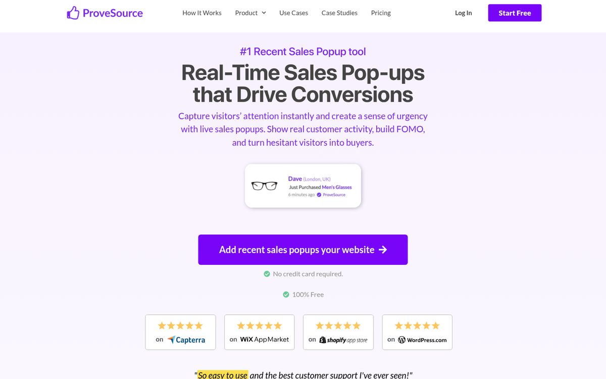
This works best if there's a limited quantity of products available, to trigger the fear of missing out. If only three are available and the user sees a notification saying "ONE JUST SOLD JUST NOW HURRY IF YOU WANT ONE OR IT WILL SELL OUT YOU DON'T KNOW WHEN IT'LL BE BACK", well, maybe they'll make a purchase.
10. Embed Social Media Posts that Link to Landing Pages

Posting on places like Instagram, TikTok, Pinterest, or Facebook with images or videos of your products and a call to action helps you get traffic and buyers to your site. Beyond that you can then take those social media posts and embed them on your site, in your blog posts. You get the benefit of a social media post, in your blog post, with an accompanying call to action. This is especially helpful with TikTok and Instagram Reels content, which continues to drive strong engagement as of 2026.
11. Create Whole Site Wraps
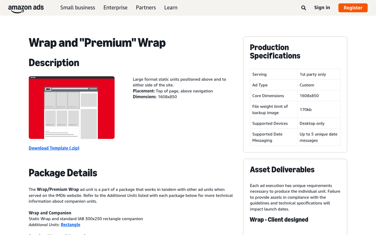
Fewer sites do this than they used to. But some sites still create whole site wraps full of advertising. Usually this is on behalf of another company willing to pay for web estate. But you can use the same technique to advertise something you're selling. A whole site wrap will add sidebars, gutters, backgrounds, headers, images, everything - it basically replaces your existing theme with its own giant pile of advertising. Use this sparingly - it can seem a bit overwhelming to visitors.
12. Use Social Media Buttons with Arrows
One thing to keep in mind is that not all calls to action have to be about products and landing pages. Social media follows are usually one of the easier sells, and building your following has long-term compounding benefits.
You can include social media buttons in a number of places, like across the top of posts, in a sidebar that hovers with the user as they scroll, at the bottom of the post, in a header or footer, or in more than one of those locations. Embellish them with arrows to draw attention, and you can get a steady inflow of followers with each new post.
13. Include a Related Posts Widget
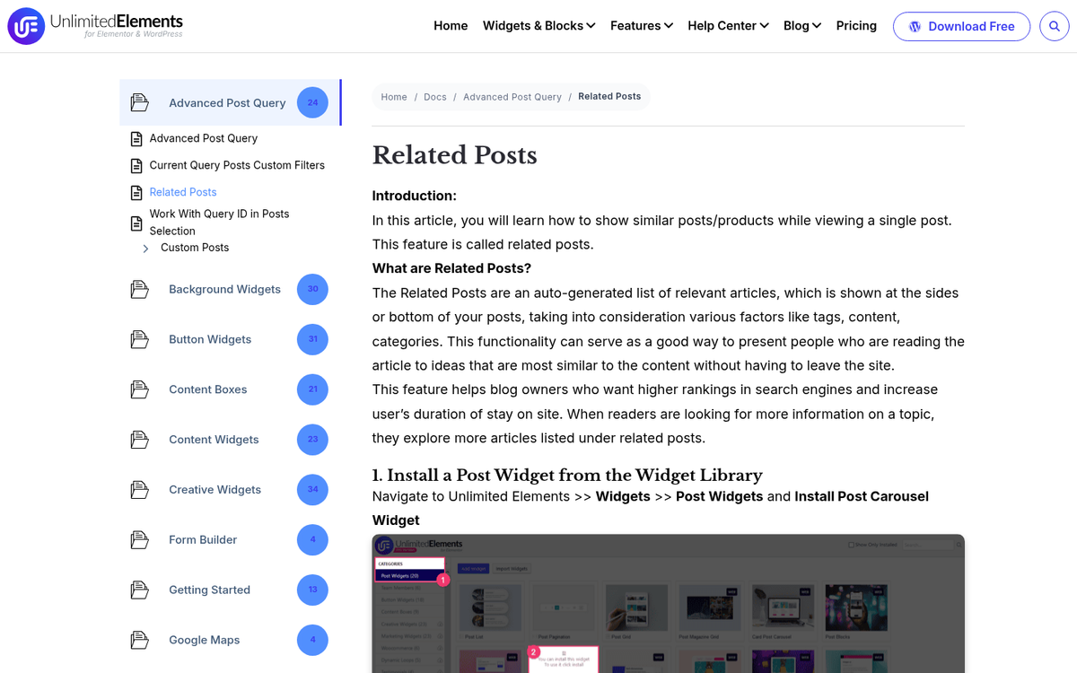
Every blog, in my opinion, should have a related posts widget. A related posts widget will add boxes that show a thumbnail and title for a couple of other blog posts, usually posts that have some relation to the post the user is currently reading, though they may just be recent posts as well. The call to action here is to keep users on your site reading more of your articles; they can be exposed to other calls to action as well.
13. Include a Related Posts Widget
Every blog, in my opinion, should have a related posts widget. A related posts widget will add boxes that show a thumbnail and title for a couple of other blog posts, usually posts that have some relation to the post the user is currently reading, though they may just be recent posts as well. The call to action here is to keep users on your site reading more of your articles; they can be exposed to other calls to action as well.
14. Create a Box for Newsletter Opt-Ins
I've seen a number of different boxes that have newsletter opt-ins. But one of the most prominent tends to be a large box that interrupts the blog post text, either mid-way through or down near the bottom. Some even sit after the conclusion, but before the comments section.
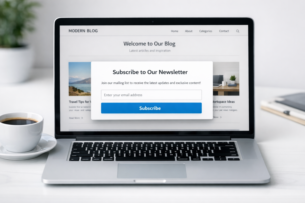
They have a call to action like "don't miss our posts in the future" with an email opt-in attached, and they do a good job of encouraging those who read your post in full to sign up to read more. One important note: once someone is on your email list, best practice is to automate emails to your blog subscribers and use just one call to action per email campaign to stay focused and avoid overwhelming subscribers.
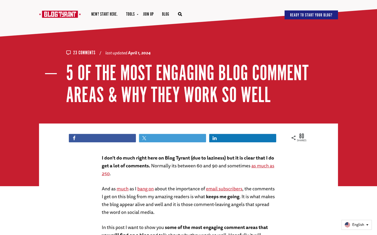
15. Call for Comments
Another call to action you can use is basically a call for comments. At the end of your blog posts, just post a sentence or two asking your users to leave a comment. As long as your comments sections are moderated, you can get commenting just by asking for it.
Blog comments are great because they improve the amount of content on your page, they give you engagement from your users, and they give you feedback. You can use them to build a community and guide the future development of your blog topics. If you're looking for the right tool, check out our guide to the best commenting plugin for WordPress.
It's even easy to do. See, watch:
What do you guys think? What calls to action have proven to be the most helpful on your sites? I'd like to hear how well these techniques perform. Leave a comment with your top techniques below!